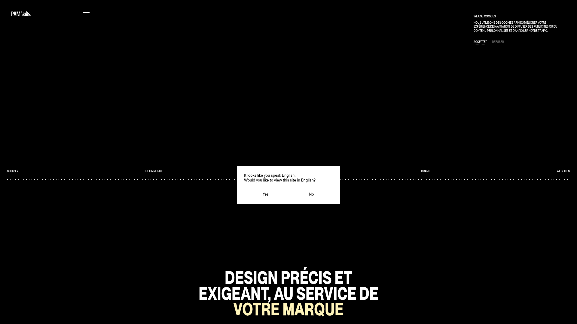
Pam Agency Portfolio Hero
A high-contrast Shopify agency landing page featuring a full-width marquee hero, horizontal service cards, and a sleek yellow-accented slide-out contact form.
Overview
This portfolio landing page for Pam Agency showcases a high-end, minimalist aesthetic tailored for luxury Shopify development and branding. It is a powerful clone reference for creators needing a high-contrast, typography-driven layout that balances dense technical credentials with sprawling, cinematic visual space.
Design System
- Color Palette & Visual Hierarchy: The site uses a strict high-contrast theme—predominantly deep black (
bg-black) and bright white, punctuated by a signature functional yellow (#F1E4A4orbg-yellow). Yellow is reserved for the most important interactive elements: the floating contact slider and the client list section. - Typography: The system relies on a bold, uppercase sans-serif at varying scales. It features a "headline-large" hero style with tight leading and specific color shifts (white to yellow) to draw the eye to the value proposition. Small, uppercase utility text is used for navigation and service labels to maintain a professional, architectural feel.
- Page Structure: The flow begins with a full-svh (screen vertical height) marquee hero section, followed by a dense service grid, a project showcase featuring large-format
aspect-[4/5]imagery, and finally a high-impact yellow client list that spans the full width. - Reusable Components:
- The Marquee Hero: A horizontal scrolling image strip (
animate-[marquee_30s_infinite_linear]) that creates constant energy behind the static hero text. - Service Cards: A responsive card system that shifts from a scrollable horizontal list on mobile to a structured 12-column grid on desktop.
- Slide-out Form: A sophisticated
z-50side-panel contact form with a yellow background that overlaps the main content using smooth CSS transitions.
- The Marquee Hero: A horizontal scrolling image strip (
- Interactions & Motion: The site utilizes tooltips (
data-tooltip) that follow the cursor and opacity-based hover states on project cards. The image-switching hover effect on service links (changing fromagence-ecommerce.jpgtoservice-shopify.webp) provides a dynamic preview of the work. - Implementation Clues: Built using Nuxt/Vue, the site heavily leverages Tailwind CSS for utility-first styling (e.g., specific
aspect-ratioclasses andwill-change-transformfor performance optimization on the marquee).
Use Cases
- Who should clone this: Digital agencies, high-fashion boutiques, and independent brand designers who want a site that feels expensive and curated rather than generic.
- Product Remixes: This pattern works effectively for high-ticket service businesses or luxury product portfolios where the visual brand is as important as the service offered.
- Remix Directions:
- Brand Swap: Keep the layout but replace the high-contrast black/yellow with a softer earth-toned palette for a sustainable brand.
- Information Architecture: Use the vertical side-form component for quick-action lead generation on landing pages.
- Sectional Reuse: Clone the project grid specifically to handle high-resolution photography without cluttering the UI with text.
- Suggested Clone Scope: A quick clone of the marquee hero and the custom slide-out contact panel offers the most immediate "premium" feel for an existing site; a full-page clone is best for those starting a portfolio from scratch.
Related Inspirations
Charlie Phipps Portfolio Hero Layout
A dark-themed portfolio featuring a large horizontal scrolling marquee header, full-bleed video backgrounds, and a clean typography-focused grid for case studies.
Minimal Collective Media Grid Portfolio
A high-end creative portfolio featuring a dynamic grid layout, parallax scroll animations, image hover overlays, and a minimalist full-screen page transition system.

Niklas Rosén Designer Portfolio Index
A minimalist, responsive grid-based portfolio index featuring a clean 16-column layout, typographic list components, and a custom dark mode transition.
Break Maiden Agency Portfolio Hero
A high-impact dark mode hero section featuring oversized typography with inline GIF icons and a responsive grid for display-heavy case studies.
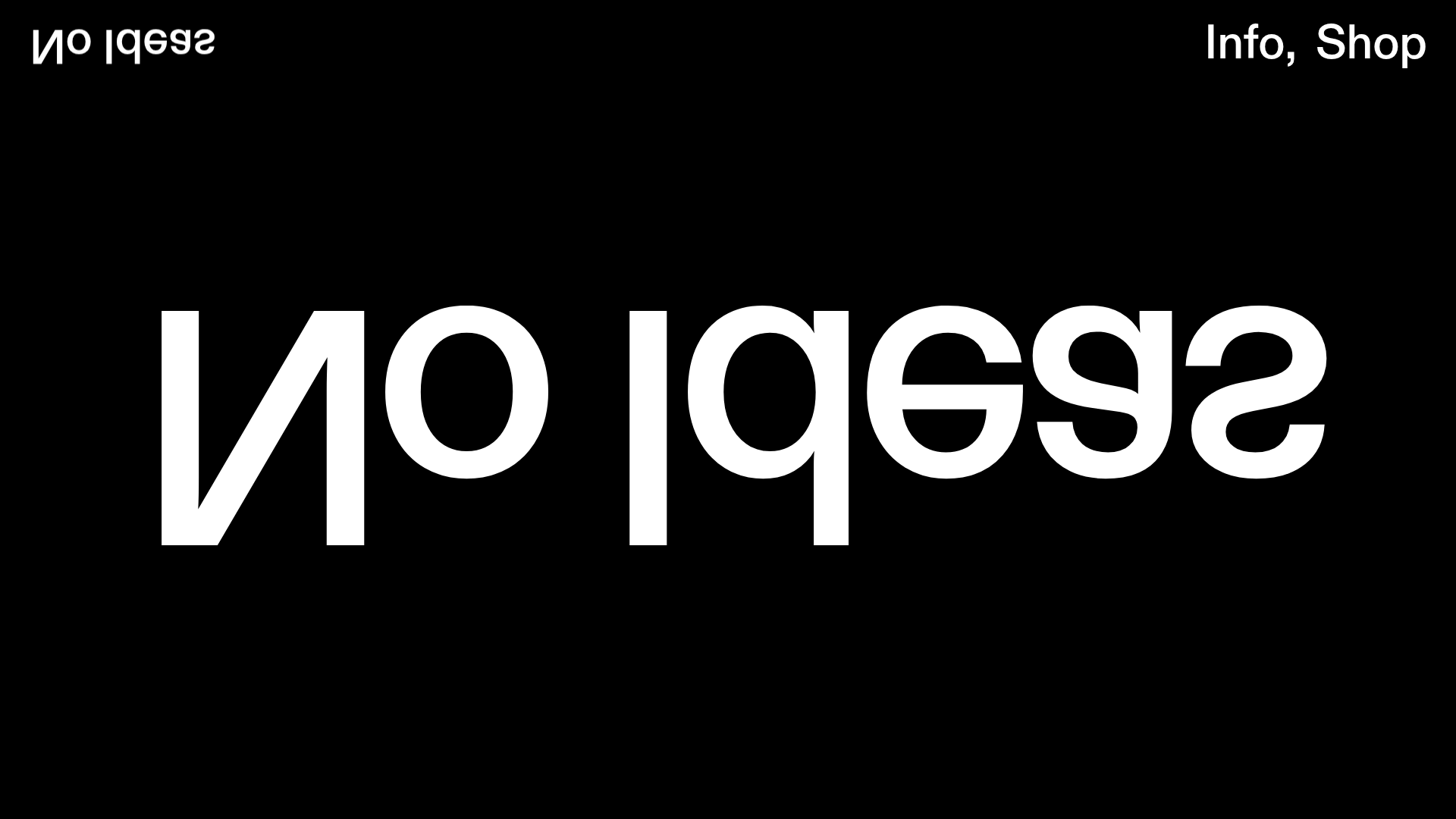
No Ideas Design Portfolio Carousel
A minimalist, full-screen portfolio featuring a high-impact typography hero and a large-scale Bootstrap carousel with video and image support.
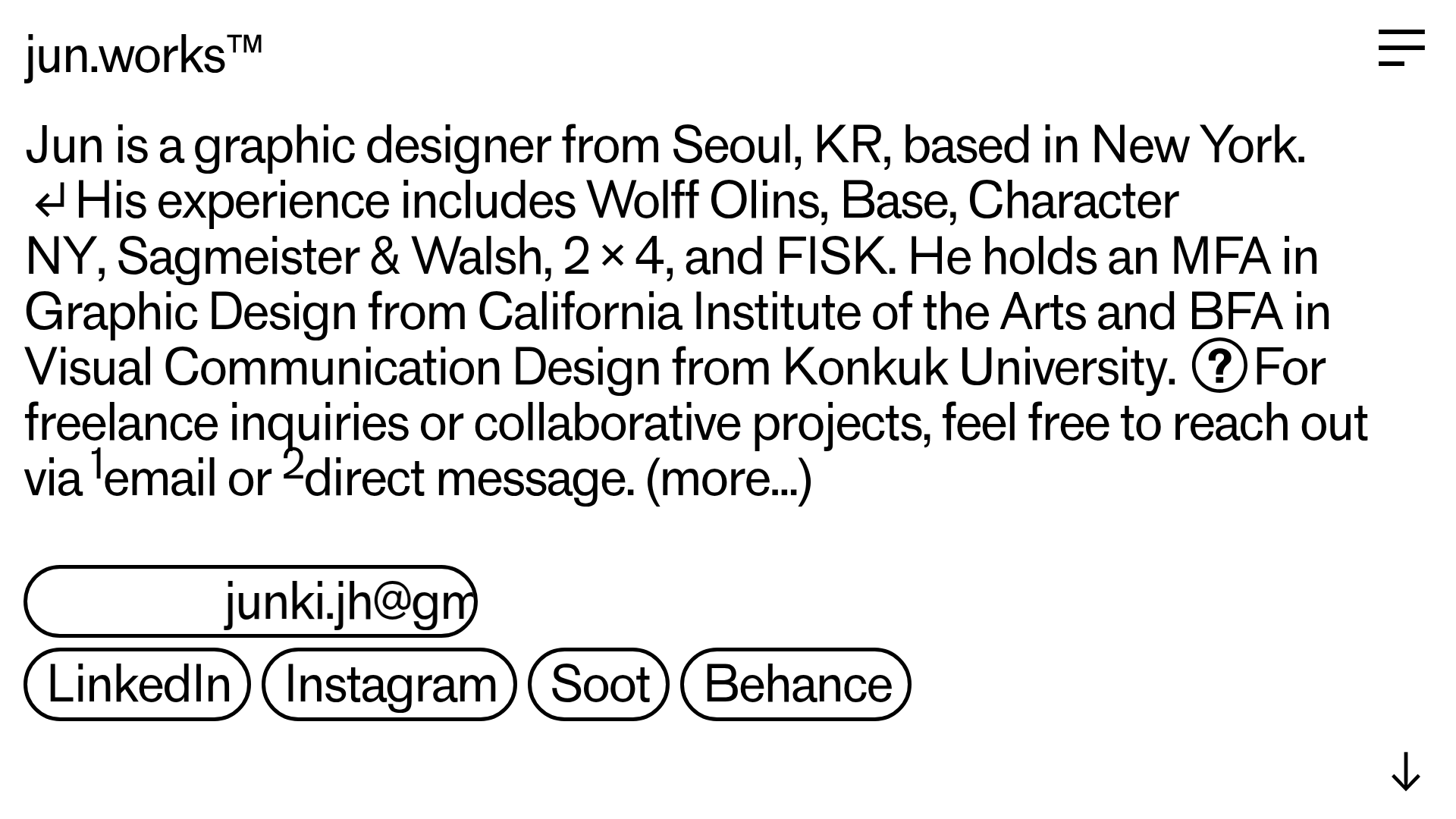
Jun Works Portfolio Landing Page
Minimalist graphic design portfolio featuring a text-heavy layout with image-on-hover tooltips, a pill-shaped marquee contact card, and a categorized hashtag tag cloud for project navigation.
