GT Planar Interactive Font Showcase
A futuristic sci-fi aesthetic landing page featuring immersive scroll-based tunnel animations, interactive variable font weight/angle controls, and a detailed technical specimen grid.
Overview
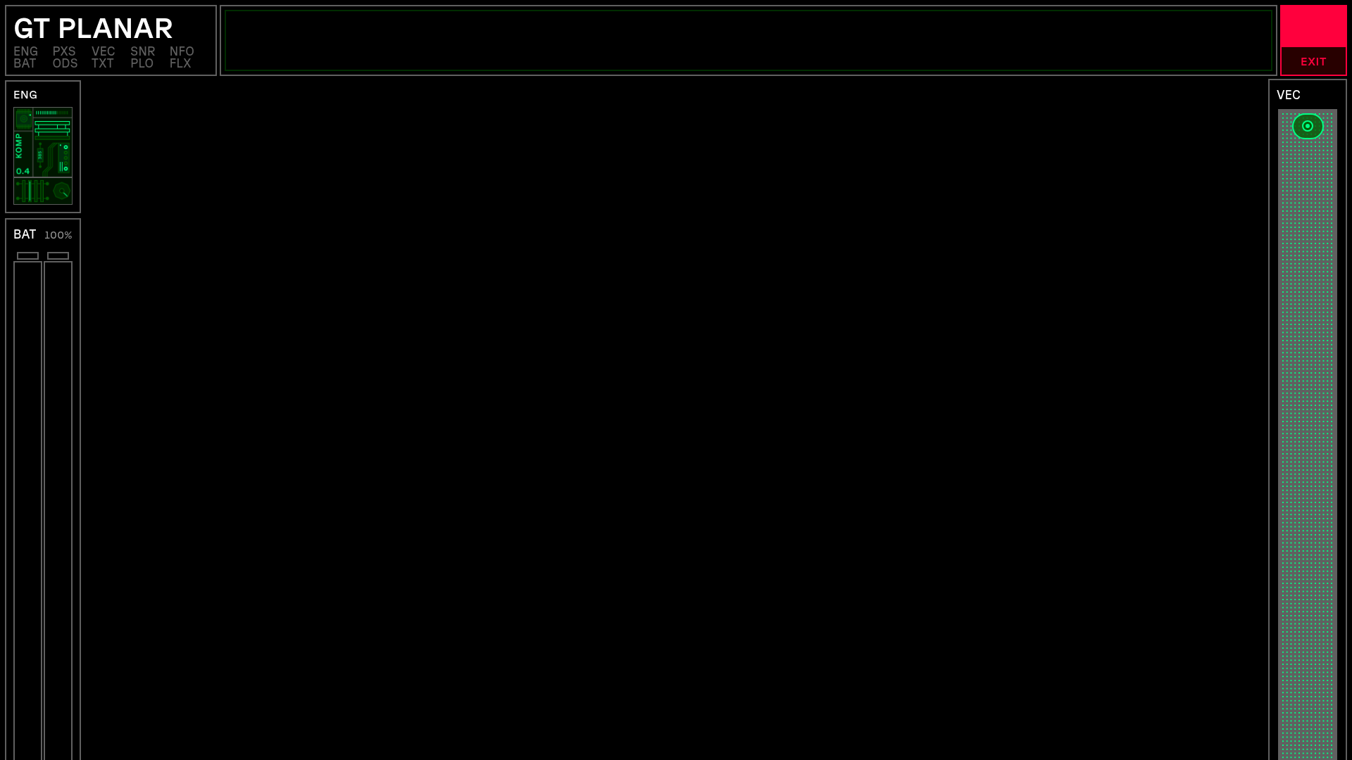
GT Planar is a high-impact interactive font specimen site that uses a futuristic "Head-Up Display" (HUD) aesthetic to showcase variable font technology. It is a premier clone reference for developers looking to master immersive scroll-based storytelling, canvas-driven background effects, and complex UI layouts that maintain usability while breaking traditional web grids.
Design System
- Color Palette & Visual Hierarchy: The site uses a high-contrast "dark mode" base (pure black) with a neon-inspired functional palette. Green signifies active states and technical data, red denotes critical buttons (like 'Exit' or 'Activate'), and amber/yellow is used for intermediate values in the specimen tables.
- Typography System: The site exclusively features the GT Planar variable font. The hierarchy uses massive display sizes (up to 30vw) for headings and tightly tracked all-caps for technical labels. The font-variation-settings (wght, slnt) are manipulated via scroll and mouse movement to demonstrate the font's 90-degree slant range.
- Page Structure & Flow: The layout is framed by a persistent HUD overlay containing biographical stats and engine status. The internal content flows through horizontal intro planes, interactive weight/slant axes, 3D "tunnel" scroll sections (
ss__tunnel), and finally a detailed technical character set grid. - Reusable Components:
- HUD Frame: A fixed-position layout using nested divs for corner and edge status bars.
- Axis Overview: A coordinate-based grid where mouse position tracks font weight and slant.
- Interactive Character Grid: A dense table showing font variations across weight and angle.
- Lottie Player Integration: Used for technical diagram animations interspersed with text copy.
- Interaction & Motion: Scroll-bound transformations are primary. The
ss__tunnel-planeelements use CSSwill-change-transformand variable font settings to create a 3D depth effect as the user scrolls. Status indicators in the HUD (Oxygen, Curiosity) use CSS animations to simulate live data stream flipping. - Responsive Behavior: On mobile, the dense HUD is simplified. Vertical writing modes (
vertical-rl) and Lottie animations switch files (e.g.,aa_mobile.jsonvsaa_web.json) to maintain performance and legibility. - Implementation Clues: Built using Tailwind CSS as indicated by utility classes like
absolute flex justify-between. It heavily utilizesdata-componentattributes for JavaScript hooks (e.g.,data-component="scramble-text") suggesting a modular, component-driven JS architecture.
Use Cases
- Who should clone this: Technical product marketers, typeface designers, and creative agencies building immersive brand "worlds."
- Effective Remixes: This pattern works effectively for hardware product launches (EVs, gaming rigs), cybersecurity dashboards, or complex SaaS landing pages that need to feel cutting-edge and data-heavy.
- Practical Directions:
- Brand Swap: Replace the green/black palette with a laboratory-style white/blue/gray for a medical or scientific product.
- Modular Reuse: Extract the
scramble-textor HUD frame components to add a "tech" layer to a standard portfolio. - IA Adaptation: Use the 3D scroll tunnel to guide users through a product timeline or feature roadmap instead of font styles.
- Clone Scope: A quick clone of the HUD Frame and Interactive Axis is recommended for adding localized punch to a site; a full-page clone is best reserved for single-product storytelling where high-friction interactivity is a feature, not a bug.
Related Inspirations
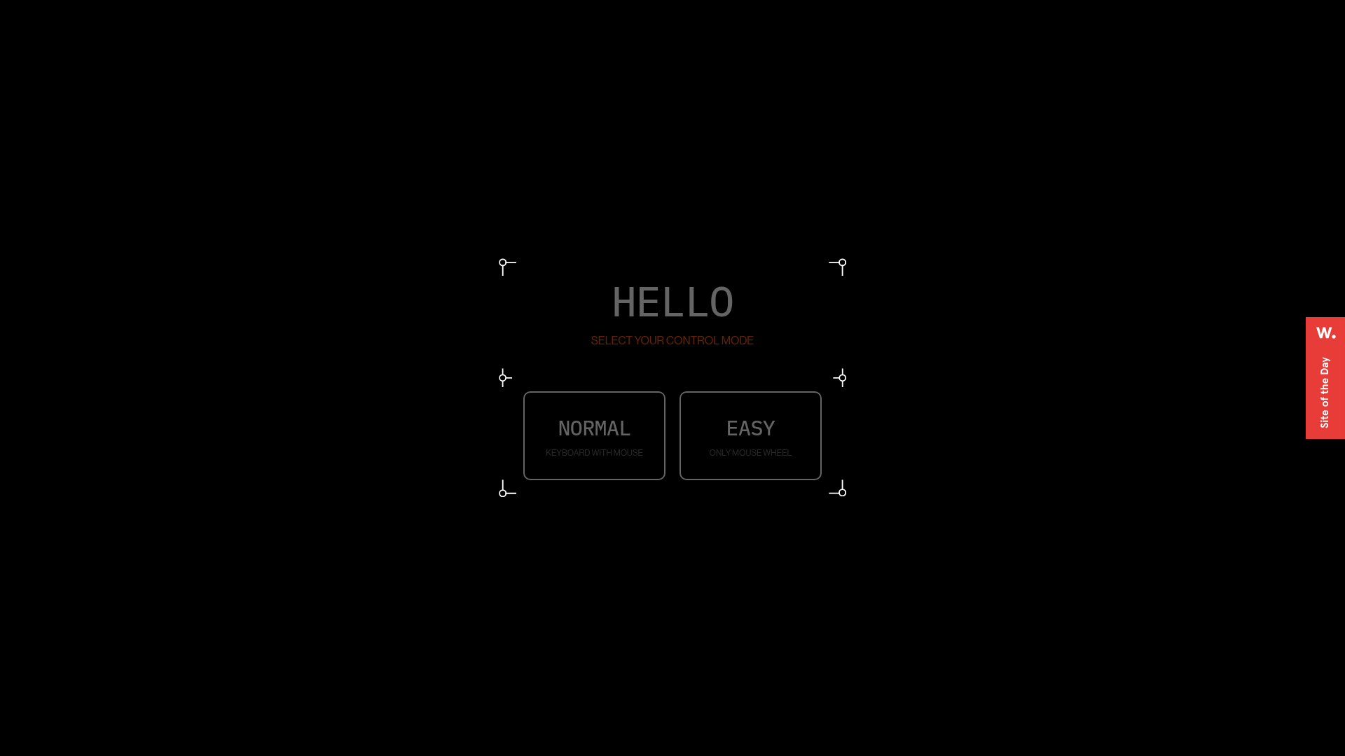
Digital Showroom Control Mode Selection
A futuristic UI featuring a modal with framed corners, grid backgrounds, and custom buttons for selecting navigation preferences like keyboard or mouse controls.
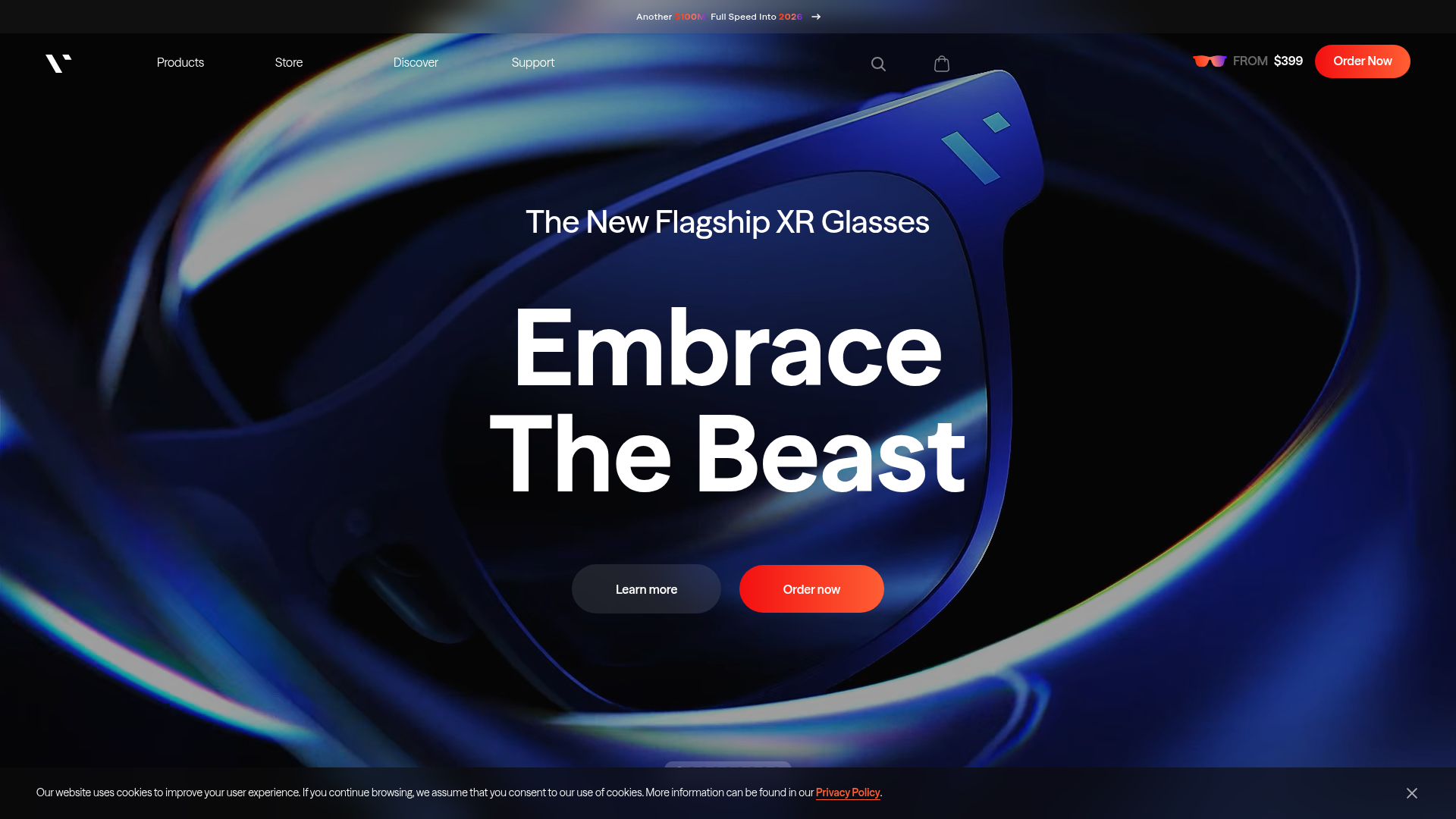
VITURE Flagship XR Product Landing Page
High-impact tech landing page featuring an immersive dark-themed hero section, animated announcement slider, and modern call-to-action buttons with vibrant gradients.
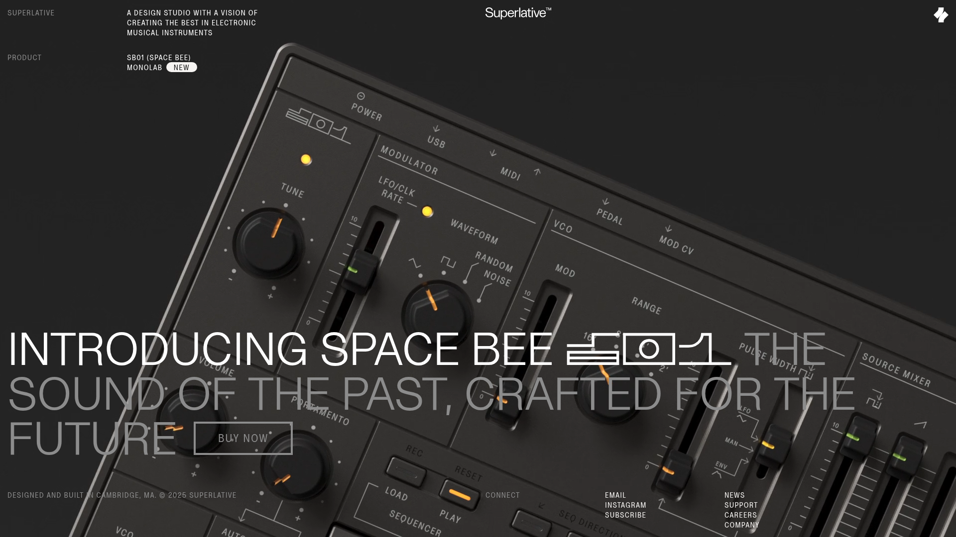
Superlative SB01 Product Landing Page
An elegant dark-themed product site featuring a full-screen video hero, sticky technical specification sidebar, an animated exploded-view diagram, and a layered product details grid.
Wayfinder Minimalist Loading Screen
A clean, dark-themed loading state featuring a centered CSS logo animation and subtle typography for use in high-contrast immersive web experiences.

IAD Lab Interactive Event Landing
A dark-themed event page featuring a Three.js WebGL hero, Svelte-powered scroll animations, a structured program timeline, and a past-edition archive list.
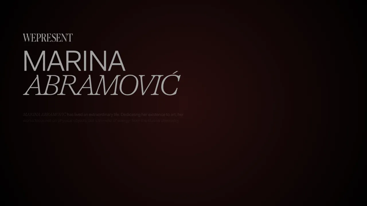
Marina Abramović Immersive Storytelling Gallery
A high-end multimedia experience featuring a 3D canvas background, custom cursor effects, interactive audio controls, and an overlay-based menu for immersive digital narratives.
