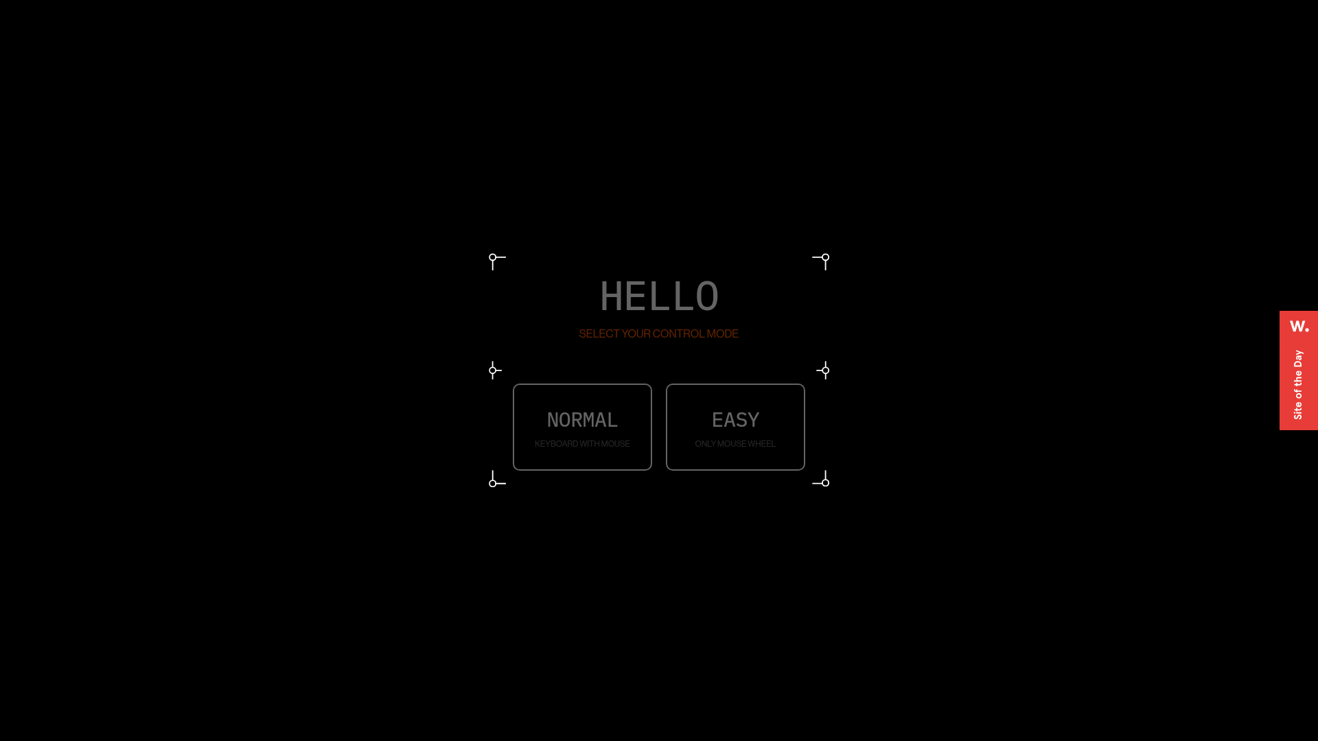
Digital Showroom Control Mode Selection
A futuristic UI featuring a modal with framed corners, grid backgrounds, and custom buttons for selecting navigation preferences like keyboard or mouse controls.
Overview
This UI is a high-fidelity control mode selector for a WebGL-based digital showroom, designed with a futuristic, sci-fi aesthetic. It serves as an excellent reference for builders wanting to implement immersive "entry gates" or configuration modals that transition users from a standard web interface into a 3D environment.
Design System
- Color Palette & Visual Hierarchy: The design uses a monochromatic "dark mode" foundation with a jet-black background (#000000). High-contrast white and muted grey text establish a clear hierarchy, while a subtle burnt-orange/red is used for secondary instruction text ("SELECT YOUR CONTROL MODE") to draw focus without breaking the dark aesthetic.
- Typography System: Features a clean, uppercase sans-serif typeface. The primary heading ("HELLO") uses wide letter-spacing for a cinematic feel. Button titles ("NORMAL", "EASY") are bold and distinct, supported by smaller, lowercase helper text explaining the functionality.
- Page Structure: The interface is centered and structured within a multi-part frame system. There is a background grid layer for depth, a decorative corner-frame layer (
#frameElement), and a content layer containing the interactive buttons. - Reusable Components:
- Modular Frames: The custom corner markers (circles with L-shaped lines) are highly reusable for any "tech" or "dashboard" themed UI.
- Control Buttons: Large, rounded-rectangle buttons with integrated sub-labels and hover states (the
.backgroundspan suggests a fill transition). - Grid Background: A subtle modal background layer that adds texture without distracting from the primary task.
- Interaction & Motion: The HTML structure indicates a heavy use of opacity and visibility transitions (
opacity: 1; visibility: inherit). The use ofaudiotags suggests sound-on-click or sound-on-hover interactions are part of the user experience. - Implementation Clues: The DOM uses a React-style
#rootmount point with a container-based layout (column-container,row-container). Decorative elements are split intoframe-top,frame-center, andframe-bottomclasses, suggesting a flexible CSS grid or flexbox approach to framing.
Use Cases
- Who should clone this pattern: Developers building browser-based games, 3D portfolios, or virtual property tours that require a setup phase before the main experience loads.
- Effective Remixes: This pattern works well for hardware configuration tools, interactive storytelling sites, or futuristic dashboard login screens.
- Practical Remix Directions: Swap the monochromatic color scheme for a "Cyberpunk" neon palette (pinks/cyans) or adapt the frame corners into sleek, minimalist lines for a modern luxury brand feel. Use the modal structure to host a site-wide navigation menu or language selector.
- Suggested Clone Scope: A quick section clone of the
#frameElementand.guide-controllmodecomponents is recommended for those wanting to add a "pro" interactive feel to their standard landing pages.
Related Inspirations
IAD Lab Interactive Event Landing
A dark-themed event page featuring a Three.js WebGL hero, Svelte-powered scroll animations, a structured program timeline, and a past-edition archive list.
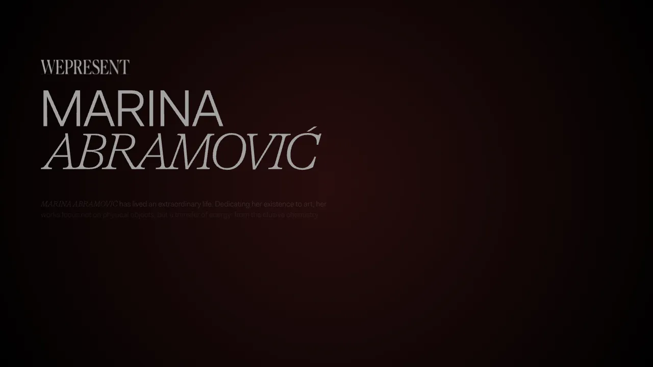
Marina Abramović Immersive Storytelling Gallery
A high-end multimedia experience featuring a 3D canvas background, custom cursor effects, interactive audio controls, and an overlay-based menu for immersive digital narratives.
Gemini Immersive WebGL Motion Showcase
Features a cinematic Three.js WebGL canvas stage with interactive navigation buttons, a hold-to-interact pattern, and data-driven terminal-style UI overlays.
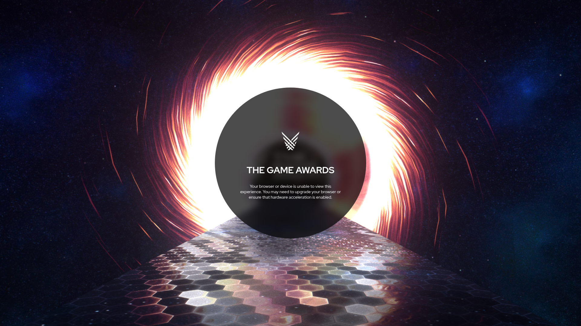
The Game Awards WebGL Experience
A high-end multimedia site featuring a WebGL canvas background with space themes, hexagon-tiled flooring, and a centered circular UI for status messaging.
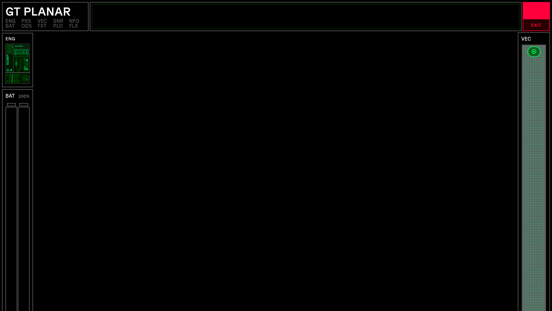
GT Planar Interactive Font Showcase
A futuristic sci-fi aesthetic landing page featuring immersive scroll-based tunnel animations, interactive variable font weight/angle controls, and a detailed technical specimen grid.
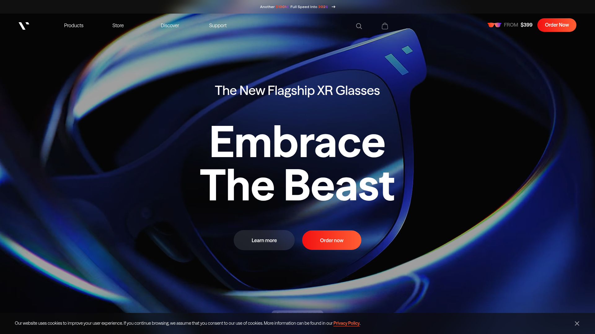
VITURE Flagship XR Product Landing Page
High-impact tech landing page featuring an immersive dark-themed hero section, animated announcement slider, and modern call-to-action buttons with vibrant gradients.
