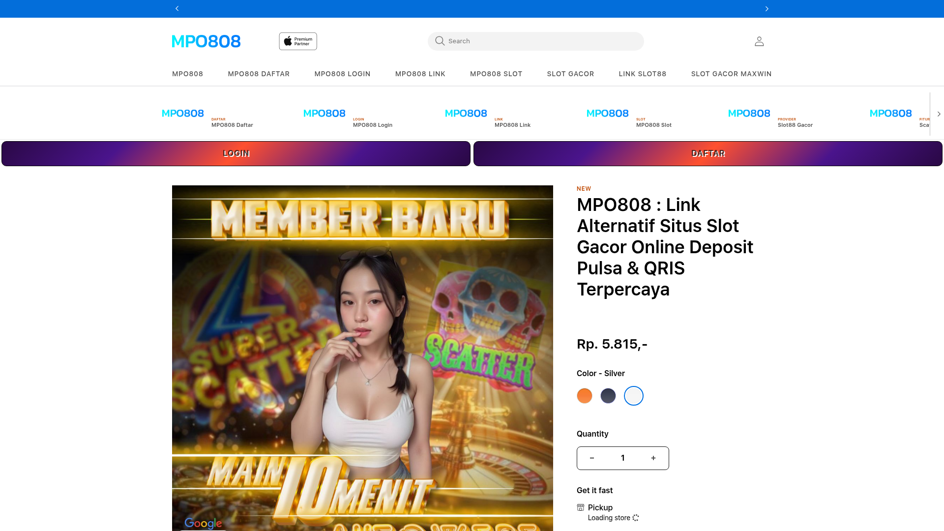
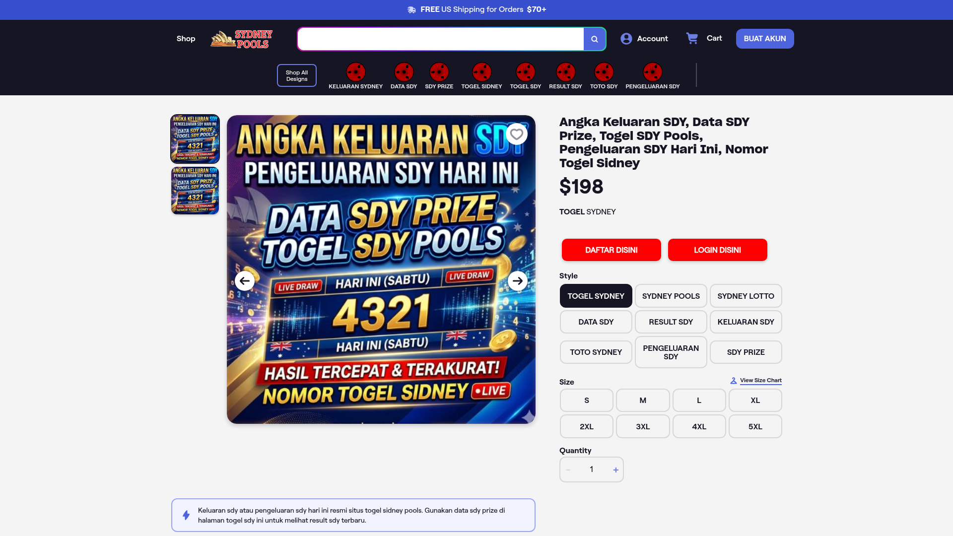
MPO808 Online Gaming Landing Page
A gambling site interface featuring a sticky navigation bar with horizontal scrolling icons, dual action hero buttons, and a two-column product layout with variant selectors.
Overview
This landing page is a gaming-optimized e-commerce interface that blends high-energy promotional imagery with structured product purchase UX. Specifically designed for high-conversion performance, it features a secondary utility navigation and dual call-to-action (CTA) buttons, making it an excellent reference for builders creating direct-response landing pages or niche affiliate sites.
Design System
- Color Palette & Visual Hierarchy: The interface utilizes a clean white background to offset a vibrant, high-saturation hero image. Vibrant blue is used for primary navigation and branding, while a deep purple-to-magenta gradient is applied to the two main conversion buttons (
.loginand.register). The hierarchy is dominated by the large central image on the left and a bold, black H1 title on the right. - Typography: The system uses a clean sans-serif stack. Scale is used aggressively for the product title (large bold H1) and price (
Rp. 5.815,-). Labels like "NEW" use a bold orange accent to draw immediate attention. - Page Structure: The layout follows a top-down flow: a thin blue announcement bar, a search-focused header, a horizontal-scrolling icon carousel for categories/links, a dual-button action stripe, and a two-column product section (Image left, Info/Forms right).
- Reusable Components:
- Horizontal Icon Nav: A
slick-sliderdriven list item (.apl_lob_list_item) with small icons and category labels. - Dual Hero Buttons: High-contrast, full-width gradient buttons for immediate user onboarding.
- Variant Selectors: Circular color swatches and a quantity stepper (
.js-qty-input) integrated into the product information block. - Accordions: An FAQs and Overview section using standard
detailsandsummarytags for progressive disclosure.
- Horizontal Icon Nav: A
- Interaction Patterns: The navigational stripe supports horizontal touch-sliding and arrow clicks. The color variant radios include a "silver" selection state with a blue border, indicating active feedback.
- Implementation Clues: The HTML reveals a Shopify-based architecture (
shopify-section,product-form) utilizingslick-sliderfor carousels and a custom CSS framework for grid layouts (grid--2-col-tablet).
Use Cases
- Who should clone this: Developers building affiliate marketing hubs, gambling/gaming landing pages, or high-velocity single-product e-commerce sites.
- Effective Remixes: The horizontal icon navigation is perfect for any catalog site with 5-10 distinct categories. The dual-button CTA row can be adapted for any "SaaS-style" login/signup workflow.
- Remix Directions: Replace the high-energy gaming visuals with tech or lifestyle imagery to transform this into a premium gadget store. The right-side product info stack is highly modular—builders can swap the variant selectors for simple feature lists.
- Clone Scope: A quick section clone of the navigation stripe and dual-button hero is recommended for mobile-first utility; a full-page clone is best for those needing a complete, high-conversion product page template.
Related Inspirations
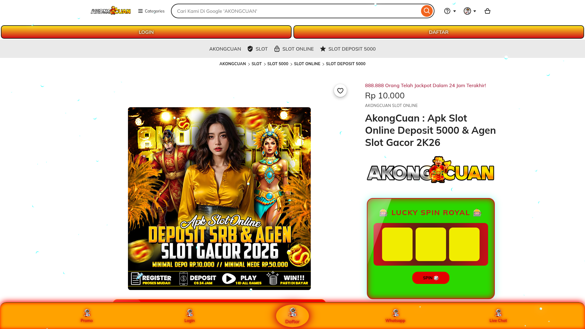
AkongCuan Slot Landing Page
A gaming landing page layout featuring a product display columns, lucky spin interactive component, breadcrumb navigation, and an icon-based sticky footer.
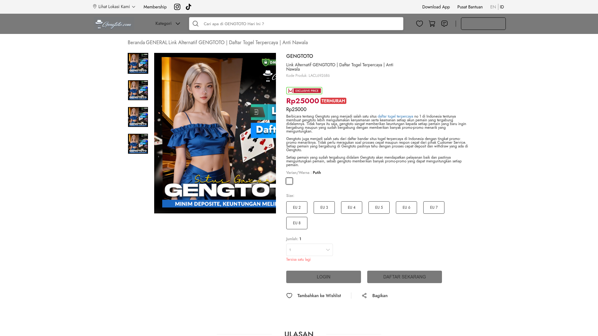
GENGTOTO Product Detail E-commerce Layout
A comprehensive product page featuring a vertical image gallery, detailed item specifications, color/size selection modules, and integrated user review and FAQ components.
ExpressVPN SaaS Landing Page
Features a high-conversion layout with a sticky countdown banner, icon-driven feature grid, flag-based server directory, FAQ accordion, and floating chat widget.
E-Commerce Product Detail Page Template
A feature-rich retail layout featuring a multi-image carousel, customizable product options with size/style selectors, tiered pricing displays, and an accordion-style FAQ section.
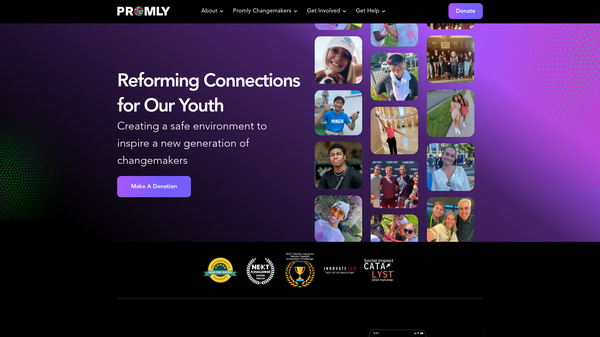
Promly Youth Platform Landing Page
A vibrant dark-mode layout featuring a vertical image marquee, bento-style reward cards, and a press-worthy horizontal slider for community-focused organizations.
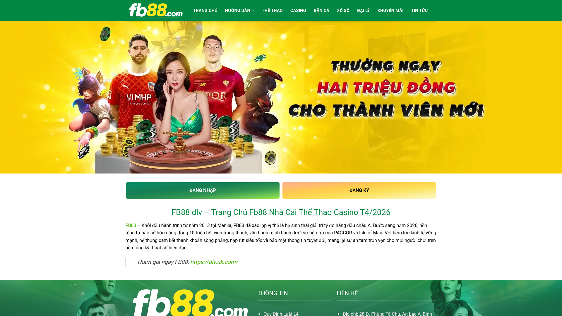
FB88 Betting Portal Homepage
A gaming-focused layout featuring an high-impact hero slider, dual-action CTAs, a structured SEO content section with data tables, and an accordion-style FAQ.
