Lama Lama Creative Agency Landing Page
A high-end portfolio layout featuring a dark-themed hero with video masking, anchor underlines, horizontal scrolling marquee elements, and a sophisticated staggered grid for featured projects.
Overview
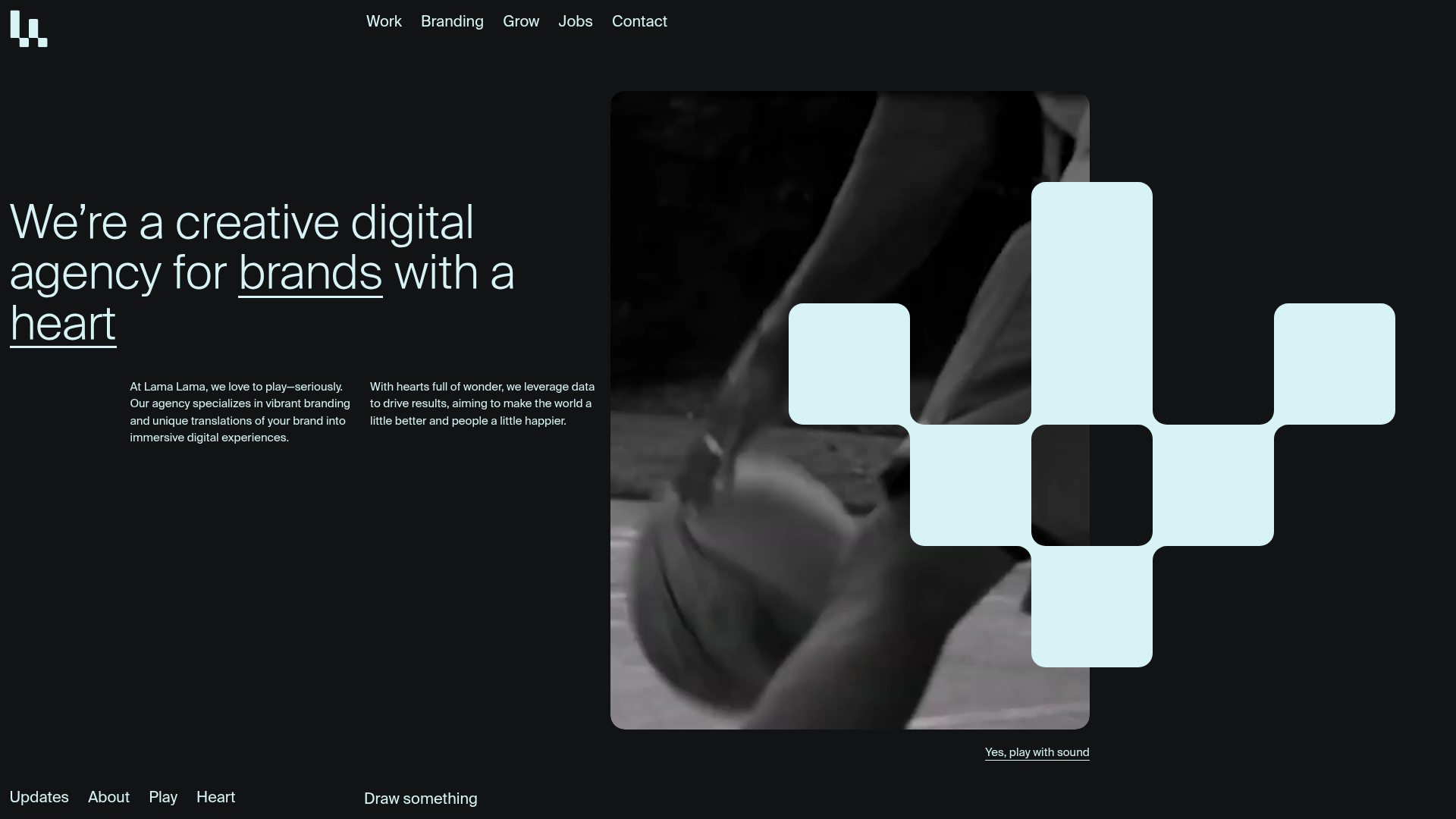
This landing page for Lama Lama is a masterclass in high-end digital agency aesthetics, combining a dark-themed minimal interface with bold, interactive elements. It serves as an excellent reference for builders wanting to implement sophisticated video masking, bespoke cursor-reactive typography, and staggered project grids that feel both playful and professional.
Design System
- Color Palette & Visual Hierarchy: The site uses a high-contrast foundation with a deep charcoal/black background (
#111314) and a soft "ice blue" accent (#d7f3f5). Hierarchy is established through extreme scale shifts in typography and the use of white-space to frame media content. - Typography: The system relies on a clean, modern sans-serif. It features massive, thin-weight display headings (targeting
heading--50) balanced against tiny, uppercase subheaders (text--subtitle) and well-spaced body copy in a two-column grid. - Page Structure: The flow starts with a text-heavy hero containing an integrated video mask, followed by a staggered project grid ("Featured Projects"), a horizontally pinned "Clients" section, and a full-width philosophy section featuring large scrolling marquees.
- Reusable Components:
- Dynamic Underlines: Multi-layered anchor links that feature both solid and dashed underlines (
js-underline) that animate on hover. - Marquee Project Tiles: Cards that reveal a "visit website" or "view case" scrolling marquee overlay when hovered.
- Sticky Footer: A high-impact, contrasting color footer (
#d7f3f5) that remains fixed, providing persistent navigation to "Play" and "Heart" sections. - Video Masking: Rounded-corner containers (
rounded-15) used for cinematic video backgrounds.
- Dynamic Underlines: Multi-layered anchor links that feature both solid and dashed underlines (
- Interaction & Motion: The design heavily utilizes GSAP-style animations, including horizontal scrolling for philosophy terms ("Dream, Act, Grow"), audio toggles for video content, and a unique "Draw something" canvas overlay.
- Implementation Clues: The HTML reveals a utility-first approach (likely Tailwind CSS) with classes like
flex,inset-0, andaspect-w-3. It uses a custom router wrapper (data-router-view) suggesting smooth page transitions and heavy JavaScript integration for the marquee and scroll-pinning effects.
Use Cases
- Who should clone this: Creative studios, independent designers, and boutique digital agencies looking for a portfolio that breaks the standard "box" grid.
- Effective Remixes: This pattern works perfectly for architecture firms or high-end fashion lookbooks where large-scale media and minimal text are priorities.
- Practical Directions:
- Swap the ice-blue accent for a neon hue to shift from "sophisticated" to "tech-edgy."
- Reuse the
home-work-tilemarquee hover effect for any e-commerce product grid to add a premium feel. - Adapt the horizontal philosophy scroll for a "Process" or "Timeline" section.
- Clone Scope: A full-page clone is ideal for those needing a complete brand overhaul, but the hero section's video-mask-and-text combination or the staggered project grid are excellent standalone components to remix into existing sites.
Related Inspirations
SWWIM Social Agency Animated Hero
A dynamic landing page featuring a wave-layered layout, ticker-tape marquees, floating SVG illustrations, and high-contrast typography in a blue-and-white nautical aesthetic.
Evermade Agency Site Showcase
A high-performance agency site featuring a luxury dark aesthetic, interactive 3D hero tilt effects, custom slider components, and a unique 'text-reveal-on-hover' service section.
OPX Studio Agency Portfolio
A minimalist dark-themed portfolio featuring a staggered masonry project grid, cinematic video embeds, and a responsive oversized typography hero section.
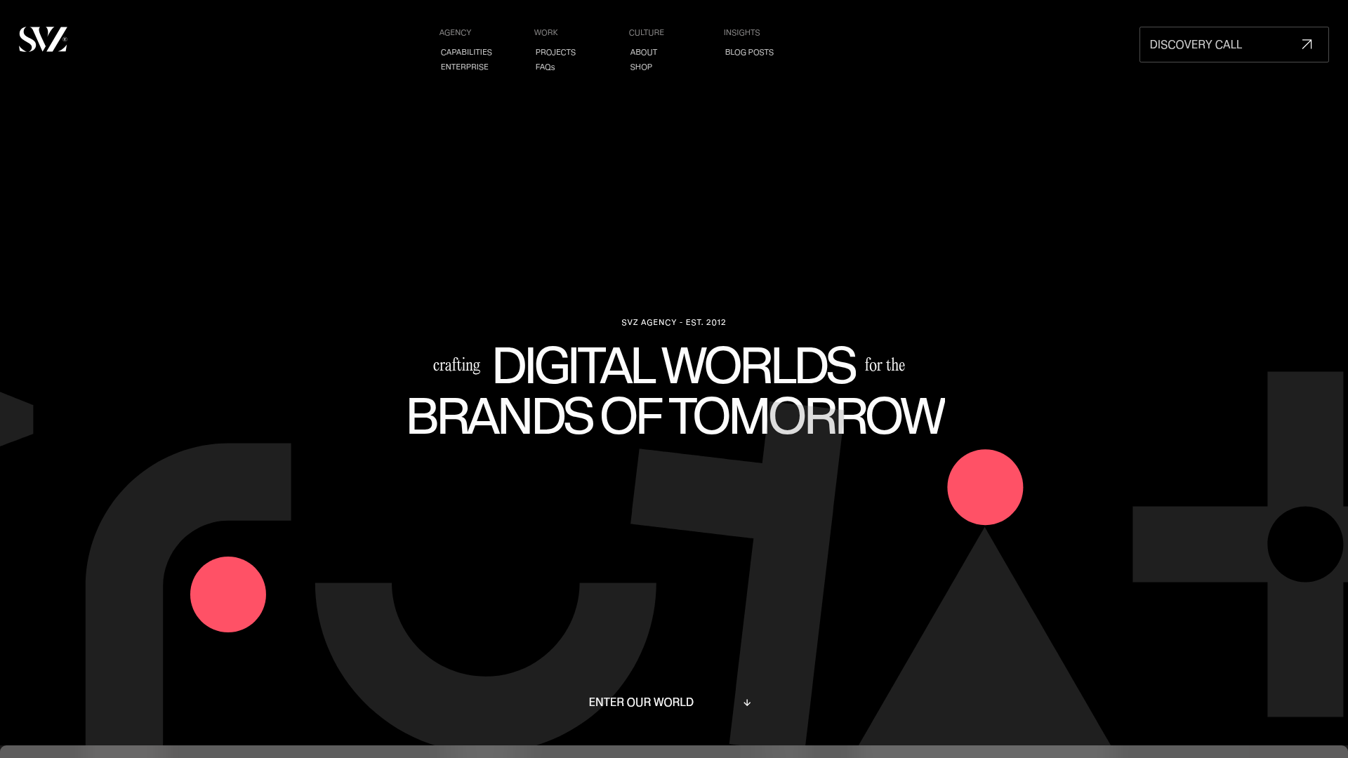
SVZ Digital Agency Hero Page
A high-impact agency landing page featuring a Lottie-animated hero background, zoom-on-scroll typography, and a parallax video portfolio grid.

Monopo London Creative Agency Portfolio
Features a PixiJS WebGL gradient hero, a vertical ruler scroll-progress indicator, and sticky project sections with dynamic scaling transitions and custom cursor interactions.
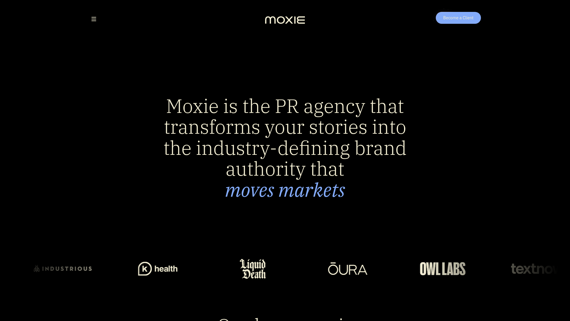
Moxie PR Agency Landing Page
A dark-themed agency site featuring an animated typewriter hero, ticker-style marquee, interactive case study cards with video backgrounds, and a vertical sticky services section.
