Moxie PR Agency Landing Page
A dark-themed agency site featuring an animated typewriter hero, ticker-style marquee, interactive case study cards with video backgrounds, and a vertical sticky services section.
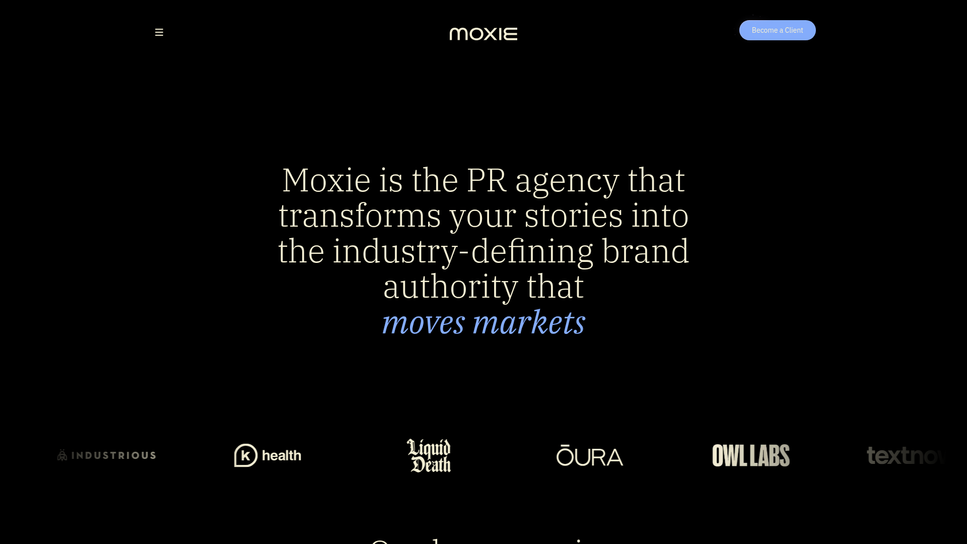
Overview
Moxie PR Agency’s landing page is a sophisticated, high-end example of modern dark-mode design that prioritizes high-impact typography and subtle motion. It is an excellent reference for builders looking to implement complex scroll interactions, video-integrated card layouts, and dynamic text animations within a clean professional framework.
Design System
- Color Palette & Visual Hierarchy: The site uses a deep black background (#000000) with high-contrast white text for primary messaging. A soft cerulean blue (seen in the 'Become a Client' button and highlighted text) serves as the primary accent color to draw attention to CTAs and core brand keywords.
- Typography: The system pairs a bold, wide serif font for major headings with a clean, functional sans-serif for body copy and navigation. A unique "typewriter" style serif is used in the hero to emphasize the storyteller nature of the agency.
- Layout & Structure: The flow follows a standard agency narrative: Hero with rotating keywords > Logo marquee > Portfolio cards > Sticky services list > Testimonials (Swiper.js) > Leadership team profiles.
- Reusable Components:
- Logo Marquee: A horizontally scrolling ticker of client logos (
home-hero_marque-line) that provides immediate social proof. - Case Study Cards: Interactive blocks (
cases_card) featuring muted video backgrounds and hover-triggered descriptions. - Vertical Sticky Services: A section where service categories remain fixed while scrolling, with text shifts driven by scroll positioning.
- Glow Buttons: Primary buttons utilize a subtle glow effect (
secondary---glow) to appear tactile against the dark background.
- Logo Marquee: A horizontally scrolling ticker of client logos (
- Motion Patterns: The hero features a vertical sliding text animation for key phrases. Scroll-based triggers (
data-w-id) control the opacity and translation of text elements, ensuring content "appears" as the user engages with it. - Implementation Clues: The HTML structure reveals a Webflow-based build utilizing utility classes for padding (
padding-global) and layout (container-large). It uses Swiper for sliders and custom HTML video embeds for the background layers in the case studies.
Use Cases
- Agencies & Consultancies: Perfect for high-end service providers who want to showcase a portfolio with cinematic flair rather than static screenshots.
- Luxury Tech Startups: The dark-mode, high-contrast aesthetic is well-suited for premium hardware or high-tier B2B software brands.
- Practical Remixes:
- Brand Swap: Developers can easily swap the cerulean accent for a brand-specific primary color (e.g., neon green for security or purple for creative tools).
- Information Architecture: The "Services" sticky section can be remixed into a "Product Features" list for SaaS landing pages.
- Selective Cloning: The interactive video cards are highly portable components that could be reused individually on a stand-alone portfolio or work page without cloning the full landing page structure.
Related Inspirations
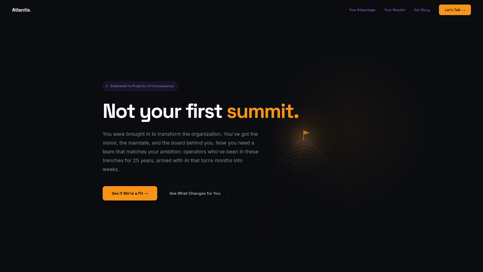
Atlantis Tech Engineering Services Landing Page
A dark-themed professional services layout featuring a custom SVG mountain hero, logo cloud, benefits grid, process timeline, and a dual-column 'fit' comparison section.
Matter of Fact Typography Landing Page
A minimalist landing page featuring a vertical scrolling text marquee animation for dynamic hero typography using GSAP or CSS transitions.
ThoughtLab Digital Studio Landing Page
A high-end dark-mode agency layout featuring scroll-triggered typography, a specialized capabilities grid, and clean blog article lists with smooth image hover effects.
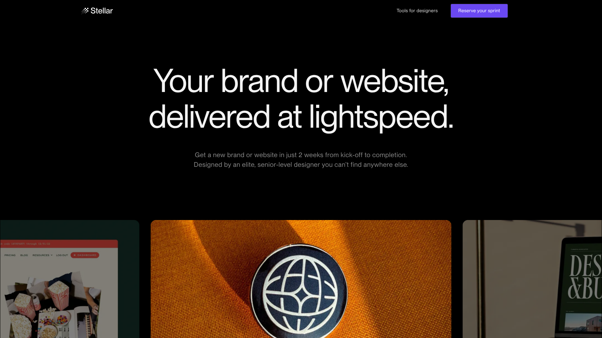
Stellar agency landing page
Dark-mode design agency landing page featuring a horizontal scroll gallery, tabbed CMS portfolios, and a unique button animation pattern with integrated availability status.

Niklas Rosén Designer Portfolio Index
A minimalist, responsive grid-based portfolio index featuring a clean 16-column layout, typographic list components, and a custom dark mode transition.
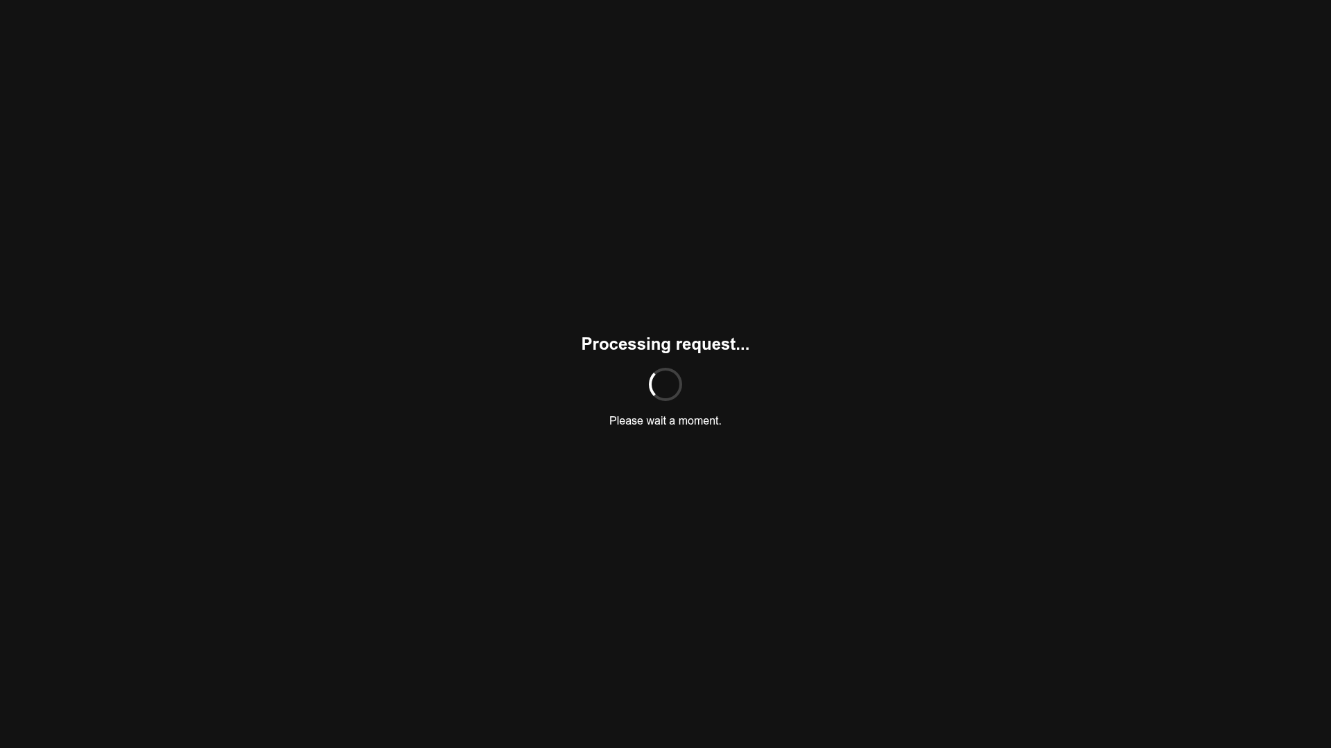
Minimalist Dark Mode Loading Screen
A clean, dark-themed redirection page featuring a centered typography layout and a CSS circular loading spinner for asynchronous processing states.
