Samara Backyard ADU Showcase
Features a parallax imagery hero, interactive housing model configurator, horizontal testimonial scroller, and a vertical step-by-step process timeline layout.
Overview
Samara's website is a high-end architectural showcase for pre-fabricated Accessory Dwelling Units (ADUs). It serves as a premier reference for builders looking to design product-led landing pages that blend immersive 3D visualization, complex interactive configurators, and long-form authoritative content into a seamless single-page experience.
Design System
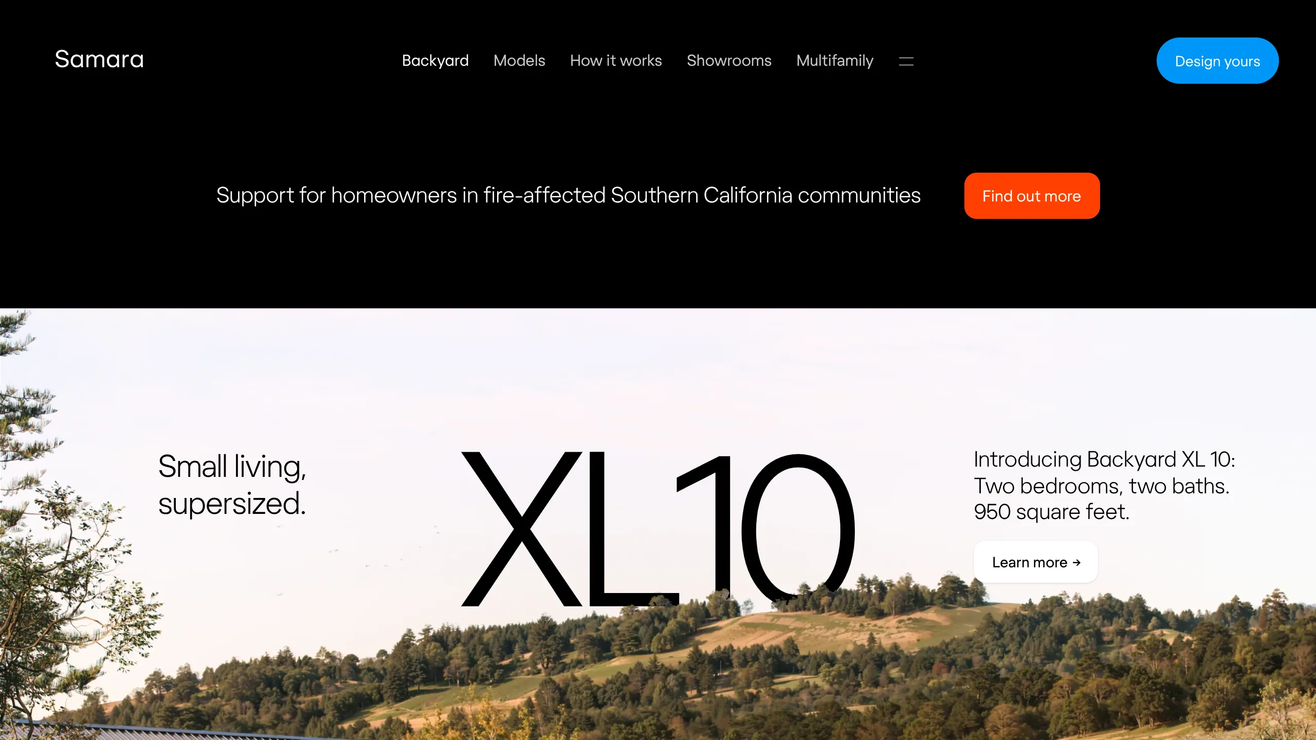
- Color Palette & Visual Hierarchy: The site uses a sophisticated monochrome base (pure black and white) with high-contrast accent colors: a vibrant 'Electric Blue' for primary actions and an 'International Orange' for urgent community alerts. Neutral light beiges are used in deep-scroll sections to reduce eye strain during information-heavy segments.
- Typography: The typography system utilizes a large-scale sans-serif (Regola/Inter style) with dramatic weighting. Headers (e.g.,
type-96,type-60) use ultra-thin or light weights for a luxury feel, while technical specs use a monospace font to emphasize precision. - Page Structure: The flow follows a "Dream to Reality" sequence: Immersive hero parallax → High-level emotional pitch → Interactive model selection → Educational process timeline → Feature-specific bento grids → Final CTA.
- Reusable Components:
- Inverted Navigation: A sticky nav that flips colors from white-on-black to black-on-white based on the background section (
.main-navigation.inverted). - Mini-Configurator: A tabbed image switcher allowing users to toggle house sizes and exterior finishes (e.g., Bone White to Evergreen) without page refreshes.
- Bento Feature Grids: Content blocks that mix high-res photography with expandable "Details" drawers using checkbox-driven UI states.
- Infinite Testimonial Scroller: A clean, horizontal auto-scroller (
.testimonials-scroll) featuring compact snippets that expand on click.
- Inverted Navigation: A sticky nav that flips colors from white-on-black to black-on-white based on the background section (
- Interaction Patterns: The site heavily utilizes parallax scrolling (
translate3dtransforms) for its hero images and a canvas-based bird animation. Section transitions use distinct "invert" triggers to flip the browser's color scheme as the user scrolls into dark or light containers. - Implementation Clues: The HTML reveals a custom-built solution rather than a standard framework like Tailwind, using semantic classes like
modern-gridand utility-based typography names (e.g.,type-30-light). It utilizes aslidescontainer system to manage vertical full-page segments.
Use Cases
- Who should clone this: Manufacturers of high-ticket modular products, high-end real estate developers, or luxury vehicle brands requiring a balance of aesthetic "lifestyle" imagery and technical customization.
- Effective Remixes:
- Product Configurator: Reuse the logic of the
.three-sizes-layoutssection to showcase furniture, gadgets, or apparel where users need to see color variants and size specs simultaneously. - Process Timelines: Adapt the
.four-simple-stepsvertical timeline for service-based SaaS platforms to explain onboarding or implementation phases.
- Product Configurator: Reuse the logic of the
- Practical Directions: Builders can swap the minimalist architectural style for bold, colorful branding while keeping the structural grid. The "Bento Box" section (
.bento) is particularly effective for adapting tech specs into a digestible visual format. - Suggested Clone Scope: A quick section clone of the "Bento Feature Grid" or the "Mini-Configurator" provides immediate value for smaller projects. A full-page clone is best for premium hardware start-ups launching a single flagship product line.
Related Inspirations
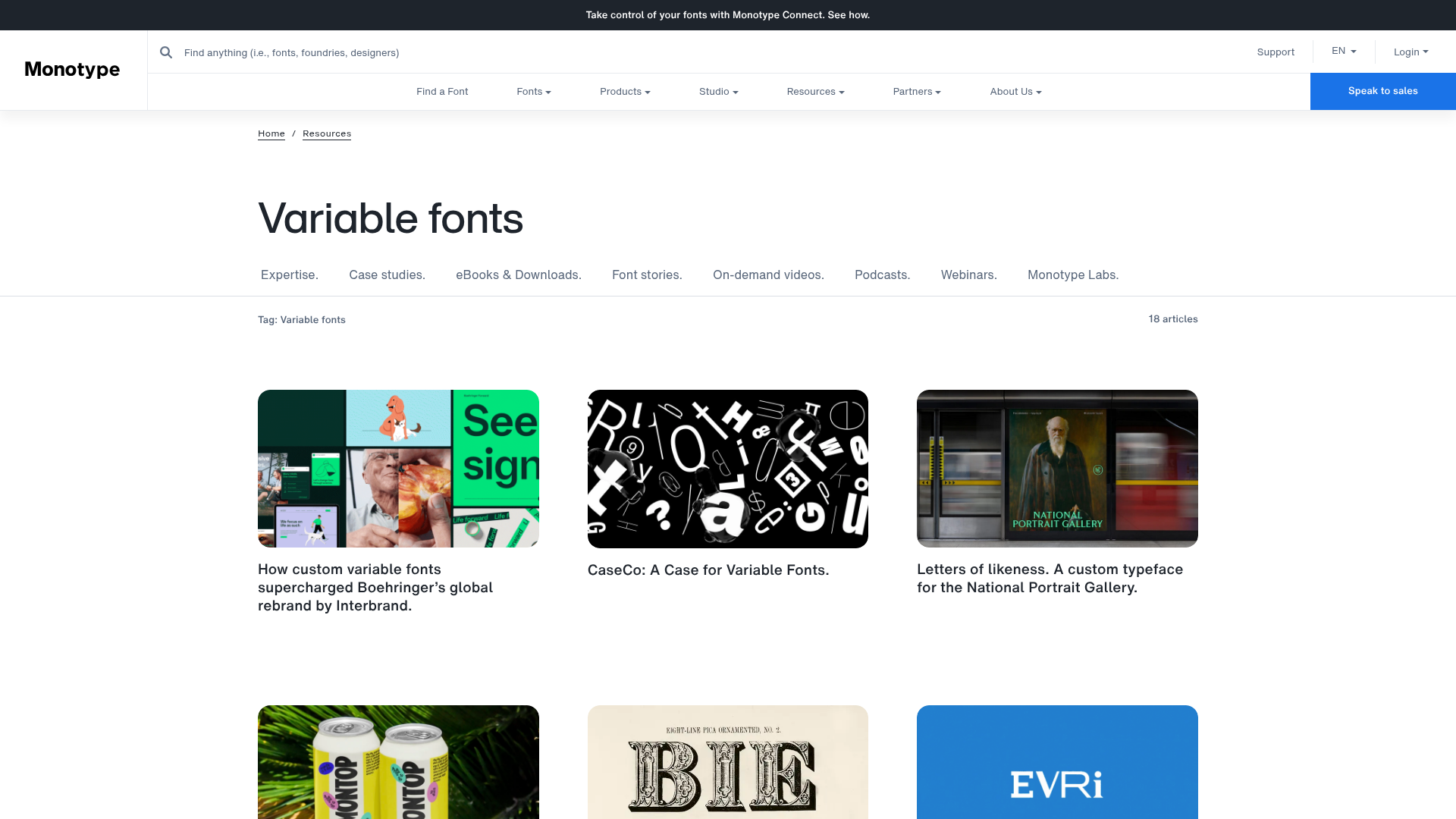
Monotype Variable Fonts Resource Gallery
A clean masonry grid layout featuring content cards with hover-state overlays, category filtering, and responsive image scaling for a media-rich resource center.
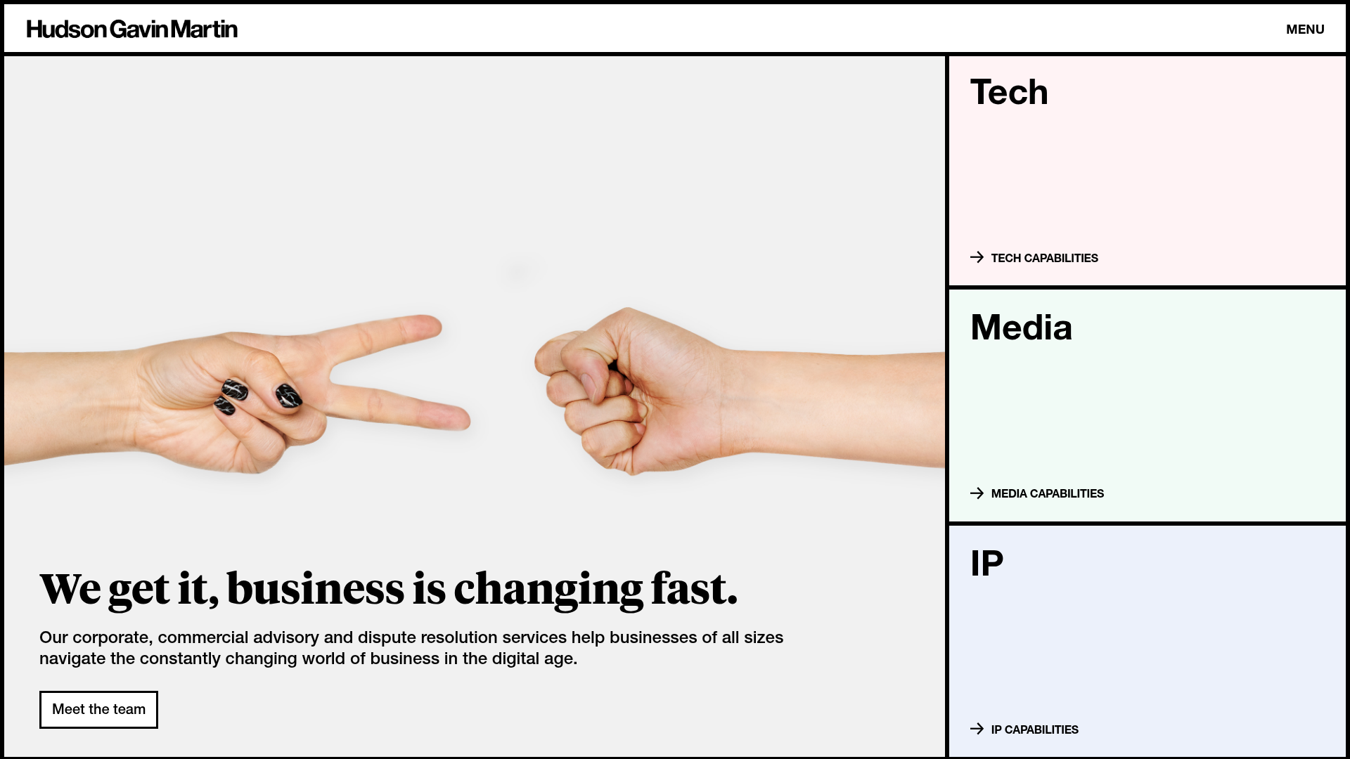
Hudson Gavin Martin Corporate Law Landing
A professional service homepage featuring a minimalist grid-based hero, color-themed navigation blocks, and a bento-style insights feed with subtle hover interactions.
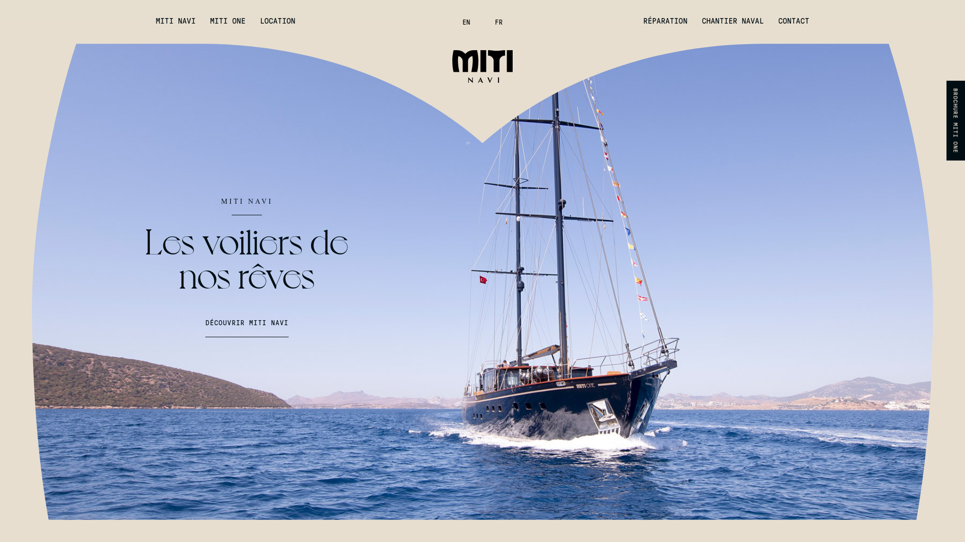
Miti Navi Luxury Nautical Portfolio
A high-end landing page featuring a curved hero mask, smooth parallax scroll effects, card-based service layouts, and sophisticated serif typography for a premium brand feel.
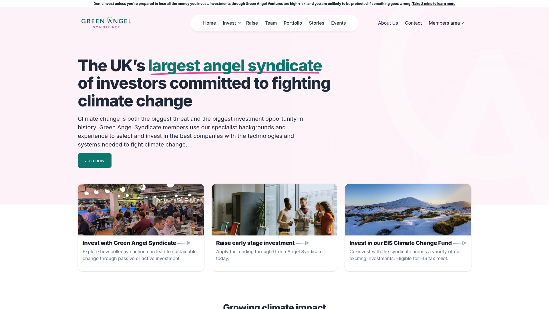
Green Angel Syndicate Investment Landing Page
A clean venture capital landing page featuring a hero section with card-based navigation, a four-column stat grid, and alternating split-layout content sections with image-text pairings.
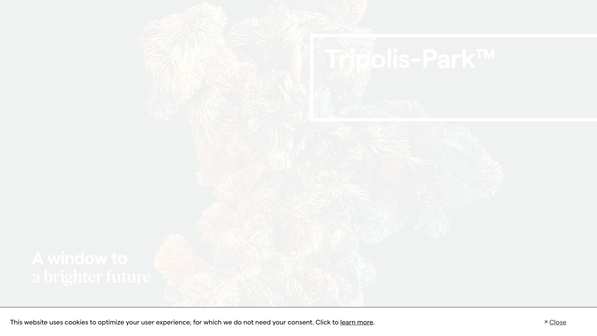
Tripolis-Park Real Estate Landing Page
Features a full-screen video hero with dynamic typography and scroll-triggered animations for showcasing architectural projects, luxury developments, or high-end portfolios.
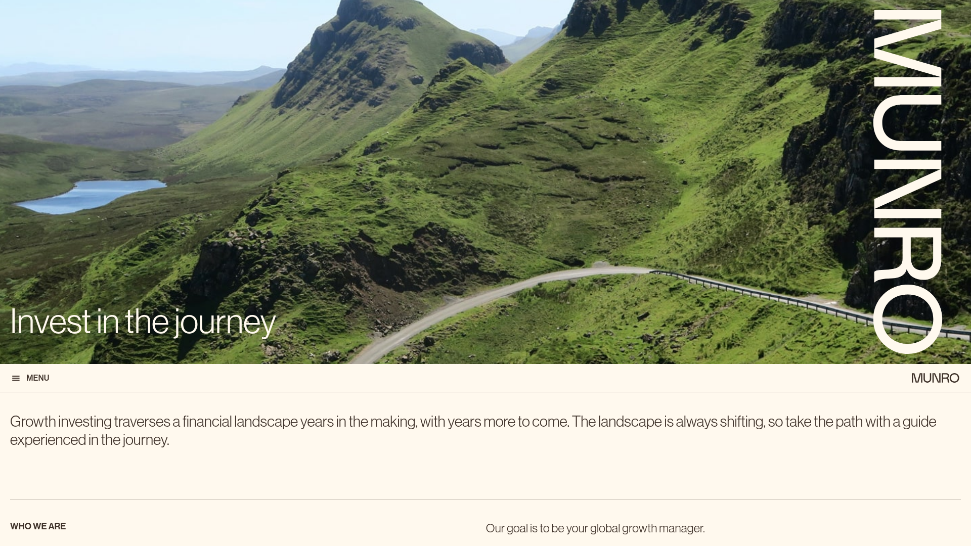
Munro Partners Financial Growth Landing Page
A professional financial services layout featuring a vertical typographic hero, animated stat counters, a data-driven fund performance table, and a colorful grid for news and investment themes.
