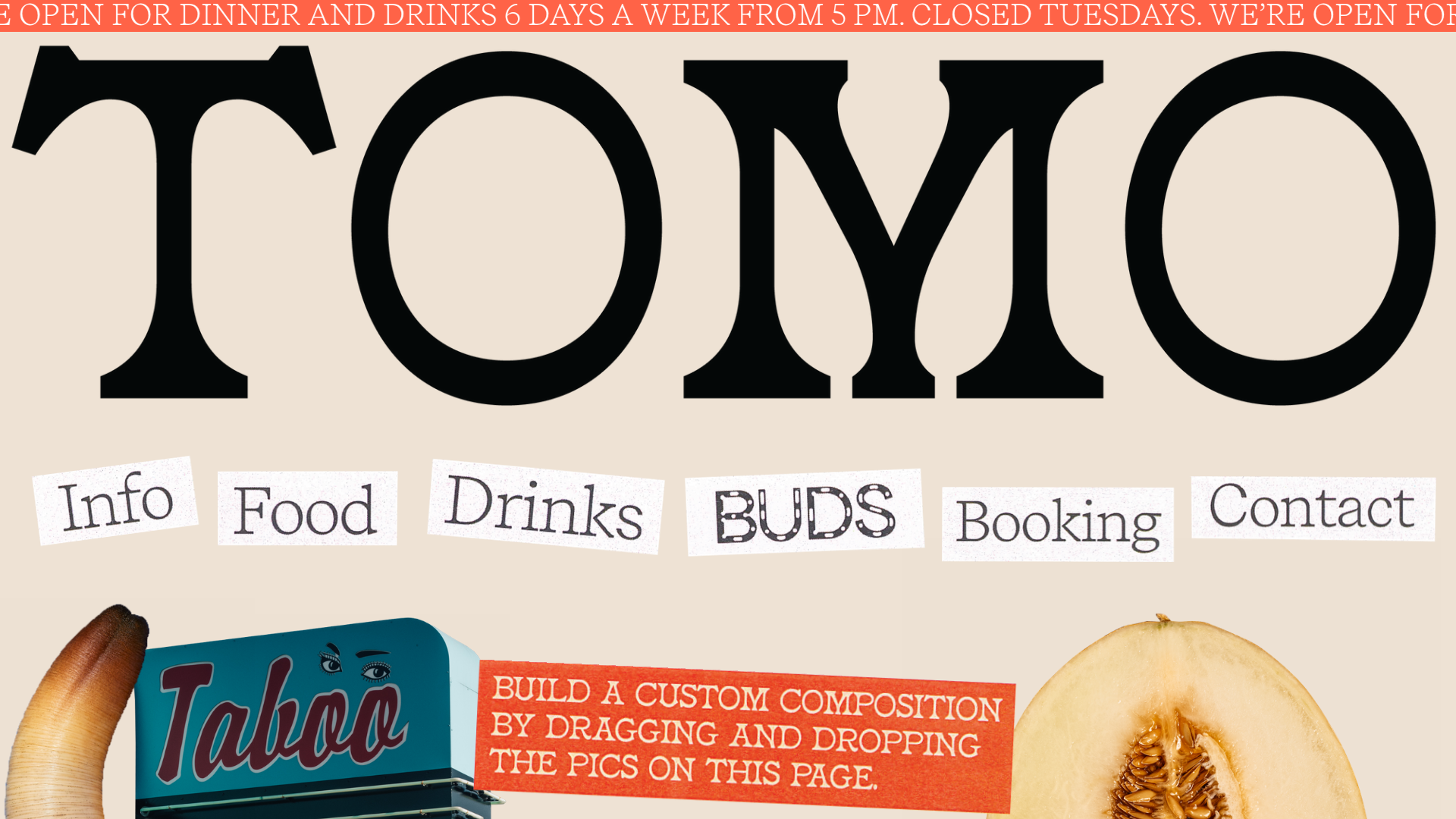
Tomo Restaurant Interactive Collage Landing
A creative restaurant landing page featuring a draggable image gallery, marquee news ticker, and navigation links presented as scattered, stylized paper cutouts.
Overview
Tomo Restaurant’s landing page is a masterclass in interactive storytelling through a high-fidelity digital collage. It leverages a draggable image gallery and a marquee news ticker to create a playful yet sophisticated brand experience that invites users to participate in the page layout. It is a strong reference for designers looking to move beyond static grids into tactile, experimental web layouts.
Design System
- Color Palette & Visual Hierarchy: The site uses a muted, warm beige background (
#f0e9e1inferred) that mimics raw paper. This is accented by a bold, high-contrast tomato red (rgb(255, 99, 71)) used for the marquee ticker and black for the primary typography. The hierarchy is dominated by an oversized logo, followed by scattered navigational "cutouts." - Typography System: The system uses a high-contrast serif for the large logo ("TOMO"), a monospaced typewriter-style font for the secondary text (navigation links like "Info," "Food," "Drinks"), and a bold sans-serif for the red ticker. This mix of analog-inspired fonts reinforces the "handmade" aesthetic.
- Page Structure: The layout is non-linear and single-section focused. It begins with a scrolling announcement marquee at the top, followed by a massive branding header, and then a "Montessori-style" interactive gallery where links and images overlap organically.
- Reusable Components:
- Interactive Gallery: A
data-draggableenabled grid where images (crabs, geoducks, wine bottles) and navigation links can be moved by the user. - Marquee Ticker: A horizontal
marquee_innercomponent with a high-visibility background for urgent information (hours, closures). - Cutout Links: Navigation items styled as white paper scraps with subtle rotation transforms (
transform: rotate(2.5deg)) and monospaced text.
- Interactive Gallery: A
- Interaction and Motion: The core interaction is the "drag and drop" functionality on nearly every element below the header, allowing users to "build a custom composition." Elements also feature varying
z-indexvalues to create a sense of physical layering. - Implementation Clues: The HTML uses Cargo Site's
image-galleryandgrid-rowutilities. The interactivity is driven bydata-draggableattributes andpreserve-3dCSS classes to manage the layering of the collage elements.
Use Cases
- Who should clone this: Creative agencies, independent restaurants, boutique hotels, or portfolios that want to showcase a highly curated and unconventional brand identity.
- Effective Remixes: This pattern works for any brand with strong visual assets (photography, illustrations) that benefit from being seen "in pieces." It’s particularly effective for digital lookbooks or experimental menu previews.
- Practical Remix Directions:
- Swap Brand Style: Replace the paper texture and typewriter fonts with neon colors and futuristic sans-serifs for a "digital vaporwave" aesthetic.
- Information Architecture: Use the draggable cutouts as a way to reveal "surprise" discounts or hidden menu items beneath icons.
- Adaptive UI: For mobile, the gallery is forced into a standard single-column stack (
mobile_data: {columns: "1"})—remixers should prioritize this fallback for usability.
- Suggested Clone Scope: A quick section clone of the interactive marquee is great for news; a full-page clone is best for those wanting to reproduce the specific tactile, experimental UX of the collage.
Related Inspirations
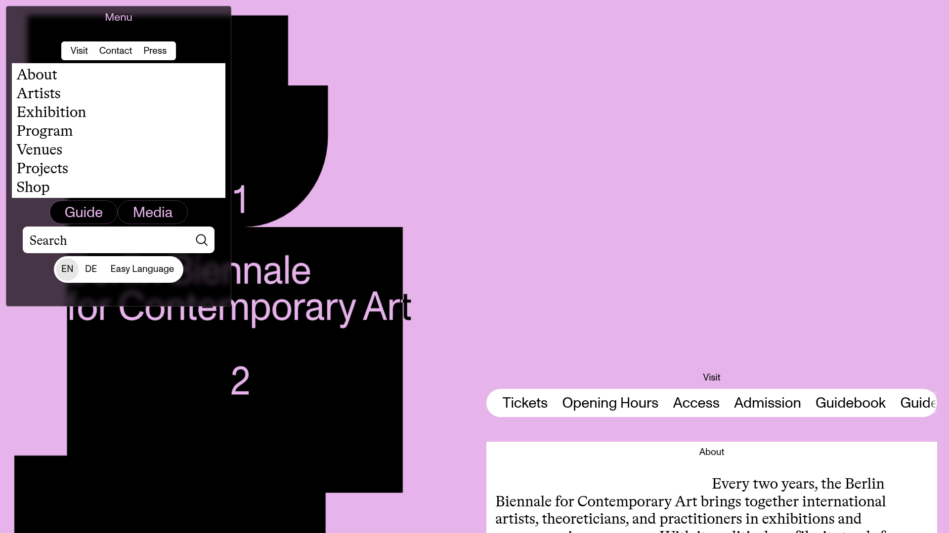
Berlin Biennale Interactive Art Guide
A brutalist art gallery site featuring an asymmetrical split-pane layout, a dark modal overlay menu with search, and horizontally scrolling navigation pills for visitor information.
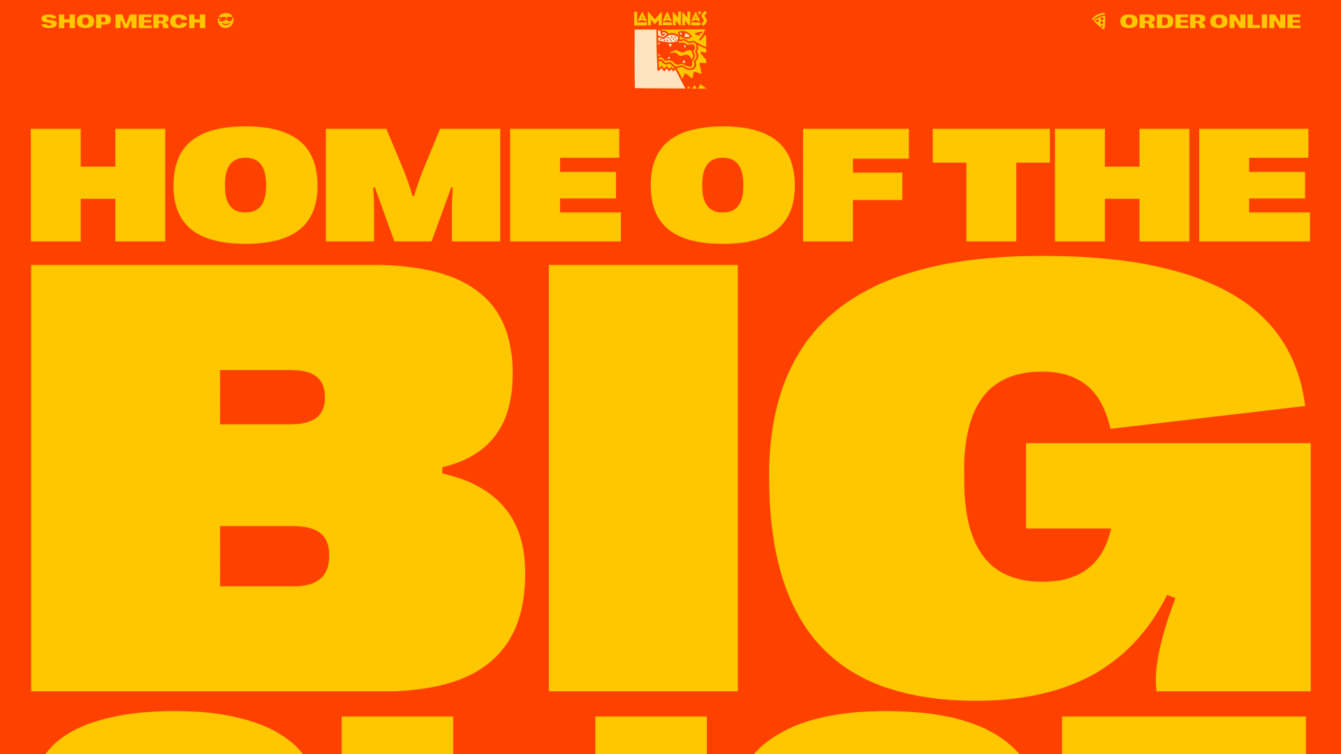
Lamanna's Bakery Vibrant Landing Page
A bold, high-contrast Italian bakery site featuring massive typography, parallax floating elements, marquee banners, and a flickity-powered product carousel.
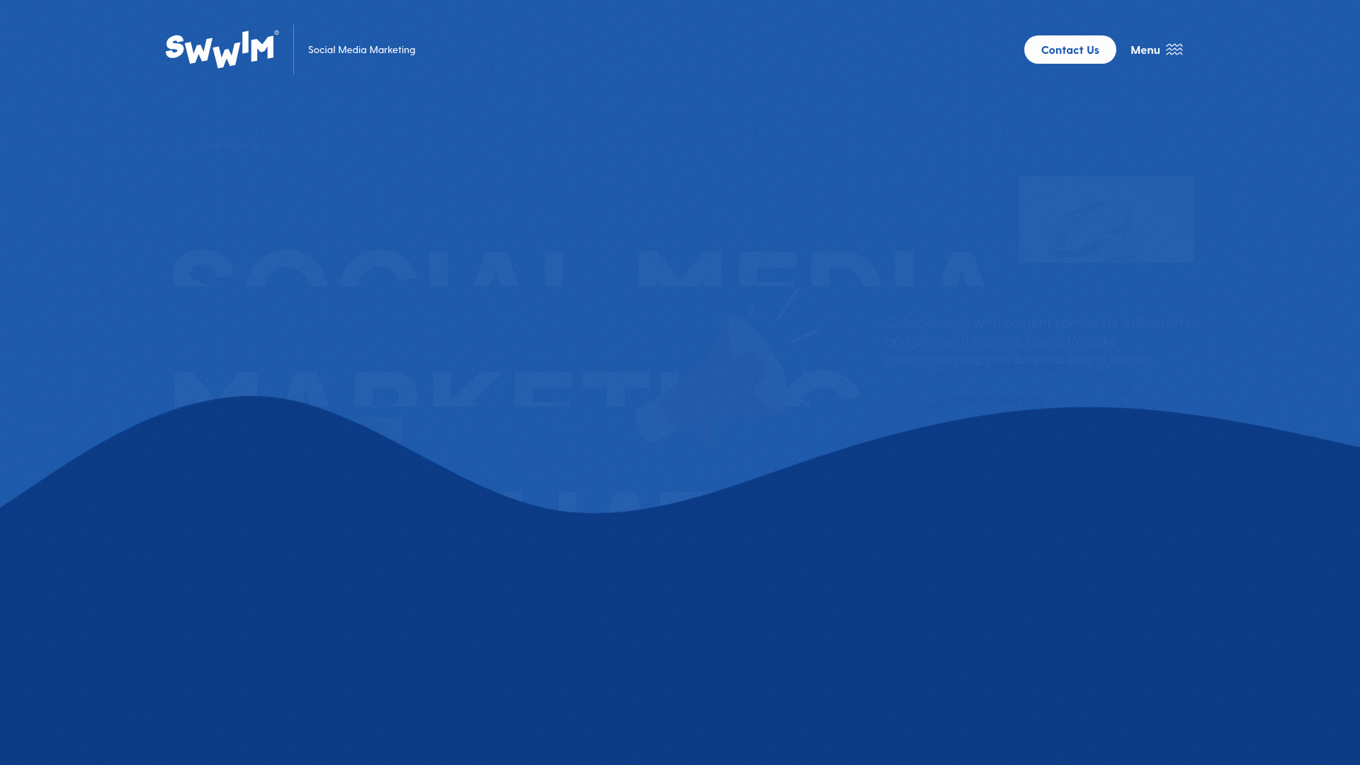
SWWIM Social Agency Animated Hero
A dynamic landing page featuring a wave-layered layout, ticker-tape marquees, floating SVG illustrations, and high-contrast typography in a blue-and-white nautical aesthetic.
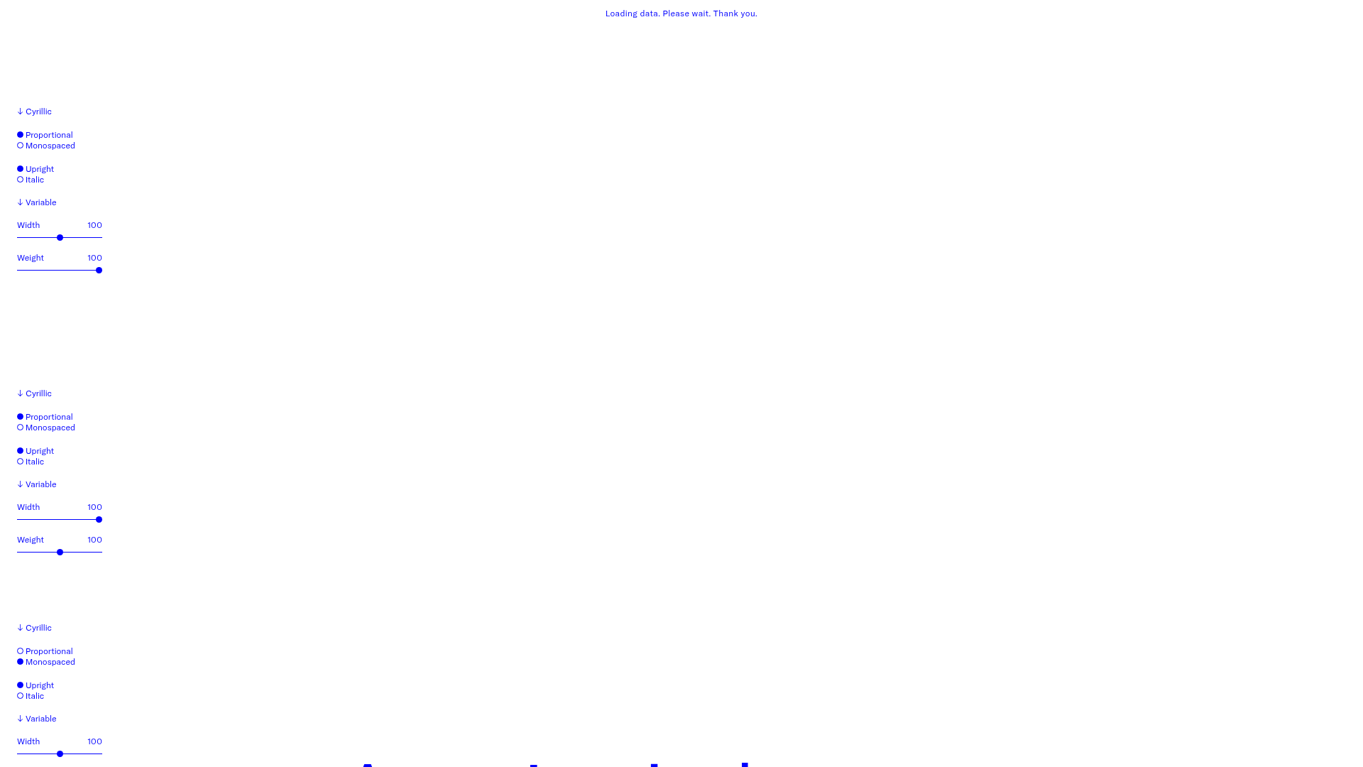
GT America Typography Tester
A layout-heavy landing page featuring interactive font testing toolkits with multi-language support, font-weight sliders, and content-editable text areas.
Hourly App Landing Page
A minimalist iOS app landing page featuring a bold typographic hero, responsive grid-based screenshot displays, and custom SVG illustrations with CSS animations.
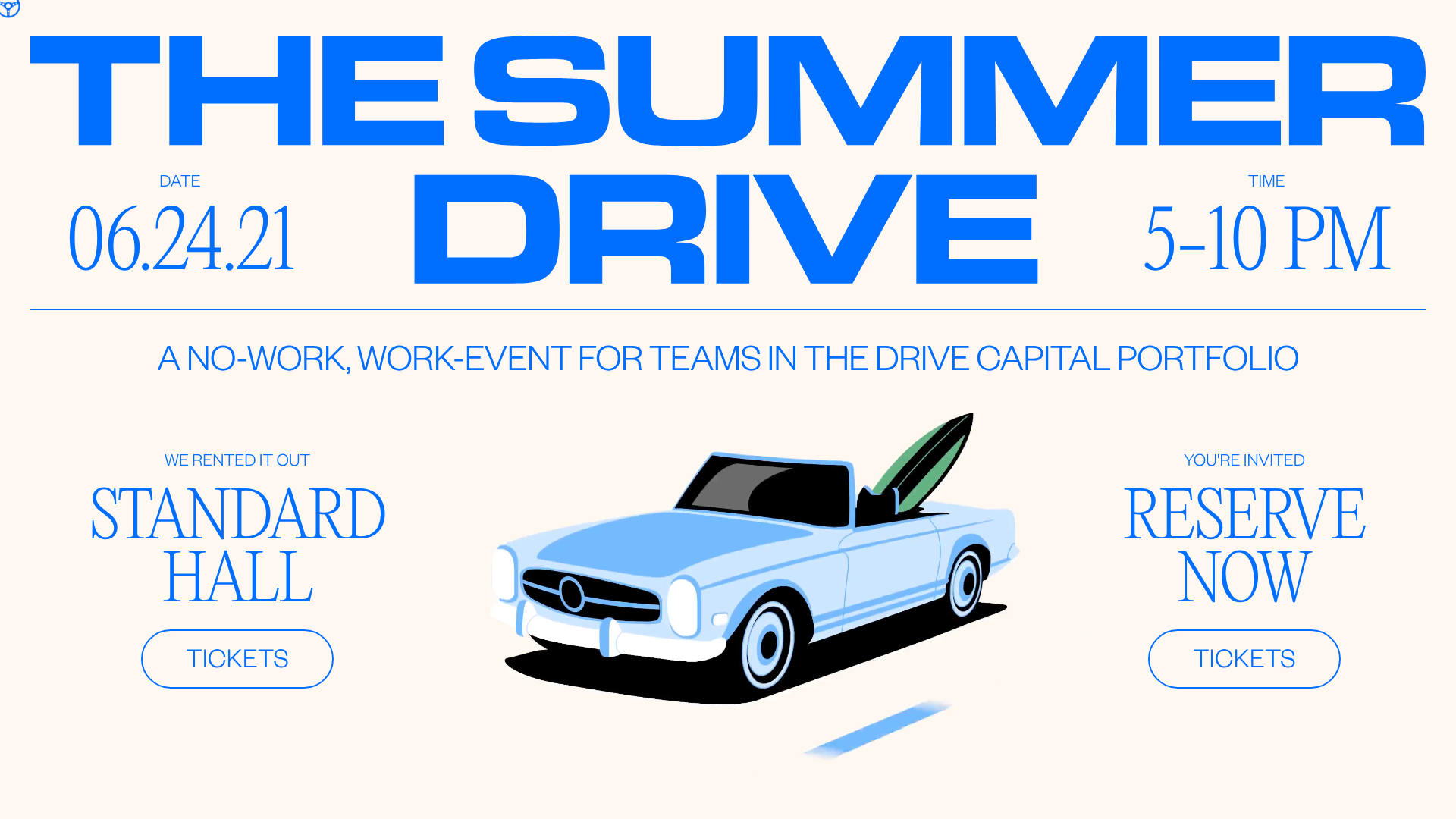
Summer Drive Event Landing Page
A vibrant event page featuring bold typography, a smooth scroll-triggered hero section, a video car animation, and a decorative logo marquee for portfolio teams.
