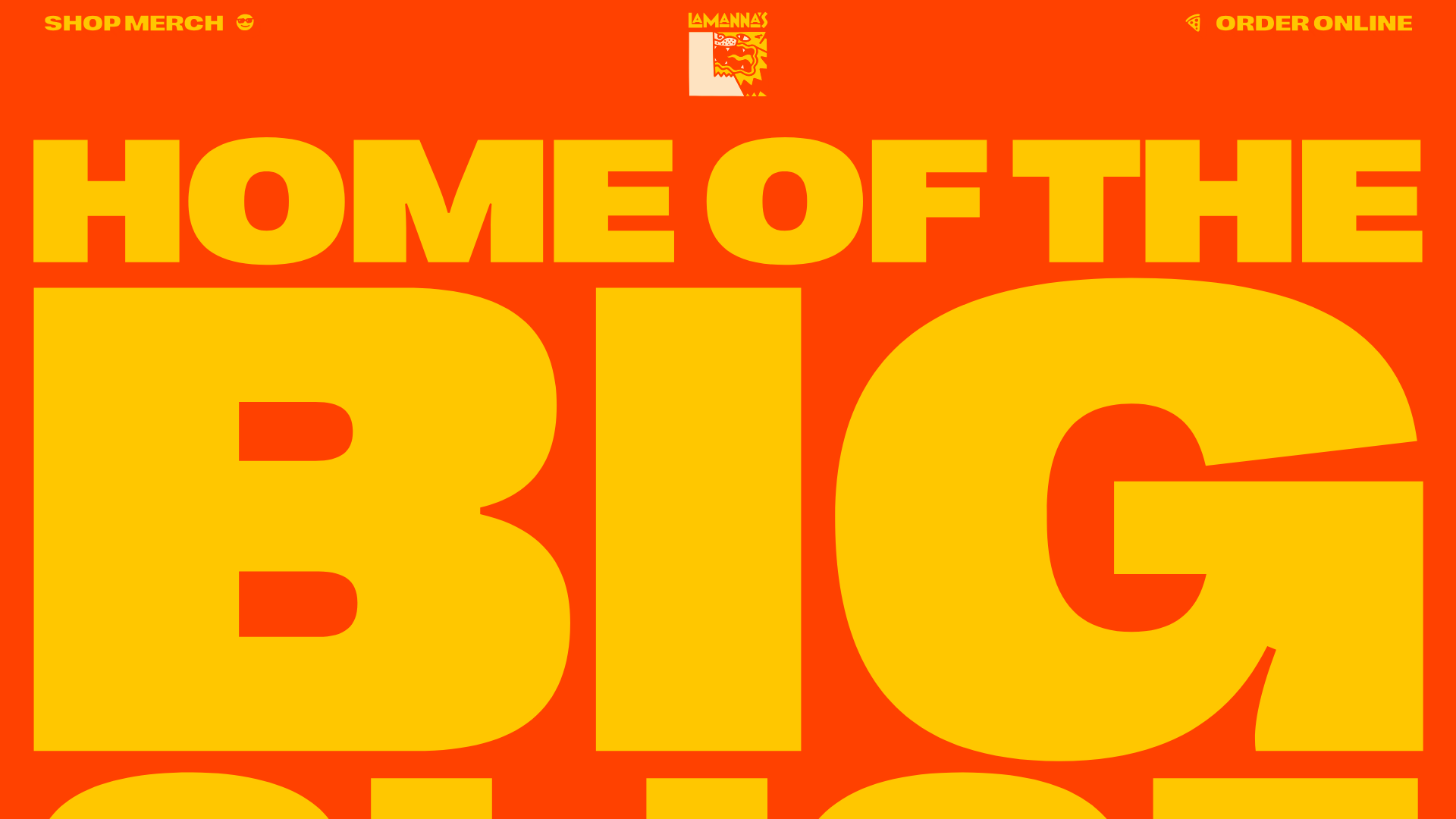
Lamanna's Bakery Vibrant Landing Page
A bold, high-contrast Italian bakery site featuring massive typography, parallax floating elements, marquee banners, and a flickity-powered product carousel.
Overview
This high-energy landing page for Lamanna's Bakery serves as a premier example of 'maximalist' web design within the food and beverage industry. It leverages bold typography, a vibrant high-contrast color palette, and dynamic parallax interactions to create an immersive, brand-first experience that stands out from typical clean-minimalist templates.
Design System
- Color Palette & Visual Hierarchy: The site uses a high-saturation palette dominated by a bold orange-red (
#FF4100) and a sunny yellow (#FFD200). This aggressive contrast establishes immediate visual hierarchy, using the yellow for primary messaging and the orange-red for background dominance and secondary accents. - Typography: The design relies on massive, heavy-weight sans-serif typography (e.g., Right Grotesk Spatial Black). The scale is extreme, with hero text and section headers often spanning the full width of the viewport. Letter-spacing and line heights are kept tight to maintain a dense, solid visual block.
- Page Structure & Flow: The flow transitions from a massive typographic hero into a multi-column 'About' section punctuated by floating SVG assets. This is followed by a recurring pattern of infinitely scrolling marquee banners, product-focused carousels, and fullscreen scrolling background image sections that act as visual breaks.
- Reusable Components:
- Typography-as-Hero: The ultra-large SVG and text headers can be reused for any loud brand.
- Marquee Banners: Horizontal text scrolls used to separate sections.
- Flickity Carousel: A horizontally draggable product slider displaying signature items with consistent image-to-text ratios.
- Coupon Blocks: Simple, centered text containers with 'Copy Code' functionality for promotions.
- Interaction & Motion: The site features 'reveal headlines' (staggered character animations) and parallax 'floating' elements (cannolis, pizzas, heat waves) that move at different speeds during scroll. Images often include a 'floating' class for subtle continuous movement.
- Responsive Behavior: The HTML reveals extensive
data-font-size-xsanddata-xl-widthattributes, indicating a granular breakpoint-specific layout where typography scaling is strictly controlled to ensure readability on small screens. - Implementation Clues: Developed using the Semplice framework, the site uses
data-moduleattributes for content blocks (text, image, gallery, code) and relies on CSS-based parallax triggers and the Flickity library for slider components.
Use Cases
- Who should clone this: Designers building for 'streetwear' food brands, fast-casual restaurants, or bold retail shops that prioritize brand personality over utility.
- Effective Remixes: High-energy lifestyle brands, music festival sites, or bold portfolio landing pages where the brand identity is the primary selling point.
- Practical Directions: Builders should remix by swapping the food SVGs for product-specific icons, while maintaining the massive typographic scale. The marquee banner and character-reveal animation script are highly reusable components for any high-impact landing page.
- Clone Scope: A full-page clone is best for those wanting to maintain the pacing of the scrolling experience, but the 'Hall of Fame' carousel and footer layout are excellent candidates for targeted section clones.
Related Inspirations
Transform Festival Event Landing Page
Features a full-width hero section, quote carousel for reviews, and a grid-based news listing using responsive card components and image-driven layout.

Good Glyphs Font Showcase Landing Page
A single-page layout featuring an interactive type tester, donation form with custom amount logic, and a contributor gallery using swiper-based glyph previews.
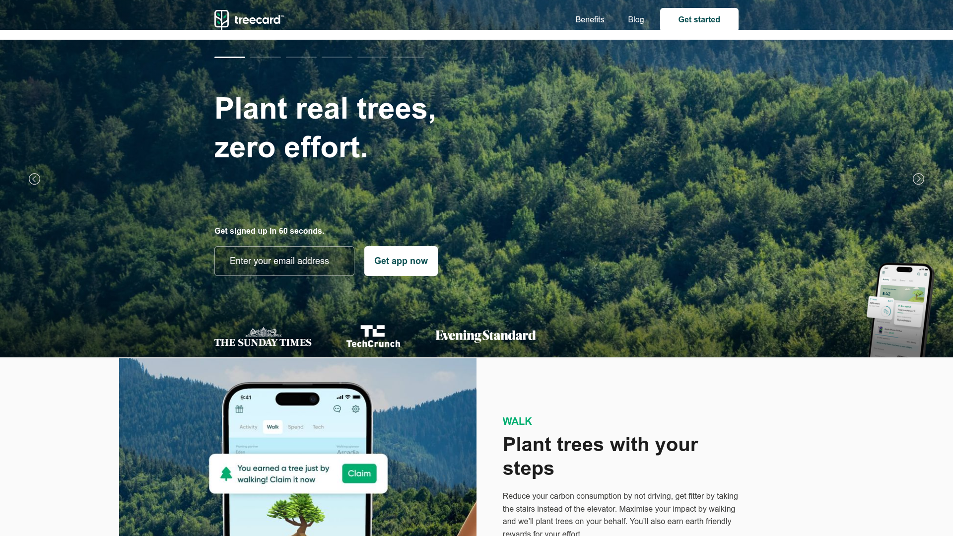
Treecard Eco-App Landing Page
An eco-friendly fintech landing page featuring an animated hero slider with progress bars, alternating content sections with mobile mockups, and a multi-form footer.
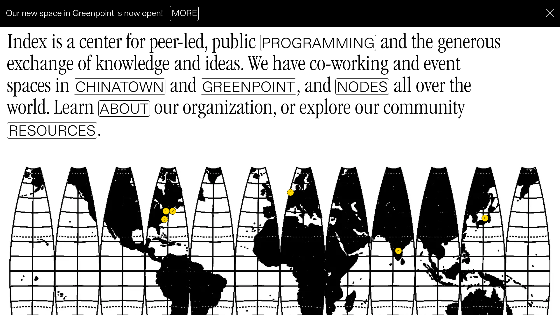
Index Community Space Landing Page
A minimalist, text-heavy landing page featuring a segmented world map visualization and an interactive sentence-based navigation layout.
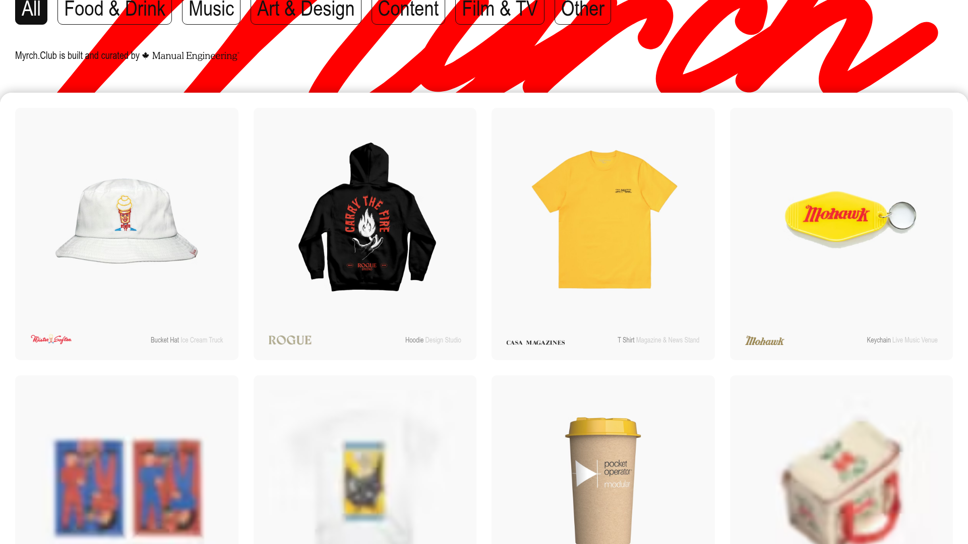
Myrch Club Merch Portfolio Gallery
A minimalist product display grid featuring category filtering buttons, clean hover-state cards, and a large-scale decorative background typography header.
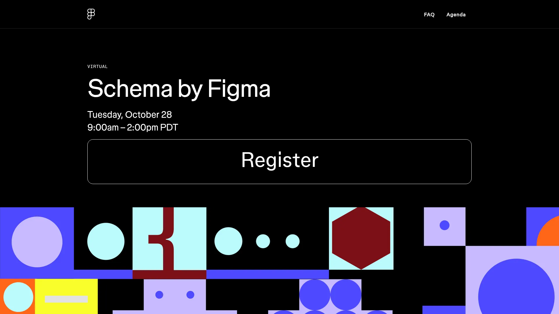
Schema by Figma Event Landing Page
A dark-themed virtual event landing page featuring a minimalist header, high-contrast typography, and a geometric abstract footer design.
