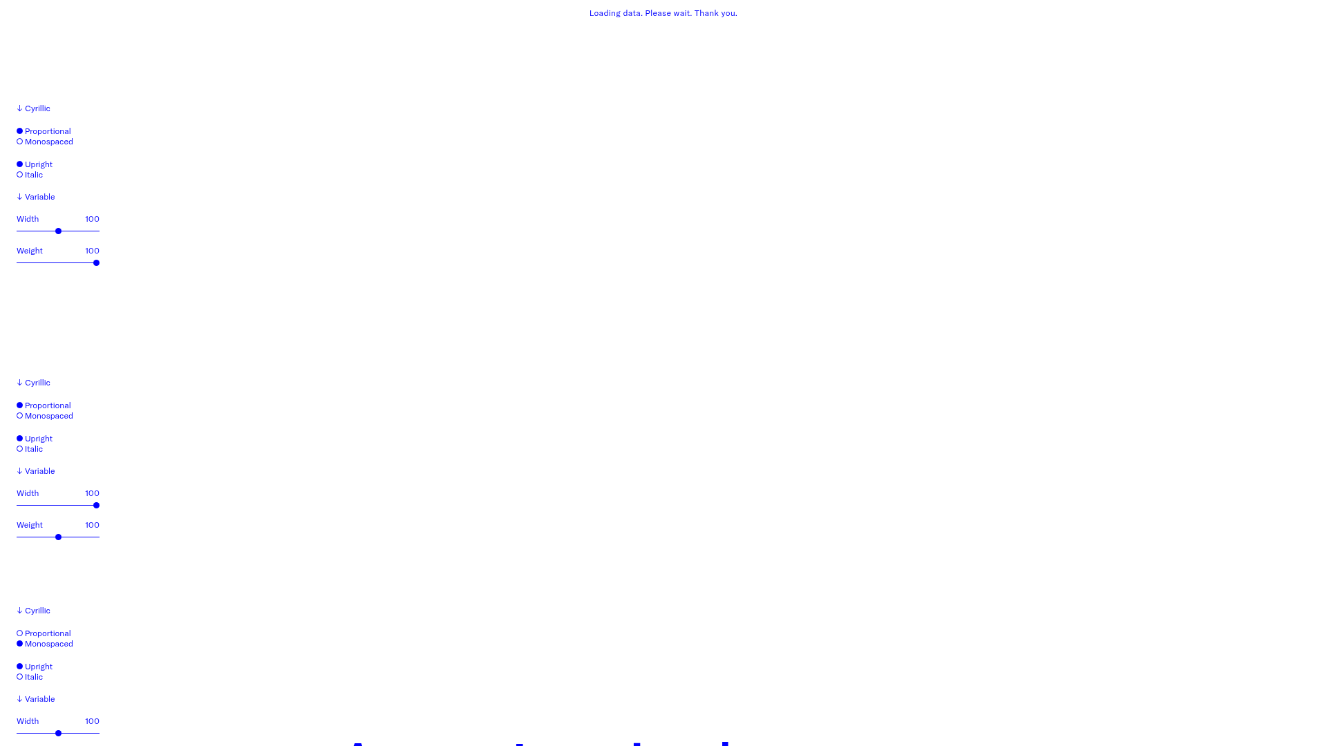
GT America Typography Tester
A layout-heavy landing page featuring interactive font testing toolkits with multi-language support, font-weight sliders, and content-editable text areas.
Overview
This project is a highly functional typography tester landing page for the GT America font family. It allows users to manipulate variable font properties—like width, weight, and slant—across multiple scripts (Latin, Cyrillic, Greek, etc.) in real-time. This is a premier reference for builders looking to implement interactive design tools, complex state management for text properties, or modular data-driven layouts.
Design System
- Color Palette & Visual Hierarchy: The design follows a strict, high-contrast aesthetic. It primarily uses a clean white background with a vibrant blue (
text-blue) for administrative UI and labels, switching to a bold red (text-red) for the active, editable text samples. This clear color-coded distinction separates the 'controls' from the 'content.' - Typography System: As a font-specific landing page, typography is the core feature. Fixed-width labels in small font sizes (12px/
text-xs) provide a technical, architectural feel to the interface. The font testing areas usecontenteditable="true"with varying sizes (data-size="l",m,s) to demonstrate the typeface's legibility across scales. - Page Structure & Section Flow: The page is constructed from repeating vertical sections (
data-component="tt__sample"). Each section features a left-hand control sidebar (using aformelement) and a broad right-hand testing area. The vertical stack allows users to compare different settings side-by-side as they scroll. - Reusable Components:
- The Typography Sidebar: A modular component containing a script selector (
select), radio group fieldsets for style toggles (upright/italic, proportional/mono), and range sliders for variable axes. - Custom Sliders: Stylized
<input type="range">elements that update font-weight and width values instantaneously. - Editable Text Blocks:
contenteditabledivs that allow for immediate user input within the design environment.
- The Typography Sidebar: A modular component containing a script selector (
- Interaction Patterns: UI elements feature subtle color shifts on hover (e.g., blue text turning red). The primary interaction is the real-time feedback loop between form inputs and the
tt__sample-textdisplay. - Responsive Behavior: The HTML reveals a mobile-first approach using Tailwind-style classes like
flex-col md:flex-row. On small screens, the control form stacks above the text; on desktop, it sits to the left at a fixed width of 120px. - Implementation Clues: The site uses a utility-first CSS framework (Tailwind) and relies heavily on data attributes (e.g.,
data-wght,data-script) to sync the JavaScript logic with the visual state.
Use Cases
- Type Foundries & Graphic Designers: Naturally suited for showcasing variable fonts or design portfolios where interactive content is key.
- Software as a Service (SaaS): A perfect pattern for feature comparison pages or configuration tools (e.g., a dashboard setting where users can preview UI themes).
- Educational Tools: Can be remixed into a learning platform for design fundamentals or language learning where users interact with script-specific settings.
- Remix Directions: Swap the blue/red palette for brand-specific colors and replace the font tester logic with product configurations (e.g., a site builder preview). Builders might choose to clone just the Sidebar Control Component to add customization options to an existing project or use the Full-Page Stack for a comprehensive technical documentation site.
Related Inspirations
Studio Lathe Minimalist Portfolio List
A high-contrast, minimalist portfolio layout featuring a dense list-based project index with flexible category labeling and a full-screen yellow background.

Niklas Rosén Designer Portfolio Index
A minimalist, responsive grid-based portfolio index featuring a clean 16-column layout, typographic list components, and a custom dark mode transition.

Clase Agency Branding Portfolio
A minimalist design agency portfolio featuring a typographic hero section, full-width image articles, sticky title bars, and integrated scrolling text marquees for a clean editorial layout.
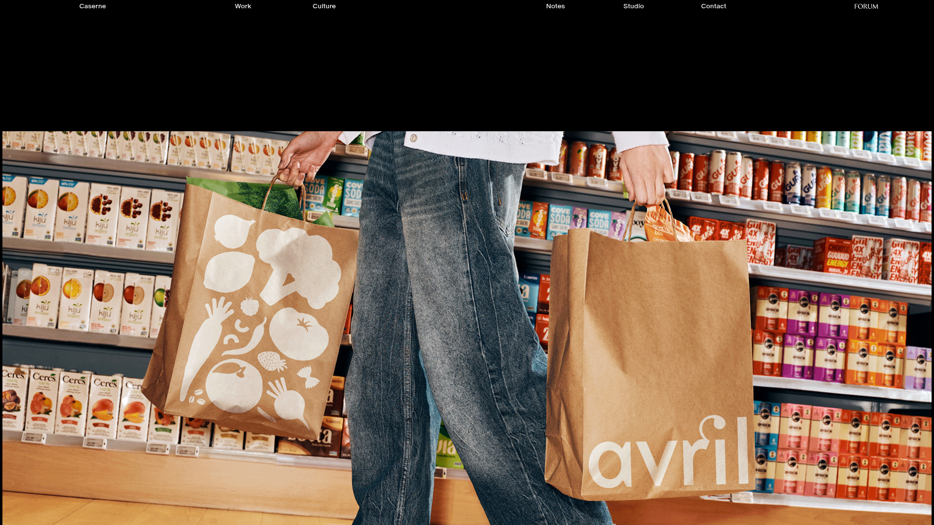
Caserne Design Studio Portfolio
A minimalist, high-impact portfolio featuring a dynamic masonry grid of project thumbnails with overlay text and a clean, oversized typography-driven footer.
Hourly App Landing Page
A minimalist iOS app landing page featuring a bold typographic hero, responsive grid-based screenshot displays, and custom SVG illustrations with CSS animations.

Lundqvist & Dallyn Studio Portfolio
Minimalist design studio portfolio featuring a custom video loader, world clock navigation, and a fluid masonry-style grid for high-quality photography and type design showcases.
