Berlin Biennale Interactive Art Guide
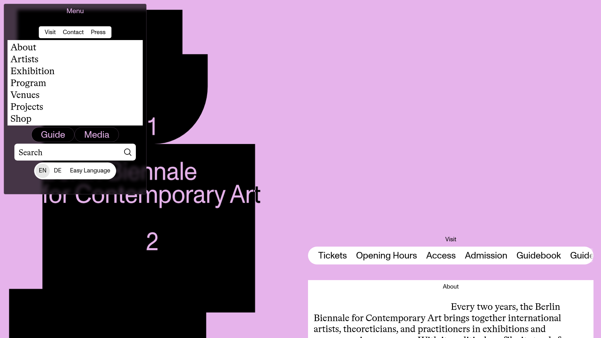
A brutalist art gallery site featuring an asymmetrical split-pane layout, a dark modal overlay menu with search, and horizontally scrolling navigation pills for visitor information.
Overview
This site for the 12th Berlin Biennale is a masterclass in modern brutalism, utilizing a bold, high-contrast aesthetic with an asymmetrical split-pane layout that differentiates utility from content. It serves as a strong clone reference for builders looking to implement non-linear navigation systems and experimental UI that remains accessible through clear categorization and mobile-first scrolling patterns.
Design System
- Color Palette & Visual Hierarchy: The site uses a high-contrast palette of pastel lavender, deep black, and stark white. Visual hierarchy is established through massive background typography (large digits "1" and "2") overlapping with organic black shapes, contrasting against a clean, white content area for body text.
- Typography System: A sophisticated mix of serif and sans-serif fonts. Large, traditional serif fonts are used for primary navigation and body text to provide readability within the artistic frame, while sans-serif labels ("Visit", "About") act as structural metadata.
- Page Structure: The layout features a persistent left-hand modal for navigation and search, while the right-hand side acts as a vertical stream of content. Sections are divided into modular blocks like "Visit", "About", "Program", and "Venues."
- Reusable Components:
- Horizontal Pill Nav: A scrolling list of rounded buttons ("Tickets", "Opening Hours") contained within a
simplebarwrapper for smooth horizontal overflow. - Overlay Navigation: A dark, semi-transparent sidebar containing a multi-tab system ("Visit", "Contact", "Press") and a integrated search bar.
- Event Cards: Minimalist blocks showing date, time, and location using a grid-like text alignment.
- Horizontal Pill Nav: A scrolling list of rounded buttons ("Tickets", "Opening Hours") contained within a
- Interaction & Motion: The site uses
SimpleBar.jsfor custom scrollbars and a canvas-based background (data-shapes-role="canvas") that likely handles the fluid organic shapes seen behind the text. Navigation is driven by a state-managedNavigatorcomponent that toggles betweenopenandclosedbackground targets. - Implementation Clues: The HTML structure uses custom data-attributes (e.g.,
data-space-role,data-navigator-role) suggesting a highly customized state machine or a modular component-based framework like React or Vue. It relies heavily on utility classes likeuse-simplebarandlazyloadfor performance.
Use Cases
- Who should clone this: Cultural institutions, art galleries, film festivals, or design agencies that want to showcase curated information in a non-traditional, immersive format.
- Products for remixing: Event schedules, portfolio sites, or digital magazines where the brand identity is as important as the information being conveyed.
- Remix Directions:
- Brand Swap: Keep the split-pane structure but exchange the lavender/black for high-saturation primary colors for a more corporate-tech look.
- Info Arch: Use the floating horizontal pill navigation as a quick-filter for an e-commerce product category page.
- Minimalist Scope: Clone only the
Navigator-openContentblock for a unique mobile menu solution in a standard 12-column grid site.
- Suggested Scope: A full-page clone is best for those wanting to reproduce the specific "spatial" feel of the background and content overlay, while a section clone of the
HomeVisit-scrolleris ideal for high-density navigation links.
Related Inspirations
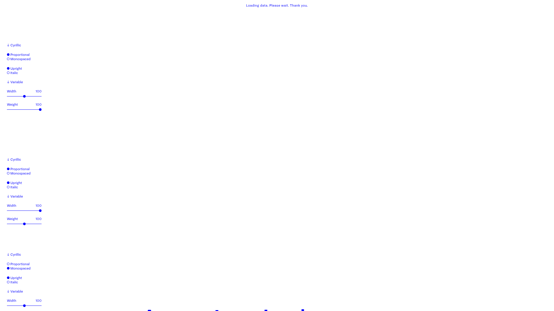
GT America Typography Tester
A layout-heavy landing page featuring interactive font testing toolkits with multi-language support, font-weight sliders, and content-editable text areas.
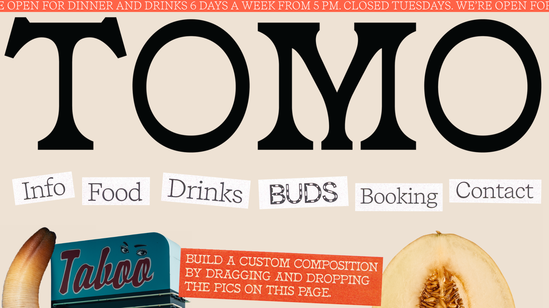
Tomo Restaurant Interactive Collage Landing
A creative restaurant landing page featuring a draggable image gallery, marquee news ticker, and navigation links presented as scattered, stylized paper cutouts.
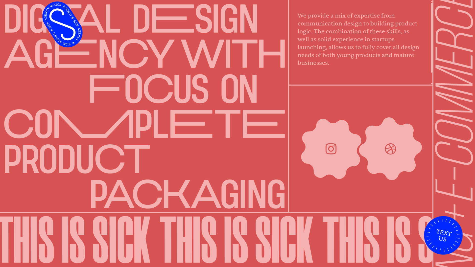
Sick Agency Typographic Resizable Grid
A brutalist design featuring resizable flex containers, dynamic floating UI elements, scrolling ticker marquee, and interactive gear-shaped social links.
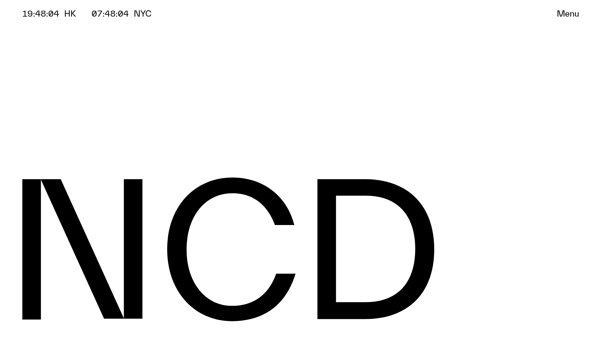
NCDA Architecture Studio Portfolio Template
A minimalist design featuring a bold typography splash screen, real-time dual-city clocks, and a discipline-based vertical scroll layout with hover-triggered overlays.

Forner Studio Minimalist Agency Landing Page
A minimalist design featuring a large-scale liquid typography layout, high-contrast dark theme, and a clean grid-based navigation structure.
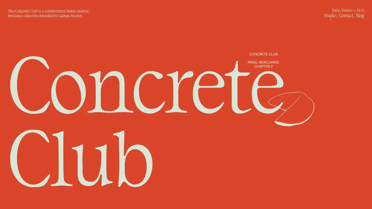
Concrete Club Portfolio Landing Page
A high-impact portfolio featuring an animated serif hero, sticky horizontal-scroll project rows with gif-on-hover effects, and canvas-based background illustrations.
