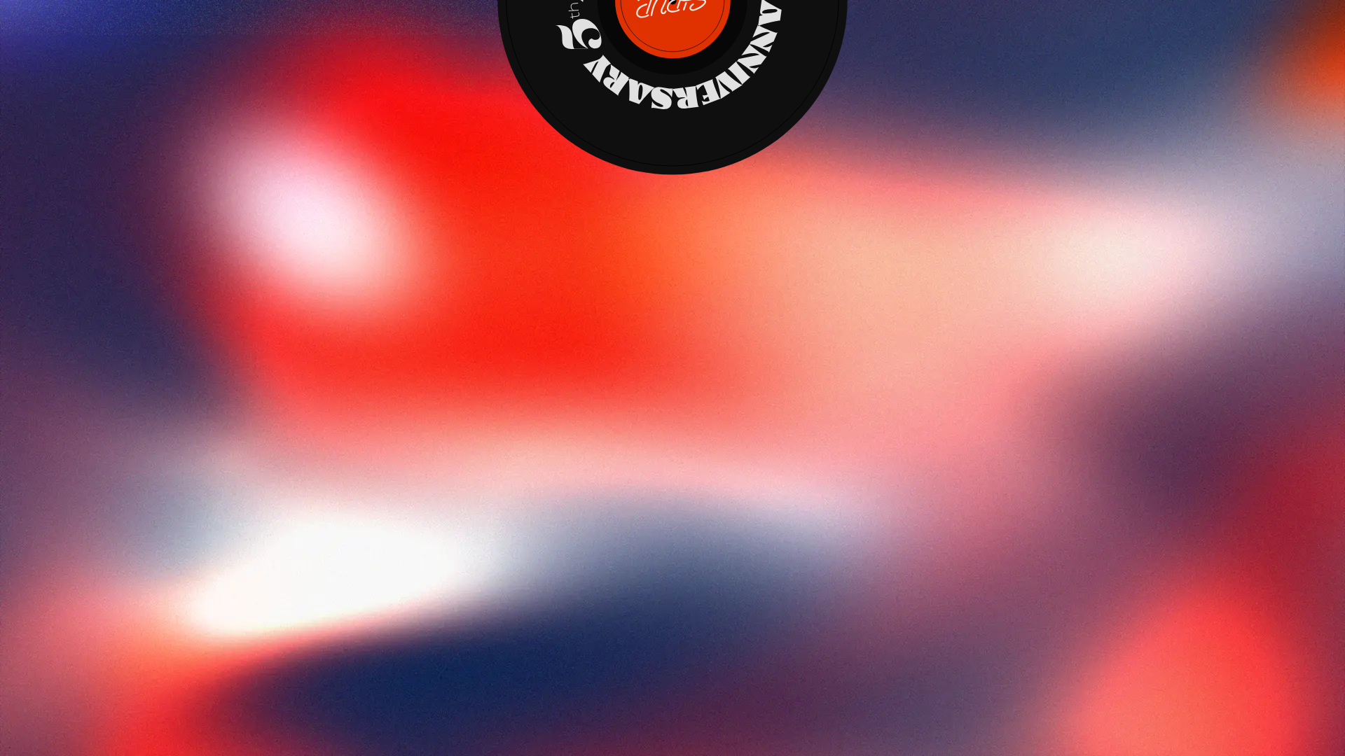
SIRUP 5th Anniversary Landing Page
An event landing page featuring a grainy gradient background, a circular anniversary badge, and a minimalist artist-focused aesthetic.
Overview
This landing page is a promotional site for the 5th anniversary of the artist SIRUP, characterized by high-impact visuals and a sophisticated minimalist layout. It serves as a strong reference for creators looking to implement modern 'mesh gradient' aesthetics combined with bold, circular graphic elements and clean typography.
Design System
- Color Palette & Visual Hierarchy: The background uses a vibrant, grainy mesh gradient blending deep indigo (#1A1A2E), scarlet red (#E63946), and warm cream/white highlights. A high-contrast black circular badge with white text acts as the primary focal point at the top center, creating a strong anchor for the page.
- Typography System: The design utilizes a mix of serif and sans-serif fonts. The '5th Anniversary' logo features a modern, high-contrast serif typeface, while the primary navigation and body text (based on the HTML) use clean, understated wide-set sans-serif fonts to maintain an avant-garde look.
- Page Structure & Section Flow: The layout follows a vertical scroll pattern starting with a full-bleed hero visual. Based on the source code, sections are organized by logical IDs (e.g., #top, #about, #news), using a semantic
maincontainer to house individual informational blocks over the continuous gradient background. - Reusable Components: The central anniversary badge (a rotating or fixed circular element) is the standout reusable asset. Other key components include minimalist nav links and structured data blocks for event information.
- Interaction & Motion Patterns: The design focuses on atmospheric depth; the HTML suggests the use of a canvas-based or CSS-layered background to achieve the grainy noise texture. The circular badge is often used in these contexts as a rotating element as the user scrolls (common in music industry sites).
- Implementation Clues: The site structure uses standard HTML5 tags and indicates a focus on high-fidelity image assets. The background is a large-scale visual element that allows the content to float on top without heavy borders or containers.
Use Cases
- Who should clone this pattern: Musicians, digital artists, and creative agencies looking to build a high-concept portfolio or event landing page.
- Effective Remixes: This pattern works exceptionally well for product launches (e.g., special edition sneakers or tech) where the brand's 'vibe' and aesthetic identity are more important than dense text information.
- Practical Remix Directions: Swapping the red/blue gradient for corporate blues/greens can transform this from an edgy music site to a futuristic SaaS hero page. The central badge can be replaced with a 3D model or a video play button.
- Suggested Clone Scope: A quick section clone of the background style and the centered hero badge is recommended for those wanting to add a 'wow' factor to an existing site without rebuilding an entire multi-page structure.
Related Inspirations
E-Commerce Product Detail Page Template
A feature-rich retail layout featuring a multi-image carousel, customizable product options with size/style selectors, tiered pricing displays, and an accordion-style FAQ section.
Kippo Gamer Dating Landing Page
A dark-themed mobile app landing page featuring a 3D-effect hero section, a scrolling press ticker, and structured feature rows with 'pro-tip' style labels and Lottie animations.

Vercel AI Cloud Landing Page
A modern landing page featuring a minimalist dark-themed navbar, a grid-overlay hero section with radial color gradients, and high-contrast typography for customer success stories.
Nova Code Editor Product Landing Page
Dark-themed landing page featuring a starfield background, a flexible feature grid, interactive tabbed preference menus, and stylized product screenshot showcases with hoverable hotspots.
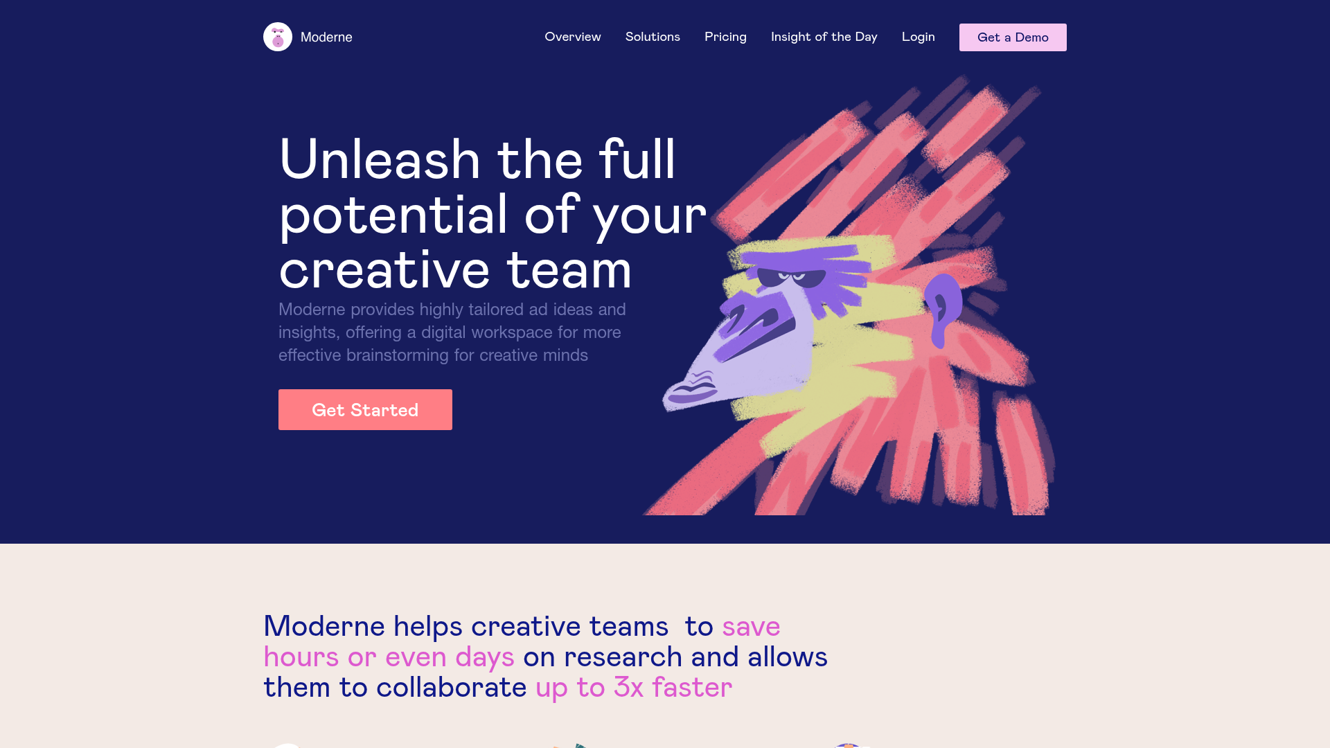
Moderne Creative Landing Page
A high-contrast landing page featuring a dark hero section with an artistic illustration overlay, distinct alternating content blocks, and a visual comparison bar chart component.
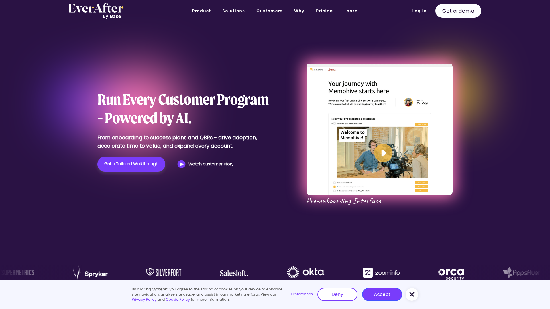
EverAfter AI Customer Portal Hero
A SaaS landing page template featuring a glowing product carousel, auto-scrolling logo marquee, accordion-based feature reveals, and an embedded scheduling widget.
