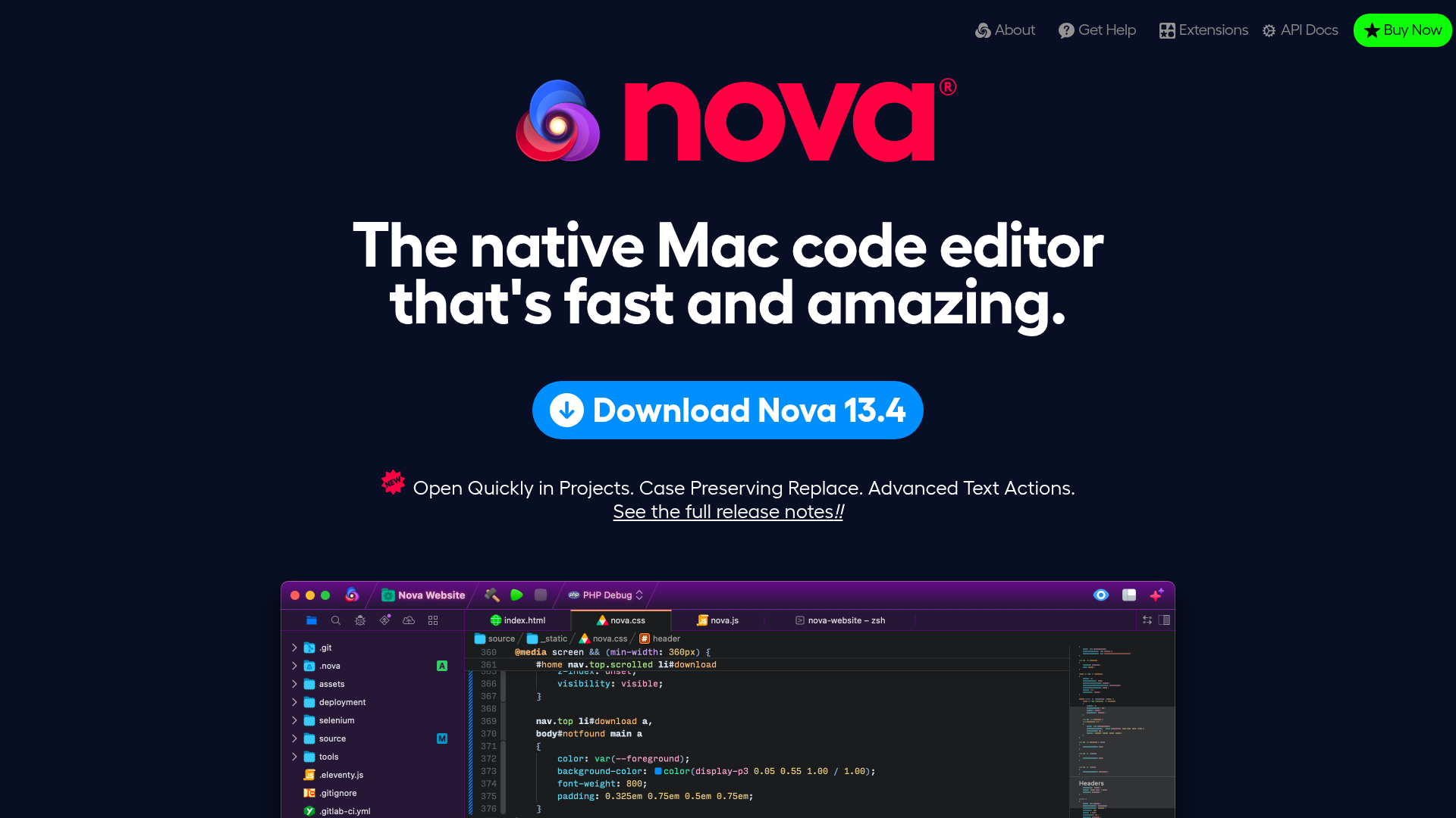
Nova Code Editor Product Landing Page
Dark-themed landing page featuring a starfield background, a flexible feature grid, interactive tabbed preference menus, and stylized product screenshot showcases with hoverable hotspots.
Overview
This is a high-impact product landing page for a native Mac code editor, utilizing a dark-themed "space" aesthetic to emphasize performance and modern engineering. It is an excellent clone reference for building developer-tooling showcases due to its sophisticated use of interactive screenshots, feature grids, and layered visual depth.
Design System
- Color Palette & Visual Hierarchy: A deep navy background (
#030712range) provides the foundation for vibrant neon accents. High-contrast white typography creates clear hierarchy, while a primary blue (#0088ff) is used for the main call-to-action. Syntax-inspired gradients and diverse icon colors (oranges, pinks, purples) categorize different technical features. - Typography: Heavily features a geometric sans-serif (reminiscent of Montserrat or Futura). Large, bold H1/H2 headers use tight letter-spacing for a modern look, while small caps or italicized emphasis (
<em>) highlight key technical terms in feature lists. - Page Structure: The layout follows a classic vertical stack:
- Hero section with marquee branding and a primary download CTA.
- Interactive feature grid for quick navigation.
- Detailed feature sections (Editor, Workflows, Debugging) separated by horizontal rules.
- An interactive preferences grid and an expandable "much more" checklist.
- Reusable Components:
- Feature Grid: A 3x2 interactive list (
#feature-grid) that acts as a table of contents. - Hotspot Screenshots: Images with
<figcaption class="highlight">overlays that act as interactive loupes/labels. - Preference Viewer: A thumbnail-driven image switcher for showcasing complex software settings.
- Extension Cards: Uniform secondary cards with icons, versioning, and vendor metadata.
- Feature Grid: A 3x2 interactive list (
- Interactions & Motion: The page uses a
<canvas id="starfield">for a subtle animated background. Hover states on images reveal magnification effects (loupes), and the "Show it all!" toggle (#moreList) reveals a massive categorized list of features using a checkbox-hack or simple visibility toggle. - Implementation Clues: The HTML uses semantic
<section>and<figure>tags with descriptive IDs (e.g.,#the_editor,#the_tools). Lazy-loading is implemented viadata-srcattributes, indicating a focus on performance for high-resolution assets.
Use Cases
- Who should clone this: Software developers launching desktop applications, IDE plugins, or complex SaaS platforms that need to showcase a high volume of technical features without overwhelming the user.
- Effective Remixes:
- Portfolio Sites: Adapt the "Hotspot Screenshot" pattern to showcase specific areas of a design project.
- SaaS Documentation: Use the interactive preference grid pattern to guide users through complicated software menus.
- Product Changelogs: The style of the "Extension Cards" and the "Show it all" toggle works well for detailed release notes.
- Suggested Clone Scope: Start with the Hotspot Screenshot component as it is the most unique method for explaining UI. A full-page clone is ideal for "technical deep-dives" where the goal is to prove the product's depth through exhaustive lists and visual evidence.
Related Inspirations
Intranetus Project Showcase Landing Page
A high-concept portfolio page featuring a large-scale video hero, Lottie animations, layered parallax transition effects, and a vertical grid of browser-mockup feature cards.
Domain For Sale Landing Page
A clean, centered landing page layout featuring a hero section for asset sales, a prominent CTA button, and a list-based showcase of related items.
Valo Health AI Biotech Landing Page
A dark-themed high-tech landing page featuring an animated gradient text hero, modular content sections with glassmorphism effects, and distinct typography scales for bold storytelling.
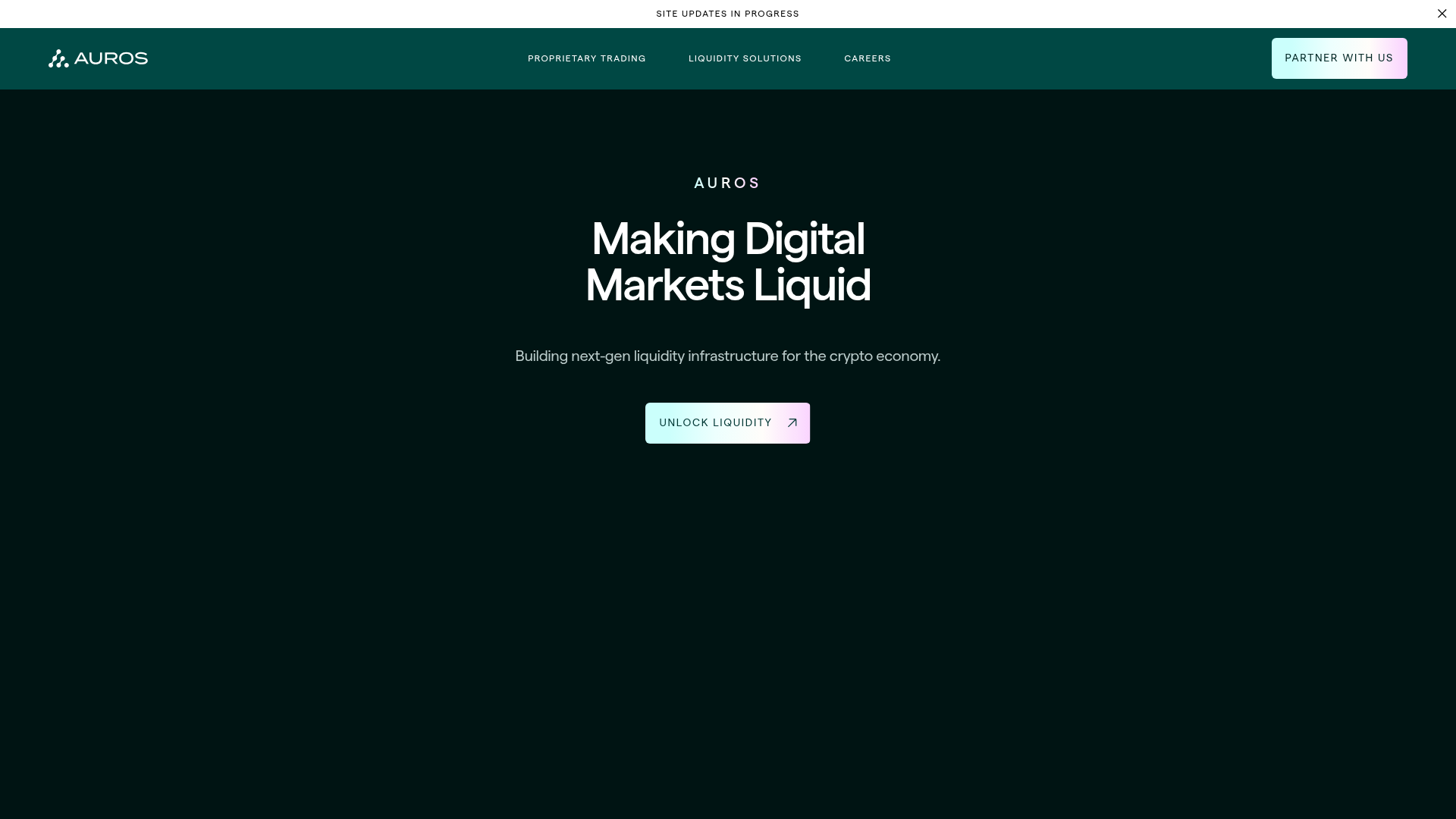
Auros Crypto Liquidity Firm Landing Page
A high-end dark mode site featuring a WebGL gradient background, horizontal text scrolls, bento grid statistics, and interactive video-integrated vertical tabs for service exploration.
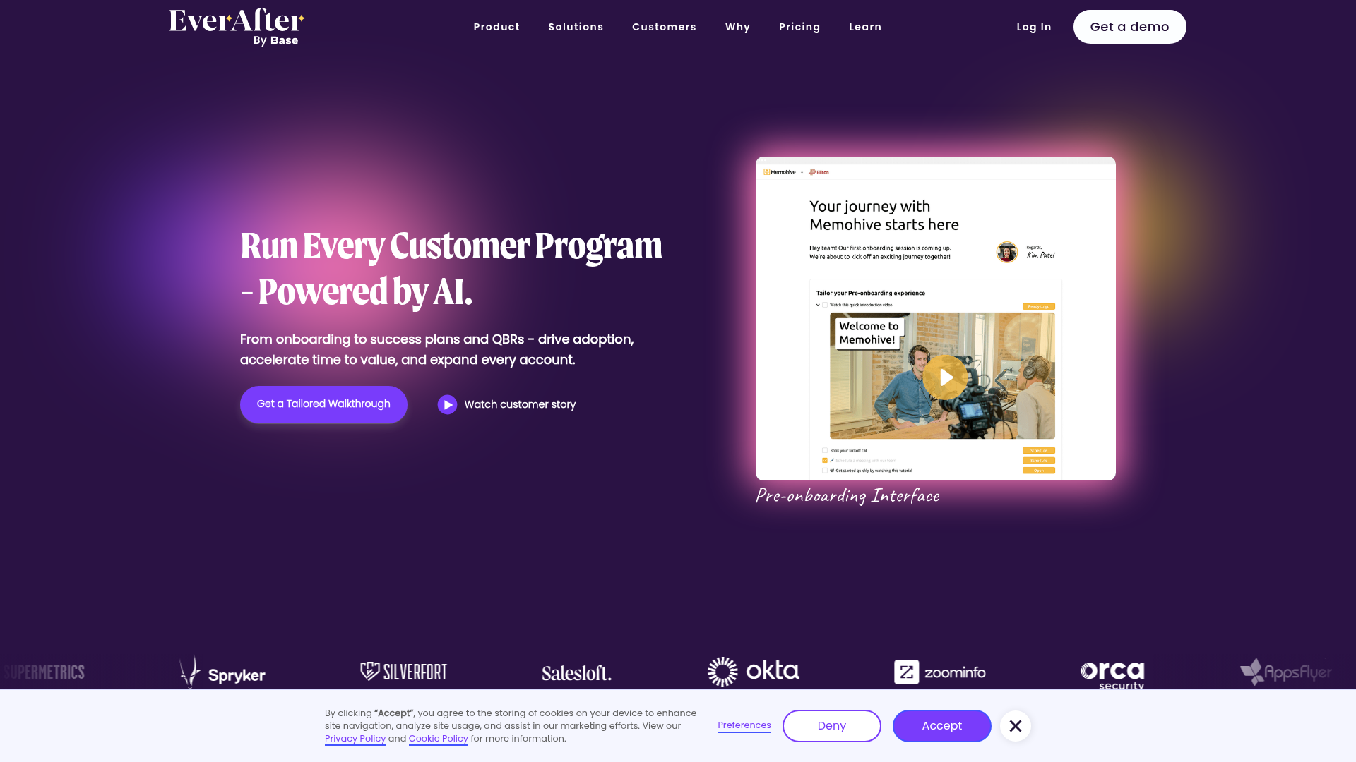
EverAfter AI Customer Portal Hero
A SaaS landing page template featuring a glowing product carousel, auto-scrolling logo marquee, accordion-based feature reveals, and an embedded scheduling widget.
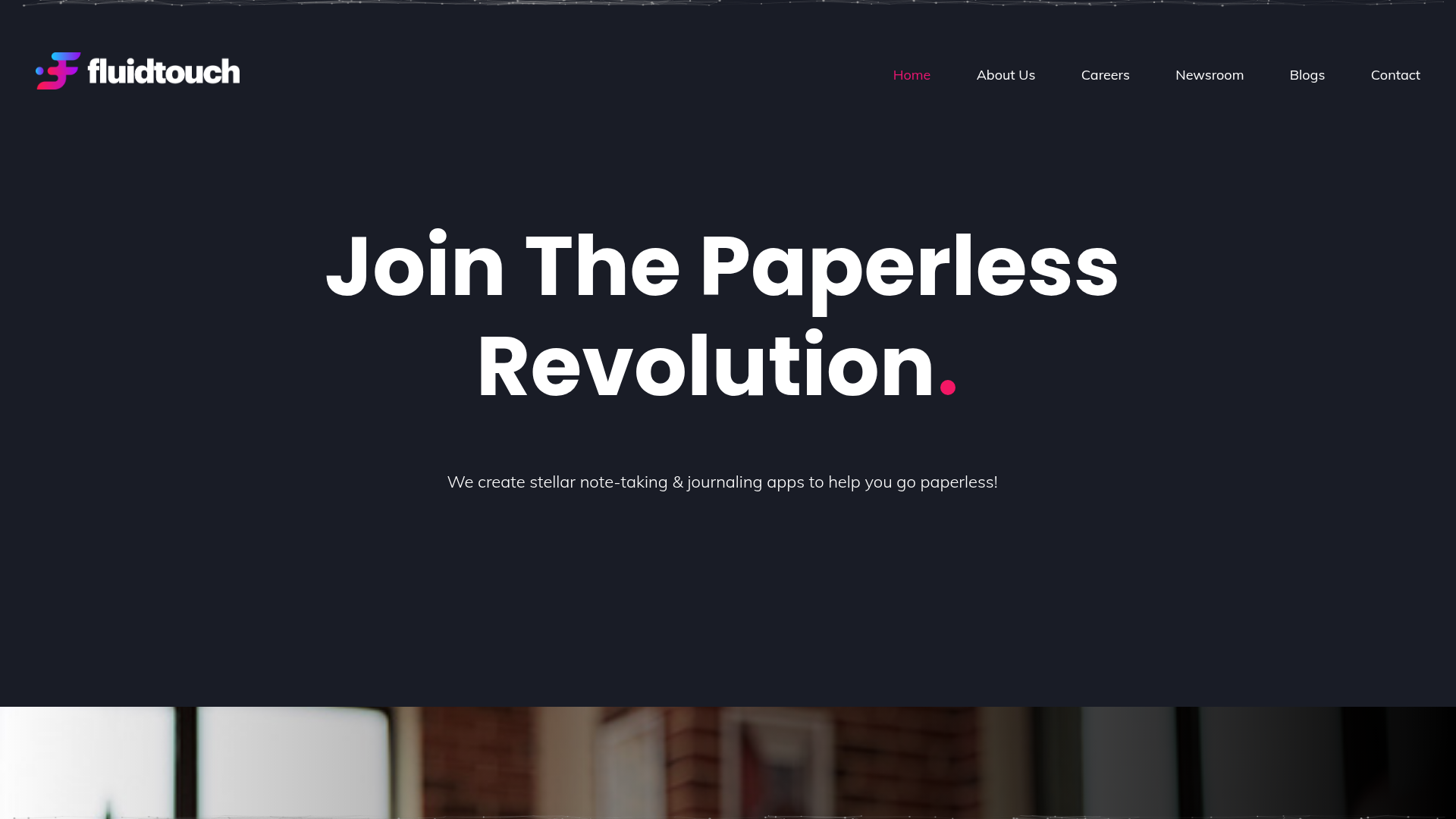
Fluid Touch Software Landing Page
A dark-themed product portfolio featuring a particle hero background, animated counter statistics, award badge carousel, and a featured media/news grid.
