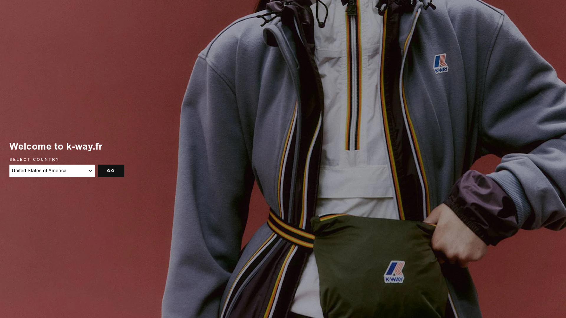
K-Way E-commerce Fashion Interface
A refined Shopify-style storefront featuring a full-bleed video hero, product grids with secondary image hover effects, and a landing page country selector.
Overview
This interface represents a high-end e-commerce experience for K-Way, built on the Shopify framework. It effectively balances large-scale atmospheric media with a dense, utility-focused product grid, making it an excellent reference for fashion brands that need to combine storytelling with high-volume sales.
Design System
- Color Palette & Visual Hierarchy: The design uses a neutral base of whites and light greys to let product photography provide the color. High-contrast black is reserved for utility elements like buttons (
btn--inverse) and the primary navigation text. Red is used sparingly as an accent for specific labels or active states. - Typography: A clean, bold sans-serif defines the hierarchy. Headlines (
h1.hero__title) use all-caps for impact, while product titles use a standard font weight. Subtitles and UI labels like "SELECT COUNTRY" utilize a smaller, wide-tracked uppercase style to establish a professional, structured feel. - Page Structure: The flow begins with a global announcement bar, followed by a multi-layered hero section featuring full-bleed autoplaying MP4 videos. This transitions into a five-column product grid (
medium-up--one-fifth), followed by a 50/50 split "Promo Grid" for category navigation (Homme/Femme). - Reusable Components:
- Hero Video: A 100vh container with centered text overlays and ghost-style buttons.
- Product Cards: Featuring an
image-maskthat handles aspect ratio and a secondary image hover effect (grid-product__secondary-image). - Ajax Cart Drawer: A slide-out right-hand panel (
drawer--right) for seamless shopping. - Country Selector: A minimalist overlay seen in the landing state with a clean
<select>and "GO" button.
- Interaction & Motion: The site uses AOS (Animate On Scroll) for image fade-ins. Product grids feature a smooth image swap on hover, and the navigation utilizes a slide-out "Drawer" pattern for both mobile and desktop utility menus.
- Implementation Clues: The HTML confirms a Shopify Liquid architecture using BEM-style naming (e.g.,
grid-product__content). It relies on the Flickity library for sliders and specific CSS classes likepage-width--flush-smallfor responsive spacing.
Use Cases
- Who should clone this: Brands in the activewear, outerwear, or luxury fashion space that rely heavily on lifestyle video content to sell technical features.
- Effective Remixes: The 5-column product grid is ideal for catalog-heavy stores, while the full-bleed video hero can be remixed for smaller boutiques looking for a "cinematic" entrance.
- Practical Directions: Builders can reuse the "Country Selector" landing pattern for international storefronts or extract the Shopify-specific drawer logic for high-performance mini-carts. The promo grid (
flex-grid--50) is highly versatile for any two-category split (e.g., New Arrivals vs. Sale). - Clone Scope: A full-page clone is recommended for a complete retail overhaul, but the hero video section and the product grid with hover-swap logic are the most valuable individual components to rip for smaller projects.
Related Inspirations

Context Gallery High-End Furniture Landing Page
A minimal editorial layout featuring a multi-column product carousel, designer biographies with image-text pairings, and a magazine-style content grid for curated design stories.

Glein Minimalistic Bento Grid eCommerce
A clean, modular layout using a bento-style responsive grid of text teasers and large-scale product imagery for lookbooks and collection browsing.

Basic.Space E-commerce Gallery Clone
A minimalist product marketplace featuring a clean sticky navigation bar, nested flyout menus, and a horizontally scrollable product carousel with hover-state image switching.

Ashley & Co Lifestyle E-commerce
An elegant Shopify-based storefront featuring a split-screen animated hero, horizontal ticker-tape collection carousel, and dynamic mega-menus with scent-specific color switching and image previews.
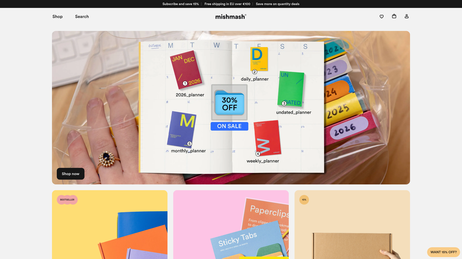
Mishmash Stationery E-commerce Layout
A clean retail template featuring rounded image grids, a multi-column comparison section with custom iconography, and a responsive products carousel.
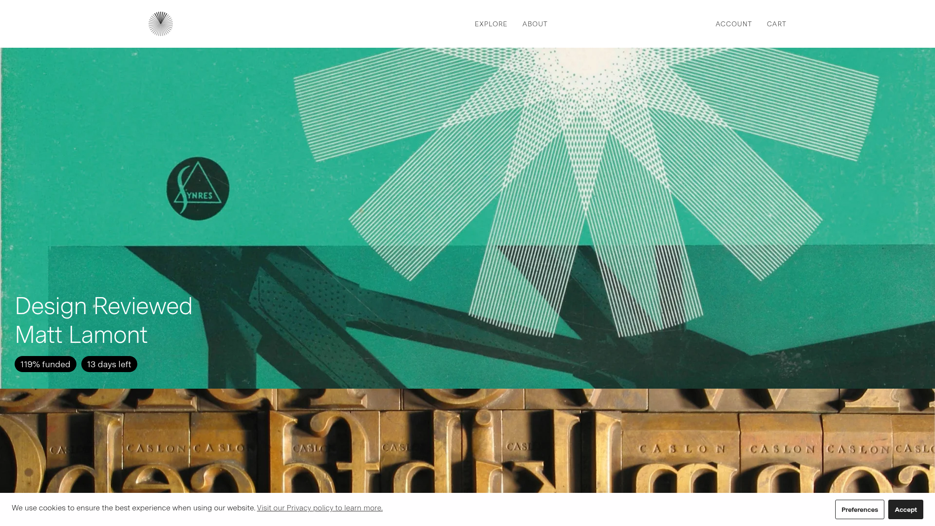
Volume Crowdfunding Book Gallery
A minimalist editorial storefront featuring full-width high-resolution image cards, status pills for campaign progress, and a clean typography-focused navigation layout.
