Studio Lathe Minimalist Portfolio List
A high-contrast, minimalist portfolio layout featuring a dense list-based project index with flexible category labeling and a full-screen yellow background.
Overview
Studio Lathe is a high-contrast, minimalist portfolio website designed as a functional project index. It moves away from traditional image-heavy grids in favor of a clean, data-dense list that emphasizes collaborations and service tags. It is an excellent reference for creators who want to showcase a large volume of work with extreme typographic clarity and a bold brand identity.
Design System
- Color Palette: The site uses a high-vibrancy monochromatic approach featuring a full-screen, high-saturation yellow background (#FFFF00) paired with sharp black typography. This creates a "hazardous" or "industrial" aesthetic that commands attention without relying on photography.
- Typography: The system utilizes a clean, humanist or grotesk sans-serif. Visual hierarchy is achieved through layout position rather than weight; secondary text (like the "with [Agency]" credits) is nested within spans to provide context without breaking the vertical rhythm of the list.
- Page Structure: The layout is built on a simple vertical list (
ul.project-list). Each row (li.project-list-wrapper) is split into a multi-column flexbox containing the project title, a sub-list of category tags, and an "active" status indicator (a square bullet point). - Reusable Components:
- Project Row: A flex-based list item that rebalances content based on viewport width (using utility classes like
w-50-mandw-25-l). - Tag System: Inline list items used for categorization to allow for easy filtering or quick scanning of skill sets.
- Columnar Header: The top navigation is a simple, wide-spaced flex bar anchoring "Studio Lathe" to the left and "Design & Development" to the right.
- Project Row: A flex-based list item that rebalances content based on viewport width (using utility classes like
- Implementation Clues: The HTML reveals a Vue.js/Nuxt framework implementation using scoped CSS (
data-vattributes). The layout relies heavily on utility-first percentage widths (e.g.,w-50,w-25) to manage the horizontal distribution of text columns.
Use Cases
- Who should clone this: Independent developers, architectural firms, or branding studios with an extensive back-catalog of work where project names are more recognizable than single thumbnail images.
- What products can remix it: Service directories, internal documentation indexes, or news archives that require high readability and a unique, non-corporate visual identity.
- Practical remix directions:
- Brand Swap: Keep the list logic but replace the high-vis yellow with a muted paper texture or a dark-mode charcoal for a more premium, understated feel.
- Information Architecture: Expand the project row to include dates or physical locations if adapting for an architectural or exhibition-based portfolio.
- Suggested clone scope: The project list component (
ul.project-list) is the most valuable asset to clone for builders needing a responsive, text-based alternative to the standard image gallery.
Related Inspirations

Niklas Rosén Designer Portfolio Index
A minimalist, responsive grid-based portfolio index featuring a clean 16-column layout, typographic list components, and a custom dark mode transition.

Clase Agency Branding Portfolio
A minimalist design agency portfolio featuring a typographic hero section, full-width image articles, sticky title bars, and integrated scrolling text marquees for a clean editorial layout.

Lundqvist & Dallyn Studio Portfolio
Minimalist design studio portfolio featuring a custom video loader, world clock navigation, and a fluid masonry-style grid for high-quality photography and type design showcases.

Baubauwerk Minimal Agency Portfolio Homepage
A clean studio site featuring a centered text hero, scatter-plot filterable project gallery, and full-bleed image sections for case studies.

AcolorBright Design Agency Portfolio
Minimalist bento-style portfolio layout featuring numerical section headers, horizontally scrolling project teasers, and a clean grayscale client logo grid.
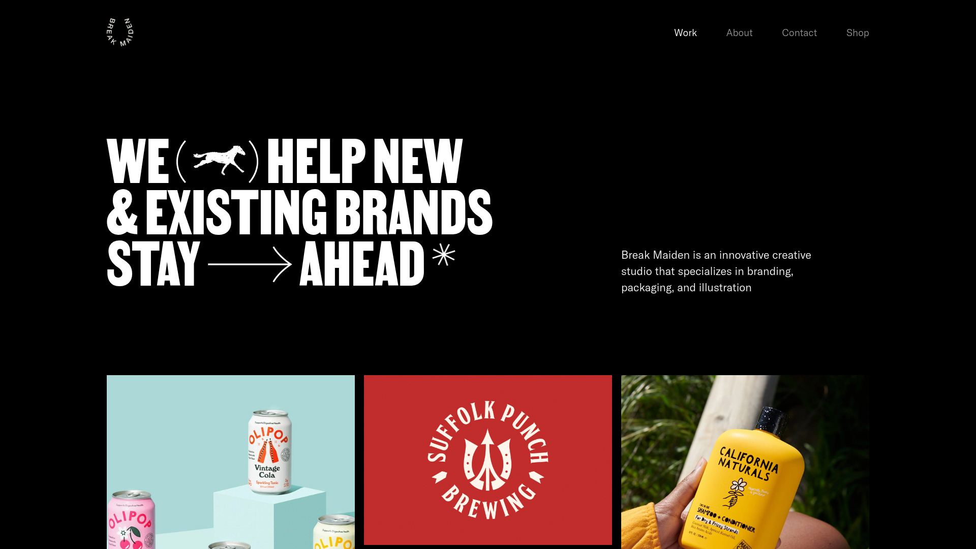
Break Maiden Agency Portfolio Hero
A high-impact dark mode hero section featuring oversized typography with inline GIF icons and a responsive grid for display-heavy case studies.
