Baubauwerk Minimal Agency Portfolio Homepage
A clean studio site featuring a centered text hero, scatter-plot filterable project gallery, and full-bleed image sections for case studies.
Overview
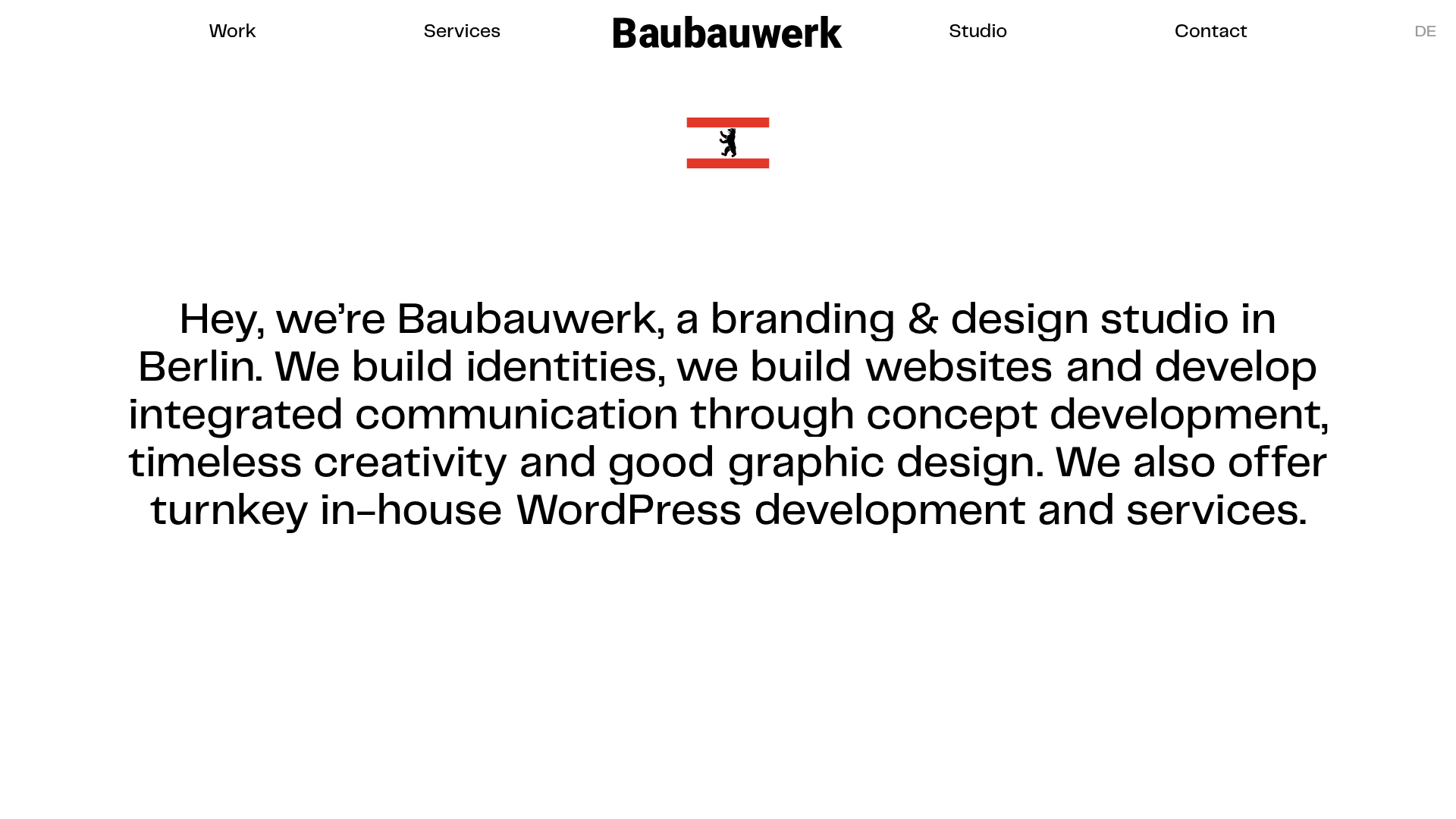
Baubauwerk is a minimalist agency portfolio that prioritizes extreme whitespace and bold, centered typography to establish a premium brand identity. It is an excellent clone reference for building a high-end studio site that balances a clean editorial aesthetic with a unique scattered project gallery.
Design System
- Color Palette & Visual Hierarchy: A strict monochrome palette (Black
#000000text on White backgrounds) creates a "gallery" feel. Hierarchy is established through extreme font sizing rather than color, with a prominent custom red/black Berlin flag icon as the only consistent pop of color. - Typography: The site uses a clean, modern sans-serif. The hero section features a large, medium-weight font with tight leading, using inline links in the same weight to integrate navigation directly into the brand story.
- Page Structure:
- Minimal Header: Centered logo with split navigation (Work/Services on left, Studio/Contact on right).
- Hero Intro: Centered text block providing a high-level mission statement.
- Scatter-Plot Gallery: A non-traditional grid of project thumbnails (
c-showcase-item) with varied aspect ratios and positions. - Full-Bleed Case Studies: Large, high-resolution imagery paired with two-column text (Category/Tags on left, Description on right).
- Horizontal Blog Feed: A four-column grid for news and updates with small, consistent thumbnail sizes.
- Reusable Components:
- The Intro Flag: An SVG-based decorative element that anchors the hero.
- Project Links: Minimal text-based buttons (
o-btn) and tag clouds (c-tags) used for filtering and external links. - Responsive Layout: The HTML uses
grid-containerandgrid-xclasses (Foundation Framework), indicating a flexible grid system that collapses into single-column stacks on mobile.
- Interaction Patterns: The design features subtle hover states on images and a unique "WERK" illustration at the bottom of the page (
home-illustration) that transitions between two SVGs on hover.
Use Cases
- Who should clone this: Creative directors, independent designers, and boutique architecture or branding firms who want a portfolio that feels sophisticated and "less is more."
- Product Remixing: This layout works effectively for high-end lifestyle brands or digital magazines. The scattered gallery can be remixed as a "featured products" section for a curated e-commerce landing page.
- Remix Directions: Swap the monochrome palette for a high-contrast dark mode; replace the Berlin flag with a localized icon or brand mark; or adapt the large-text hero to include a video background behind the text.
- Clone Scope: A full-page clone is recommended to maintain the specific spatial rhythm, but the scattered project showcase (
c-showcase) is a standout individual section to reuse for any image-heavy site.
Related Inspirations
Minimalist Typography Portfolio and Services Grid
A clean, serif-heavy layout featuring an A-Frame 3D hero animation, tiered service lists, and a modular multi-column text structure for design manifestos.
Porto Rocha Design Portfolio Mockup
A minimalist, side-bar navigation portfolio featuring a dual-column layout with a scrollable project feed and high-contrast typography.
Spacelab Exploratory Architectural Portfolio
A minimalist studio website featuring a clean sidebar navigation and a high-impact asymmetric grid layout designed for visual storytelling.
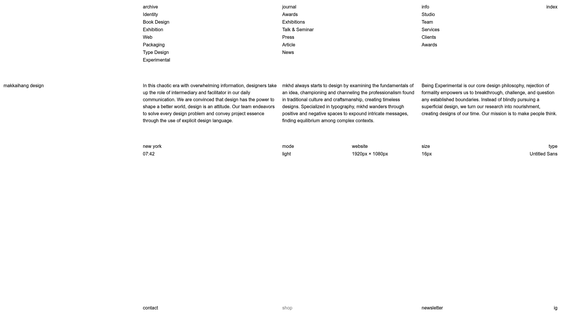
Makkaihang Design Studio Portfolio
A minimalist design agency landing page featuring a full-bleed video hero, a multi-column typographic layout, and a functional footer tracker for real-time local time and font details.
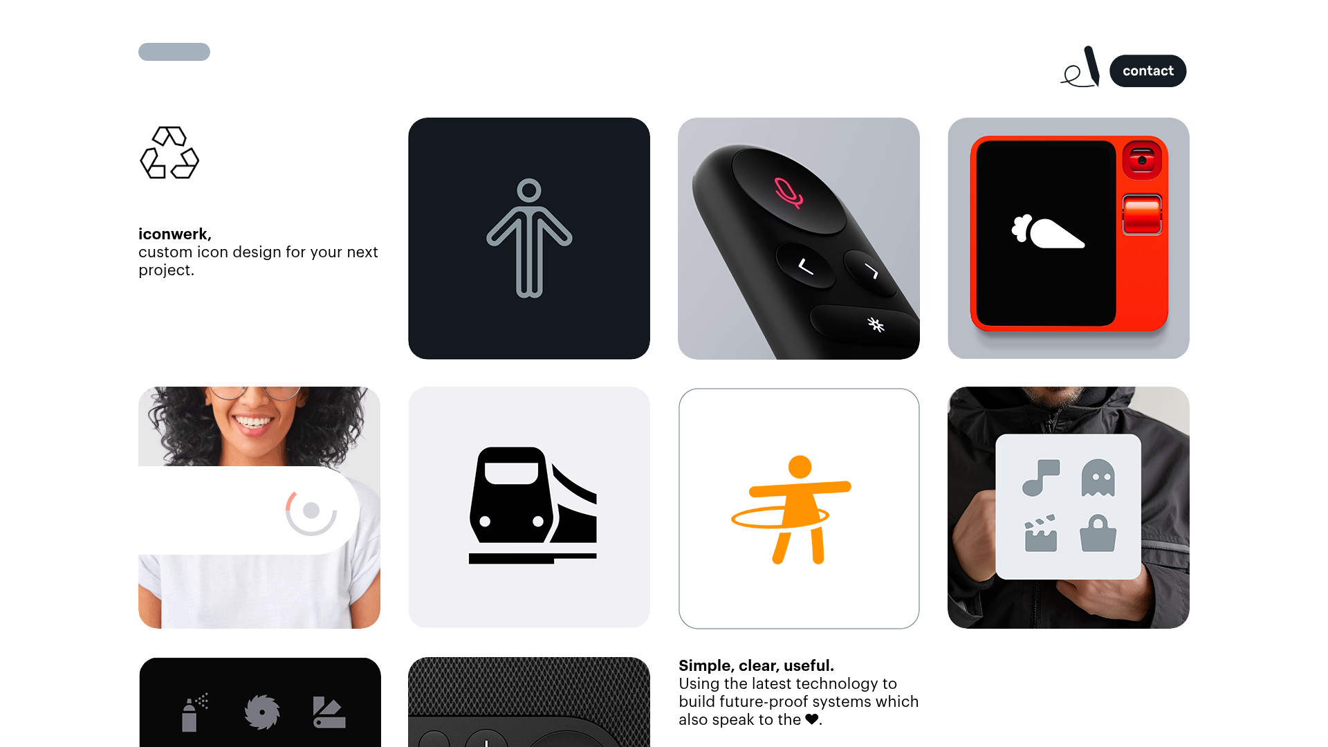
Iconwerk Design Portfolio Bento Layout
A minimalist bento grid portfolio featuring varying square tile sizes, clean iconography showcases, and a simple fixed navigation header for creative work.
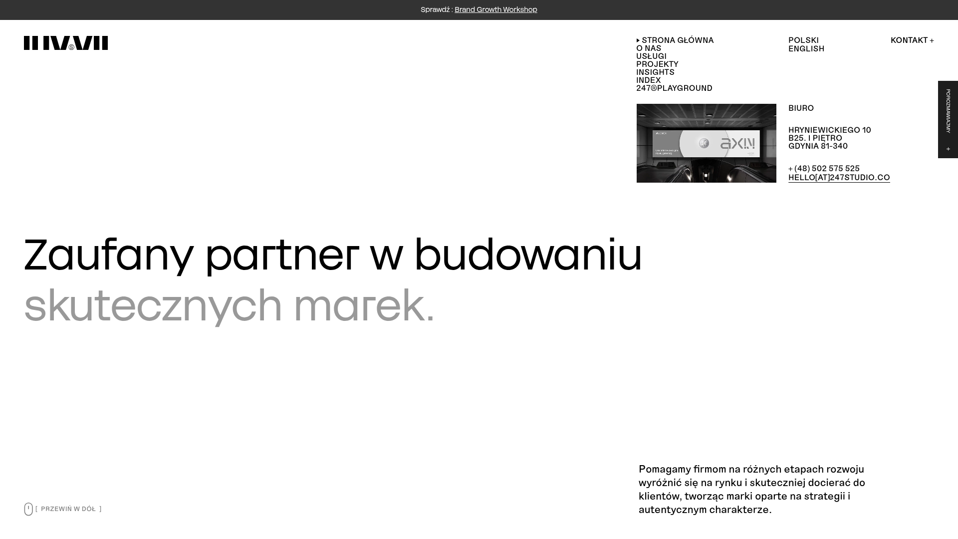
247 Studio Creative Agency Showcase
A minimalist agency landing page with a dynamic rotating headlines hero, numbered brand logo grid, and modern high-contrast service cards with timing labels.
