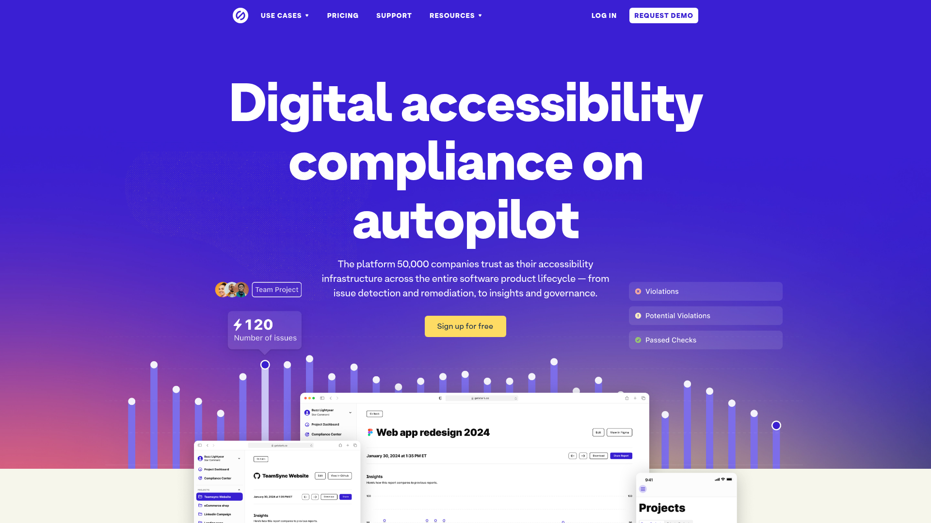
Stark Accessibility Software SaaS Landing Page
A vibrant SaaS landing page featuring a purple gradient hero, layered dashboard mockups, grid-based feature highlights, and segmented user-persona navigation.
Overview
This landing page is a high-impact example of a modern B2B SaaS design, specifically tailored for tools that bridge the gap between design and development. It uses a bold, single-color saturated gradient theme to establish strong brand identity while showcasing complex software capabilities through layered, realistic mockups. It’s an excellent reference for builders looking to present a technical product as both professional and user-friendly.
Design System
- Color Palette & Visual Hierarchy: The design is dominated by a deep primary purple (
#5e17ebrange) and a secondary teal (#base-teal). Visual hierarchy is achieved through a strong contrast between the dark purple backgrounds and vibrant white/yellow typography. The "Sign up for free" call-to-action is rendered in a bright yellow to break the monochromatic scheme and draw immediate focus. - Typography: The layout uses a clean, bold sans-serif (Inter or similar). Headlines use large optical sizes with tight letter-spacing for a modern feel. The HTML class
headline--1andheadline--2suggest a standardized heading system, often paired with monospace fonts for technical labels and "above-title" eyebrow text. - Page Structure & Flow: The flow starts with a high-energy hero section featuring floating dashboard components. This is followed by a horizontal logo cloud for social proof, a 4-column feature grid for core platform pillars, and alternating "image-text" sections for deeper feature drill-downs. It concludes with a segmented navigation block for different user personas (Designers, Developers, etc.).
- Reusable Components: Notable components include the "floating" status badges (Violations, Passed Checks), high-fidelity browser mockups with shadow overlays, and the 4-column feature cards that use illustrative icons with mono-spaced utility text. The person-based navigation at the bottom is a sophisticated alternative to standard tabs.
- Interaction & Implementation: The site is built with Gatsby and Tailwind CSS (evidenced by classes like
flex,justify-center, andgap-x-12). It includes motion patterns such asanimate-streamlining-section-fade-inand hover states on persona cards that highlight the entire container while underlining headings.
Use Cases
- Who should clone this: Developers or designers launching productivity tools, developer experience (DevEx) platforms, or compliance-heavy software that needs to appear modern rather than bureaucratic.
- Effective Remixes: This pattern works well for complex dashboards. You can remix it by swapping the purple brand color for a deep navy or forest green to change the mood while keeping the layout logic. The "persona-switcher" at the bottom is perfect for products that serve multiple departments (e.g., Marketing vs. Sales vs. Engineering).
- Suggested Scope: A full-page clone is ideal for a flagship product launch. For smaller projects, cloning the hero section's layered mockup layout provides an immediate high-end appearance for any software demonstration.
Related Inspirations
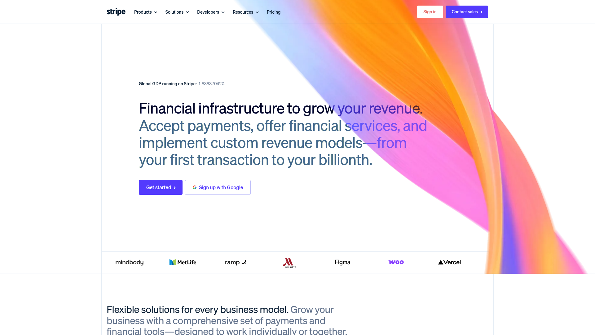
Stripe Modern SaaS Landing Page
A high-conversion landing page featuring a complex mesh-gradient hero, sticky navigation, and a horizontal logo wall for brand social proof.
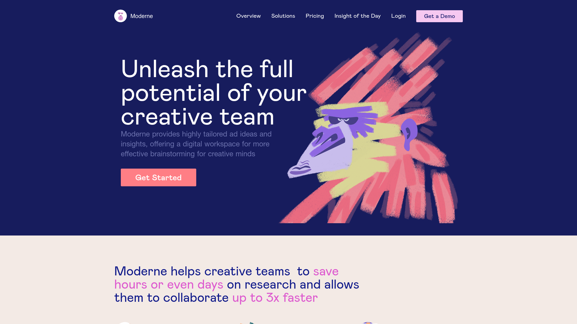
Moderne Creative Landing Page
A high-contrast landing page featuring a dark hero section with an artistic illustration overlay, distinct alternating content blocks, and a visual comparison bar chart component.
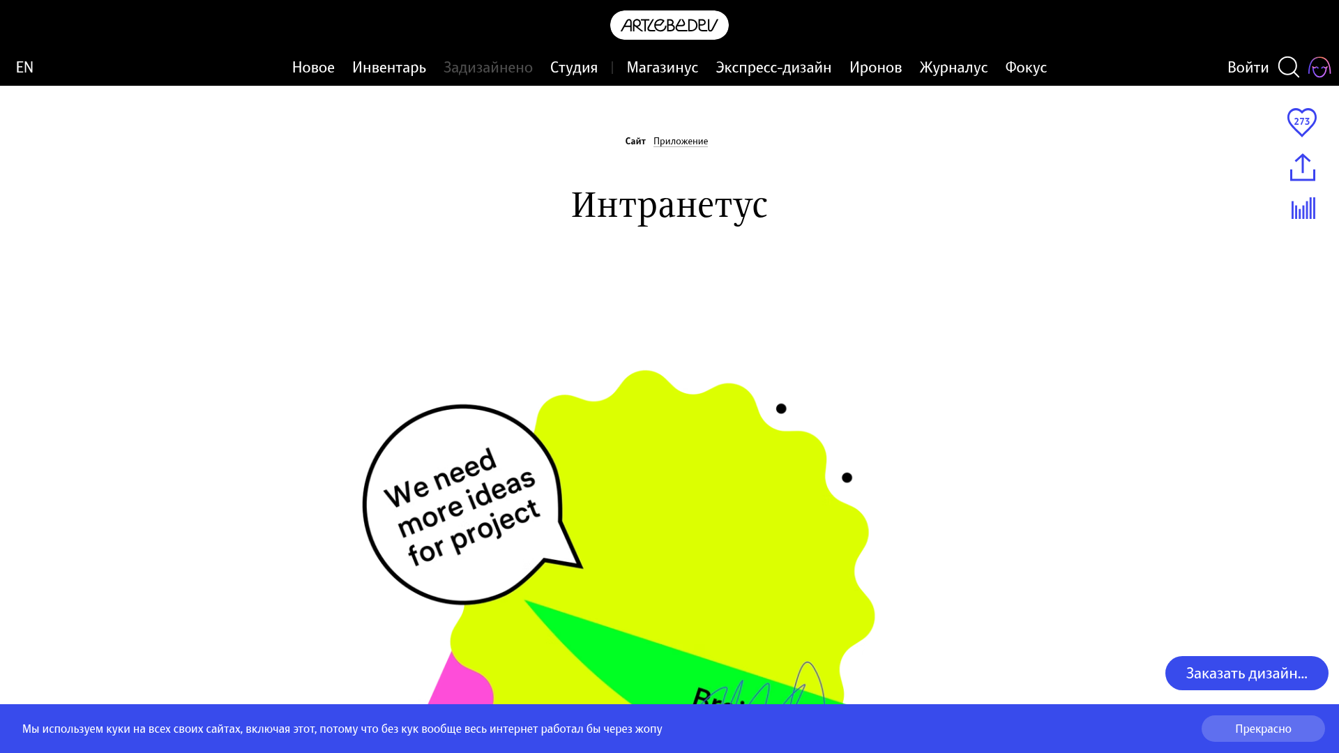
Intranetus Project Showcase Landing Page
A high-concept portfolio page featuring a large-scale video hero, Lottie animations, layered parallax transition effects, and a vertical grid of browser-mockup feature cards.
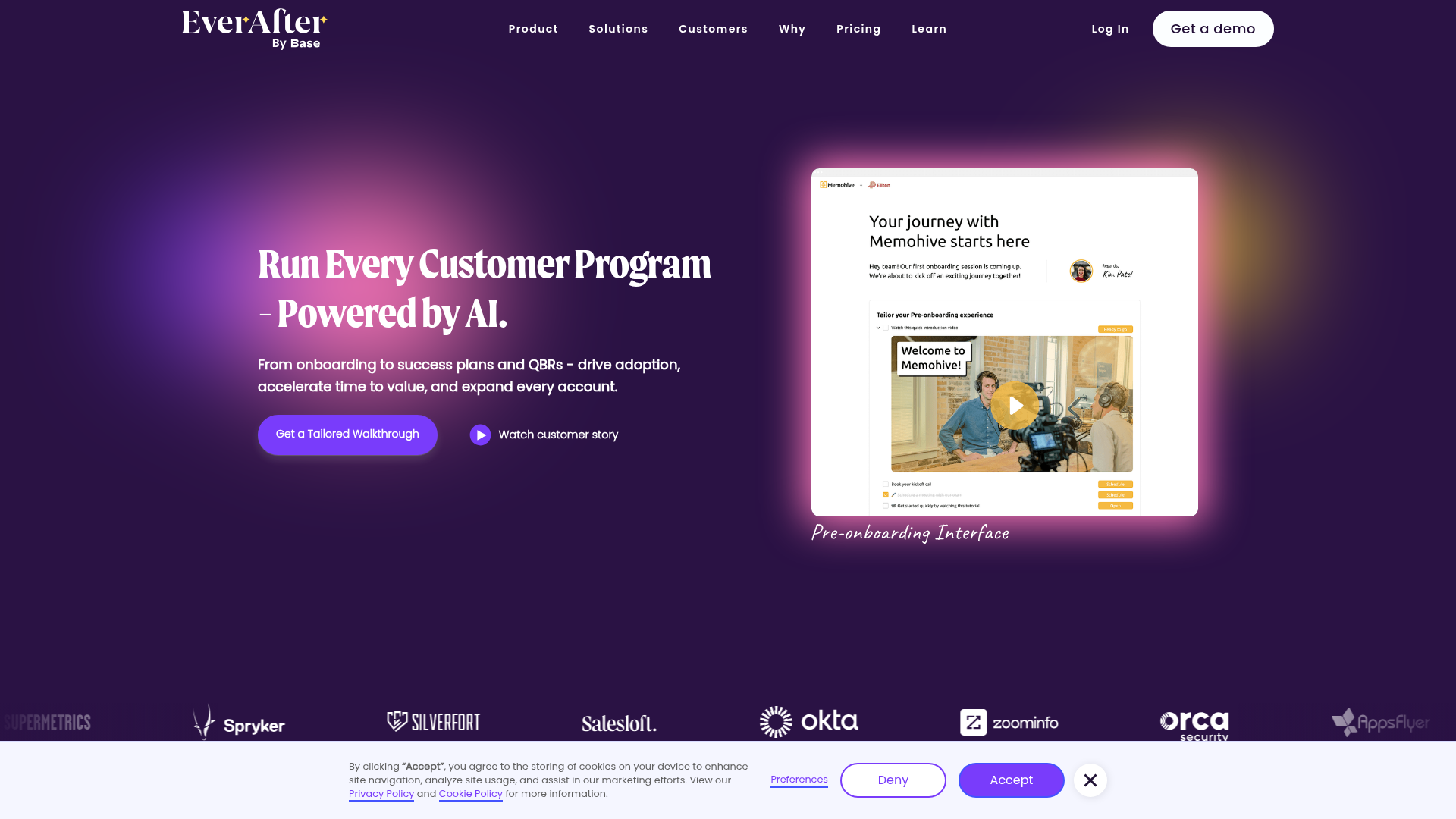
EverAfter AI Customer Portal Hero
A SaaS landing page template featuring a glowing product carousel, auto-scrolling logo marquee, accordion-based feature reveals, and an embedded scheduling widget.
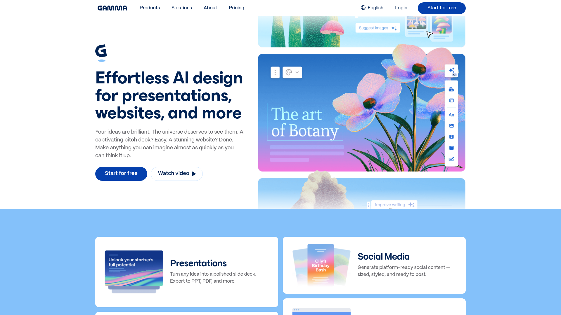
Gamma AI SaaS Landing Page
A modern software landing page featuring a split-hero section, alternating feature blocks with embedded video, card-based product grids, and a high-density customer testimonial carousel.
Squadeasy Employee Engagement SaaS Landing Page
A vibrant wellness platform layout featuring a sticky navigation bar, modular high-contrast sections, interactive testimonials slider, and animated data counting components.
