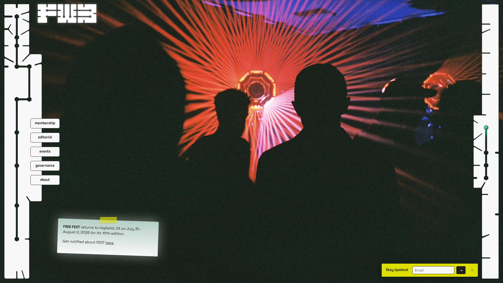
Friends with Benefits Community Portal
A creative community landing page featuring an immersive full-screen video background, custom geometric framing, and floating UI navigation elements for a unique digital identity.
Overview
This community portal is a high-impact, single-page landing experience designed for a creative DAO. It is a premier clone reference for its unconventional "brutalist-futurism" aesthetic, utilizing SVG-based geometric framing and floating UI elements to create a distinctive digital identity that feels more like an application interface than a traditional marketing site.
Design System
- Color Palette & Visual Hierarchy: The design features a high-contrast palette of 'Jet' black, 'Foam' off-white, and a signature 'Acid' lime green used for high-visibility CTAs and status indicators. The hierarchy is driven by depth, layering floating interface cards over a grainy, cinematic full-screen video background.
- Typography: The system uses Space Grotesk as a primary sans-serif for UI labels and body text, emphasizing a modern, technical feel. A secondary custom lettermark typeface provides brand-specific character. Text is kept small (xs to sm) to maintain a refined, "instrument panel" look.
- Page Structure: The layout is non-linear and fixed. It consists of a central immersive video stage bounded by complex peripheral SVG frames. Navigation is distributed: primary links are on the left, a pulse indicator/news ticker on the right, and a newsletter capture in the bottom-right corner.
- Reusable Components:
- Floating Info Cards: Off-white cards with a 2-degree rotation, featuring a 'tape-strip' header (Acid green) and 3D shadow effects.
- SVG Decorative Frames: Sophisticated, non-standard borders that adapt to viewport height, giving the site a "hacker-terminal" or "blueprint" aesthetic.
- Pill Navigation: Minimalist white buttons with black borders that transition to an 'Acid' green gradient on hover.
- Interactions & Motion: Elements use
duration-750transitions for smooth entrance. Cards featurecursor-grabbehavior, suggesting a draggable interface. There is a persistent pulse animation (animate-pulseGlow) on the branding elements to keep the page feeling active. - Responsive Behavior: On mobile, the complex side frames are hidden. Navigation collapses into a full-height sidebar menu (
w-[60%]), and the newsletter form shifts to a full-width bottom bar to maintain thumb-reachability. - Implementation Clues: The HTML reveals a Tailwind CSS implementation along with Svelte components. It uses absolute positioning extensively (
absolute top-0 left-0) to manage the layered UI components over the background video.
Use Cases
- Who should clone this: Creative agencies, NFT projects, or underground event organizers looking for a "lo-fi but high-tech" aesthetic that stands out from standard SaaS templates.
- Effective Remixes:
- Gaming Hub: Swap the festival footage for gameplay and the UI labels for server status and leaderboards.
- Portfolio: Use the SVG framing to create a unique "gallery-view" interface for digital artists or developers.
- Practical Directions: Reuse the floating card and sidebar navigation logic while swapping the SVG frames for simpler, cleaner geometric lines if a more professional corporate look is desired. The newsletter 'Stay Updated' footer is a perfectly isolated component for any site needing a low-profile capture form.
- Clone Scope: A full-page clone is best to preserve the integrated interface feel, but the floating info-card system is the most versatile individual piece for quick section reuse.
Related Inspirations
No Ideas Design Portfolio Carousel
A minimalist, full-screen portfolio featuring a high-impact typography hero and a large-scale Bootstrap carousel with video and image support.
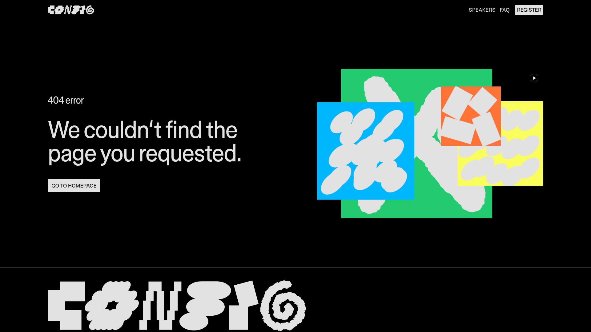
Figma Config 404 Error Page
A high-contrast dark mode error page featuring a bold typographic layout, a video-based hero graphic, and a sticky navigation bar with a custom-styled 'Register' button.
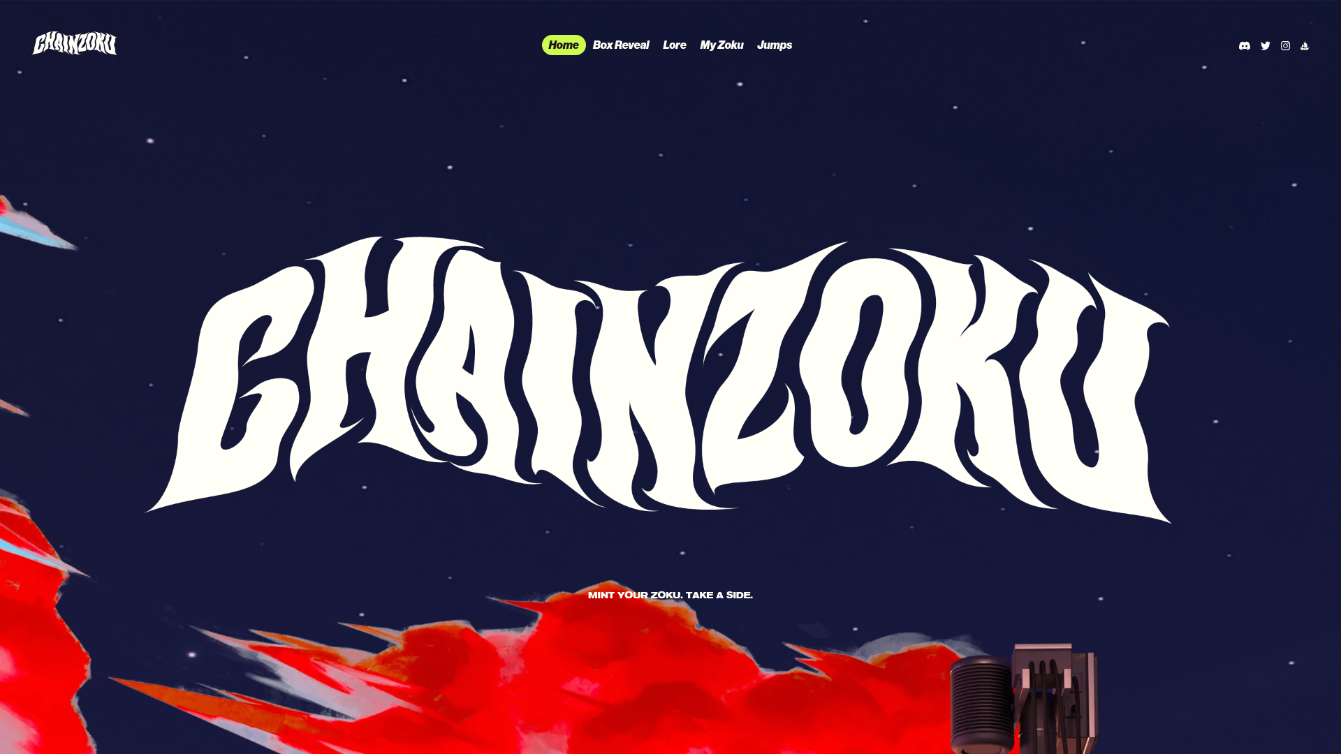
Chainzoku Gaming and NFT Landing Page
A high-impact landing page featuring a wobbly marquee hero logo, parallax cloud layers, sticky background-reveal sections, and a horizontal character faction switcher.
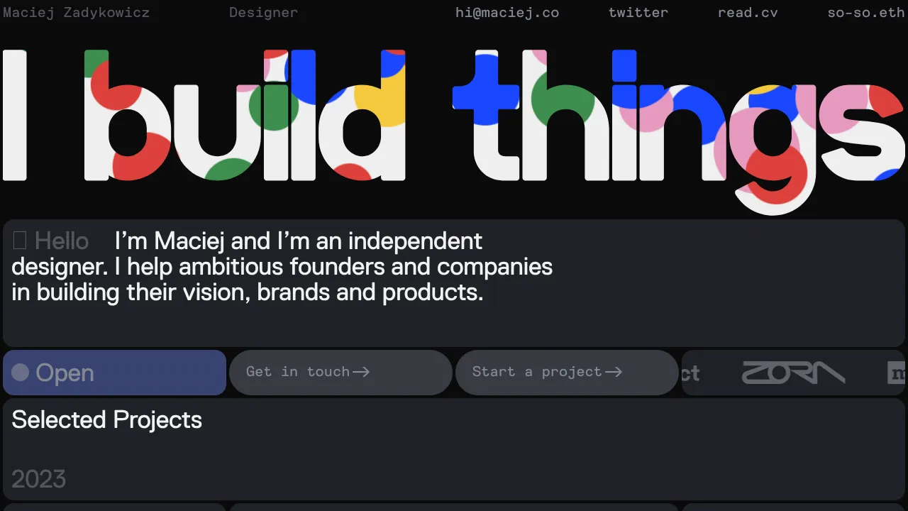
Maciej Zadykowicz Design Portfolio Concept
A high-contrast dark mode portfolio featuring a canvas-based particle hero, bento-style grid layouts, logo ticker, and flickity-powered project carousels.
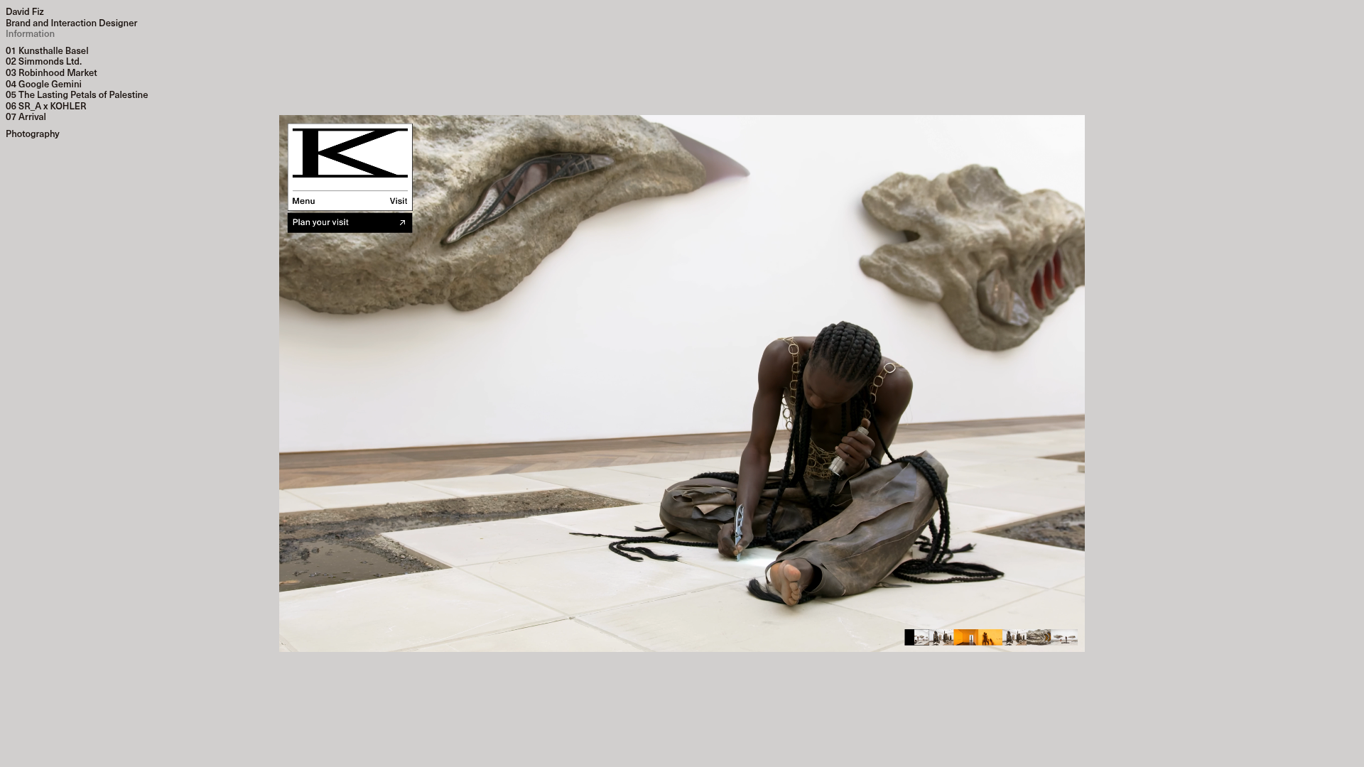
David Fiz Visual Design Portfolio
A minimalist portfolio featuring a fixed sidebar navigation paired with an immersive, full-screen media showcase and interactive project-specific image carousels.
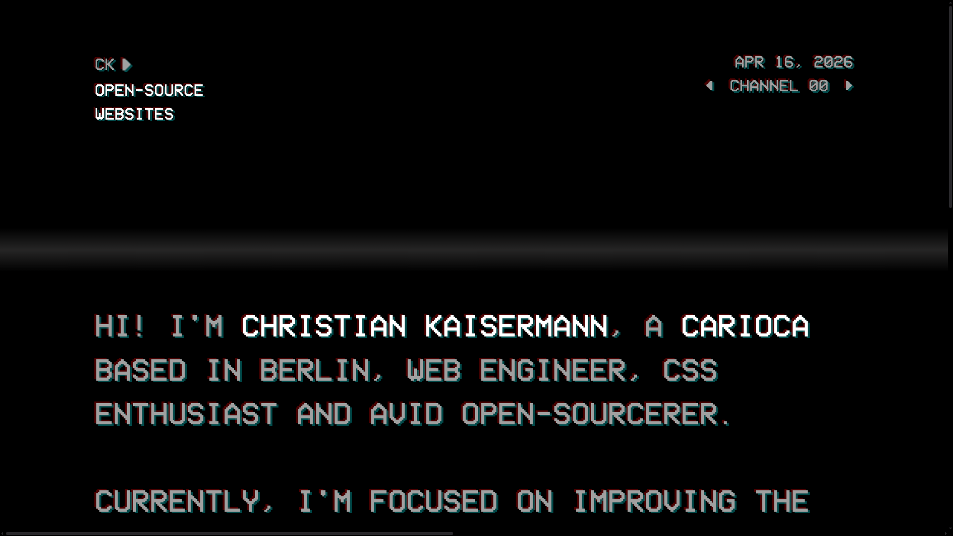
Christian Kaisermann Retro CRT Portfolio
A dark-themed developer portfolio featuring a 90s CRT television interface with glitch text effects, scanlines, and an interactive remote control navigation system.
