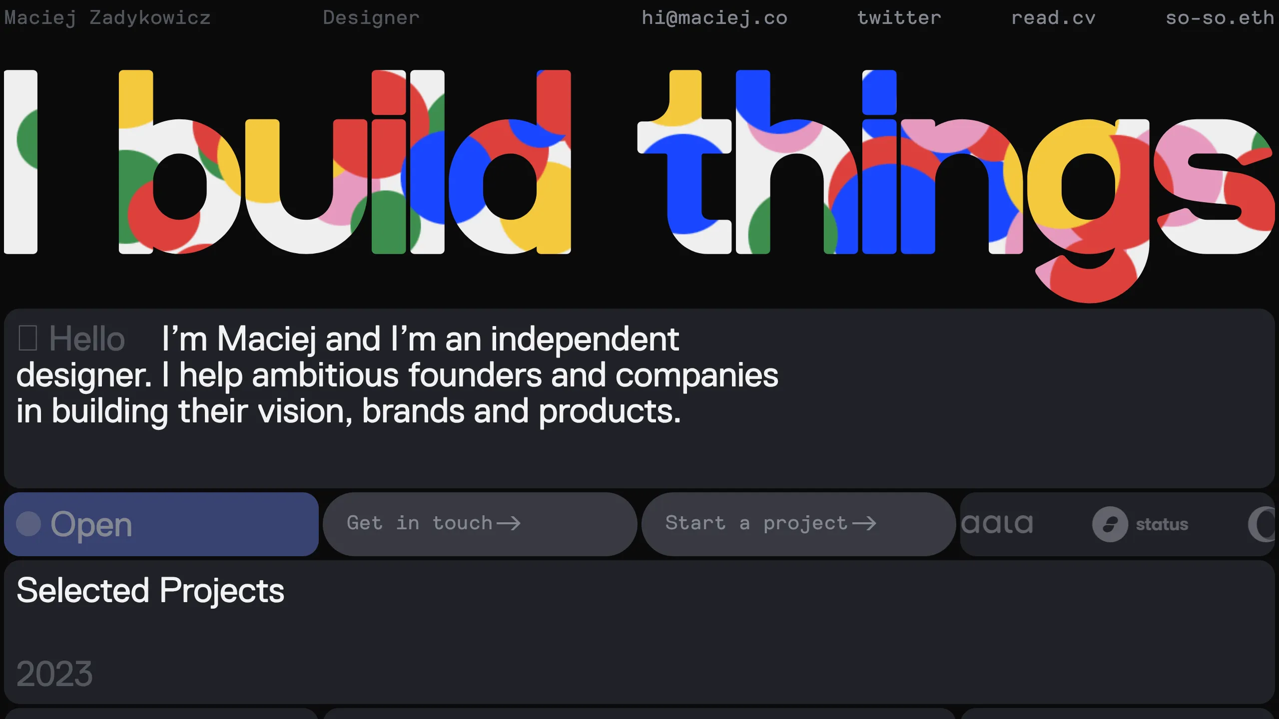
Maciej Zadykowicz Design Portfolio Concept
A high-contrast dark mode portfolio featuring a canvas-based particle hero, bento-style grid layouts, logo ticker, and flickity-powered project carousels.
Overview
This portfolio for designer Maciej Zadykowicz is a masterclass in high-contrast dark mode design, blending large-scale typography with a modular grid system. It is a strong clone reference for builders who want to showcase a visual-heavy portfolio while maintaining a clean, structured appearance through a sophisticated "bento-box" layout.
Design System
- Color Palette & Visual Hierarchy: The site uses a deep matte black (
#000000or similar) background with off-white/grey text. Vibrant accents are introduced solely through project imagery and a particle-based hero canvas that uses primary colors (red, blue, green, yellow). High hierarchy is established through massive font sizes for headers, while secondary information uses muted grey tones. - Typography: The system relies on a bold, grotesque-style sans-serif for impact. Headers (
h1) are exceptionally large and often span the full width of the grid, while metadata (years, roles) use smaller, monospace-adjacent styling for a raw, technical feel. - Page Structure: The layout follows a strict vertical progression: a navigation header, a canvas-based animated hero, a short personal introduction, a 'status' action bar, followed by tiered project sections that alternate between text descriptions and wide Flickity carousels. It concludes with an 'About' section featuring mixed media (video, photography) and a mirrored footer.
- Reusable Components:
- Bento Grid Cells: Standardized
.gridand.cellclasses create a flexible framework for content blocks. - Action Bar: A horizontal strip containing an 'Open' status indicator, 'Get in touch' and 'Start a project' buttons, and an infinite logo ticker.
- Flickity Carousels: Full-width
.carouselunits that handle both desktop and mobile-sized mockups within a single slider. - Scoped Project Blocks: A consistent template for title, year, description, and a list of project 'scope' tags.
- Bento Grid Cells: Standardized
- Interaction & Motion: The hero section features a canvas-based particle interaction. Buttons use a pill-shape design with inset spans, suggesting subtle hover transitions. Carousels include custom
.button-prevand.button-nextcontrols for manual navigation. - Responsive Behavior: The HTML reveals a mobile-specific SVG header (
header-mobile.svg) and usesspan-allorspan-halfgrid logic to stack content on smaller screens, ensuring the bento layout remains readable.
Use Cases
- Who should clone this: Independent designers, creative developers, or agencies with a high volume of visual assets (3D, branding, UI) who want an 'industry-standard' premium aesthetic.
- Effective Remixes: This pattern works exceptionally well for SaaS landing pages where the 'Project' sections are replaced by 'Feature' deep-dives, or for crypto/Web3 projects that favor high-contrast, technical layouts.
- Remix Directions: Replace the canvas particles with a Spline 3D model; swap the heavy grotesk font for a serif to pivot from 'tech-industrial' to 'high-fashion/editorial'; or extract just the 'Action Bar' and 'Logo Ticker' for use as a standalone CTA section on an existing site.
- Clone Scope: The project carousel and bento grid layout are the most valuable components for a quick section-based clone, while the full-page layout is ideal for a comprehensive personal brand overhaul.
Related Inspirations
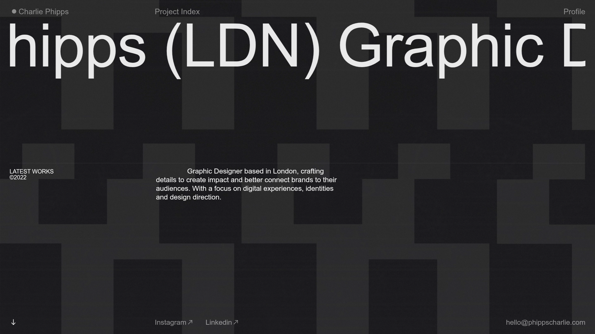
Charlie Phipps Portfolio Hero Layout
A dark-themed portfolio featuring a large horizontal scrolling marquee header, full-bleed video backgrounds, and a clean typography-focused grid for case studies.
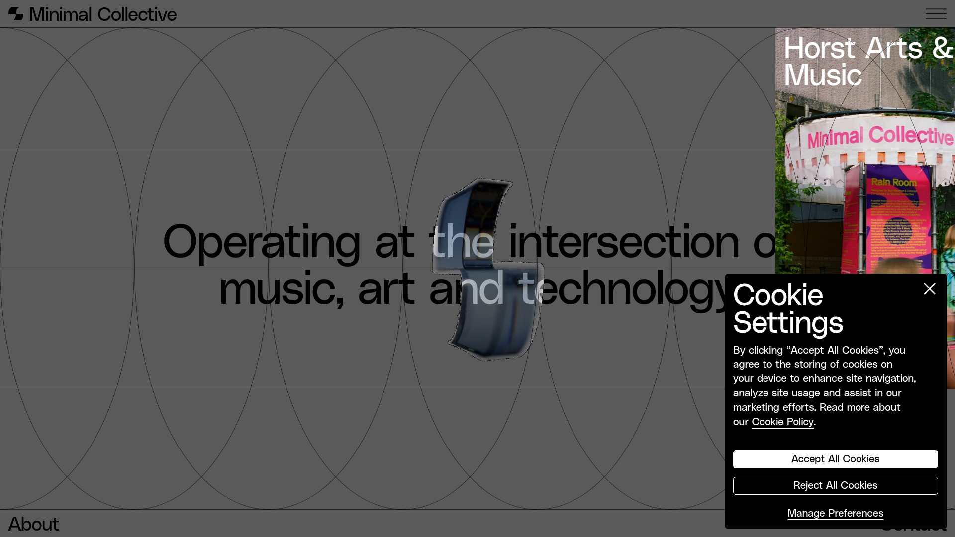
Minimal Collective Media Grid Portfolio
A high-end creative portfolio featuring a dynamic grid layout, parallax scroll animations, image hover overlays, and a minimalist full-screen page transition system.
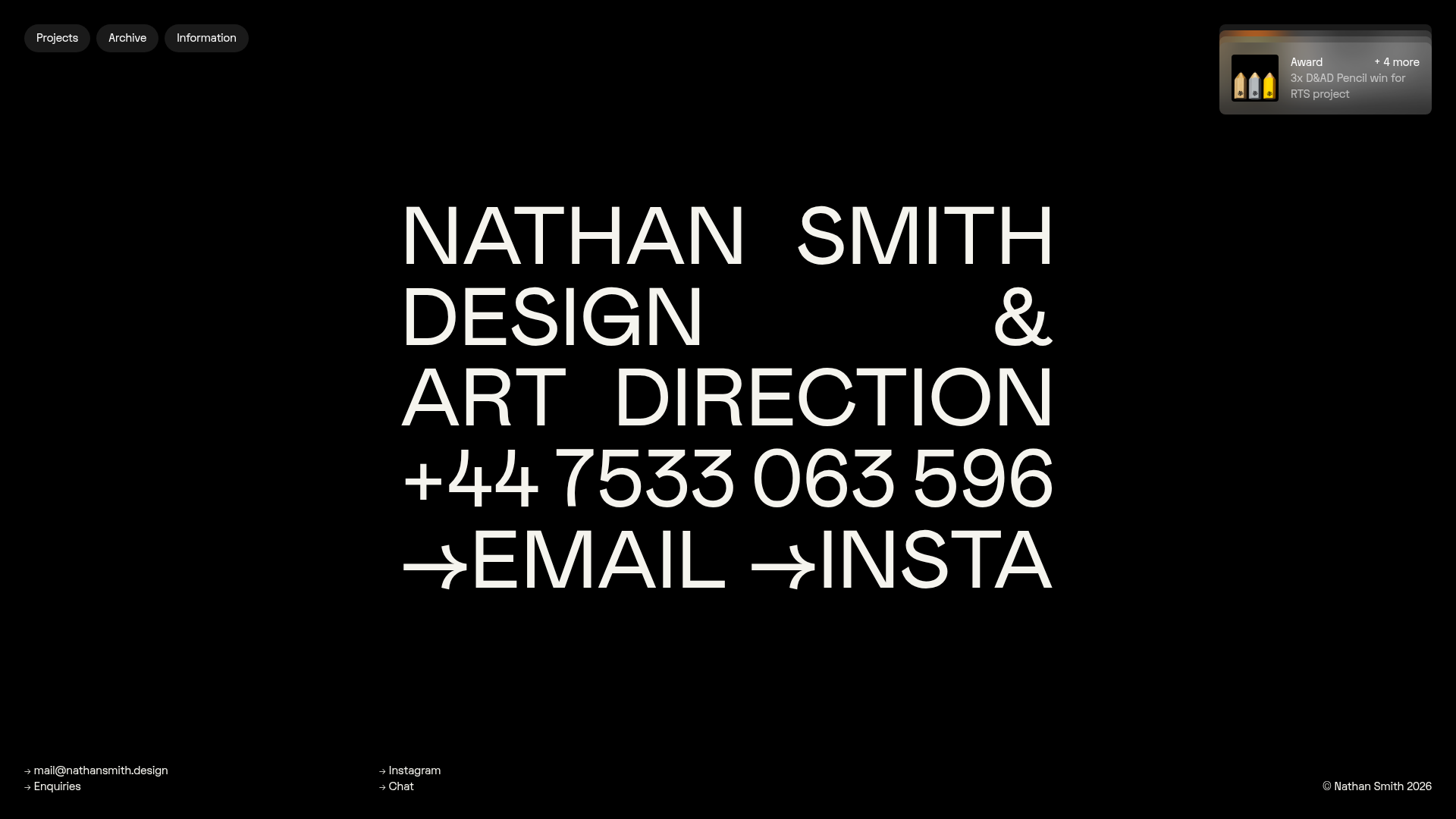
Nathan Smith Design Portfolio Homepage
A bold typography-led hero section with a hover-active portfolio grid featuring dynamic background color transitions and a slide-out contact form.
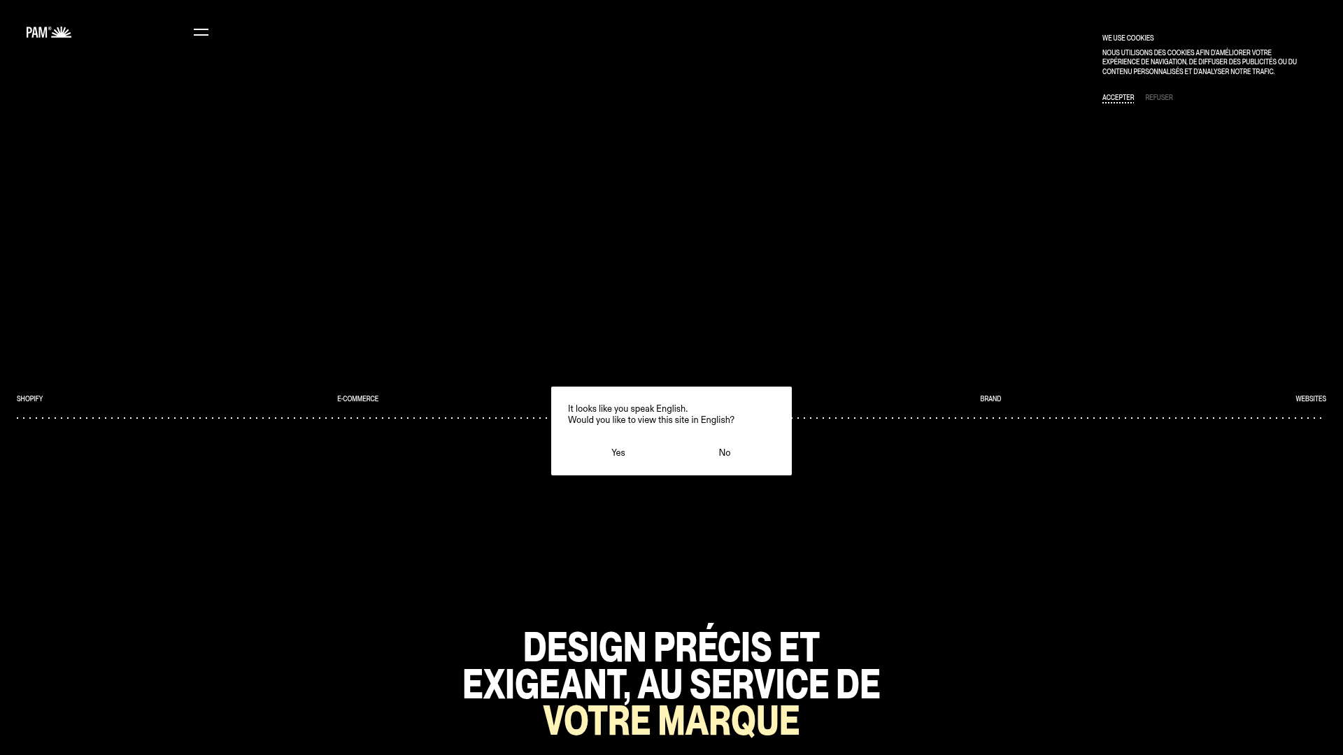
Pam Agency Portfolio Hero
A high-contrast Shopify agency landing page featuring a full-width marquee hero, horizontal service cards, and a sleek yellow-accented slide-out contact form.
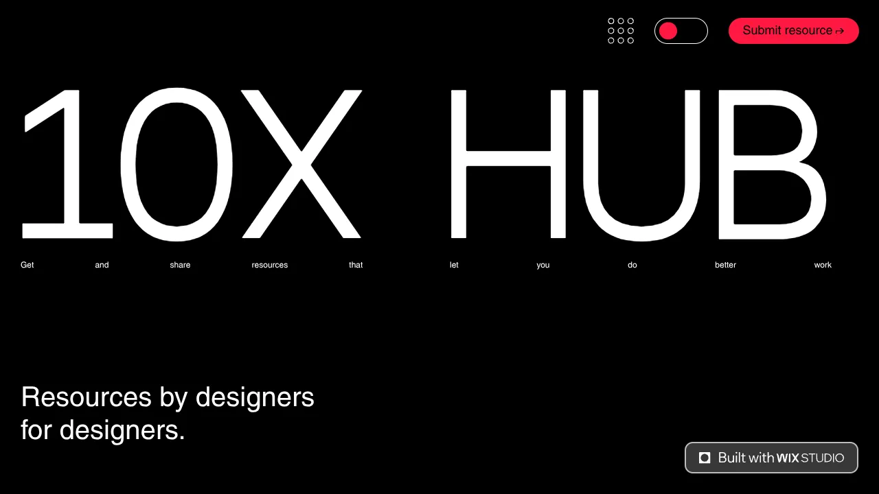
10X Hub Minimal Performance Resource Gallery
A high-contrast dark mode resource hub featuring big typography, a filtered repeater list for discovery, and a comprehensive multi-step submission form.

Niklas Rosén Designer Portfolio Index
A minimalist, responsive grid-based portfolio index featuring a clean 16-column layout, typographic list components, and a custom dark mode transition.
