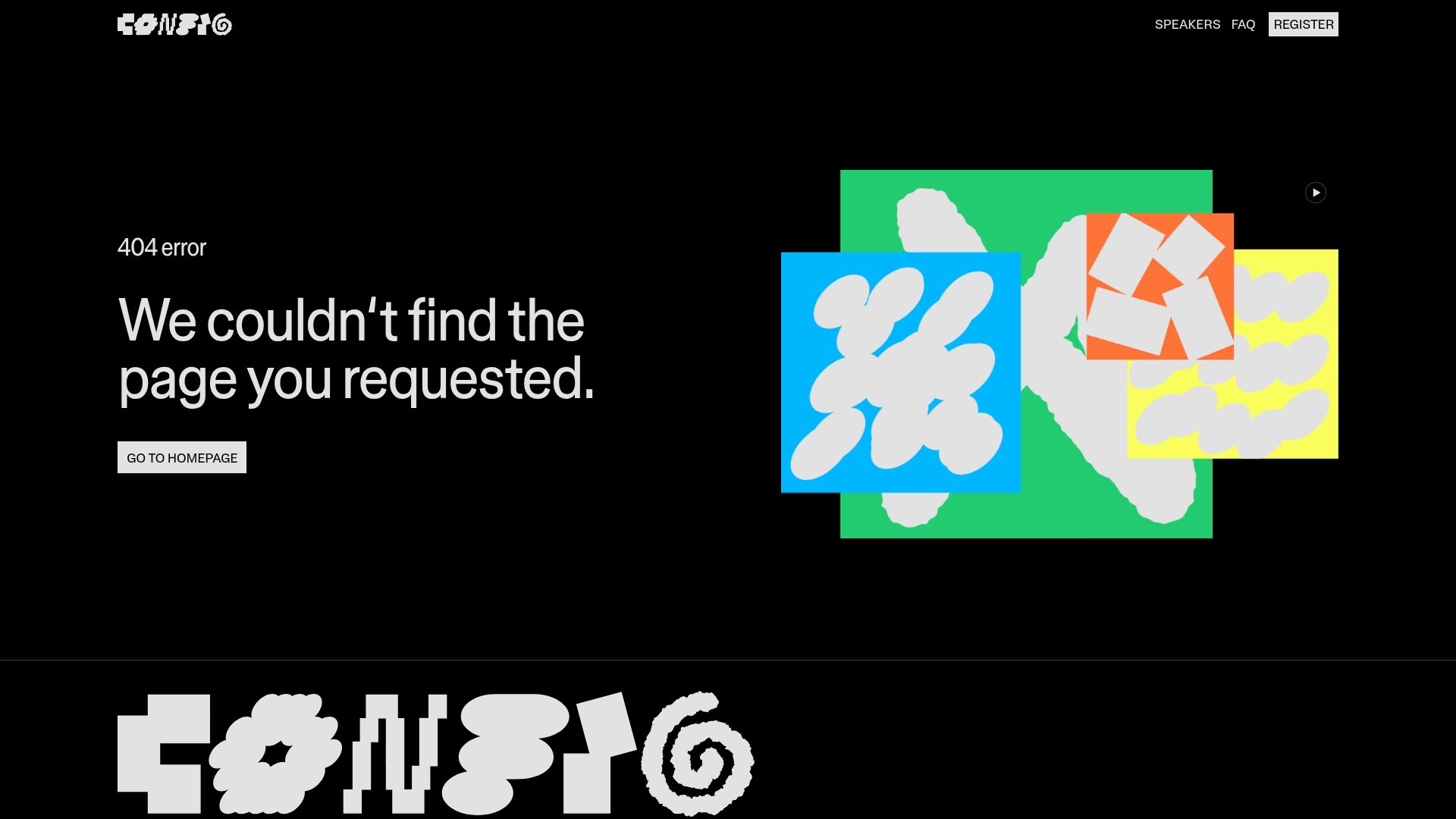
Figma Config 404 Error Page
A high-contrast dark mode error page featuring a bold typographic layout, a video-based hero graphic, and a sticky navigation bar with a custom-styled 'Register' button.
Overview
This 404 error page from Figma’s Config 2022 event is a masterclass in high-impact, minimalist branding for developers and designers. It demonstrates how to turn a dead-end user experience into a memorable brand moment using bold typography and dynamic, abstract motion graphics. It is an excellent reference for high-contrast dark mode layouts and playful, experimental navigation headers.
Design System
- Color Palette & Visual Hierarchy: The design uses a deep
#000000black background to provide maximum contrast for white text and a vibrant secondary palette of neon green, sky blue, and bright orange found in the hero artwork. The hierarchy is clear: the error message is the focus, supported by a single, high-contrast call-to-action button. - Typography: The system relies on a bold, sans-serif typeface (Inter/Helvetica style) with tight letter spacing. Large heading sizes are used for the error description, while a smaller, all-caps weight is reserved for navigation and specific labels like "404 error" to create structural distinction.
- Page Structure: The layout is split into a two-column hero section. The left column contains the textual information and navigation (Breadcrumb-style label, Heading, CTA), while the right column houses a decorative video-based graphic. A footer features a massive, experimental "CONFIG" wordmark made of distorted characters.
- Reusable Components:
- Sticky Header: A sleek top bar with text-based links and a framed 'Register' button.
- Secondary Button: The "Go to homepage" button features a clean, white-boxed background with black text, typical of high-end design tool aesthetics.
- Hero Graphic: An embedded Vimeo player masked within abstract shapes, which can be reused for any decorative video background.
- Implementation Clues: The HTML reveals a React-based structure (
#react-root) and usesdata-color-scheme="black"attributes to manage the dark mode styling globally. The complex wordmark at the bottom is an image asset (.png), optimized for high-density displays.
Use Cases
- Who should clone this: Creative agencies, design-led startups, and event organizers looking for a modern, "tool-brand" aesthetic that feels professional yet edgy.
- What products can remix it: Portfolio sites, developer documentation landing pages, and SaaS dashboards can adapt this layout for empty states or error pages.
- Practical Remix Directions:
- Swap the abstract geometric video for a product demo clip to turn the 404 into a marketing touchpoint.
- Adapt the "CONFIG" footer into a custom marquee or a decorative scroll-triggered element.
- Replace the high-contrast white boxes with brand-specific primary colors to align with a different design system.
- Suggested Clone Scope: A quick section clone of the 2-column hero is highly effective for any landing page redirect. The header is also a versatile component for minimal navigation needs.
Related Inspirations
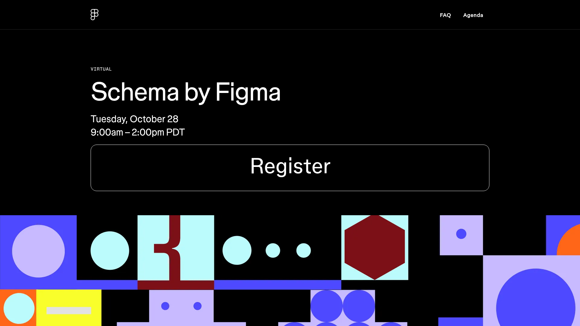
Schema by Figma Event Landing Page
A dark-themed virtual event landing page featuring a minimalist header, high-contrast typography, and a geometric abstract footer design.
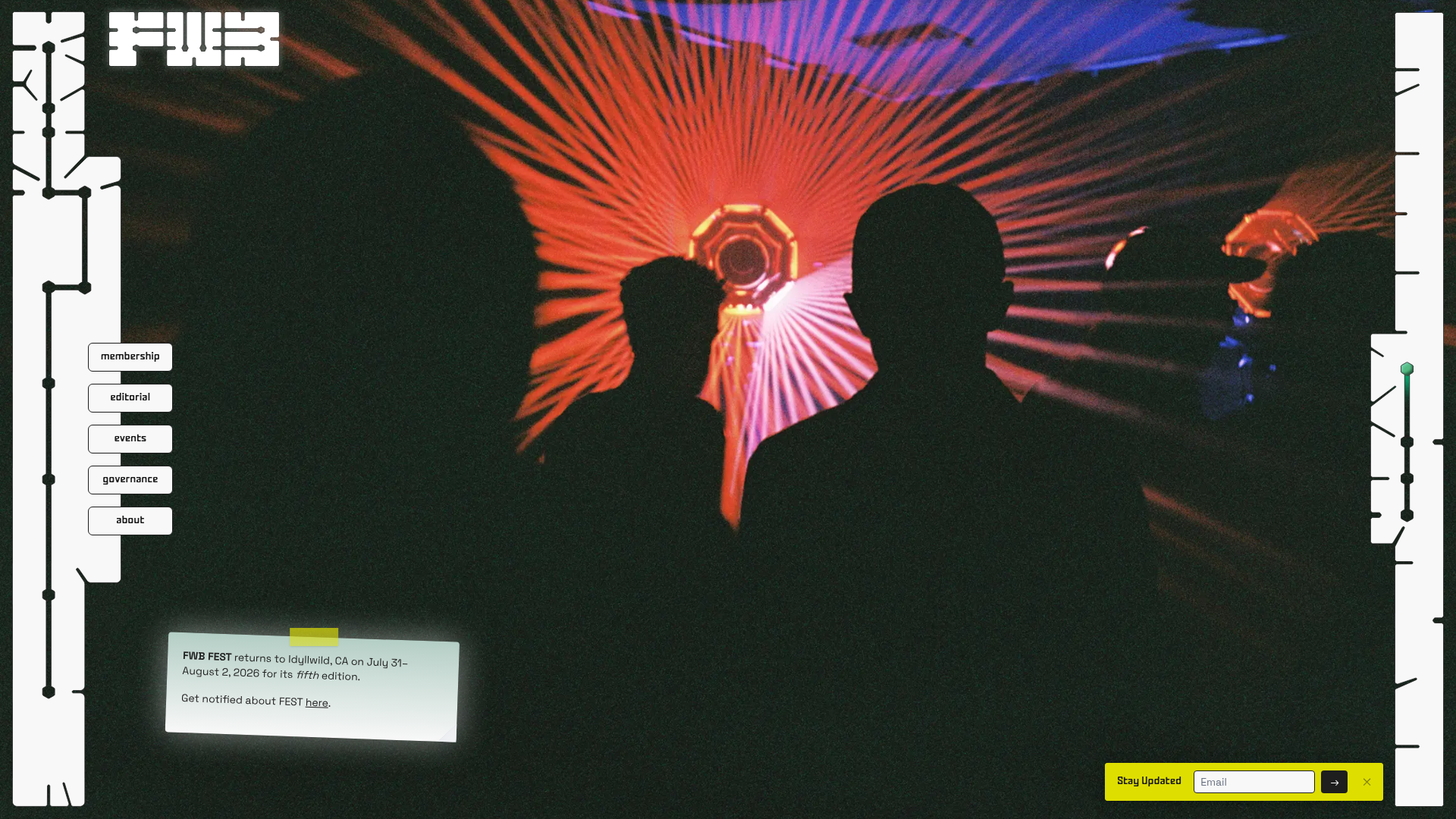
Friends with Benefits Community Portal
A creative community landing page featuring an immersive full-screen video background, custom geometric framing, and floating UI navigation elements for a unique digital identity.
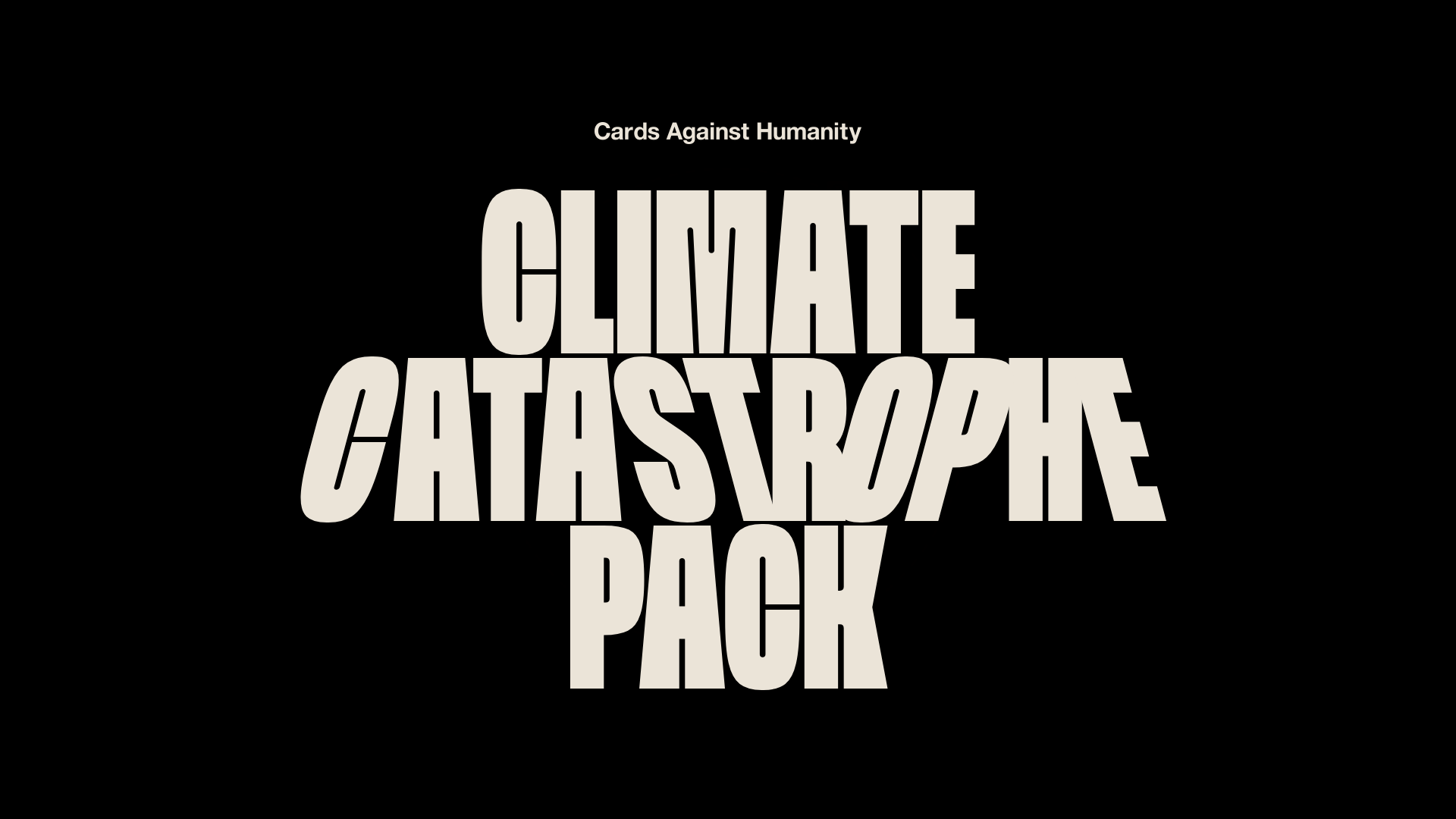
Cards Against Humanity Climate Landing
A high-impact single-page layout featuring a distorted typography hero, parallax scroll animations, interactive Zip code discount logic, and a classic iconography-based FAQ section.
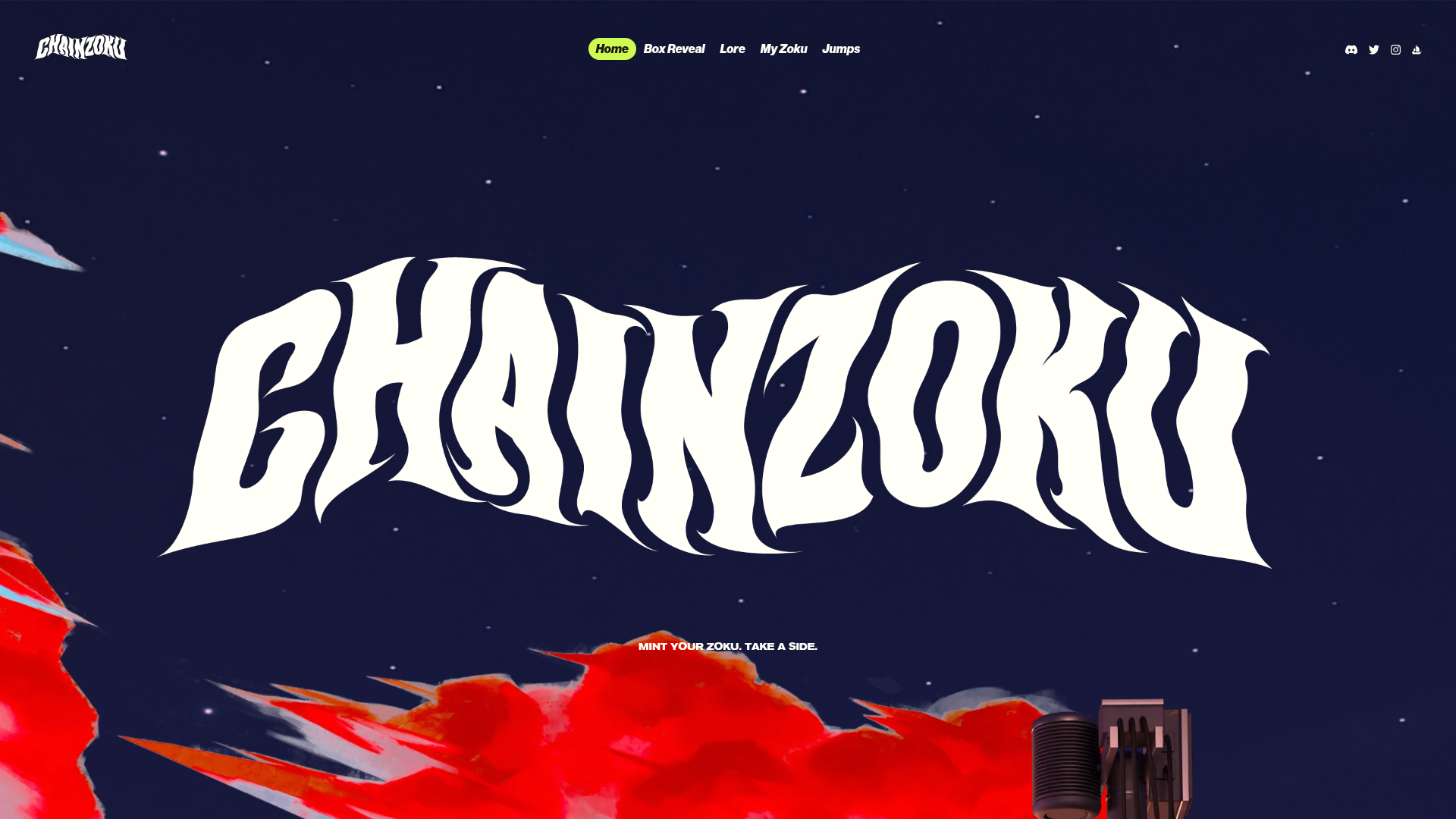
Chainzoku Gaming and NFT Landing Page
A high-impact landing page featuring a wobbly marquee hero logo, parallax cloud layers, sticky background-reveal sections, and a horizontal character faction switcher.
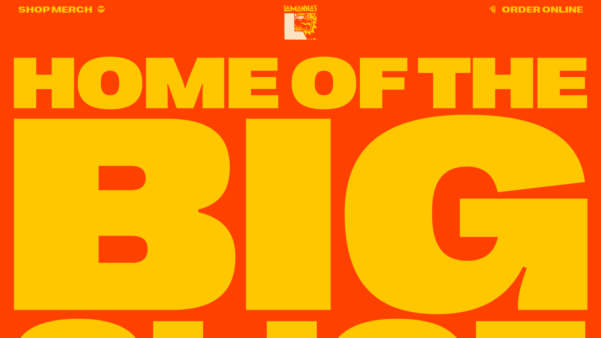
Lamanna's Bakery Vibrant Landing Page
A bold, high-contrast Italian bakery site featuring massive typography, parallax floating elements, marquee banners, and a flickity-powered product carousel.
Hourly App Landing Page
A minimalist iOS app landing page featuring a bold typographic hero, responsive grid-based screenshot displays, and custom SVG illustrations with CSS animations.
