Josephmark Portfolio Agency Site
A dark-themed agency site with a minimalist typography-heavy hero, high-impact video reels, a responsive two-column work grid, and a horizontal news carousel.
Overview
This portfolio design for Josephmark, a digital technology studio, uses a bold "maximalist minimalism" approach, pairing large-scale typography with high-energy video content. It is an excellent reference for creators needing to balance professional authority with creative edge through sophisticated use of space and motion.
Design System
- Color Palette & Visual Hierarchy: The site primarily uses a high-contrast dark theme (pure black
#000000background with white text) to allow vibrant imagery and video to pop. It strategically breaks into light-themed sections (white background for partners, beige for news) to signal content shifts and prevent visual fatigue. - Typography System: The design leans heavily on a modern sans-serif. Headers are set with very tight tracking (
tracking-[-0.035em]) and a fluid scaling system (usingcalcin CSS) that transitions from roughly 2.25rem on mobile to massive 4xl sizes on desktop. This creates a punchy, editorial feel. - Page Structure & Section Flow:
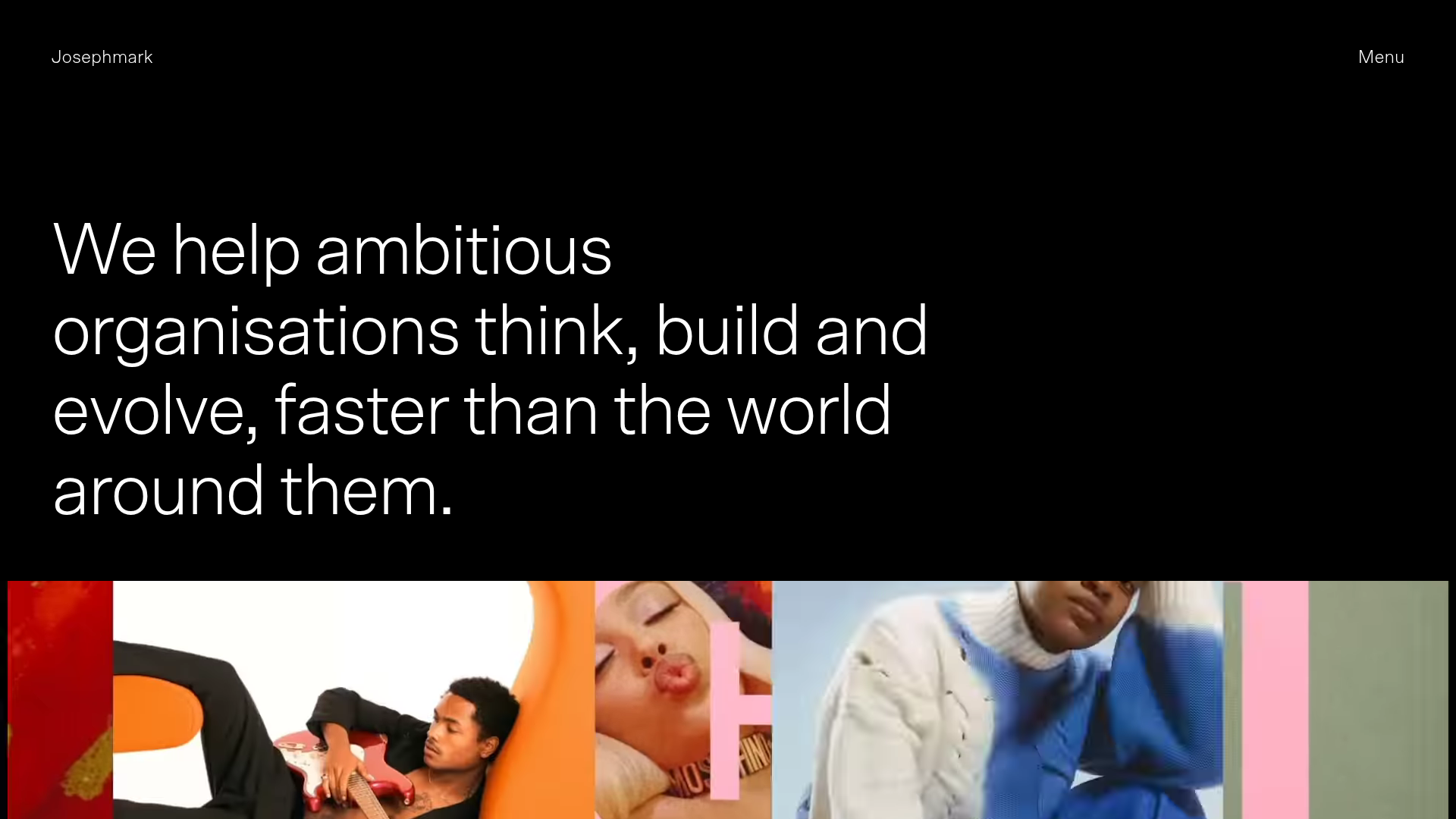
- Hero: Minimalist text-only headline.
- Impact Reel: Full-bleed auto-playing background video.
- Value Proposition: Large-scale text block with a single primary CTA.
- Work Grid: A responsive two-column grid featuring large image thumbnails and subtle hover transitions.
- Social Proof: A simple grid of logo icons on a white background.
- Narrative/News: Horizontal card layouts for articles and achievements.
- Reusable Components:
- Pill Buttons: Rounded-full, light-bordered buttons that invert colors on hover (white-to-black or black-to-white).
- Work Cards: Simple vertical stack of
img,h2(client),h3(description), and category tags. - Logo Grid: A clean responsive grid using
object-containfor diverse logo aspect ratios.
- Interaction & Motion: The site uses "bouncy" transition timing (
ease-bouncy) and opacity fades triggered by scroll entry. Hover states on images utilize a slight opacity shift (peer-hover:opacity-80) rather than distracting scale effects. - Implementation Clues: Built with Tailwind CSS (noted by utility classes like
pt-[240px],ease-bouncy, andgrid-cols-12). It utilizes a 12-column grid system for precise layout control on large screens.
Use Cases
- Creative Agencies & Studios: Perfect for showcasing high-fidelity digital production work where video reels are central to the pitch.
- Fashion & Lifestyle Brands: The editorial typography and minimalist color palette suit brands that want a high-end, "lookbook" digital presence.
- Remix Directions:
- Typography Swap: Swap the clean sans-serif for a high-contrast serif to immediately shift the vibe from "Digital Studio" to "Luxury Magazine."
- Color Inversion: Turn the black-to-white sections into white-to-black for a lighter, more approachable corporate feel.
- Sectional Clone: Builders can quickly clone just the Hero and Video Reel sections to add a high-impact intro to any existing site.
- Recommended Scope: A full-page clone is ideal for agencies, but the individual Work Article components are highly reusable for any site requiring a clean image-led grid.
Related Inspirations

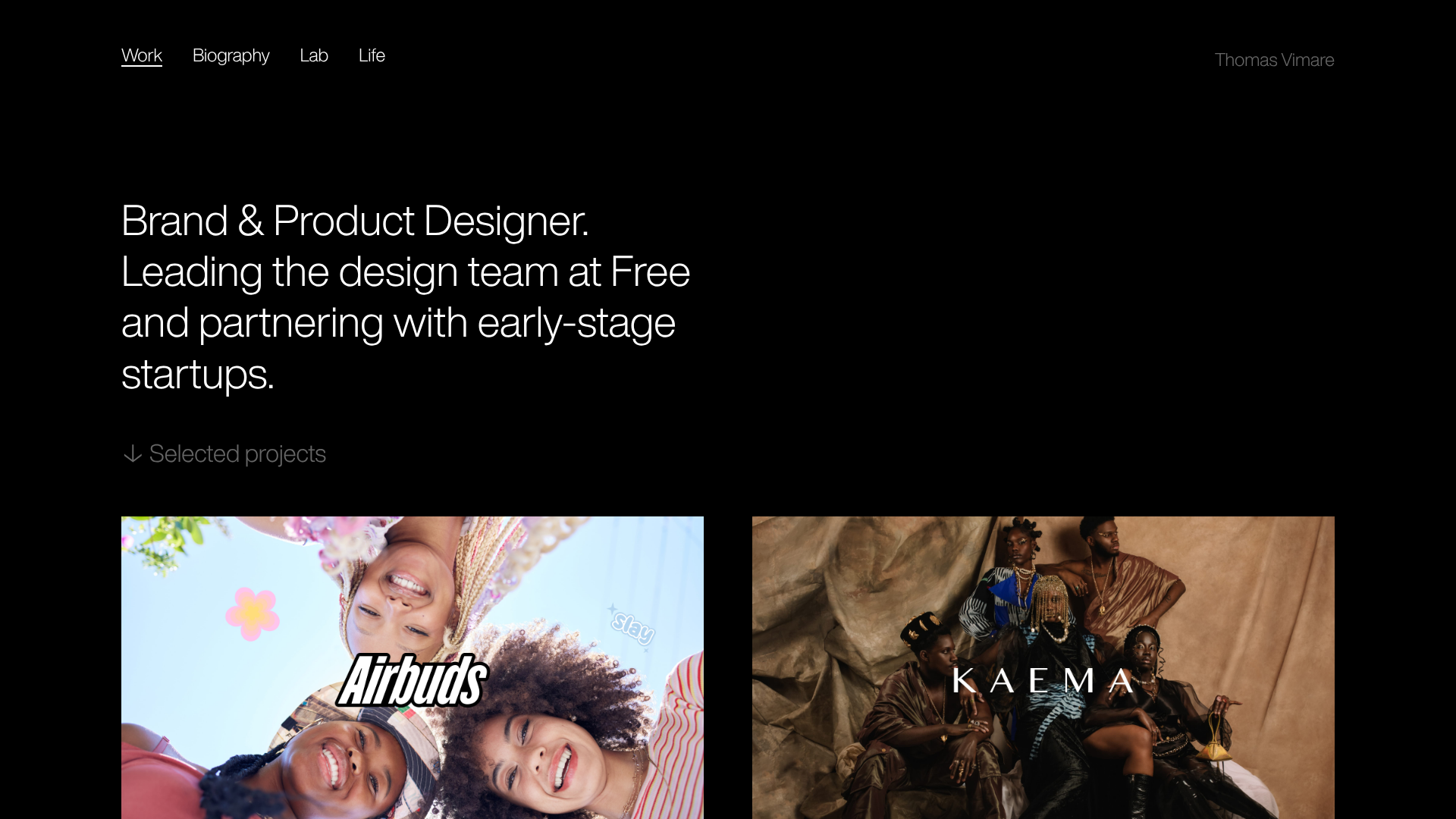
Niklas Rosén Designer Portfolio Index
A minimalist, responsive grid-based portfolio index featuring a clean 16-column layout, typographic list components, and a custom dark mode transition.

Clase Agency Branding Portfolio
A minimalist design agency portfolio featuring a typographic hero section, full-width image articles, sticky title bars, and integrated scrolling text marquees for a clean editorial layout.

Lundqvist & Dallyn Studio Portfolio
Minimalist design studio portfolio featuring a custom video loader, world clock navigation, and a fluid masonry-style grid for high-quality photography and type design showcases.
Minimalist Dark Designer Portfolio Grid
A clean, dark-themed portfolio featuring a bold typography hero section and a staggered two-column image grid with subtle entrance animations.

AcolorBright Design Agency Portfolio
Minimalist bento-style portfolio layout featuring numerical section headers, horizontally scrolling project teasers, and a clean grayscale client logo grid.
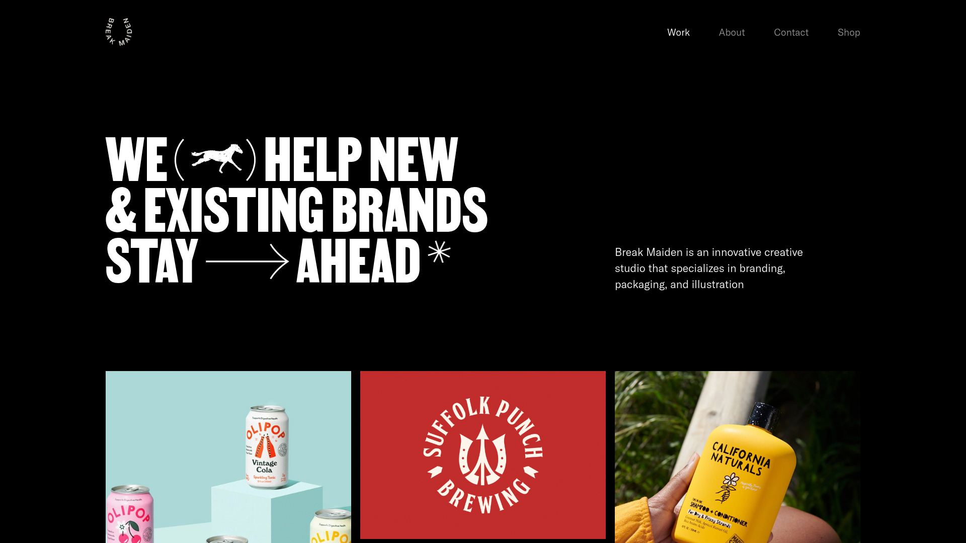
Break Maiden Agency Portfolio Hero
A high-impact dark mode hero section featuring oversized typography with inline GIF icons and a responsive grid for display-heavy case studies.
