Roberta’s Pizza Restaurant Landing Page
A high-energy food service layout featuring a video background hero, interactive CTA buttons with hover effects, scrolling marquees, and a testimonial slider.
Overview
This high-energy restaurant landing page uses a bold, "grunge-luxe" aesthetic to drive high-intent actions like delivery, bookings, and catering. It is a strong reference for developers looking to implement a media-rich, fast-paced brand identity using a combination of video heroes, scrolling marquees, and interactive layout cards.
Design System
- Color Palette & Visual Hierarchy: The site uses a high-contrast palette of solid Red (#FF0000), Smoke/Off-white, and deep Black. The red acts as a powerful primary brand color used for backgrounds and primary buttons to create urgency, while a dotted and checkered pattern divisor adds a retro, tactile feel.
- Typography: The system relies on bold, all-caps sans-serif headers (evident in the
heading-style-h1andh2classes) which convey authority and energy. Body text uses a clean, legible sans-serif with generous line-height to balance the dense visual environment. - Page Structure: The flow transitions from a video-driven hero section to a modular grid of services. Sequence: Video Hero -> About/Intro -> Text Marquee -> Service Highlights (Catering/Delivery) -> Testimonial Slider -> Events/Private Dining -> Product Shop -> Social Marquee.
- Reusable Components:
- Interactive Buttons: The
button-circlecomponent features a sophisticated hover effect where a circle expands behind the text. - Flip Cards: The "What’s On" section uses
whatson-card_flip-wrapperfor information disclosure on interaction. - Scrolled Marquees: Two types of marquees are present—a text-based static version (
fs-marquee-instance="text-marquee") and a CMS-driven image version for Instagram content.
- Interactive Buttons: The
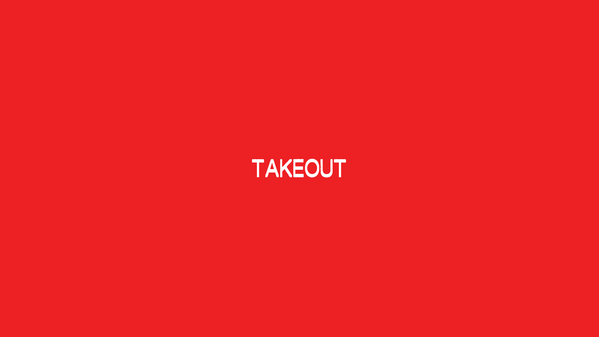
- Motion Patterns: The site utilizes the Lenis library for smooth scrolling. GSAP is used for a unique text-based preloader (Takeout, Delivery, Frozen) and cascade reveal animations on headers.
- Implementation Clues: Built with Webflow, the site uses the Finsweet (
fs-) attributes for specialized functionality like the marquee and slider, and Splide.js for carousels.
Use Cases
- Who should clone this: Small to mid-sized food and beverage brands that need a high-impact, single-page experience to manage multiple revenue streams (merch, catering, bookings, delivery).
- Remix Directions:
- Adapt Info Architecture: The "What’s On" flip-cards can be remixed into a menu preview or a staff bio section.
- Visual Swap: Replace the red/checkerboard palette with a more muted, organic palette (e.g., forest green and beige) to adapt the high-energy layout for a farm-to-table brand without changing the structural logic.
- Suggested Scope: Developers should prioritize cloning the Hero Section for the video-toggle functionality and the Service Layout Cards (
layout-card) for their effective use of background images and text overlays. The full-page clone is best for brands with a diverse range of sub-services.
Related Inspirations

Good Glyphs Font Showcase Landing Page
A single-page layout featuring an interactive type tester, donation form with custom amount logic, and a contributor gallery using swiper-based glyph previews.
Moving Parts SwiftUI Component Library
A high-performance landing page featuring a interactive code comparison toggle, animated mobile UI previews, and a clean minimalist aesthetic for developer tools.
Stripe Modern SaaS Landing Page
A high-conversion landing page featuring a complex mesh-gradient hero, sticky navigation, and a horizontal logo wall for brand social proof.

GoCardless Payments Platform Landing Page
A dark-themed fintech landing page featuring a split-screen video hero, bento-style feature cards, a horizontal logo slider, and step-by-step accordion guides.
Hudson Gavin Martin Corporate Law Landing
A professional service homepage featuring a minimalist grid-based hero, color-themed navigation blocks, and a bento-style insights feed with subtle hover interactions.

Special Offer Studio Landing Page
Minimalist full-screen landing page featuring a centered logo, bold flat-color background, and accessible skip link structure using Nuxt.js and Tailwind CSS.
