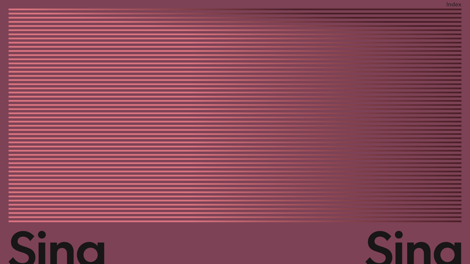
Sing-Sing Creative Portfolio Landing Page
A minimalist studio portfolio featuring high-contrast typography, a horizontal line-grid hero section, and responsive image components with custom cursor interactions.
Overview
Sing-Sing is a minimalist creative studio portfolio identified by its unique linear hero graphic and bold, oversized typography. It serves as an excellent reference for high-end boutique agencies or artists looking to create a site that emphasizes visual rhythm and a distinctive "digital-physical" aesthetic through its grid-like textures.
Design System
- Color Palette & Visual Hierarchy: The site uses a muted, sophisticated dusty rose/burgundy base (
#7D4C56approx.) contrasted with deep charcoal or black text. The hierarchy is driven by extreme scale—oversized "Sing" headers at the bottom anchors the hero, while the line-grid occupies the majority of the visual weight. - Typography System: The design utilizes a clean, geometric sans-serif (similar to ITC Avant Garde or Futura). Scale is the primary emphasis tool, with the main headers appearing near the page edge at a massive point size, and body text using standard sizes with ample line-height for readability.
- Page Structure: The layout follows a classic single-column focus with a massive hero section featuring a horizontal line-grid, followed by a responsive image-based portfolio list that includes rich captions (
figcaption). - Reusable Components:
- The Line-Grid Hero: A series of horizontal rules that create texture and depth without using heavy assets.
- Responsive Image Figure: A robust
<picture>element implementation that uses source sets and aspect-ratio maintainers to ensure images load efficiently at different viewport sizes. - Custom Cursor: The HTML contains a
custom-cursordiv with dedicated loader and element states, perfect for cloning a bespoke navigation experience.
- Interaction & Motion: The UI includes a transform-based scroll container (
translate3d) and custom cursors that indicate interactivity. The design suggests a liquid, smooth-scrolling experience where content translates vertically behind a fixed or semi-fixed frame. - Implementation Clues: The site is built with a custom-depth wrapper (
#wrap) and a main content area that handles offset margins. It uses standard figure/figcaption tags for SEO-friendly image metadata.
Use Cases
- Who should clone this: Independent designers, production houses, and creative directors who want a portfolio that feels curated and gallery-like rather than corporate.
- Effective Remixes: This pattern works well for a photography gallery where the hero grid represents film grain or light shutters, or for a motion graphics studio where the horizontal lines suggest speed or timeline scrubbing.
- Practical Directions: Swap the burgundy background for a high-contrast monochromatic black/white for a more brutalist look; replace the hero lines with a vertical grid for a different structural feel; reuse the
figcaptionlayout for a clean, minimal blog layout. - Clone Scope: A full-page clone is recommended to maintain the specific relationship between the massive typography and the generous white space, but cloning just the CSS line-grid hero is highly effective for a quick, low-asset landing page refresh.
Related Inspirations
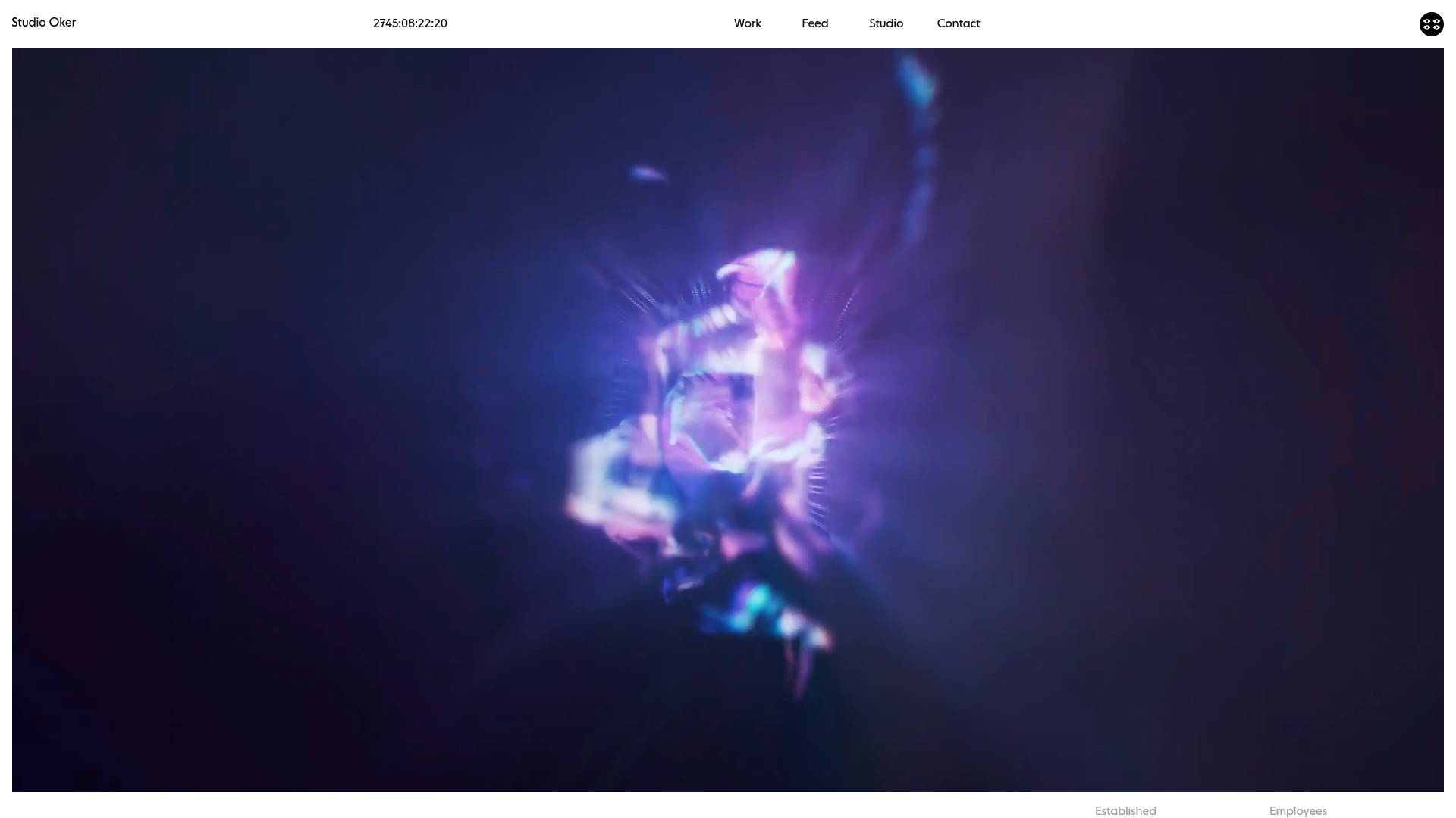
Studio Oker Creative Portfolio Landing
A minimalist studio landing page featuring an immersive full-screen video hero, horizontal glide carousel for project feeds, and a dynamic masonry project grid.
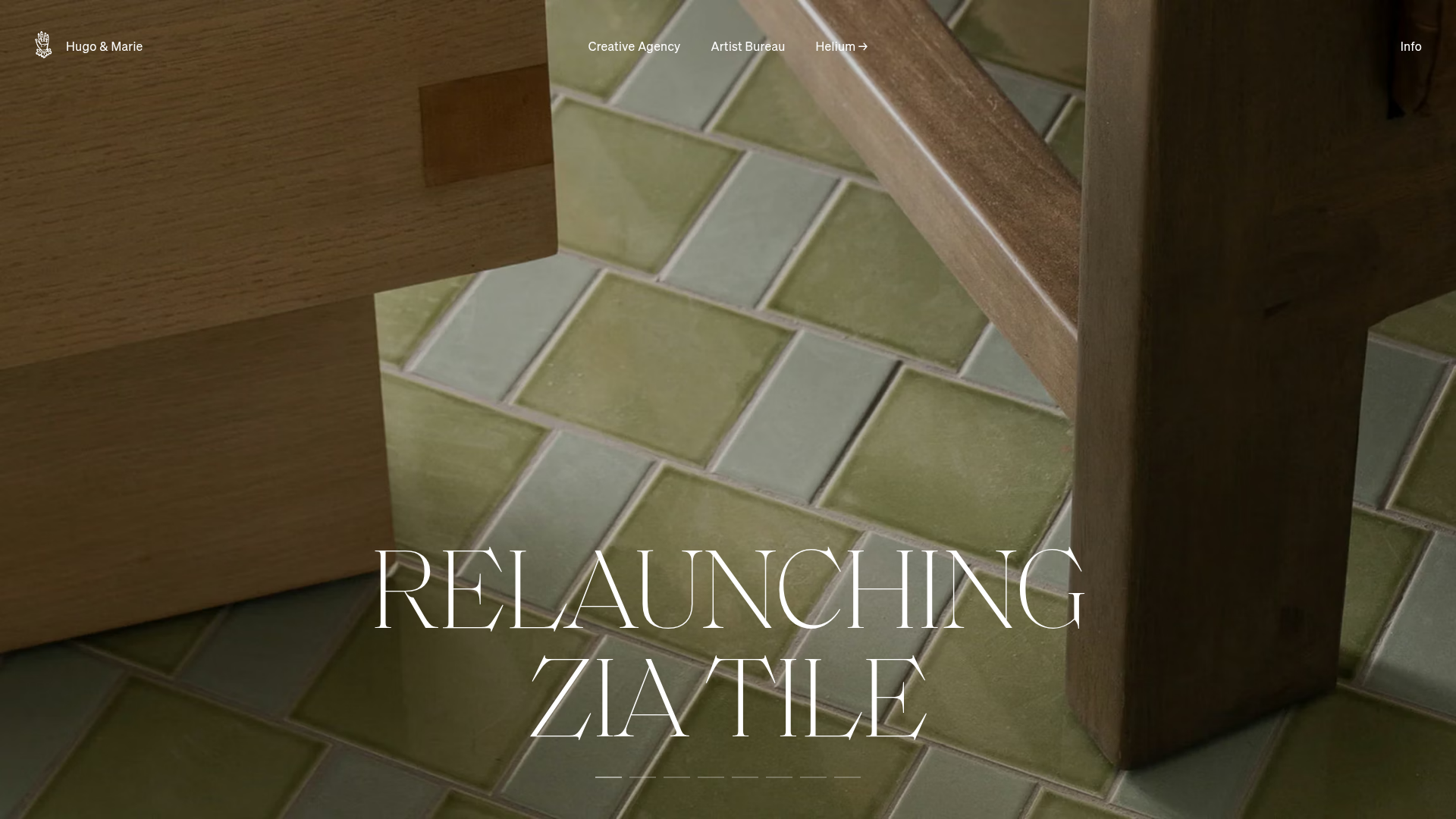
Hugo & Marie Agency Landing Page
Features a full-screen auto-playing media carousel with elegant serif typography overlays and a cleanly structured three-column services layout.
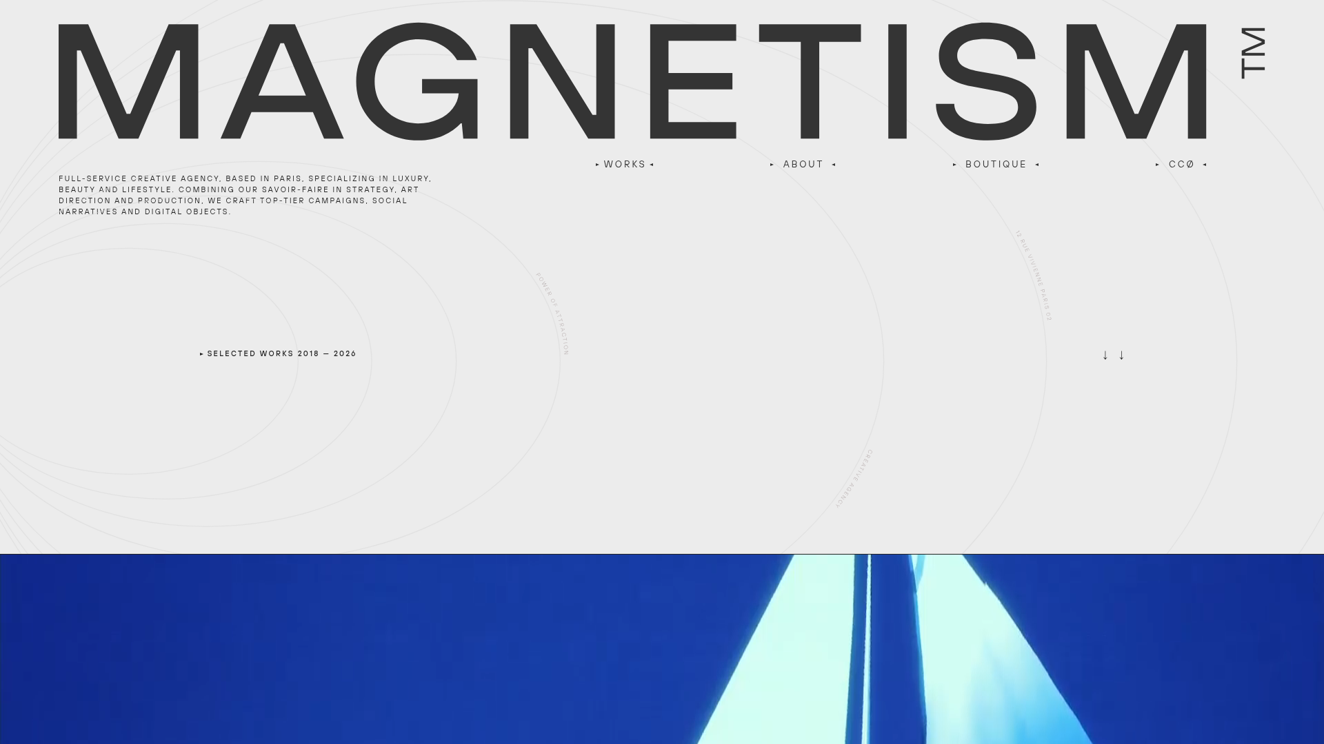
Magnetism High-End Portfolio Landing Page
A luxury-focused creative agency layout featuring a oversized typographic hero, interactive project grid with video hovers, and a sleek concentric-ring background animation.
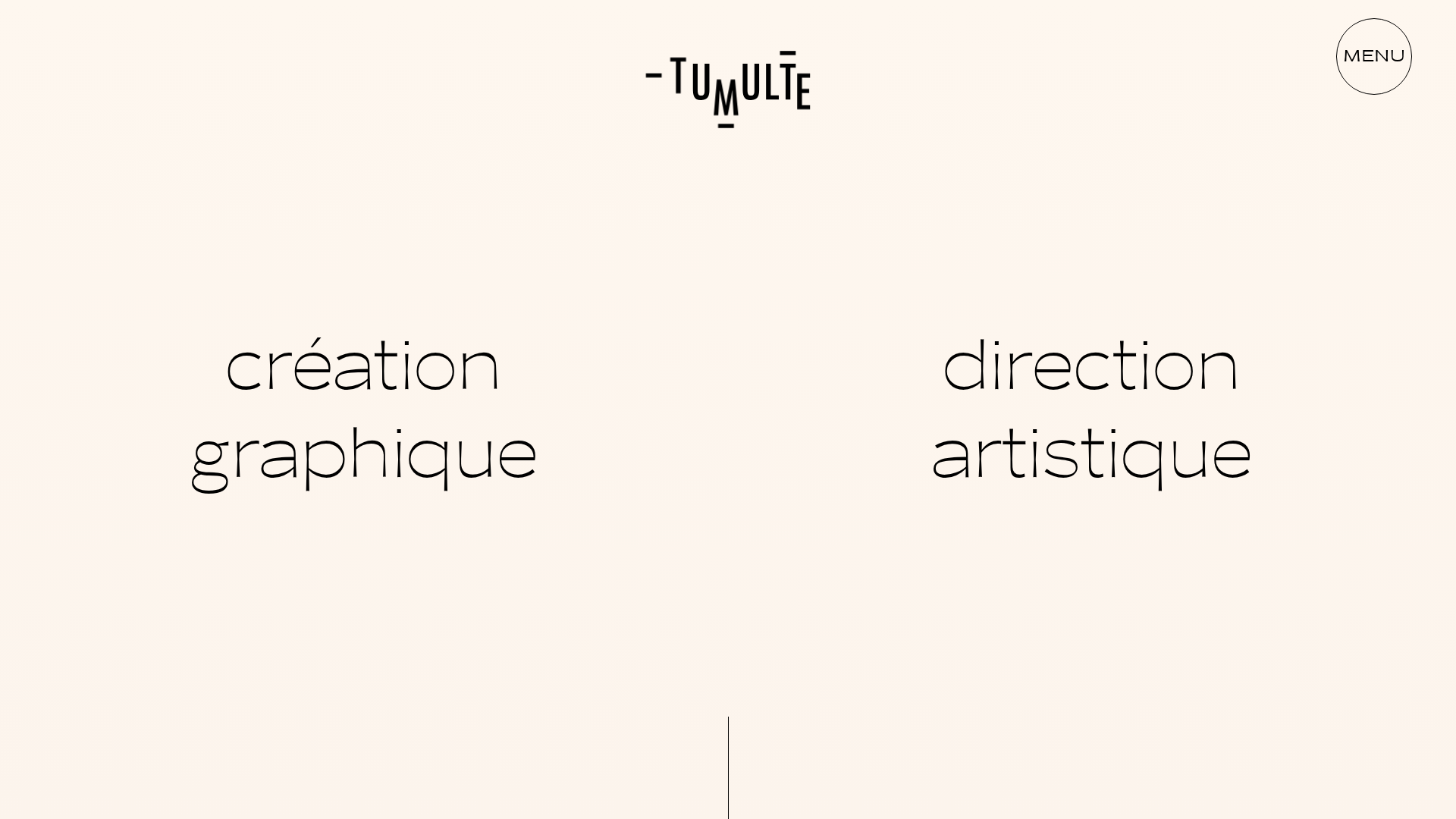
Studio Tumulte Minimalist Portfolio
A design studio portfolio featuring a split-hero landing page, custom cursor interactions, and a non-linear masonry collage layout for creative case studies.
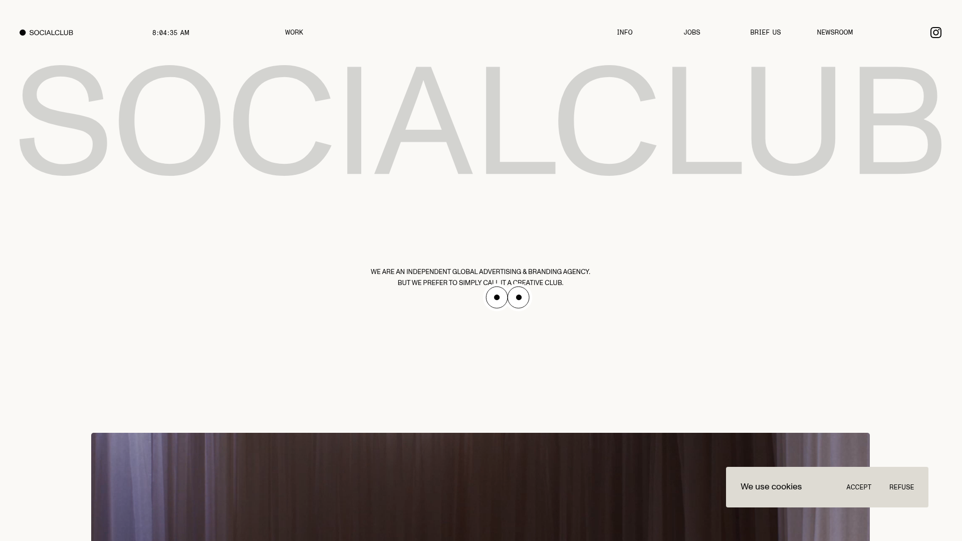
SocialClub Creative Agency Portfolio Landing
A minimalist advertising agency site featuring a large-scale typographic hero header, custom interactive cursor movements, and an asymmetrical grid of video project cards.
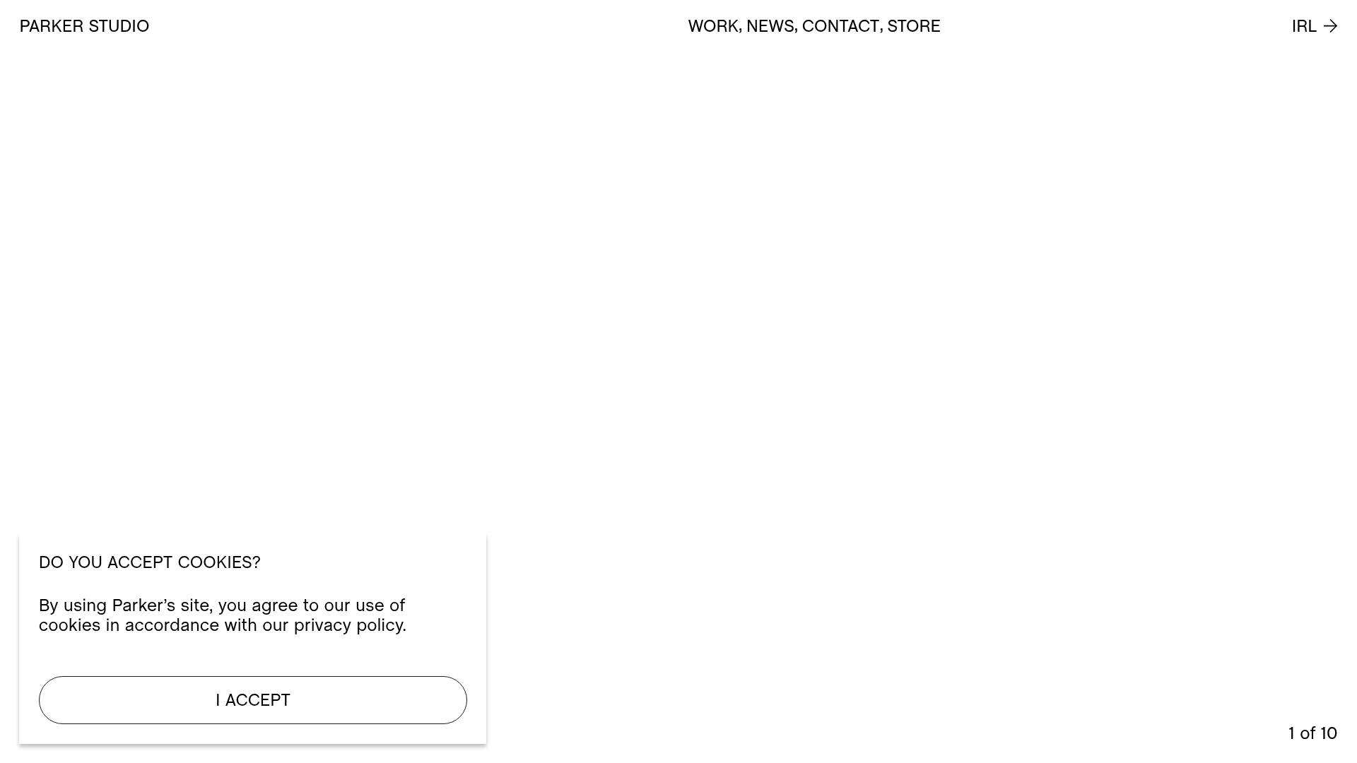
Parker Studio Minimalist Design Portfolio
A high-end creative portfolio featuring a full-screen video slideshow hero, masonry-style project grid, draggable news carousel, and modular layout with clean typography.
