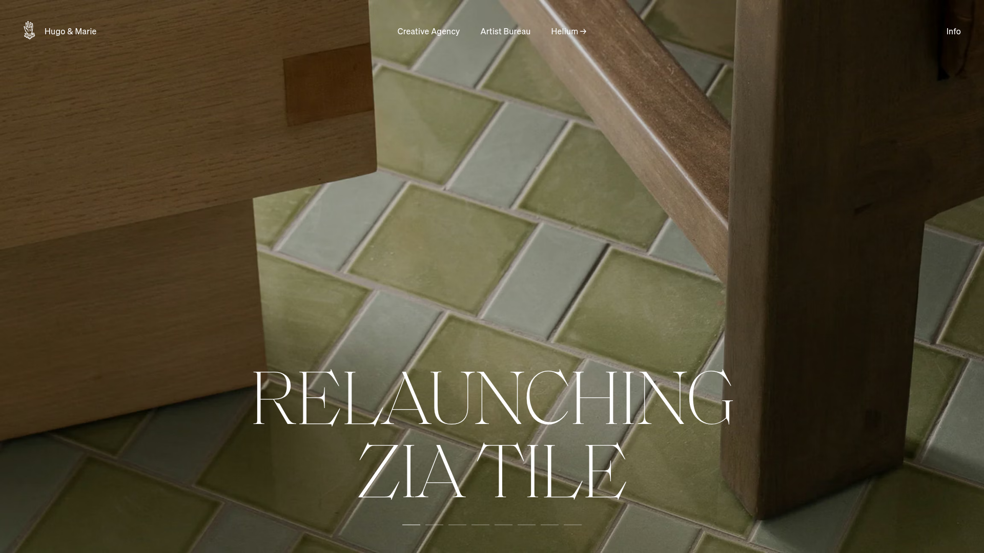
Hugo & Marie Agency Landing Page
Features a full-screen auto-playing media carousel with elegant serif typography overlays and a cleanly structured three-column services layout.
Overview
Hugo & Marie’s agency landing page is a masterclass in high-end minimalism, centered around a full-bleed, auto-playing media carousel. It serves as a sophisticated reference for builders looking to showcase visual portfolios where the imagery and motion drive the narrative, supported by an understated navigation system.
Design System
- Color Palette & Visual Hierarchy: The design uses a sophisticated, monochromatic-leaning neutral palette (white, black, and light greys) to ensure the vibrant project media remains the focal point. The layout uses high-contrast white text overlays on darkened or rich-media backgrounds to establish an immediate hierarchy of information.
- Typography: The typography system is defined by a dichotomy of styles. Project titles use a large, elegant serif typeface with high stroke contrast, while the functional navigation and body text utilize a clean, sans-serif font (likely a custom variation of a grotesque face) in small caps or lowercase for a modern, editorial feel.
- Page Structure: The site follows a vertical progression:
- A persistent, transparent Site Header with logo and secondary nav items.
- A dominant Hero Carousel (
mr-featured-gallery) with full-screen media slides. - A Three-Column Service Layout (
text-3-columns) for descriptive text and links. - A Filtered Assets Grid with custom toggle switches for browsing specific artists or project types.
- Reusable Components:
mr-featured-gallery: A slider component that handles both video (.mp4) and responsive<picture>elements.- Dot Navigation: Minimalist horizontal bar indicators at the bottom of the hero to show slide progress.
- 3-Column Modules: Clean blocks with title, "Explore" arrow links, and description text.
- Interaction & Motion: The hero slider features automatic transitions every 5000ms. Hovering over links in the three-column section triggers subtle arrow animations. The header background color is programmed to transition as the user scrolls, moving from transparent to solid white (
js-site-header__background). - Responsive Behavior: The HTML reveals five distinct caption spans for various breakpoints (mobile, tablet portrait, tablet landscape, desktop small, and desktop large), ensuring typography scales perfectly across devices.
Use Cases
- Who should clone this: Creative agencies, fashion brands, high-end architecture firms, and independent artists who need a "portfolio-first" digital presence.
- Remixing for different products:
- E-commerce: Replace the project slides with seasonal lookbooks where each slide links to a specific collection.
- Product Launch: Use the full-screen video background to showcase product functionality with the large serif text for value propositions.
- Practical Remix Directions: Swap the high-contrast serif for a bold, chunky sans-serif to shift from "elegant/luxury" to "modern/tech." Adapt the three-column grid at the bottom for "Features," "Pricing," and "About" modules.
- Suggested Clone Scope: Start with the
mr-featured-gallerycomponent for an immediate impact, or adopt the full-page structure (Hero -> 3-Column -> Filtered Grid) for a complete agency website template.
Related Inspirations

Christopher Doyle Agency Portfolio Layout
A minimalist, typography-led portfolio featuring a wide-margin grid system, smooth fade-in animations, and simple image-focused project cards.

Clase Agency Branding Portfolio
A minimalist design agency portfolio featuring a typographic hero section, full-width image articles, sticky title bars, and integrated scrolling text marquees for a clean editorial layout.
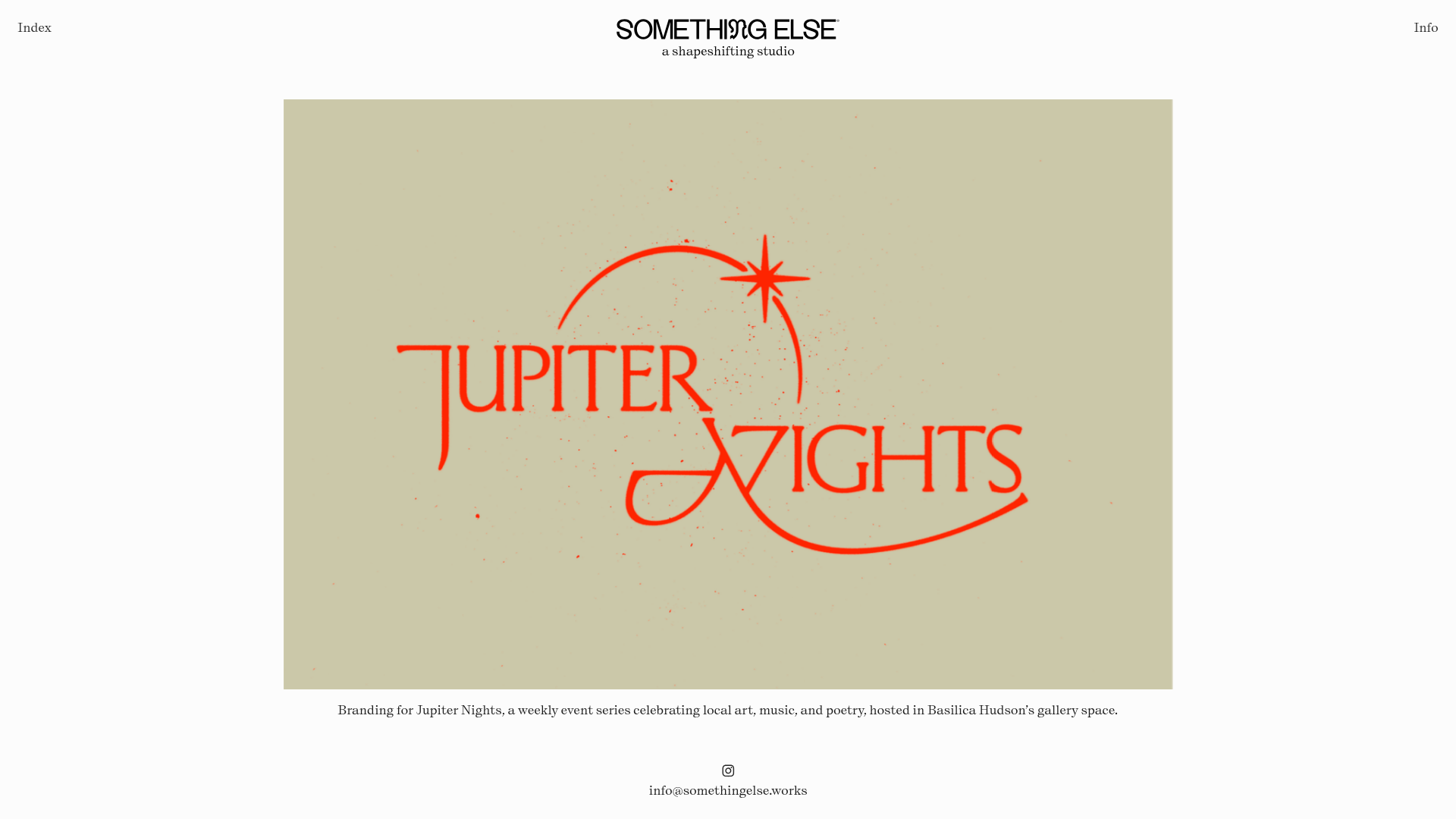
Something Else Portfolio Slideshow
A minimalist design studio portfolio featuring a full-width image and video slideshow with large-scale typography, sticky navigation, and centered captions.
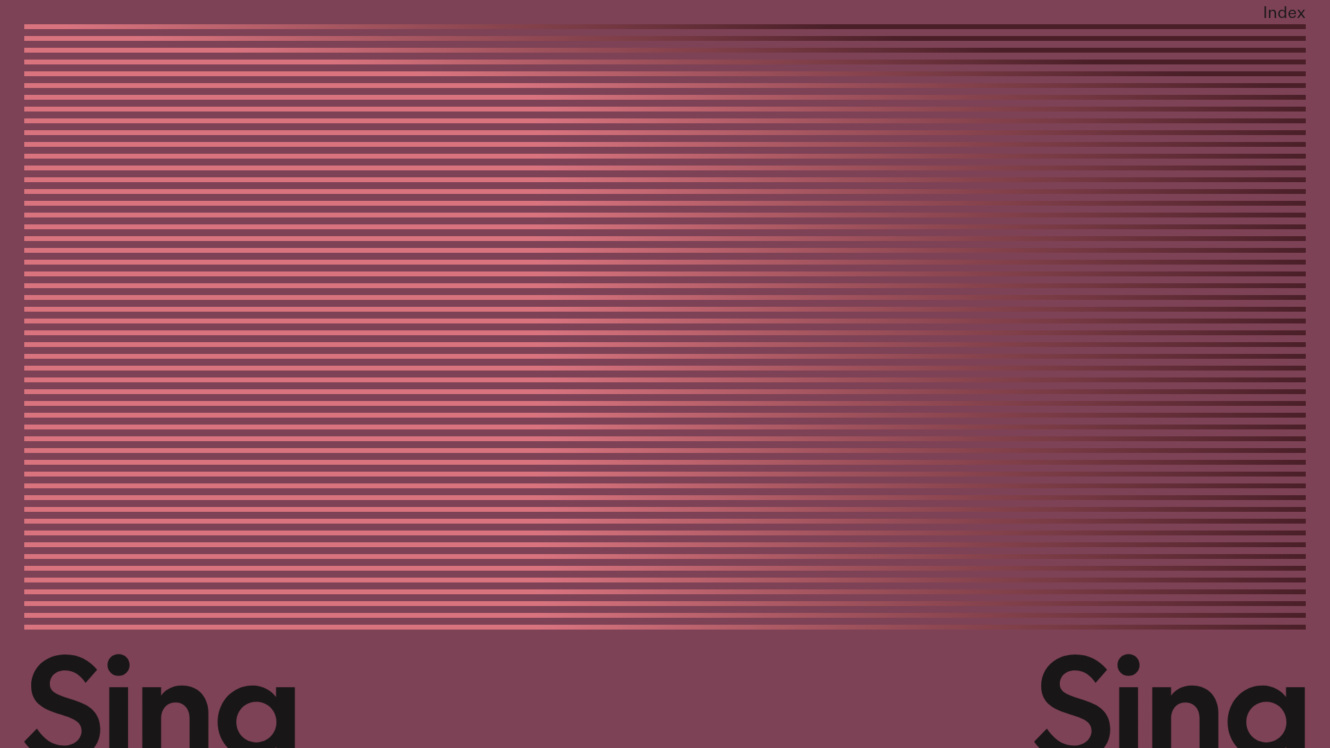
Sing-Sing Creative Portfolio Landing Page
A minimalist studio portfolio featuring high-contrast typography, a horizontal line-grid hero section, and responsive image components with custom cursor interactions.

Lundqvist & Dallyn Studio Portfolio
Minimalist design studio portfolio featuring a custom video loader, world clock navigation, and a fluid masonry-style grid for high-quality photography and type design showcases.

AcolorBright Design Agency Portfolio
Minimalist bento-style portfolio layout featuring numerical section headers, horizontally scrolling project teasers, and a clean grayscale client logo grid.
