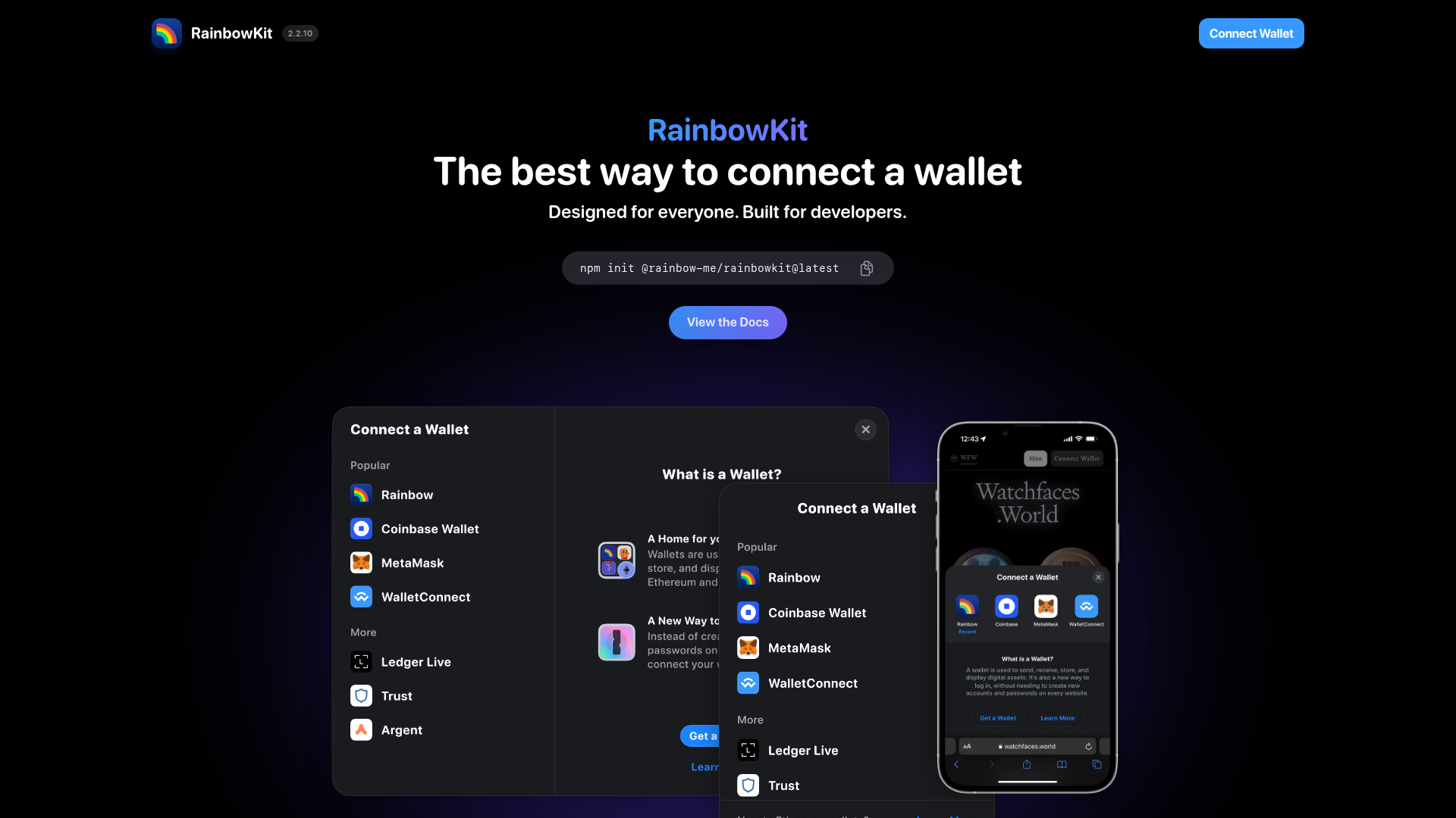
RainbowKit Web3 Developer Landing Page
A dark-themed developer tool landing page featuring a center-aligned hero, terminal command snippet, and clean modal UI components for wallet connection flows.
Overview
RainbowKit is a high-performance landing page designed for Web3 developer tools, characterized by its minimalist dark theme and focus on user conversion. It serves as an excellent clone reference for its seamless integration of developer-oriented technical snippets with high-fidelity UI mockups that demonstrate product functionality.
Design System
- Color Palette & Visual Hierarchy: The site uses a deep black background (#000000) with subtle radial gradients of blue and purple to create depth. Hierarchical focus is achieved through a vibrant 'Connect Wallet' blue for primary CTAs and a monochromatic terminal block for core technical actions.
- Typography: The design utilizes a clean, sans-serif typeface (likely a variant of SF Pro or Inter). The hero section features a large, bold 'H1' with strong weight contrast between the brand name and the accompanying value proposition.
- Page Structure: The layout follows a classic center-aligned funnel: a navigation header with a prominent CTA, followed by a hero section, an actionable CLI command, and a multi-layered preview of the UI components in desktop and mobile viewport sizes.
- Reusable Components:
- Terminal Snippet: A dark code block with a one-click copy icon, ideal for dev-tool adoption.
- Interactive Modals: Detailed list-based components for wallet selection, featuring high-quality iconography and nested navigation.
- Primary Buttons: High-contrast blue buttons with rounded corners and clear hover state indicators.
- Responsive Behavior: The design includes a specific mobile-safe mock within the visual showcase, indicating a transition from a side-by-side modal layout to a bottom-sheet mobile interaction.
- Implementation Clues: The HTML structure suggests a modern stack likely utilizing React and Tailwind CSS, focusing on atomic component architecture and responsive utility classes for layout management.
Use Cases
- Who should clone this pattern: Developers building SDKs, APIs, or open-source software libraries who need to bridge the gap between technical documentation and aesthetic appeal.
- Effective Remixes: Crypto wallets, dApp browsers, and SaaS platforms can remix this layout to showcase different subscription tiers or feature integrations within the modal component.
- Practical Remix Directions: Swap the terminal block for a search bar or email opt-in for non-technical products; adapt the 'Connect a Wallet' list into a 'Select a Platform' or 'Integrations' directory.
- Suggested Clone Scope: A quick section clone is recommended for the hero and CLI command area for immediate impact, while the layered UI preview is worth a full-page clone for projects needing to demonstrate complex multi-device workflows.
Related Inspirations
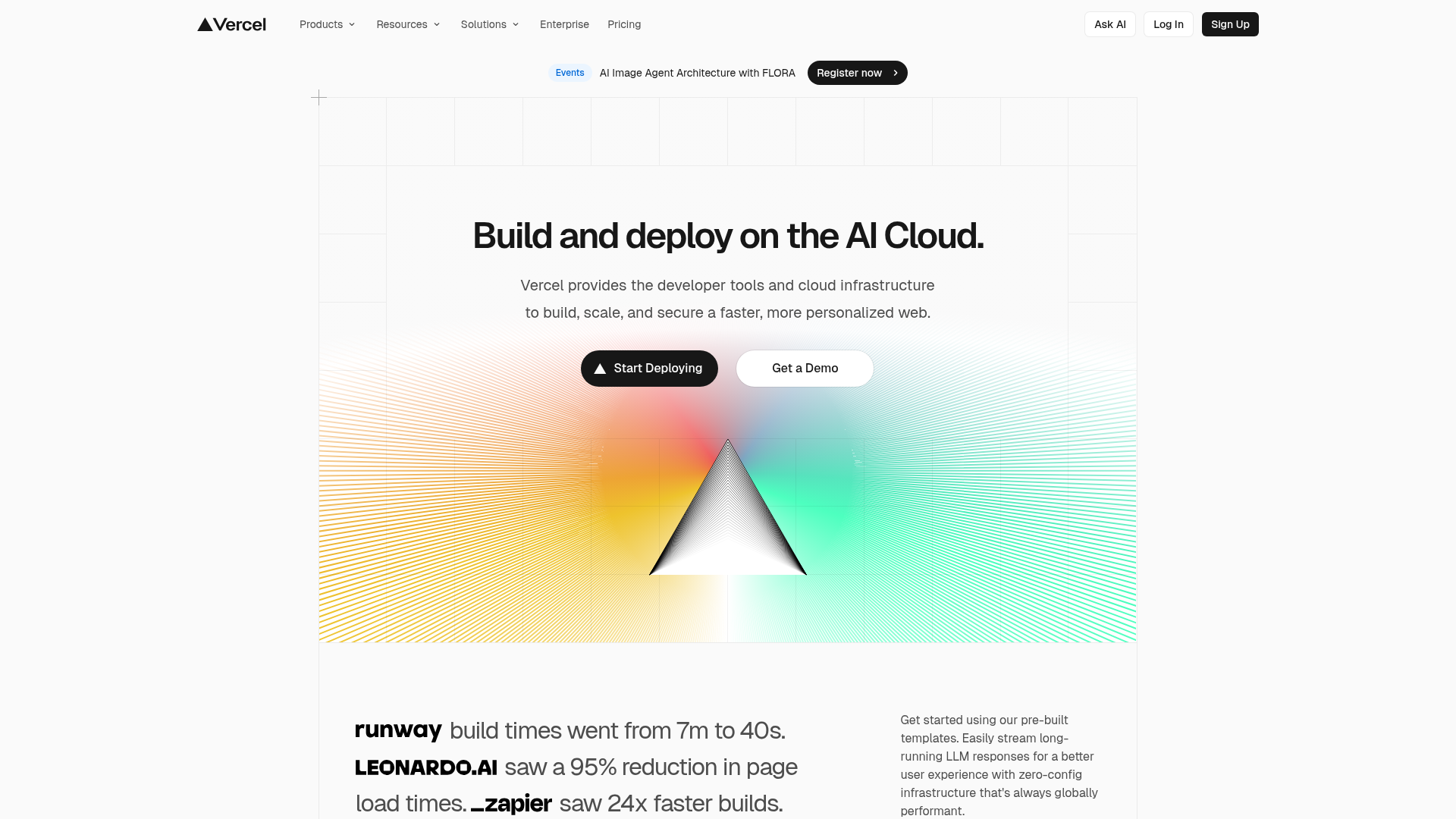
Vercel AI Cloud Landing Page
A modern landing page featuring a minimalist dark-themed navbar, a grid-overlay hero section with radial color gradients, and high-contrast typography for customer success stories.
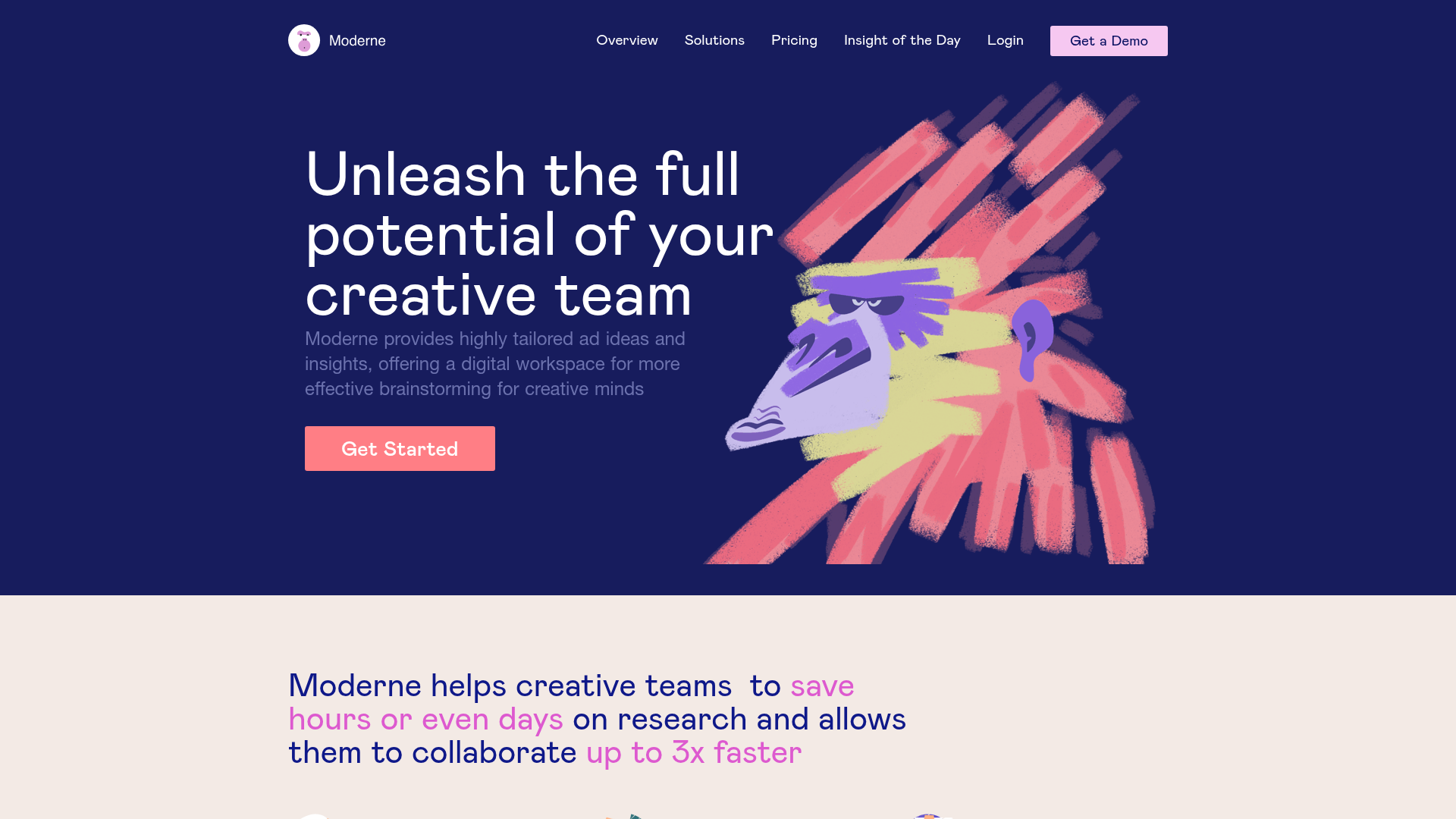
Moderne Creative Landing Page
A high-contrast landing page featuring a dark hero section with an artistic illustration overlay, distinct alternating content blocks, and a visual comparison bar chart component.
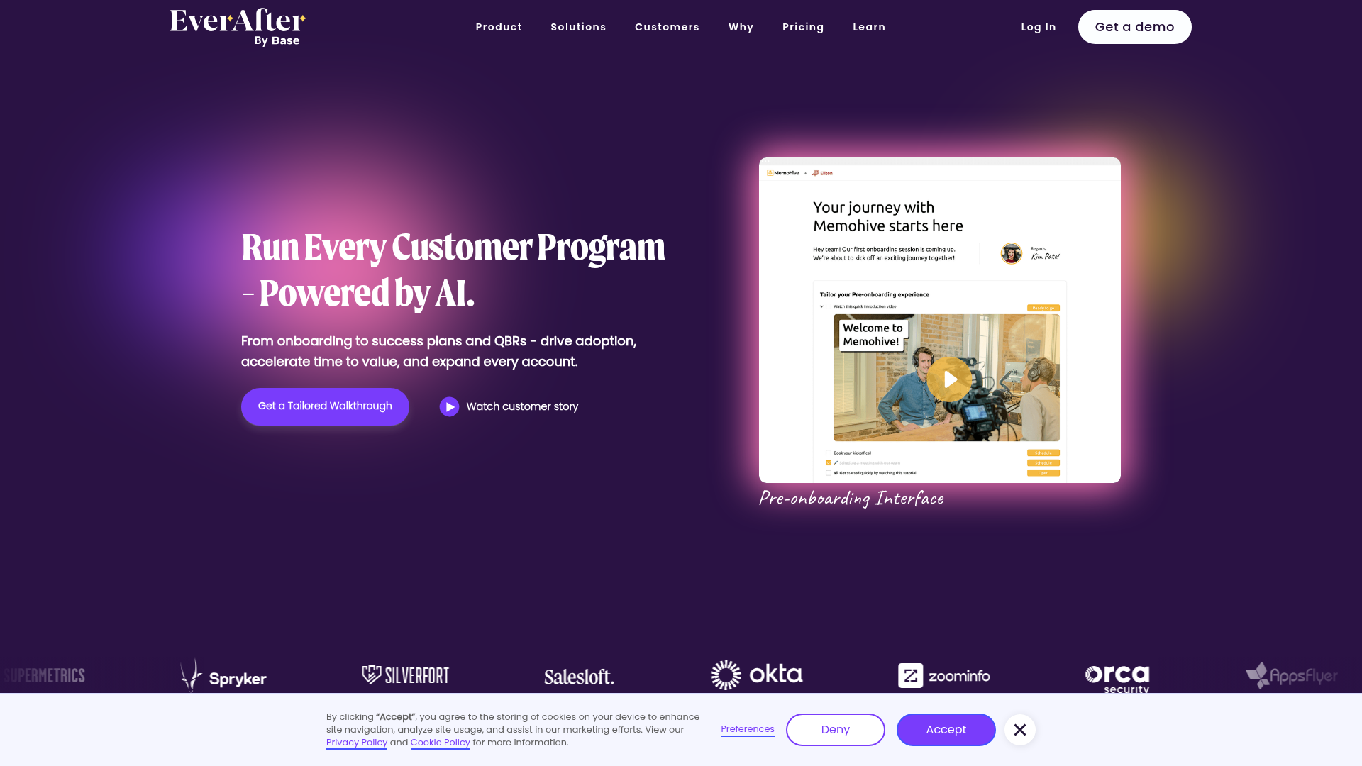
EverAfter AI Customer Portal Hero
A SaaS landing page template featuring a glowing product carousel, auto-scrolling logo marquee, accordion-based feature reveals, and an embedded scheduling widget.
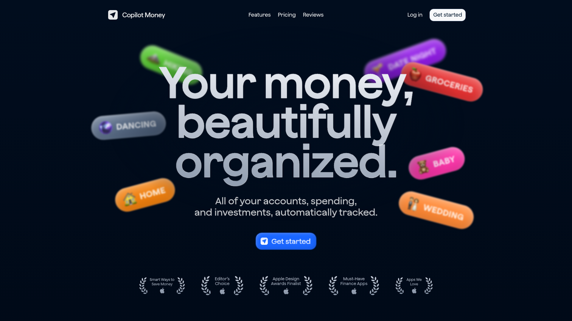
Copilot Money Finance Landing Page
A dark-themed finance landing page featuring a centered animated hero section with floating category badges, integrated trust badges, and a clean minimalist navigation bar.
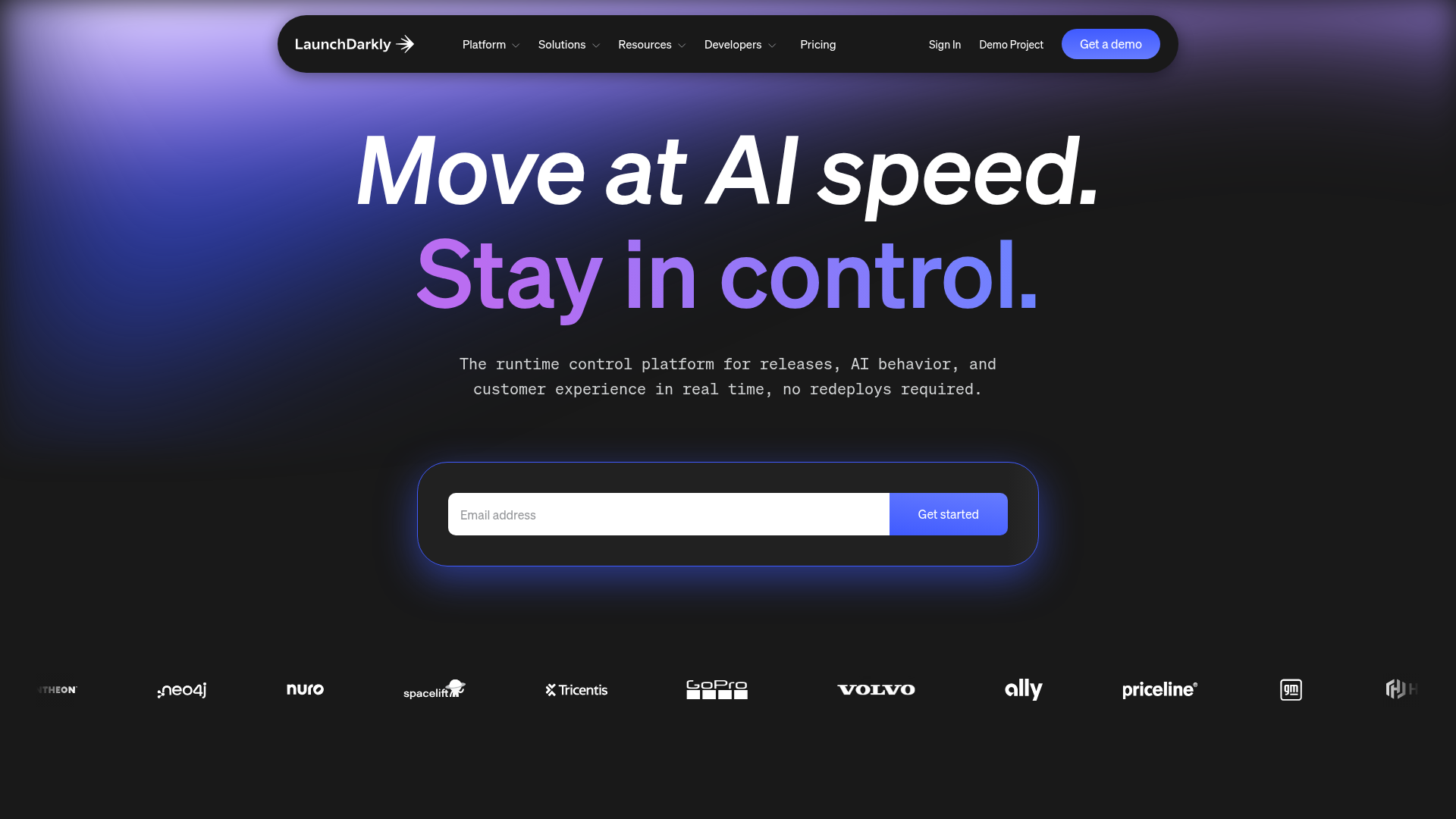
LaunchDarkly SaaS Landing Page Hero
A dark-themed developer marketing layout featuring a glowing blurred background, sticky pill-shaped navigation, tabbed feature showcases, and a horizontal logo marquee.
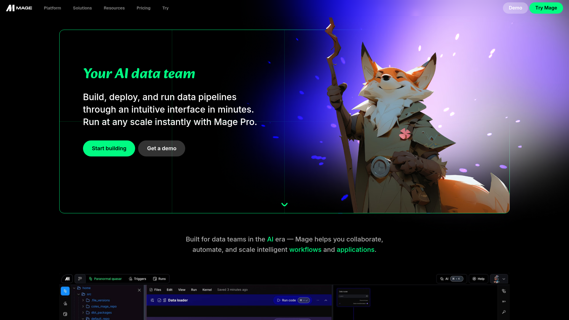
Mage AI Landing Page Hero
A dark-themed developer tool landing page featuring a split-screen hero layout with a high-quality illustration, call-to-action buttons, and a bottom code editor interface preview.
