Jacob Leech Portfolio Portfolio Site
A minimalist developer portfolio with custom cursor interactions, scroll-triggered text animations, a clean resume layout, and unique full-width graphic components.

Overview
This project is a high-end minimalist developer portfolio built for Jacob Leech, focusing on "digital craftsmanship" through precise typography and subtle interaction design. It is an excellent reference for cloning because it demonstrates how to use whitespace, large-scale typography, and scroll-triggered animations to create a premium, agency-style feeling without heavy imagery.
Design System
- Color Palette & Visual Hierarchy: The site uses a high-contrast monochromatic scheme, primarily featuring deep charcoal (#222222) and off-white/cream backgrounds. Visual hierarchy is established through extreme variations in font size rather than color, using large display headings to anchor sections.
- Typography System: A neo-grotesque sans-serif (likely Inter or similar) is used for body copy, while serif fonts are reserved for drop caps and specific emphasis. The scale is dramatic, featuring
larger-textclasses for introductory paragraphs andsmaller-textfor figure captions (e.g., "Fig 1."). - Page Structure & Section Flow: The layout follows a linear narrative: a horizontal intro with external links, a skills section with offset columns, a work history list, and a blog/writing section. It uses a structured "flow-section" system to maintain consistent vertical rhythm.
- Reusable Components:
- Graphic Containers: Unique
graphic-outerblocks with CSS border-details (graphic-tb-border) that frame abstract representations of tech (laptop, mouse, key). - Work List: An underlined list component for professional history that uses flexbox to justify agency name, role, and dates.
- External Links: A vertical sidebar list with clean, low-opacity separators.
- Floating Tips: A custom "Craftsman's Tip" widget positioned in the bottom-right for personality-driven micro-copy.
- Graphic Containers: Unique
- Interaction and Motion: The HTML reveals extensive use of
data-splittingfor per-character text entrance animations. Scroll-triggered transforms (e.g.,translate(0%, 100%)) suggest a GSAP or similar execution for elements as they enter the viewport. A customcursorelement follows the user's mouse. - Implementation Clues: Use of Bulma-like grid classes (
columns,is-12-mobile,is-offset-1-tablet) combined with utility classes for spacing (spaced-h-normal,flow-normal).
Use Cases
- Who should clone this pattern: Creative developers, UI/UX designers, or technical writers who want a portfolio that feels curated and authoritative rather than flashy.
- Remix Directions:
- Visual Branding: Swap the charcoal/cream palette for a navy/gold or forest/sage combination while keeping the typography scale.
- Asset Replacement: Replace the abstract "Fig 1." graphic containers with project screenshots or Lottie animations within the same bordered frames.
- Info Architecture: The work history list is modular; it can be easily repurposed for a "Services" list or a "Speaking Engagements" log.
- Suggested Clone Scope: A full-page clone is recommended to maintain the deliberate pacing and animation choreography, but the "History" section is a standalone modular component perfect for quick reuse in existing sites.
Related Inspirations
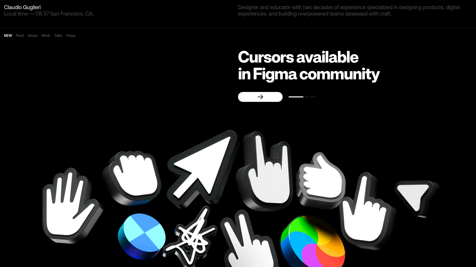
Claudio Guglieri Portfolio Portfolio Hero
A dark-themed designer portfolio featuring a 3D asset hero section, minimal top navigation bar, and integrated visitor message submission form.
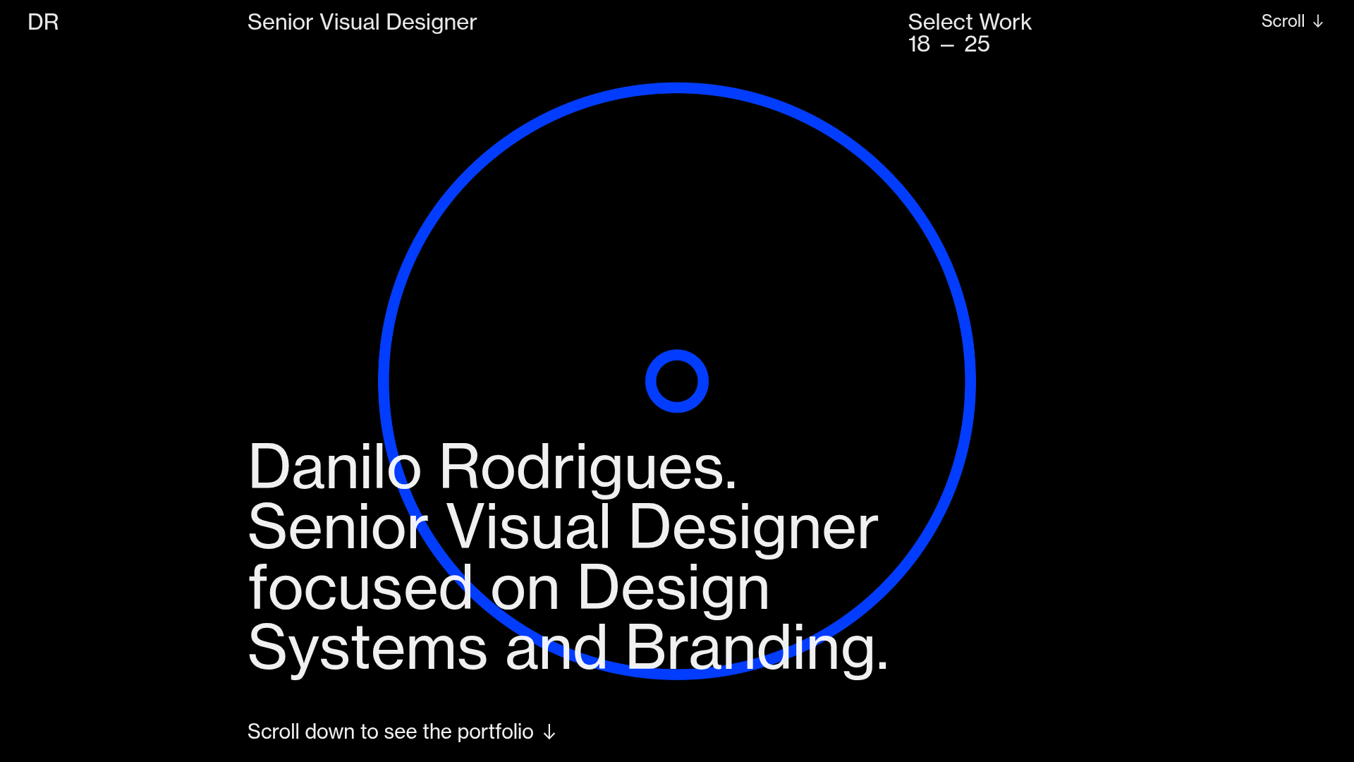
Danilo Rodrigues Designer Portfolio Landing
A minimalist, high-impact design portfolio featuring a full-screen image carousel hero, fluid typography, large scroll-triggered key visuals, and a clean grid-based case study layout.
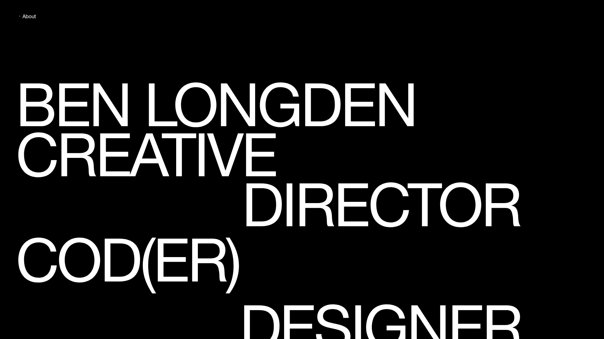
Ben Longden Minimalist Creative Portfolio
A bold typography-focused site featuring a large-scale overlapping hero section, horizontal image carousels for projects, and a scrolling text marquee footer.
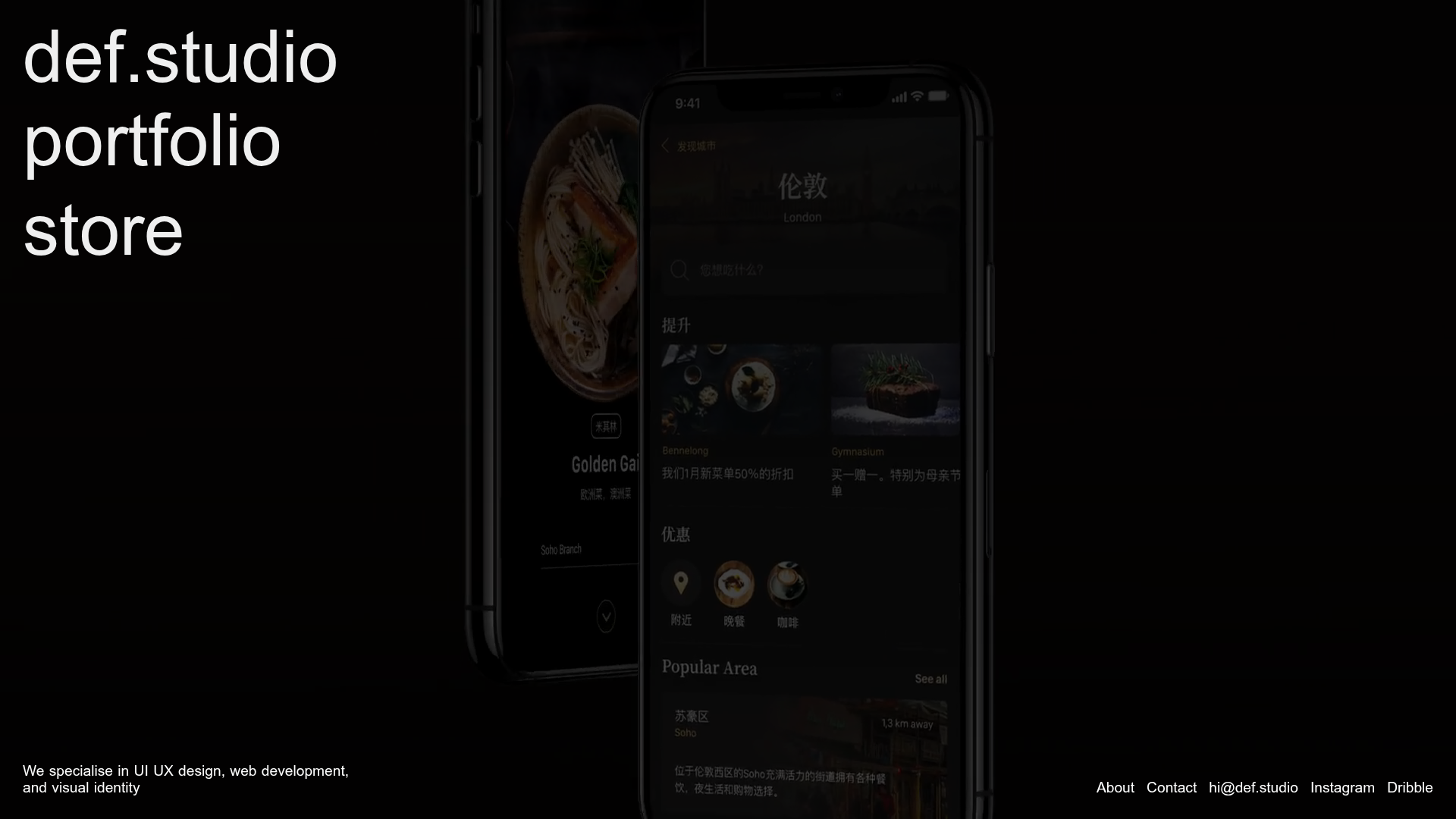
Def.studio Design Agency Portfolio
A dark-themed portfolio featuring a full-screen video background, smooth scroll transitions, and a vertical list of large-scale media-driven project cards with lazy-loaded video previews.
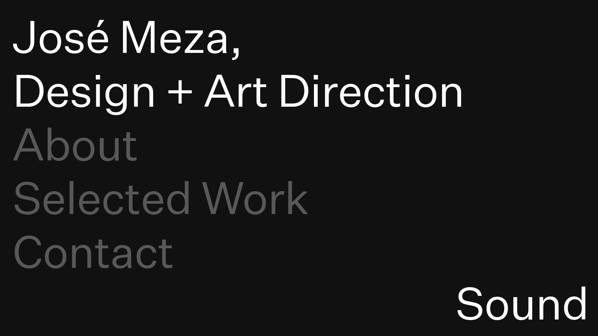
José Meza Minimalist Portfolio
A dark-themed minimalist portfolio featuring expandable accordion sections, sound-triggered interactions, and a custom SVG cursor with a clean typography-focused layout.
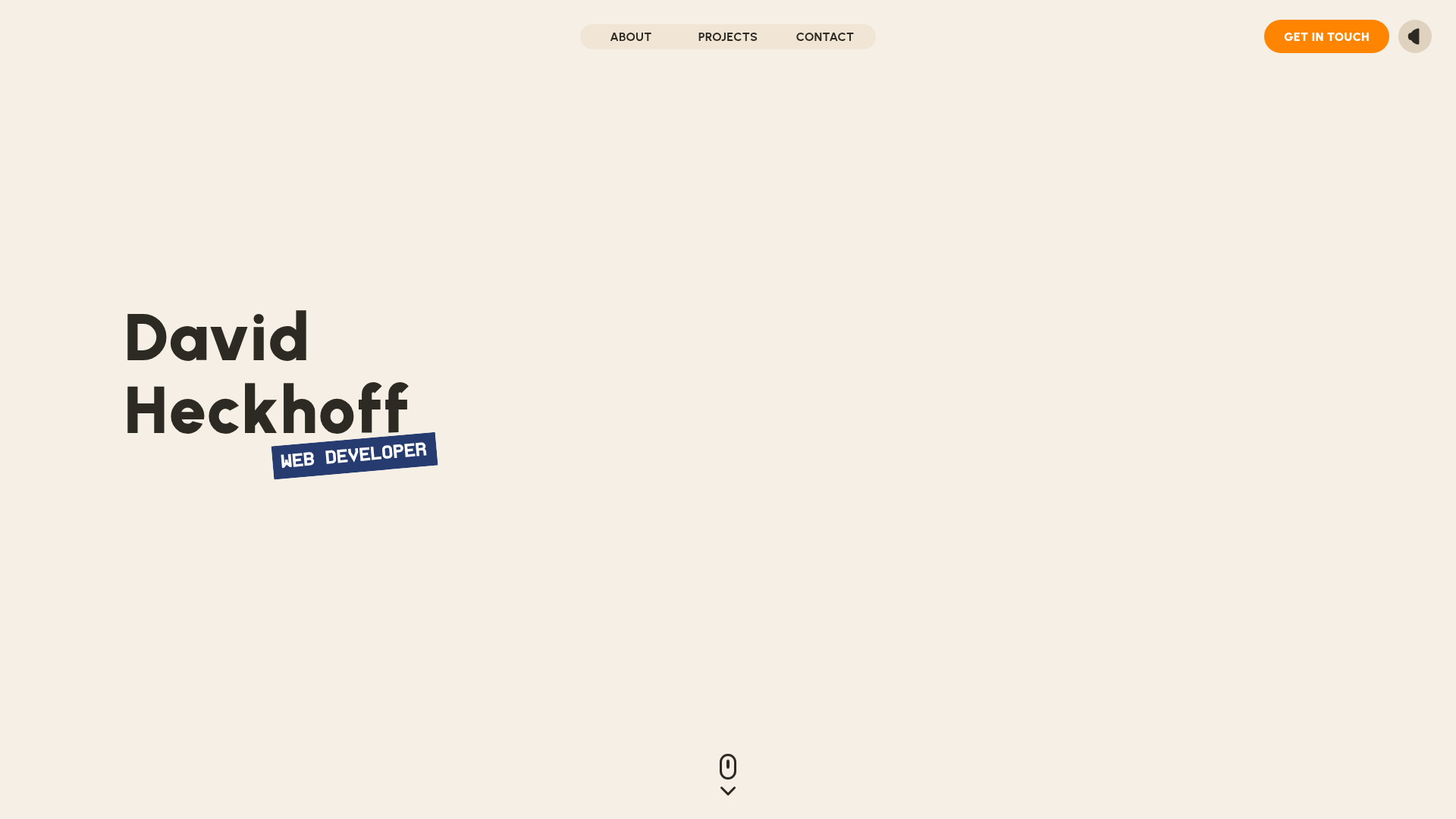
David Heckhoff Developer Portfolio
Minimalist interactive portfolio featuring a Three.js 3D hero background, GSAP scroll-triggered reveal animations, and a custom bento-style project grid with hover effects.
