Danilo Rodrigues Designer Portfolio Landing
A minimalist, high-impact design portfolio featuring a full-screen image carousel hero, fluid typography, large scroll-triggered key visuals, and a clean grid-based case study layout.
Overview
This portfolio for Danilo Rodrigues is a masterclass in minimalist, high-impact visual design, utilizing a dark mode aesthetic and a sophisticated grid-based layout. It serves as an excellent clone reference for creatives who want to balance large-scale immersive visuals with clean, professional typography and significant whitespace.
Design System
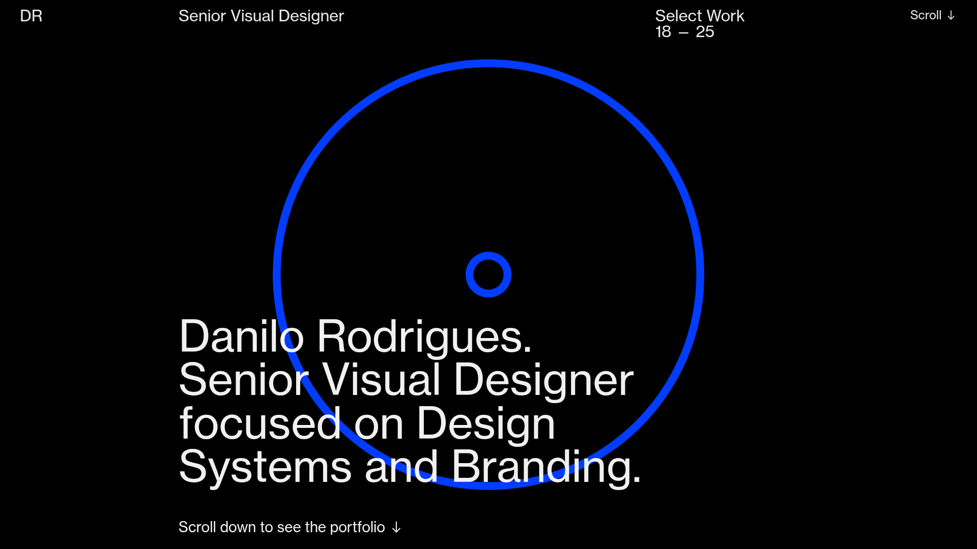
- Color Palette & Visual Hierarchy: The site uses a high-contrast "Pitch Black" (#000000) background with white typography (#FFFFFF) and a vibrant blue (#0047FF) accent for the central hero graphic. The hierarchy is established through extreme scale; a large central ring draws the eye first, followed by massive H1 typography.
- Typography System: A clean, neutral Neo-Grotesk typeface (likely Helvetica or Inter) is used across all scales. The system features oversized headers for impact, standard body copy for readability, and a utility-focused monospace-style secondary font for metadata (e.g., "Select Work 18 — 25").
- Page Structure & Flow: The site follows a vertical storytelling flow. It starts with a hero section (Title and scroll indicator over a slick-slider background), transitions into a text-heavy "About" section using a multi-column grid, and then leads into full-bleed project imagery interspersed with brief, structured project descriptions.
- Reusable Components:
- The Hero Hub: A centered ring graphic paired with left-aligned big type and a bottom-aligned scroll call-to-action.
- Project Headers: Two-column grid blocks where technical credits and project summaries are separated by significant gutter space.
- Sticky/Pinned Navigation: A minimal top bar displaying the name, role, and page status that remains accessible while scrolling.
- Interaction & Motion: The presence of the
slick-sliderandpulsinganimation classes in the HTML suggests a smooth image carousel at the hero level and scroll-triggered fade-ins for content sections. The "Scroll" indicator at the top right acts as a persistent guide. - Implementation Clues: Built on the Cargo Collective platform, the site uses a custom grid system (
grid-row,grid-col) and a backdrop wallpaper feature for full-screen image transitions.
Use Cases
- Who should clone this: Senior designers, art directors, and photography studios looking for a "less is more" approach that prioritizes visual artifacts over excessive UI clutter.
- Effective Remixes: This pattern works exceptionally well for high-end fashion brands, architecture firms, or design agencies where the work's visual quality is the primary selling point.
- Practical Directions: Builders can swap the central blue ring for a branded animated SVG or a 3D element. The info architecture can be adapted by reusing the two-column grid sections for service offerings or team bios rather than project credits.
- Clone Scope: The hero section is a perfect "quick clone" for a high-impact landing page. A full-page clone is recommended for portfolios requiring a cinematic feel and structured case study narratives.
Related Inspirations

Jacob Leech Portfolio Portfolio Site
A minimalist developer portfolio with custom cursor interactions, scroll-triggered text animations, a clean resume layout, and unique full-width graphic components.
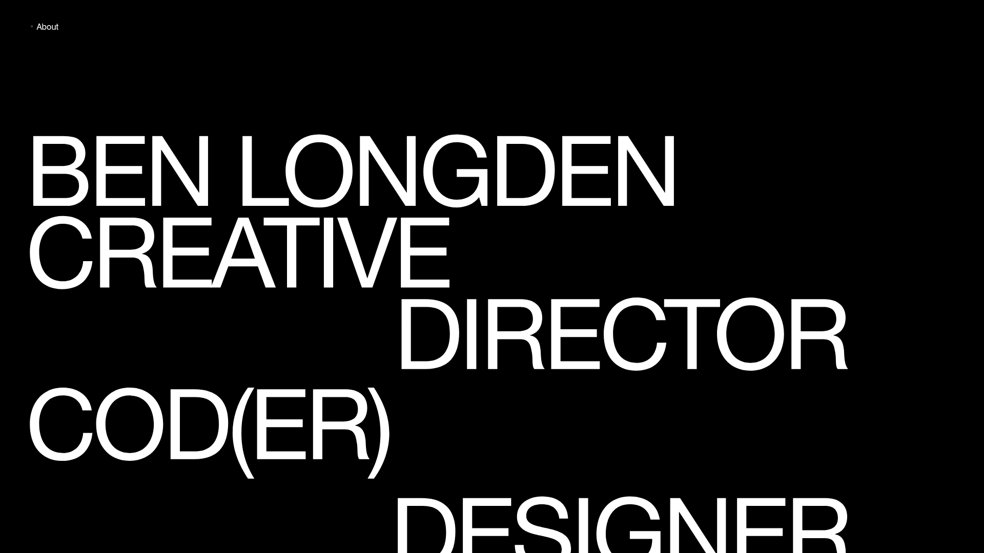
Ben Longden Minimalist Creative Portfolio
A bold typography-focused site featuring a large-scale overlapping hero section, horizontal image carousels for projects, and a scrolling text marquee footer.
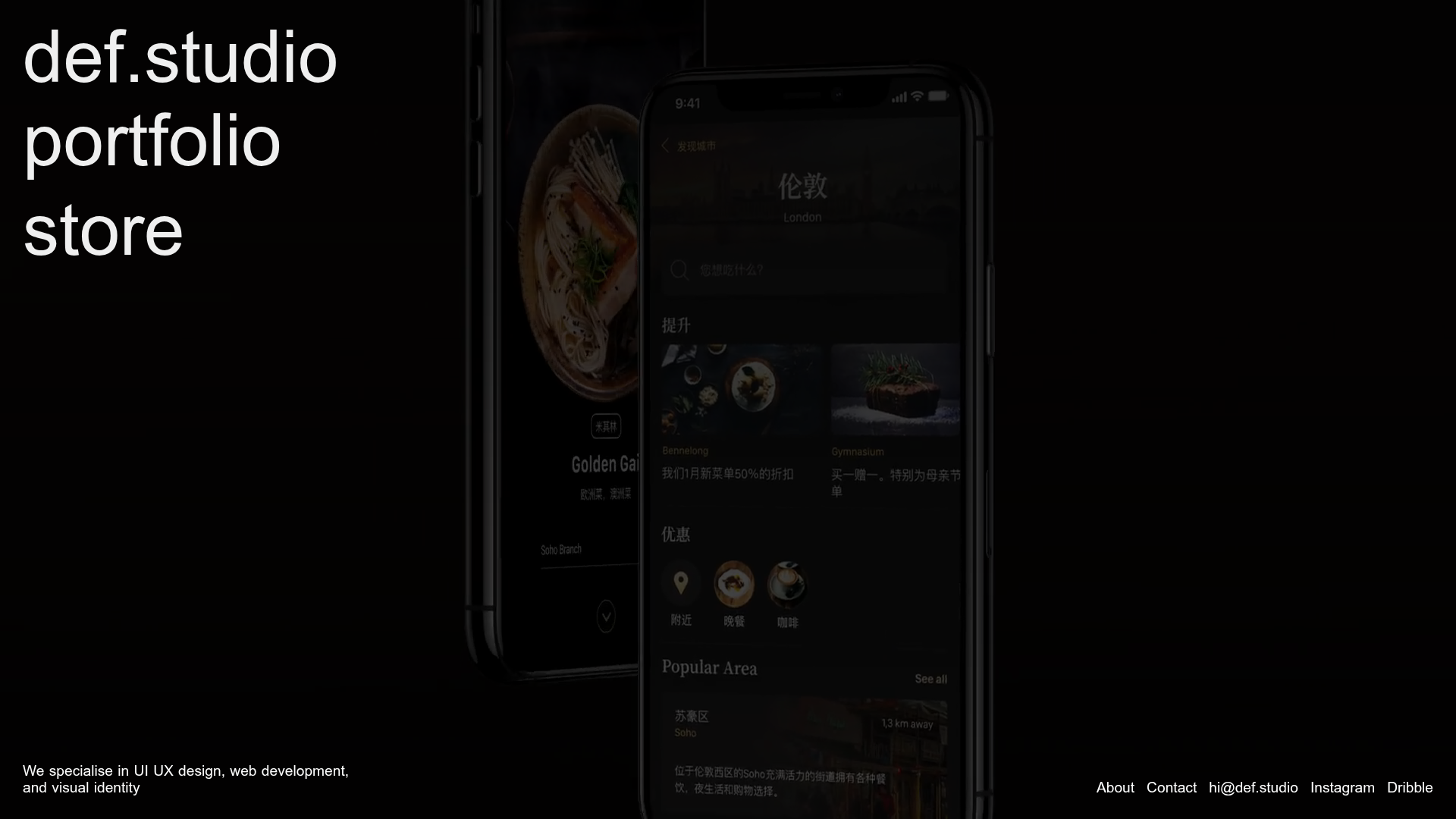
Def.studio Design Agency Portfolio
A dark-themed portfolio featuring a full-screen video background, smooth scroll transitions, and a vertical list of large-scale media-driven project cards with lazy-loaded video previews.
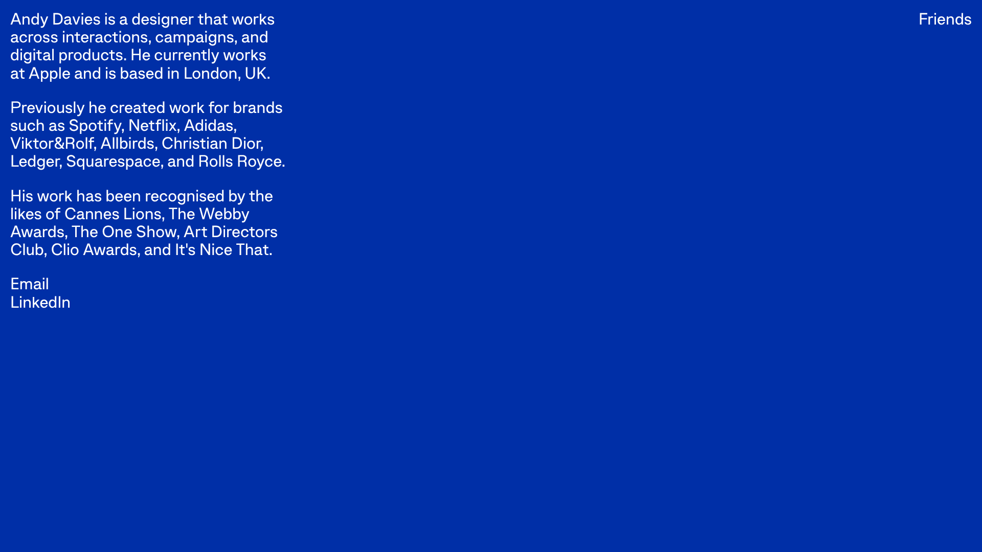
Andy Davies Minimalist Bio Landing Page
A stark, single-screen typographic layout featuring a high-contrast blue background, clean sans-serif text blocks, and simple text-based navigation.
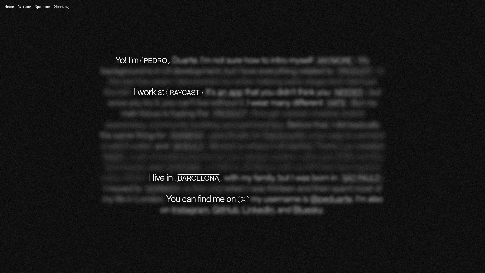
Pedro Duarte Personal Portfolio Site
A minimalist portfolio featuring an interactive text-reveal interface, a full-screen background video, and Radix UI components with a distinct dark aesthetic.

Niklas Rosén Designer Portfolio Index
A minimalist, responsive grid-based portfolio index featuring a clean 16-column layout, typographic list components, and a custom dark mode transition.
