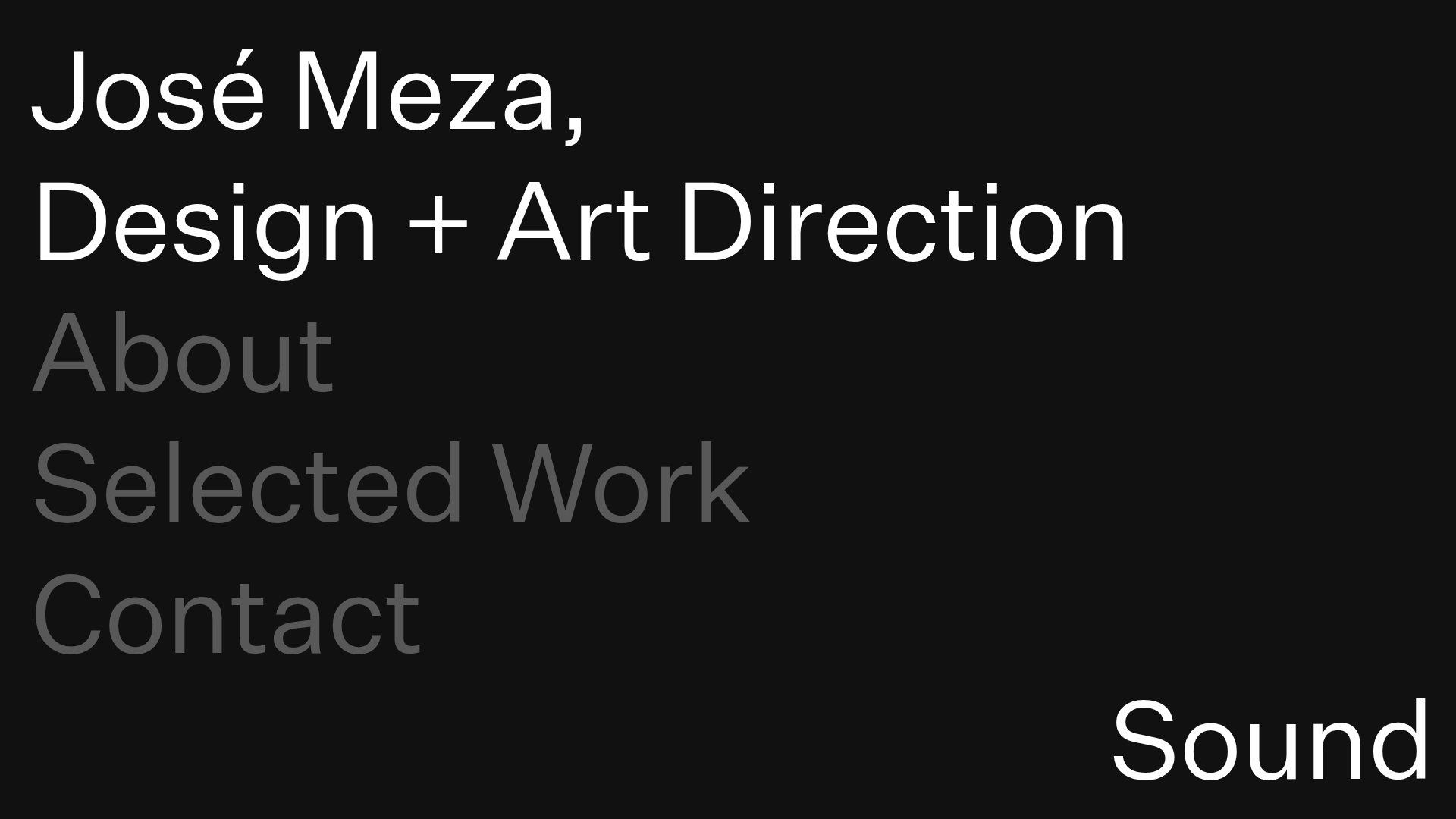
José Meza Minimalist Portfolio
A dark-themed minimalist portfolio featuring expandable accordion sections, sound-triggered interactions, and a custom SVG cursor with a clean typography-focused layout.
Overview
This website is a highly refined, minimalist portfolio for a multidisciplinary designer, utilizing a brutalist-inspired black-and-white aesthetic. It is an excellent clone reference for its sophisticated use of accordion-based navigation to maximize screen real estate and its integration of auditory feedback to enhance digital interaction.
Design System
- Color Palette & Visual Hierarchy: The site uses a high-contrast monochromatic palette with a solid black background (
#000000) and white text. Active sections or headers carry white text, while collapsed or secondary information uses a muted gray to denote hierarchical depth. - Typography System: Features a clean, sans-serif grotesque typeface. The scale is intentionally oversized for the name and title to establish brand authority, while nav items use a medium-weight large font. Body text in expanded sections uses a smaller, readable scale with generous line-height.
- Page Structure: A single-page layout where content is vertically stacked. The sequence starts with a static header (Name/Title), followed by three interactive accordion panels: "About," "Selected Work," and "Contact."
- Reusable Components:
- Interactive Accordion Panel: The core structural unit consisting of a
.expandablePanelTriggerand a hidden.expandablePanelContentContainer. - Custom Image Gallery: Located within the work section, featuring side-by-side navigation triggers (
#imageContainerLeftTrigger/#imageContainerRightTrigger) and an image counter. - SVG Cursor: A custom-styled cursor that replaces the default browser pointer, adding a curated feel.
- Interactive Accordion Panel: The core structural unit consisting of a
- Interaction and Motion: Uses
fadeOnLoadclasses for entrance animations. The most distinct feature is the data-driven audio triggers (e.g.,data-audio-open="shutter") that play sound effects when panels are toggled. Transitions between accordion states are immediate and smooth. - Implementation Clues: The HTML reveals a class-based structure for managing states (e.g.,
.showing,.soundOn). The sound controller is a fixed-position toggle (#soundController) in the bottom right, allowing users to opt-out of the site's auditory experience.
Use Cases
- Who should clone this pattern: Creative directors, architects, or graphic designers who need a portfolio that emphasizes curation over quantity.
- Effective Remixes: This layout works perfectly for "Link-in-bio" style landing pages or boutique agency landing pages where the brand voice is sophisticated and minimal.
- Practical Remix Directions: Builders can swap the monochromatic palette for a brand-specific primary color or replace the sound effects with haptic-inspired feedback for mobile-first versions. The image gallery can be adapted into a slider for case studies.
- Suggested Clone Scope: A quick section clone of the accordion panel is highly valuable for UI kits. For a complete personal brand overhaul, a full-page clone provides a ready-made structure for content-heavy portfolios in a compact form factor.
Related Inspirations
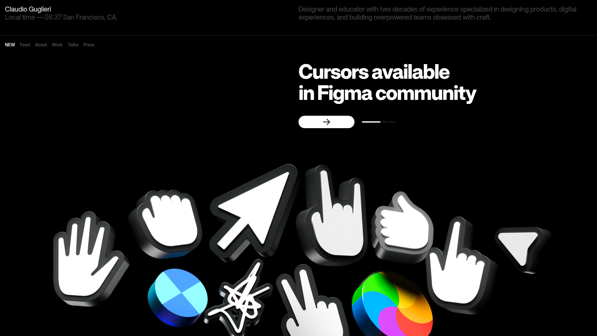
Claudio Guglieri Portfolio Portfolio Hero
A dark-themed designer portfolio featuring a 3D asset hero section, minimal top navigation bar, and integrated visitor message submission form.

Jacob Leech Portfolio Portfolio Site
A minimalist developer portfolio with custom cursor interactions, scroll-triggered text animations, a clean resume layout, and unique full-width graphic components.

Niklas Rosén Designer Portfolio Index
A minimalist, responsive grid-based portfolio index featuring a clean 16-column layout, typographic list components, and a custom dark mode transition.
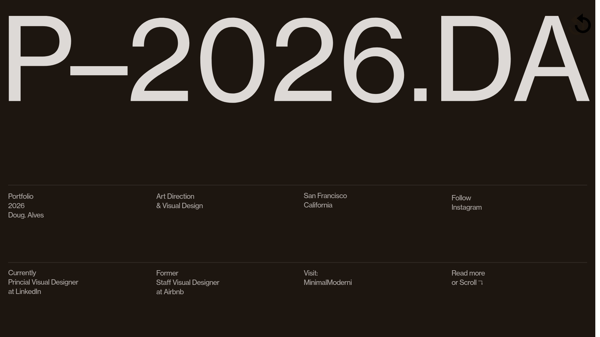
Doug Alves Visual Design Portfolio
A minimalist, high-contrast design portfolio featuring oversized typography, a sticky four-column grid footer, and a vertical scroll-triggered slide-show for project showcases.
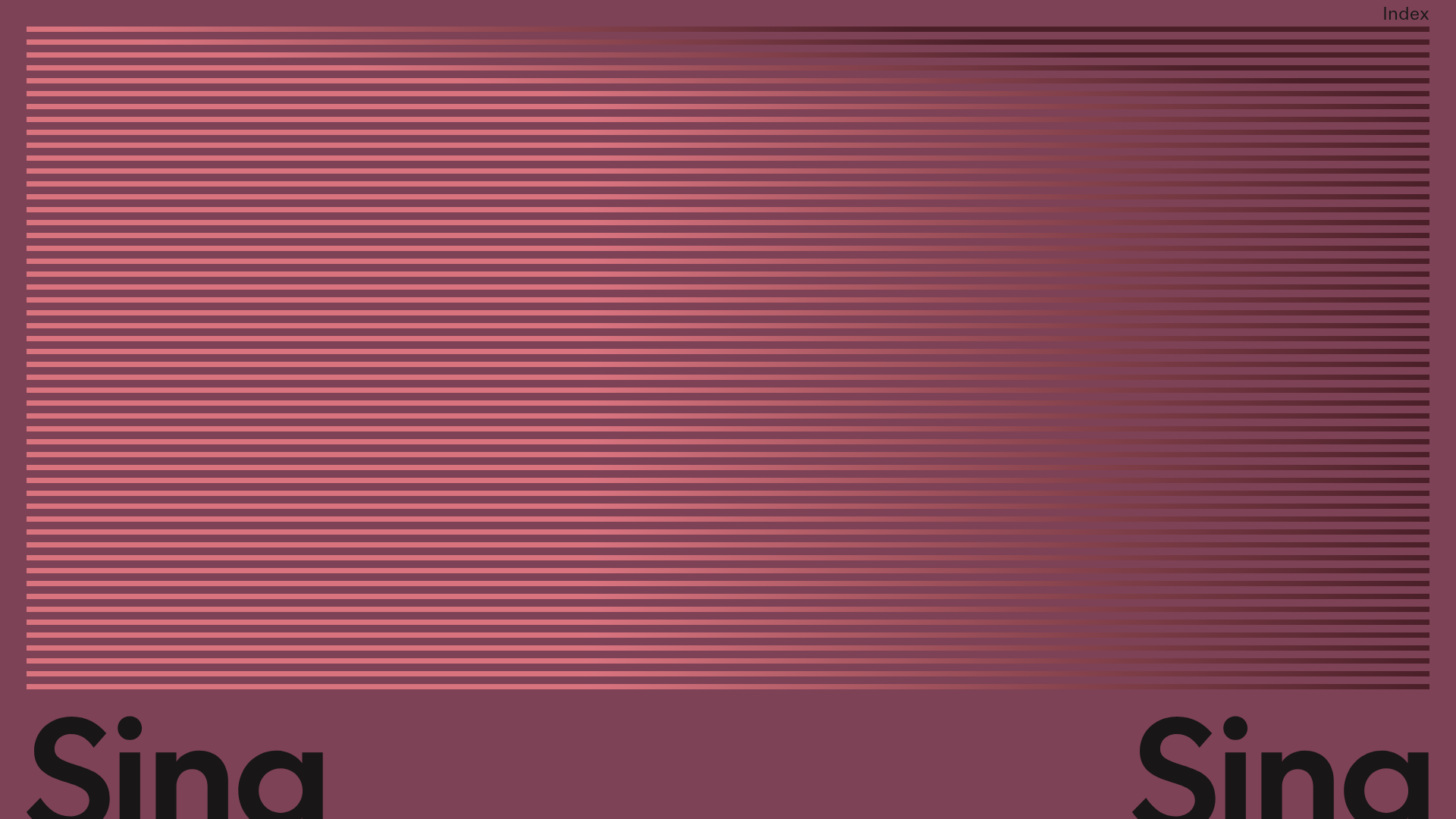
Sing-Sing Creative Portfolio Landing Page
A minimalist studio portfolio featuring high-contrast typography, a horizontal line-grid hero section, and responsive image components with custom cursor interactions.
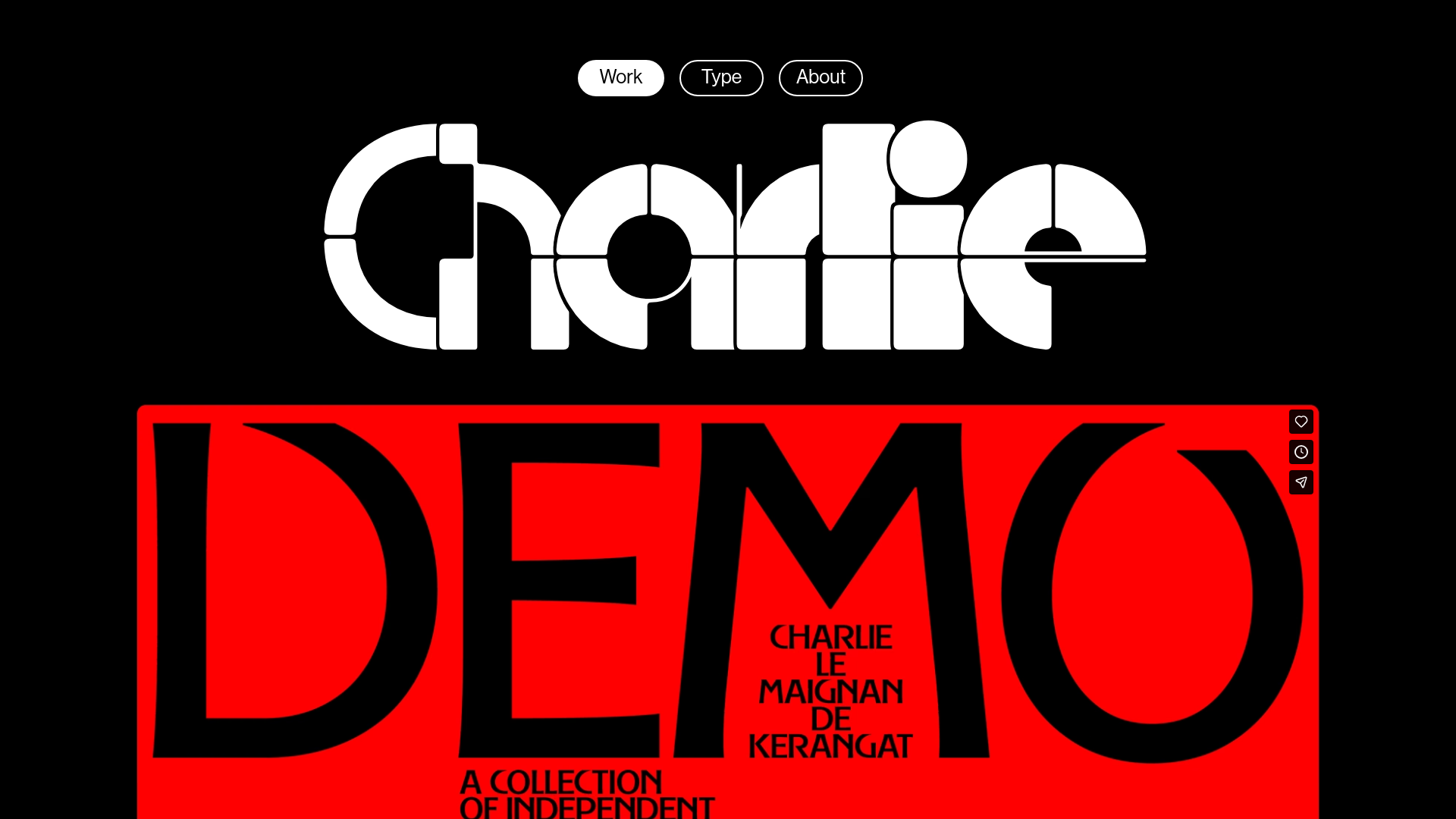
Charlie Le Maignan Portfolio Archive
A minimalist dark-mode portfolio featuring high-contrast typography, a geometric logo header, and an integrated full-width video gallery showcasing independent creative work.
