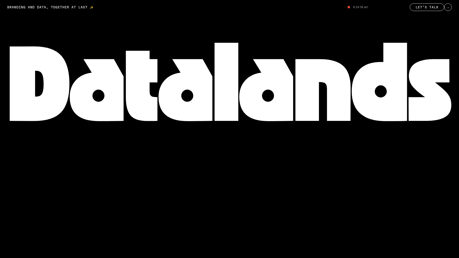
Datalands Branding Agency Landing Page
A minimalist dark-themed hero section featuring bold oversized typography, a fixed navigation bar with a live clock, and a call-to-action button.
Overview
Datalands is a minimalist landing page for a branding agency that uses high-impact, oversized typography to command immediate attention. It serves as an excellent clone reference for building premium, design-forward brands that want to showcase confidence through a 'less is more' aesthetic and a dark-mode interface.
Design System
- Color Palette & Visual Hierarchy: The design centers on a high-contrast monochromatic scheme, primarily deep black backgrounds (
#000000) with stark white text. A vibrant red dot near the navigation clock provides a single focal point of color, signaling modern digital connectivity. - Typography System: The hero section features a custom, ultra-bold sans-serif typeface characterized by thick strokes and tight kerning, creating a blocky, monumental feel. Secondary text uses a monospace/technical font for the navigation and utility labels, emphasizing a data-centric or 'developer-adjacent' brand identity.
- Page Structure & Section Flow: The layout is built on a structured header bar containing the brand tagline on the left, a live status indicator/clock in the center-right, and a pill-shaped CTA on the far right. This is followed by a massive full-width hero header.
- Reusable Components:
- Navigation Bar: A minimalist fixed or top-aligned bar with micro-labels.
- Pill Button: An outlined 'Let’s Talk' button with an accompanying arrow icon in a separate circle, common in modern luxury/tech interfaces.
- Live Clock/Status Indicator: A simple dynamic JavaScript component that adds personality and a sense of 'real-time' presence.
- Responsive Behavior: Given the scale of the central text, this design likely adopts a fluid typography scale (vw units) or stacks the navigation items into a vertical menu for mobile viewports.
Use Cases
- Who should clone this: Creative agencies, freelance designers, or niche SaaS startups looking for a bold, non-traditional entrance to their site.
- Effective Remixes: This pattern works well for portfolio sites where the heavy text is replaced by the creator's name, or for launch-phase landing pages where a single powerful value proposition needs to be front-and-center.
- Practical Directions:
- Typography Swap: Change the chunky custom font for a sophisticated serif to pivot from 'tech/branding' to 'editorial/fashion.'
- Interactive Backdrop: Maintain the typography logic but replace the solid black background with a subtle grain texture or a slow-moving gradient blob.
- Suggested Clone Scope: The top navigation and the hero header are the primary assets to clone together to establish a cohesive site architecture.
Related Inspirations
Special Offer Studio Landing Page
Minimalist full-screen landing page featuring a centered logo, bold flat-color background, and accessible skip link structure using Nuxt.js and Tailwind CSS.
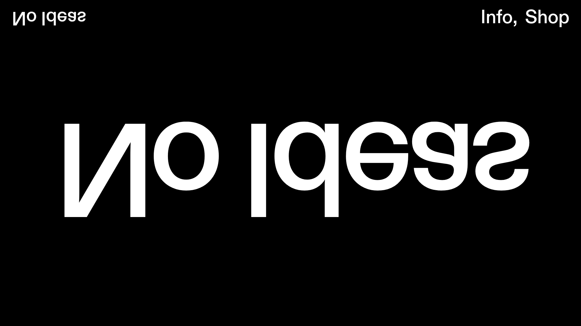
No Ideas Design Portfolio Carousel
A minimalist, full-screen portfolio featuring a high-impact typography hero and a large-scale Bootstrap carousel with video and image support.
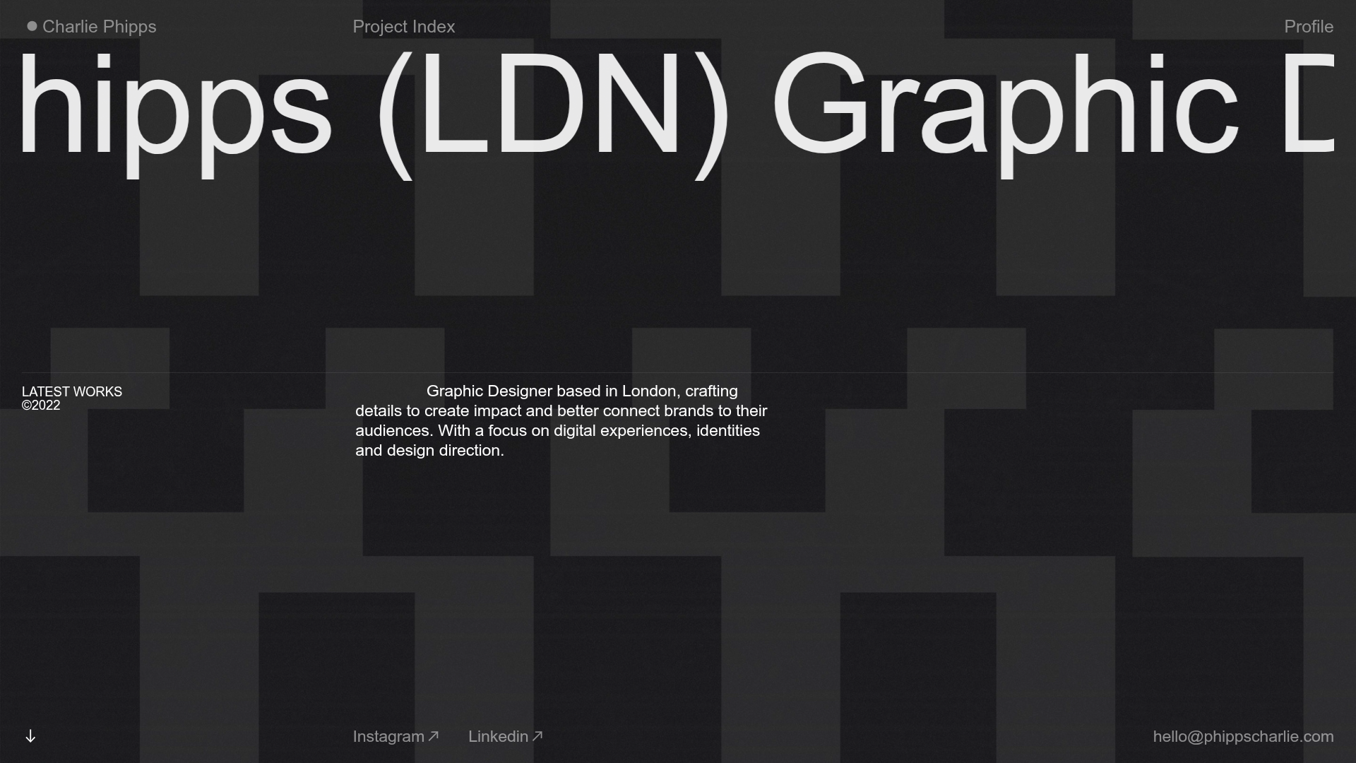
Charlie Phipps Portfolio Hero Layout
A dark-themed portfolio featuring a large horizontal scrolling marquee header, full-bleed video backgrounds, and a clean typography-focused grid for case studies.
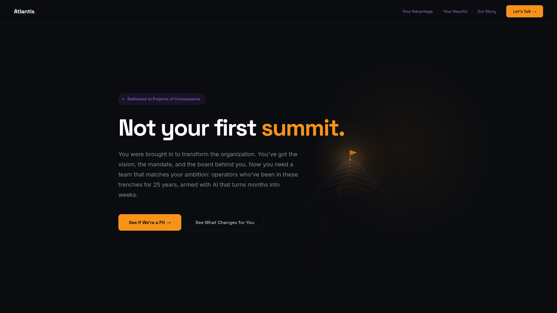
Atlantis Tech Engineering Services Landing Page
A dark-themed professional services layout featuring a custom SVG mountain hero, logo cloud, benefits grid, process timeline, and a dual-column 'fit' comparison section.
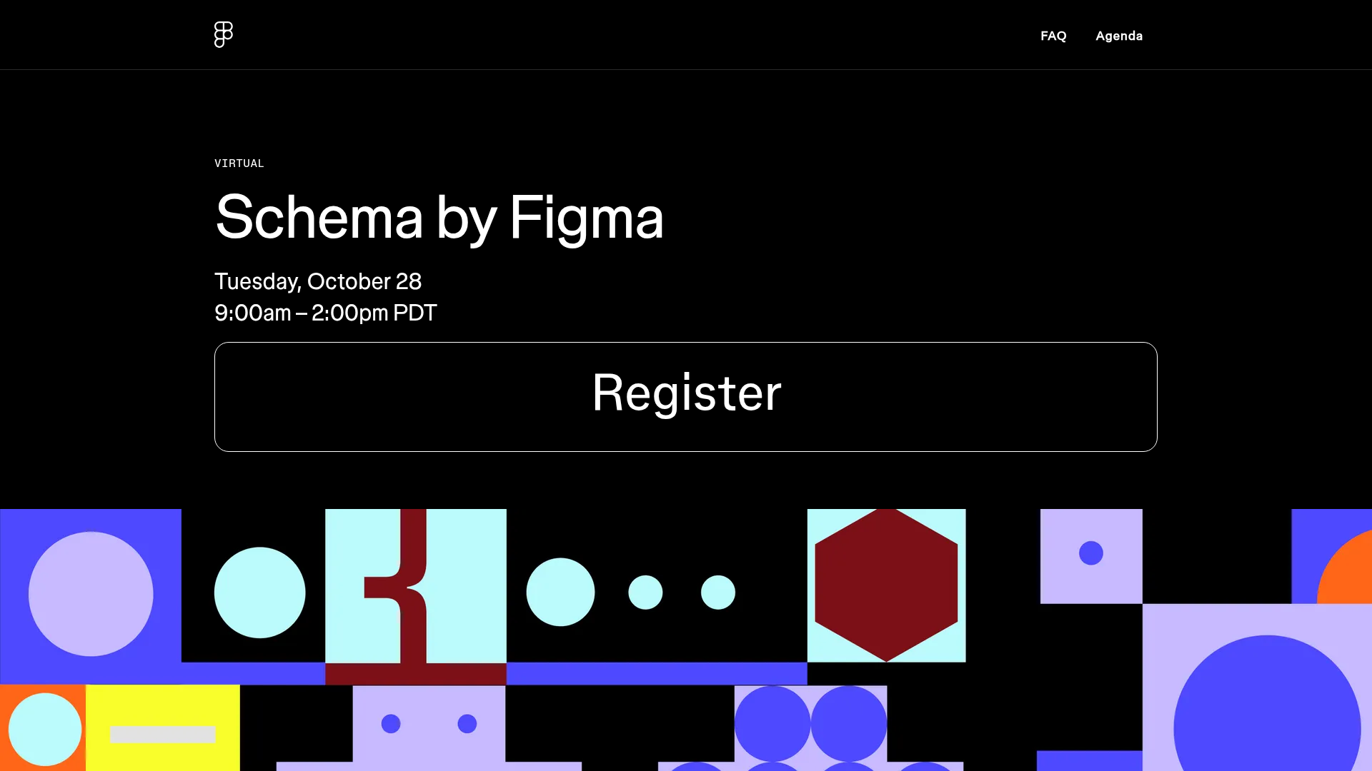
Schema by Figma Event Landing Page
A dark-themed virtual event landing page featuring a minimalist header, high-contrast typography, and a geometric abstract footer design.
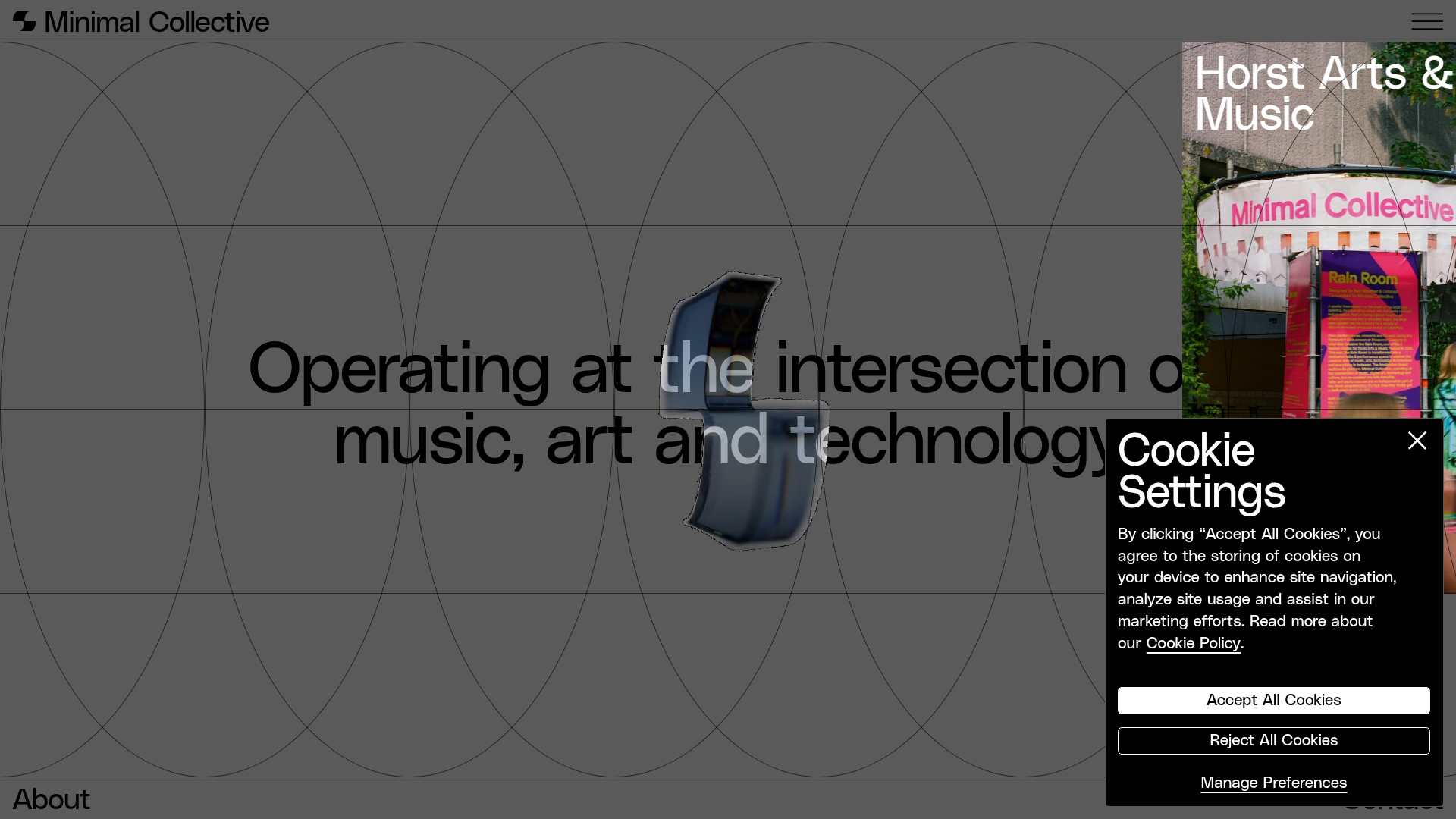
Minimal Collective Media Grid Portfolio
A high-end creative portfolio featuring a dynamic grid layout, parallax scroll animations, image hover overlays, and a minimalist full-screen page transition system.
