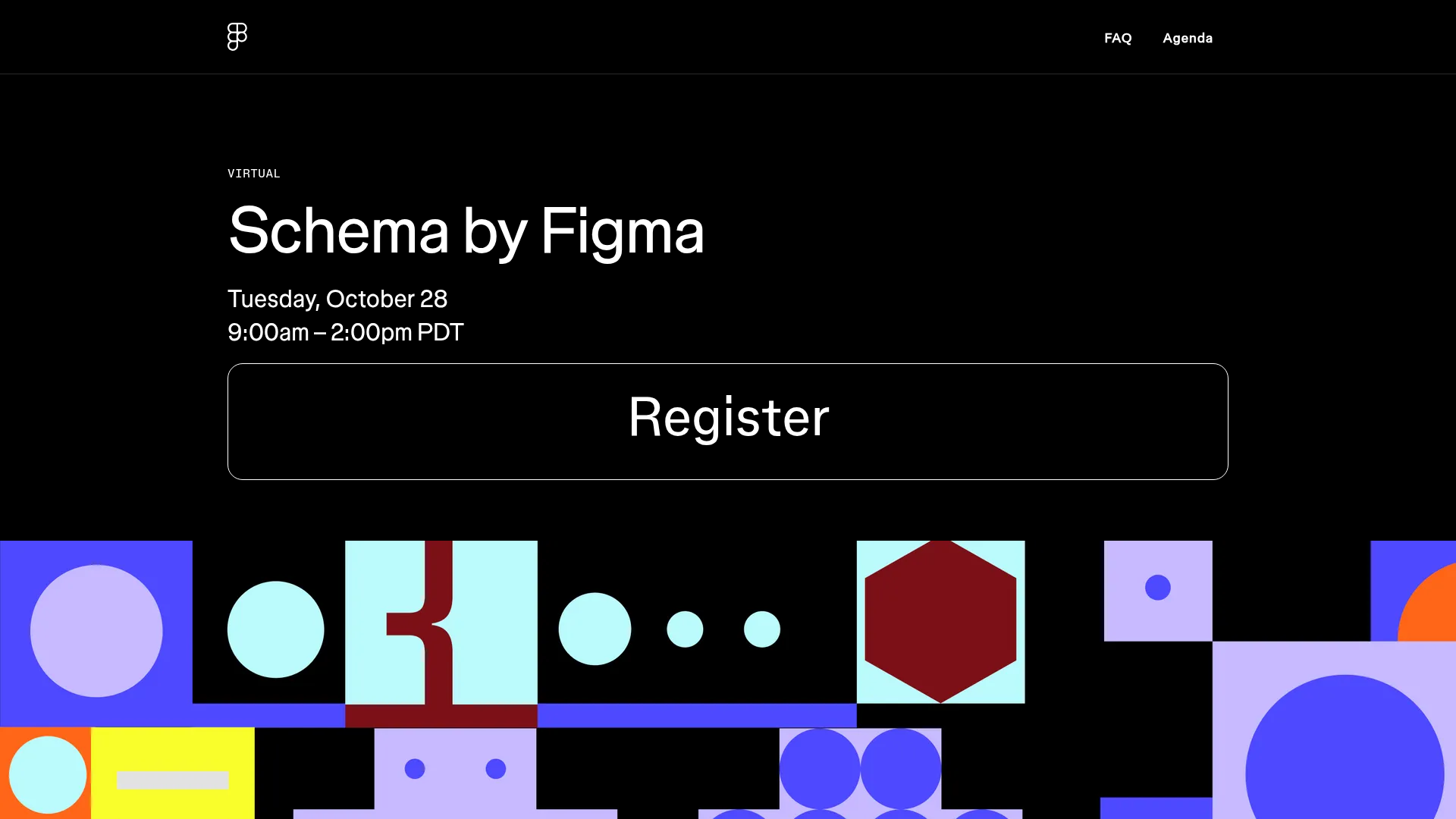
Schema by Figma Event Landing Page
A dark-themed virtual event landing page featuring a minimalist header, high-contrast typography, and a geometric abstract footer design.
Overview
This landing page is the official site for Figma's Schema event, designed to promote a virtual design systems conference. It serves as a premier example of high-impact minimalist design, using bold typography and purposeful whitespace to drive user action. Builders should clone this for its masterclass in visual hierarchy and its unique, grid-based geometric footer art.
Design System
- Color Palette & Visual Hierarchy: The site uses a high-contrast palette consisting primarily of black (
#000000) and white texts, accented by a colorful geometric footer using vibrant shades of purple, light blue, burgundy, and orange. The hierarchy is clear: the dark hero section isolates the event name and CTA, while the footer provides visual energy. - Typography: The typography system relies on Figma-Mono-Regular for labels (e.g., "VIRTUAL", "THE DETAILS") and Figma-Sans for primary messaging. It utilizes a massive scale for headers (up to 72px) with tight line-height (0.9 to 1.1) and slightly negative letter-spacing (-0.02em) to create a modern, architectural feel.
- Page Structure: The layout follows a classic conversion-focused flow: a minimalist header with a logo and simple links (FAQ, Agenda), a high-density Hero section with a prominent "Register" button, followed by an "Agenda" section featuring detailed schedules and an FAQ accordion block.
- Reusable Components:
- The Hero CTA: A large, full-width bordered button with rounded corners and centered text.
- Schedule Grid: Paragraph-based time slots coupled with larger headers for talk titles.
- Accordion FAQ: A clean list-based accordion (
sc-iGgWBj) for content reveal. - Geometric Footer: A mosaic of abstract shapes that acts as a brand-heavy visual anchor.
- Interaction & Responsive Behavior: The HTML indicates a sticky header (
data-sticky="true") and a mobile-specific hamburger menu (hamburgerButton). The call-to-action buttons use a simple border-based design that likely highlights on hover. The layout is built using a flex-grid system that collapses groups vertically for mobile users.
Use Cases
- Who should clone this: Event organizers, developer advocates, or product marketing teams launching a webinar or focused virtual conference.
- Effective Remixes: This pattern is highly effective for any product that wants to appear "design-forward." The dark mode can be inverted to a light theme without losing structural integrity.
- Practical Directions: Remixers should consider swapping the geometric footer for their own brand illustrations or a high-res photo background. The information architecture is easily adaptable: the agenda section can be converted into a multi-step product onboarding guide or a pricing comparison table.
- Clone Scope: For a quick win, clone the Hero and Footer sections to establish a strong brand identity. For a deep project, the full-page flow provides a complete framework for an informational event microsite.
Related Inspirations
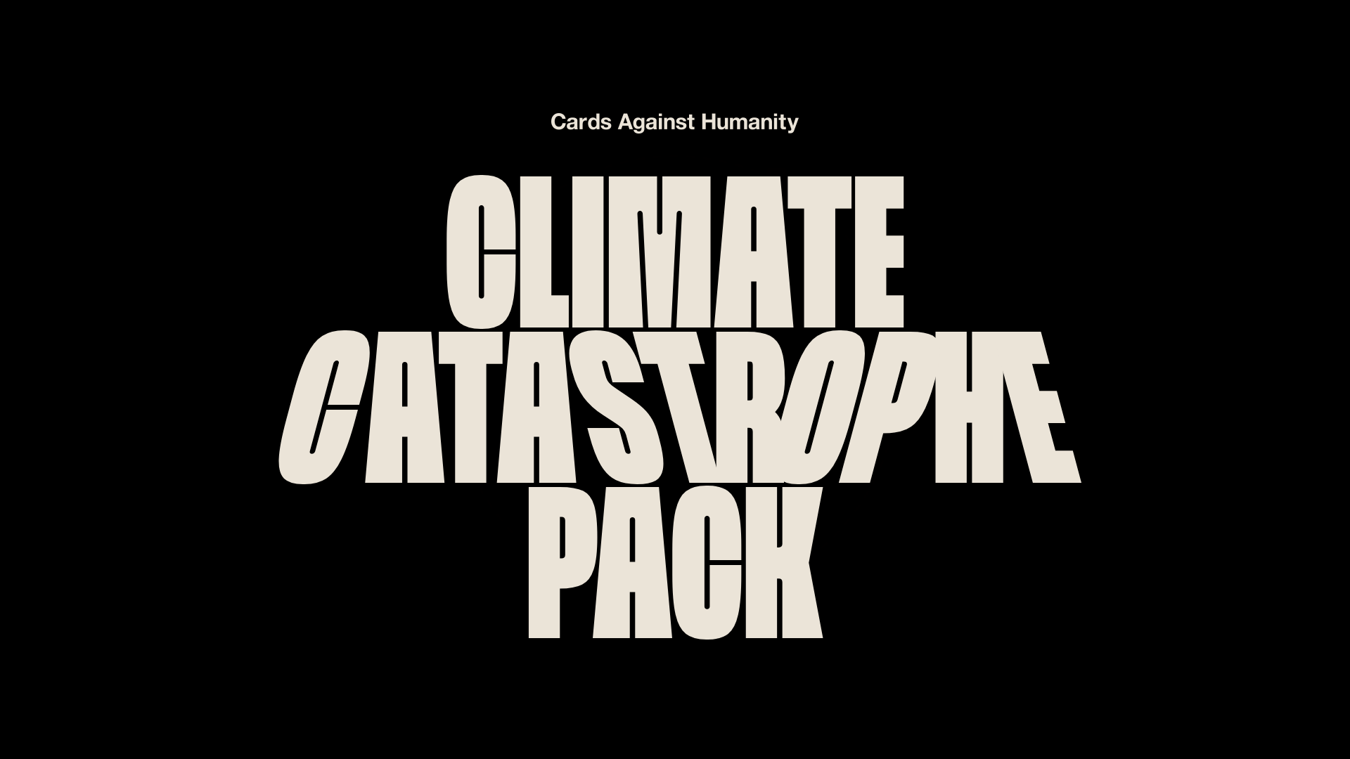
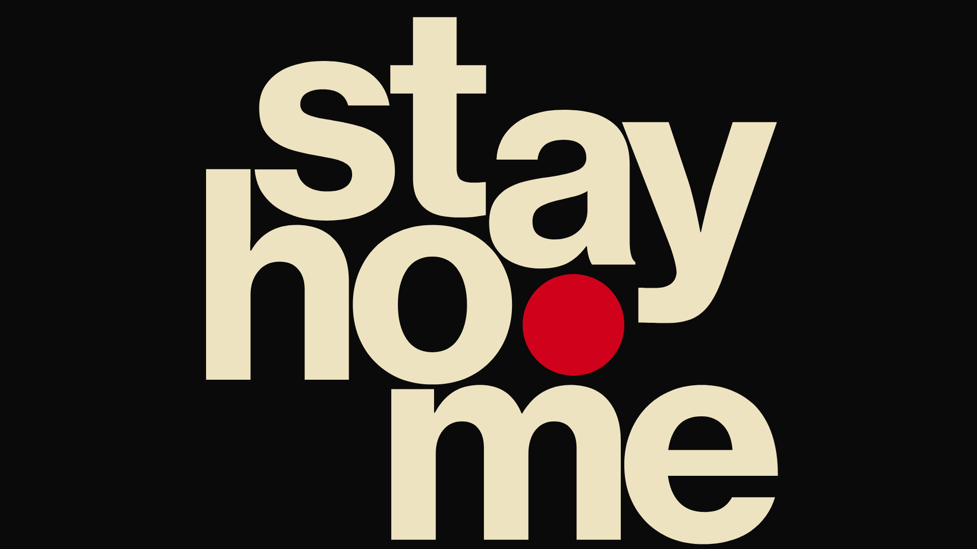
Cards Against Humanity Climate Landing
A high-impact single-page layout featuring a distorted typography hero, parallax scroll animations, interactive Zip code discount logic, and a classic iconography-based FAQ section.
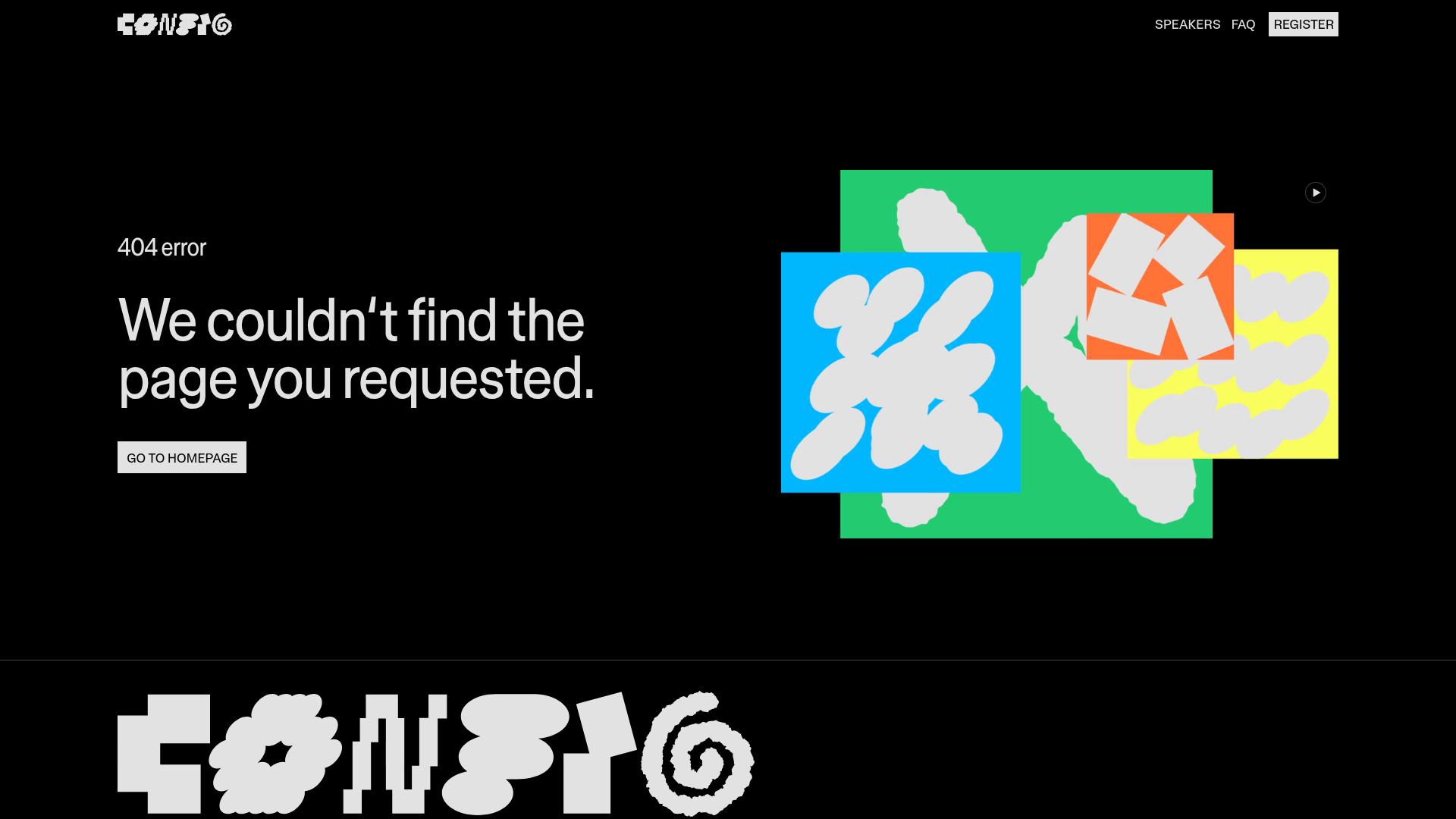
Figma Config 404 Error Page
A high-contrast dark mode error page featuring a bold typographic layout, a video-based hero graphic, and a sticky navigation bar with a custom-styled 'Register' button.
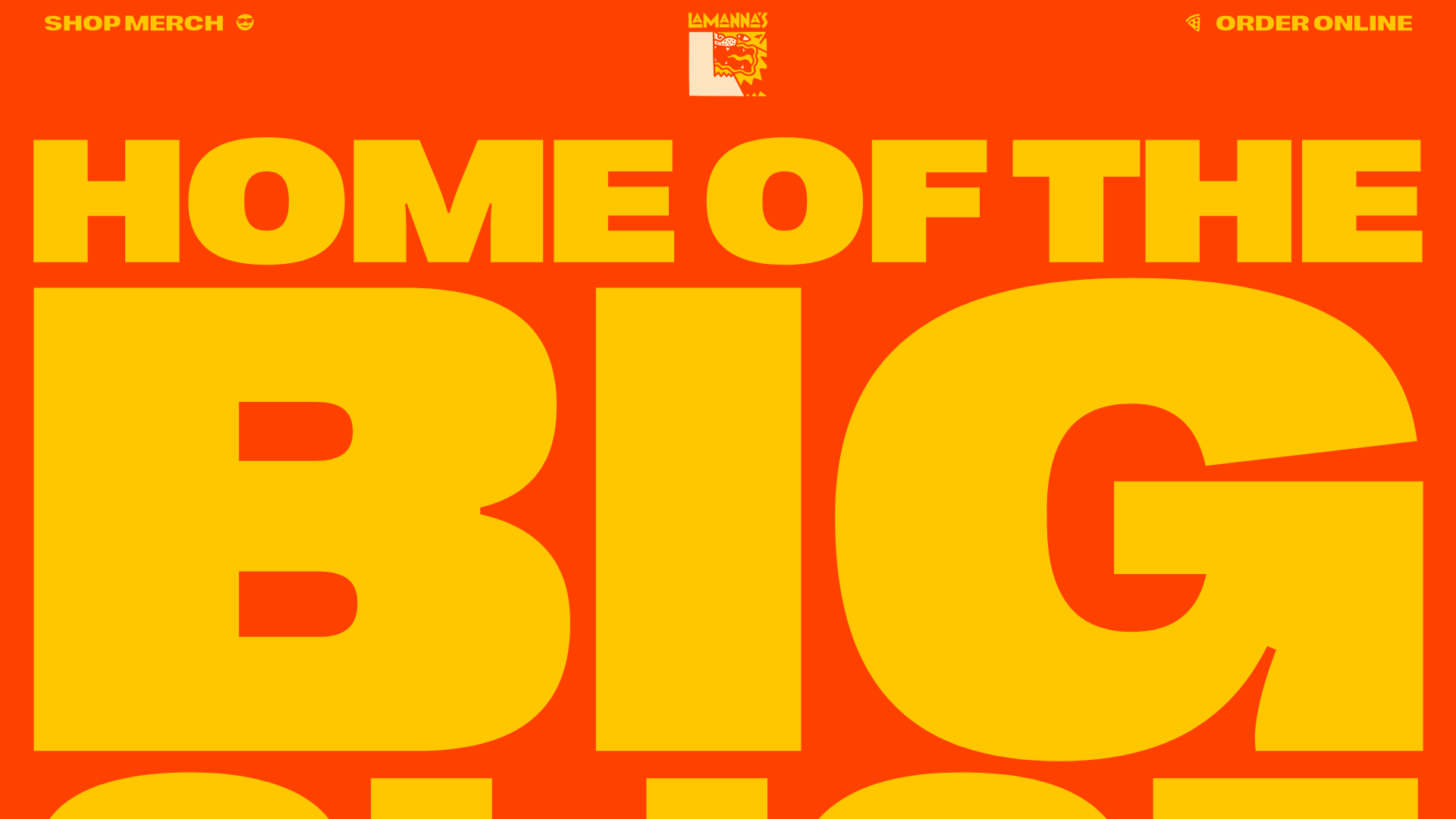
Lamanna's Bakery Vibrant Landing Page
A bold, high-contrast Italian bakery site featuring massive typography, parallax floating elements, marquee banners, and a flickity-powered product carousel.
Hourly App Landing Page
A minimalist iOS app landing page featuring a bold typographic hero, responsive grid-based screenshot displays, and custom SVG illustrations with CSS animations.
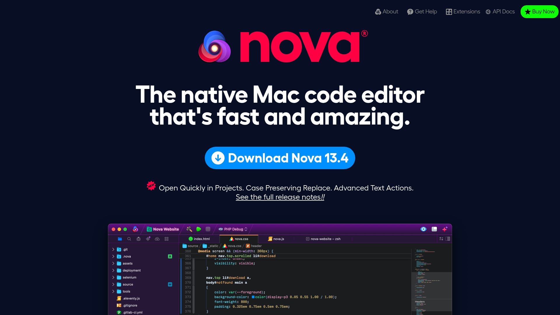
Nova Code Editor Product Landing Page
Dark-themed landing page featuring a starfield background, a flexible feature grid, interactive tabbed preference menus, and stylized product screenshot showcases with hoverable hotspots.
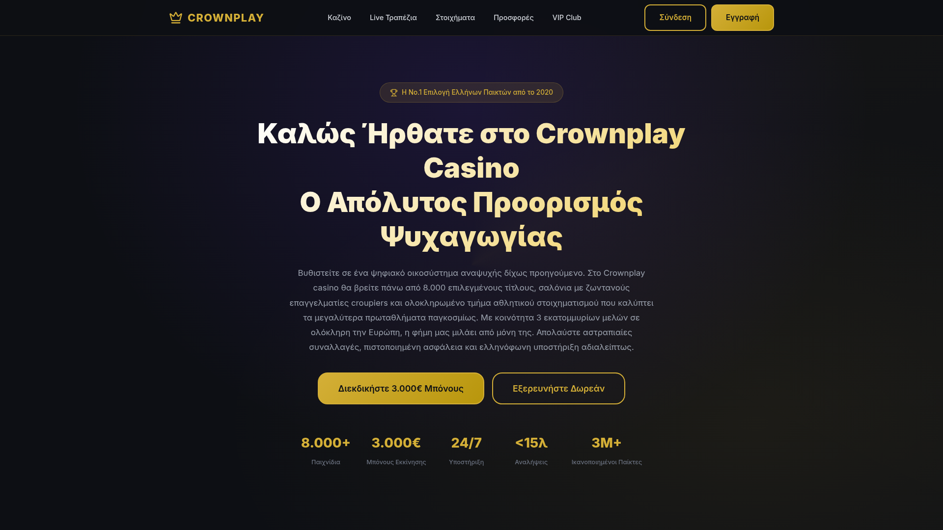
Crownplay Casino Landing Page
A luxury-themed dark mode landing page featuring a center-aligned hero section, value proposition counters, and a high-contrast call-to-action button layout.
