Sunday Restaurant Payment Tech Landing
A modern hospitality landing page featuring a bento box layout, carousel cards, animated marquee logo strips, and a sophisticated white-to-black theme transition.
Overview
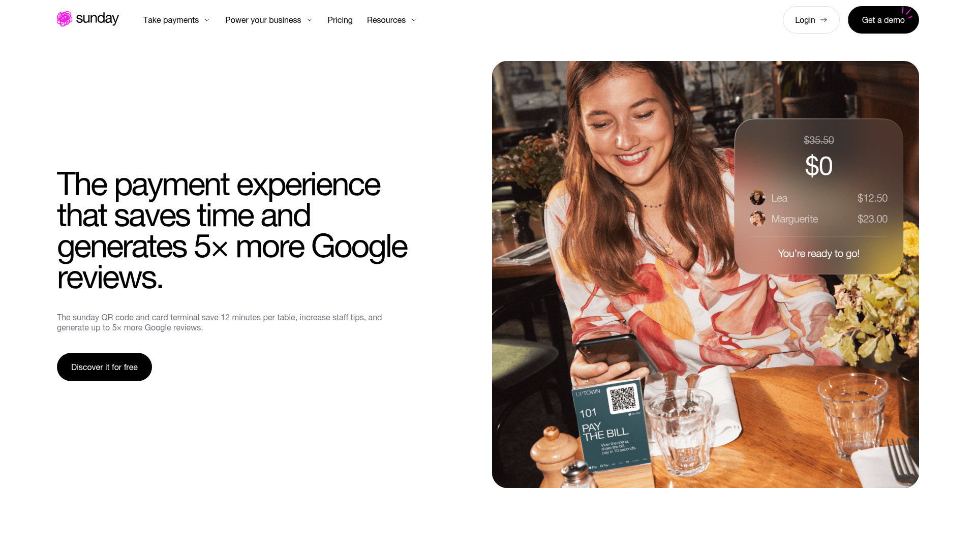
This landing page for Sunday, a restaurant payment solution, is a premier example of high-end SaaS marketing in the hospitality sector. It effectively utilizes a sophisticated "split-screen" hero, bento box layouts, and smooth dark-mode transitions to communicate a complex hardware/software ecosystem through a clean, modern aesthetic.
Design System
- Color Palette & Visual Hierarchy: The site uses a high-contrast "Dual Theme" system. It transitions from a clean "Brand Light" (pure white #FFFFFF background with black text) to a "Brand Dark" (true black #000000 background). Accent colors are minimal, used primarily in high-quality lifestyle photography and a soft pink logo gradient.
- Typography: The typography centers on a bold, high-contrast sans-serif. Headlines (h1/h2) use a tight letter-spacing and substantial weight for impact, while body text (p-big and p) maintains readability with generous leading. Functional text like "FOR OPERATORS" uses a capitalized "tag" style for categorization.
- Structure & Flow: The layout follows a modular "Fleximodule" architecture. It moves from a Value Proposition Hero → Numeric Social Proof (3,500+ clients) → Product Carousel (Swiper.js) → Logo Marquee → Bento-style Benefit Grid → Large Quote Slider → Final CTA.
- Reusable Components:
- Bento Cards: Rounded-corner containers (
card --dark) with overlaid text and high-res product renders. - Marquee Tracks: Animated logo strips (
marquee-track) that provide continuous movement and social proof. - Split-Screen Hero: A 5/12 to 6/12 grid ratio (
col-lg-5content vscol-lg-6media) that balances copy with a stylized floating UI image. - Pill Buttons: Minimalist black-on-white or white-on-black "frame" buttons with rounded ends.
- Bento Cards: Rounded-corner containers (
- Interaction & Motion: The HTML reveals a
will-animateanddata-on-reach-animatepattern, suggesting scroll-triggered reveals. The background color also changes dynamically (data-dynamic-background) as the user scrolls into different functional sections.
Use Cases
- Who should clone this: Small-to-medium hardware SaaS companies, Fintech startups, or hospitality tech providers looking for a "premium/enterprise" look that remains accessible.
- Products for remixing: This structure works exceptionally well for physical product-integrated software (e.g., POS systems, smart home hubs, or medical devices) where high-quality product photography is a primary selling point.
- Remix Directions:
- Brand Swap: Replace the white/black theme with a brand-specific primary/secondary color pair while keeping the bento grid logic.
- Architecture Adaptation: Use the
data_cardssection for any metric-heavy product (e.g., "Users served," "Uptime," "ROI generated").
- Suggested Clone Scope: The hero section and the bento grid are the most structurally valuable components to clone individually for a conversion-focused landing page.
Related Inspirations
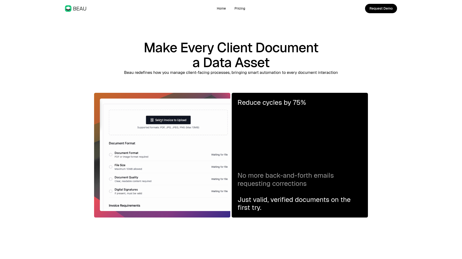
Beau Document Automation Landing Page
A modern software landing page featuring a bento-grid layout, split-screen hero assets with animated checkmarks, a step-by-step process guide, and a clean two-tier pricing table.
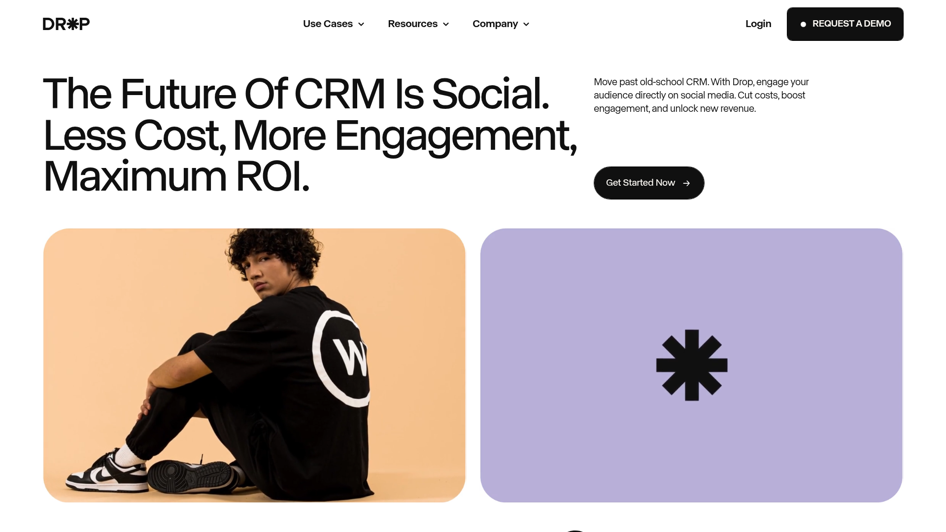
Drop Social CRM Landing Page
A modern SaaS landing page featuring a minimalist large-typography hero section, rounded bento-style image containers, and a clean navigation bar with a CTA.
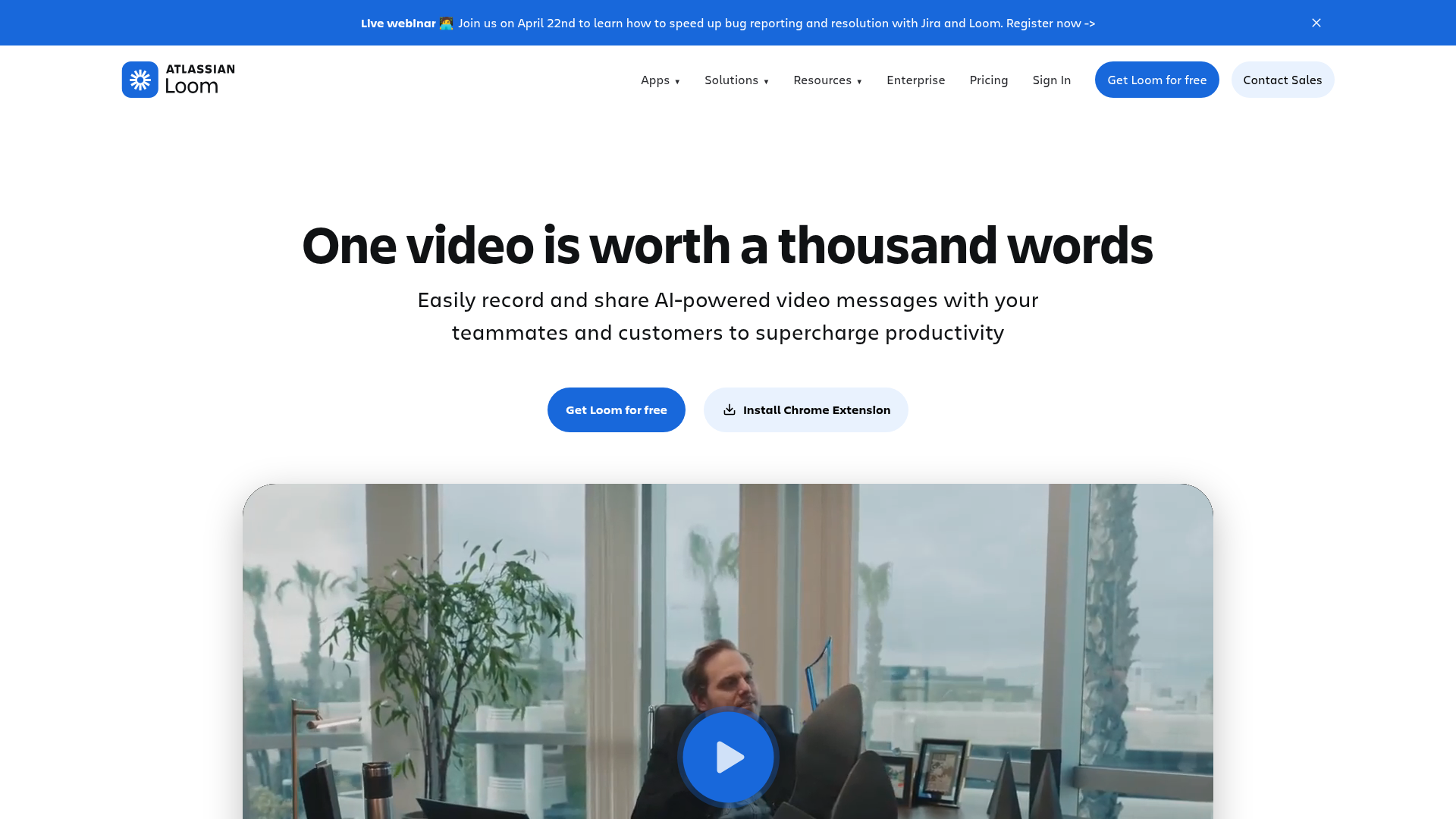
Loom AI Video Hero Page
A modern SaaS landing page featuring a centered hero layout, prominent call-to-action buttons, and an embedded large-scale video player with high-impact typography.
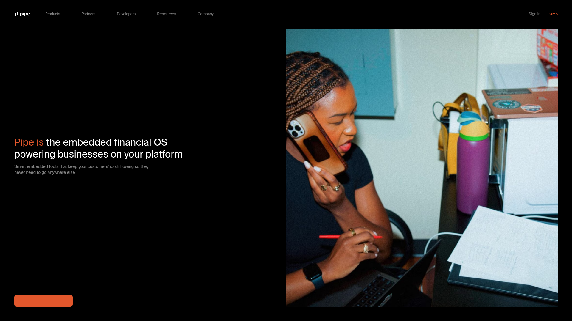
Pipe Fintech SaaS Landing Page
A minimalist dark-themed hero section featuring a split-screen layout with a high-contrast typography block and an integrated media gallery.
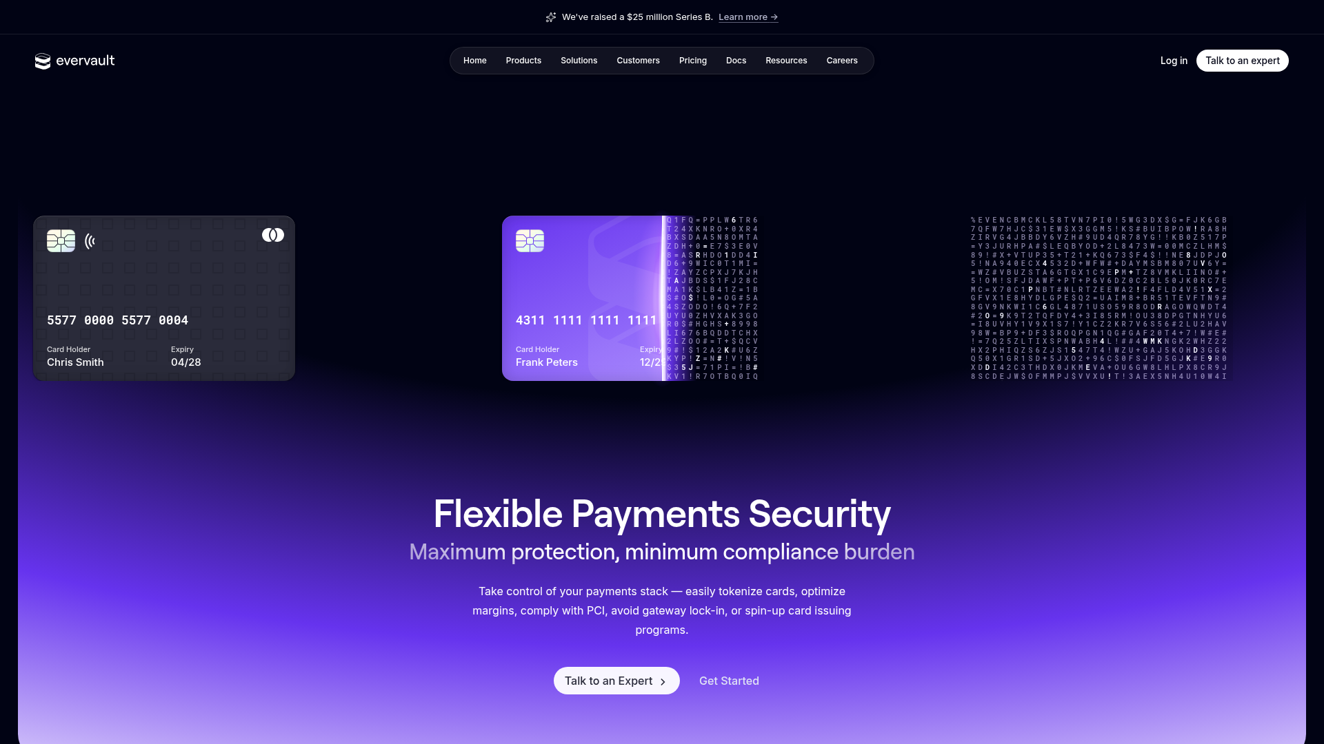
Evervault Security & Fintech Landing Page
A dark-themed developer site featuring an animated encryption hero, bento grid-style solution highlights, interactive code tabs, and a data-driven service integration ring.
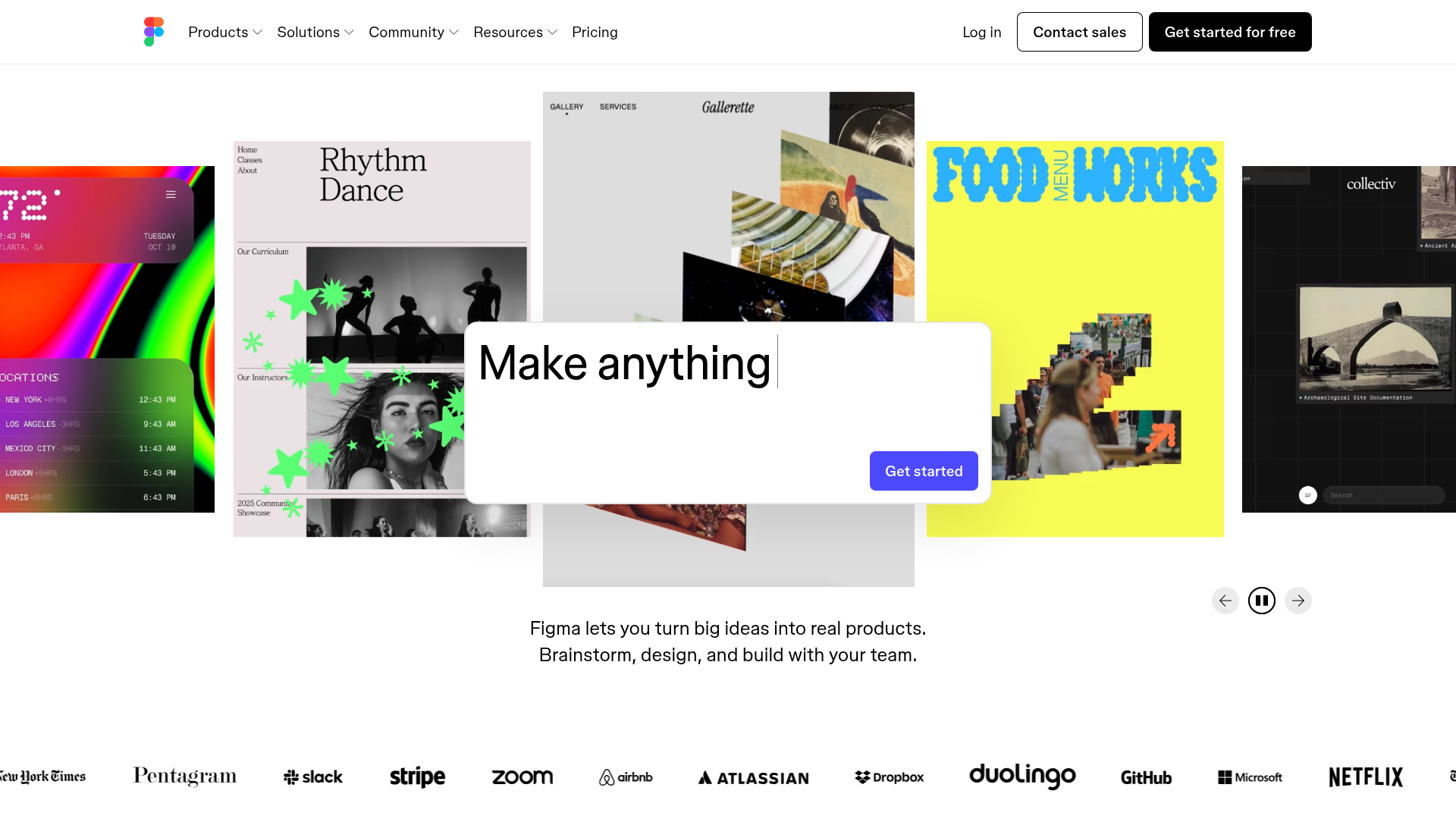
Figma Landing Page Gallery Hero
A dynamic landing page featuring a center-focused search bar hero, a horizontally-scrolling interactive video carousel, and a clean brand logo grid.
