Pipe Fintech SaaS Landing Page
A minimalist dark-themed hero section featuring a split-screen layout with a high-contrast typography block and an integrated media gallery.
Overview
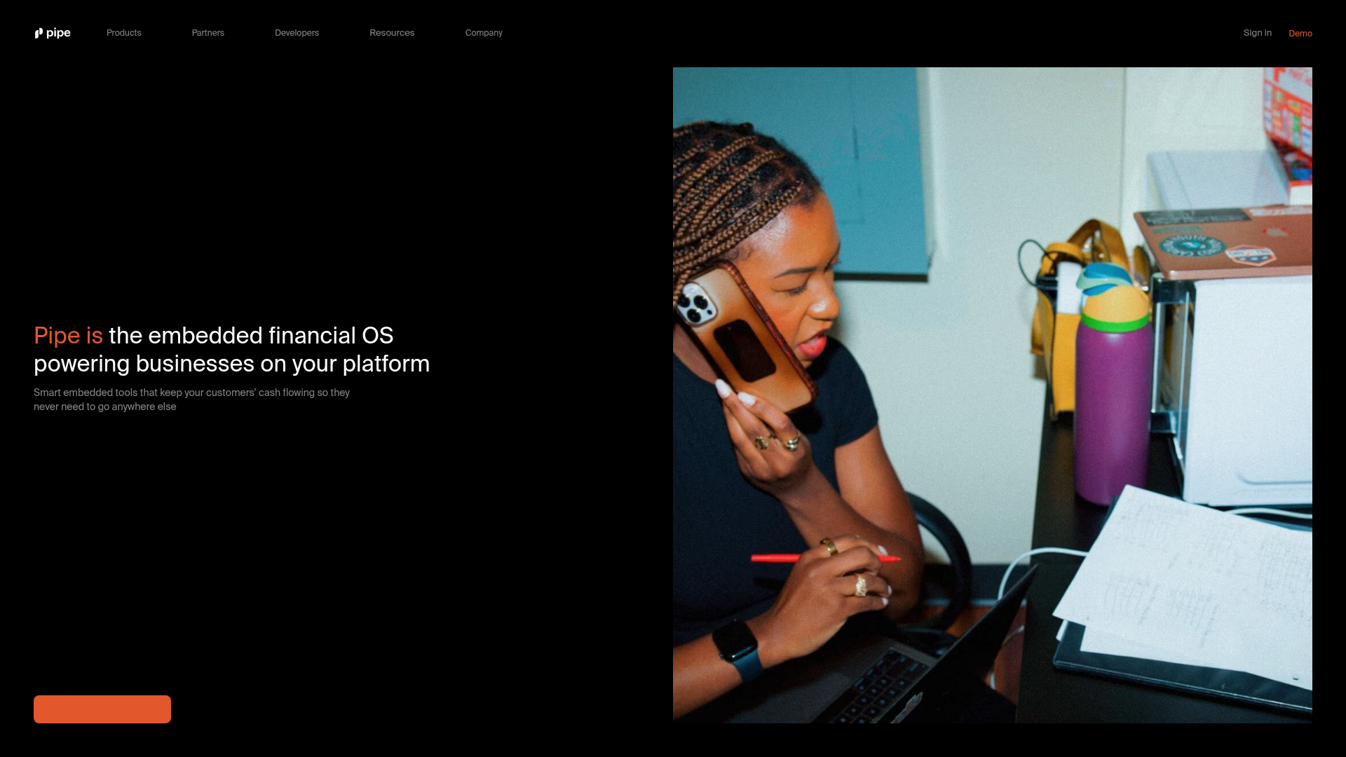
This is the landing page for Pipe, a fintech platform offering embedded financial tools for businesses. It is a premier reference for a high-end SaaS clone because of its masterful use of dark mode, split-screen hero layout, and minimalist navigation that conveys authority and modern sophistication.
Design System
- Color Palette & Visual Hierarchy: The site uses a deep black background (
#000000) to create maximum contrast with white text and vibrant accent colors. There is a distinct orange-red highlight used for primary calls-to-action (CTAs) and specific keyword emphasis (e.g., "Pipe is"), directing the eye immediately to the brand identity. - Typography System: A clean, geometric sans-serif font is used throughout. The hero headline features a large scale with tight tracking and a bold weight, while subheaders use a smaller, mid-gray font to establish clear hierarchy without competing for attention.
- Page Structure: The hero section employs a 50/50 split-screen layout. The left side is dedicated to a high-contrast copy block and a primary button, while the right side features a full-height, immersive lifestyle image that humanizes the fintech service.
- Reusable Components:
- Header Nav: A minimal top bar with clean sans-serif links and a distinct 'Demo' CTA.
- Rounded CTA Buttons: Large, pill-shaped buttons with solid color fills that anchor the layout.
- Split-Screen Grid: A versatile container structure that balances heavy text with visual media.
- Implementation Clues: The HTML structure suggests a lean, responsive framework focusing on flex-based alignment for the hero content and navigation menus. The use of high-quality image assets indicates a focus on performance-optimized media delivery.
Use Cases
- Who should clone this pattern: B2B SaaS companies, fintech startups, or developer-tool providers looking for a professional "serious yet modern" aesthetic.
- Effective Remixes: This layout works well for apps wanting to showcase a human element alongside technical product details. It is highly effective for products with a single, powerful value proposition.
- Practical Remix Directions:
- Brand Evolution: Swap the black background for a deep navy or dark slate to soften the aesthetic.
- Content Tweak: Replace the lifestyle image with an interactive app demo or a 3D product render on the right panel.
- Navigation Scaling: Expand the 'Resources' or 'Company' links into mega-menus if the site needs to house a larger content footprint.
- Suggested Clone Scope: Start by cloning the hero section and navigation bar to establish a high-impact entry point for any marketing site.
Related Inspirations
Tilt Financial Services Landing Page
A high-contrast dark mode fintech site featuring an absolute-positioned image collage hero, horizontal scrolling product panels, and bento-style application benefits.
Copilot Money Finance Landing Page
A dark-themed finance landing page featuring a centered animated hero section with floating category badges, integrated trust badges, and a clean minimalist navigation bar.

Vercel AI Cloud Landing Page
A modern landing page featuring a minimalist dark-themed navbar, a grid-overlay hero section with radial color gradients, and high-contrast typography for customer success stories.
Sunday Restaurant Payment Tech Landing
A modern hospitality landing page featuring a bento box layout, carousel cards, animated marquee logo strips, and a sophisticated white-to-black theme transition.

GoCardless Payments Platform Landing Page
A dark-themed fintech landing page featuring a split-screen video hero, bento-style feature cards, a horizontal logo slider, and step-by-step accordion guides.
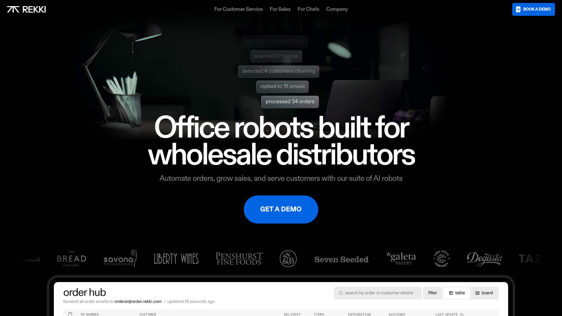
REKKI AI Automation SaaS Landing Page
A high-impact dark-mode landing page featuring a floating label hero section, marquee brand logos, an interactive dashboard UI preview, and card-based testimonial grids.
