Figma Landing Page Gallery Hero
A dynamic landing page featuring a center-focused search bar hero, a horizontally-scrolling interactive video carousel, and a clean brand logo grid.
Overview
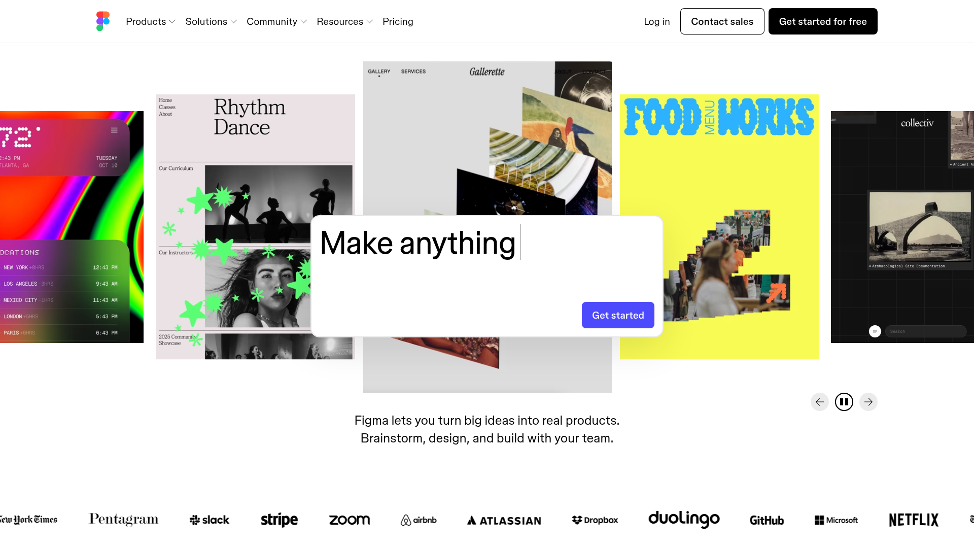
This project clones the high-impact hero section of the Figma landing page, featuring a centered interactive search bar and a large-scale, horizontally scrolling video carousel. It is an excellent reference for building a modern gallery-style landing page that prioritizes visual proof and interactive discovery over traditional static headlines.
Design System
- Color Palette & Visual Hierarchy: The design uses a minimal light-gray and white foundation to let the vibrant, saturated colors of the carousel slides dominate. High contrast is used for primary calls-to-action (a solid blue button #5551FF) and the black utility navigation.
- Typography: The system relies on a clean, geometric sans-serif (Inter-like) with tight tracking. A massive, centrally-aligned H1 provides the core message, which is then reinforced by a smaller, readable body paragraph block following the carousel.
- Page Structure:
- Global Navigation: A standard horizontal bar with dropdown menus and prominent 'Log in/Sign up' actions.
- Interactive Hero: A centered "Make anything" input field overlaying a carousel.
- Carousel Display: A series of non-standard aspect ratio video slides (approximately 3:4) with a focus on depth (central slide is scaled up, peripheral slides are scaled down and semi-transparent).
- Social Proof Section: A dense, grayscale logo grid containing high-authority brands (The New York Times, Slack, Airbnb).
- Reusable Components:
- Interactive Input Bar: A rounded white container with a focused 'Get started' button.
- Logo Grid: A flexible, responsive container for grayscale company logos.
- Slide Navigation: Minimalist circular arrow buttons and a 'pause/play' toggle for the carousel.
- Interaction & Motion: The carousel utilizes 3D transforms (
translate3d) and scaling to create a perspective effect. The HTML reveals the use of embedded Vimeo players for the video content, allowing for high-performance looping visuals. - Implementation Details: The site uses a utility-heavy CSS approach with a structured
appcontainer. The carousel is built usingaria-roledescription="carousel"androle="group"for the slides, ensuring accessibility for complex visual patterns.
Use Cases
- Who should clone this: Creative agencies, design tool startups, or portfolio platforms that need to showcase a high volume of visual work immediately upon page load.
- Effective Remixes:
- E-commerce: Replace the design tutorial videos with high-definition product lifestyle shots.
- SaaS: Use the central input bar as a URL-shortener or a search field for a large documentation database.
- Remix Directions: Swap the playful, artistic carousel content for enterprise-focused screencaps while keeping the 3D perspective transition; adapt the logo grid for a 'Featured In' press section.
- Suggested Clone Scope: Start by cloning the Logo Grid and Carousel Navigation for quick wins, or the full Hero Section to overhaul a product's landing page identity.
Related Inspirations
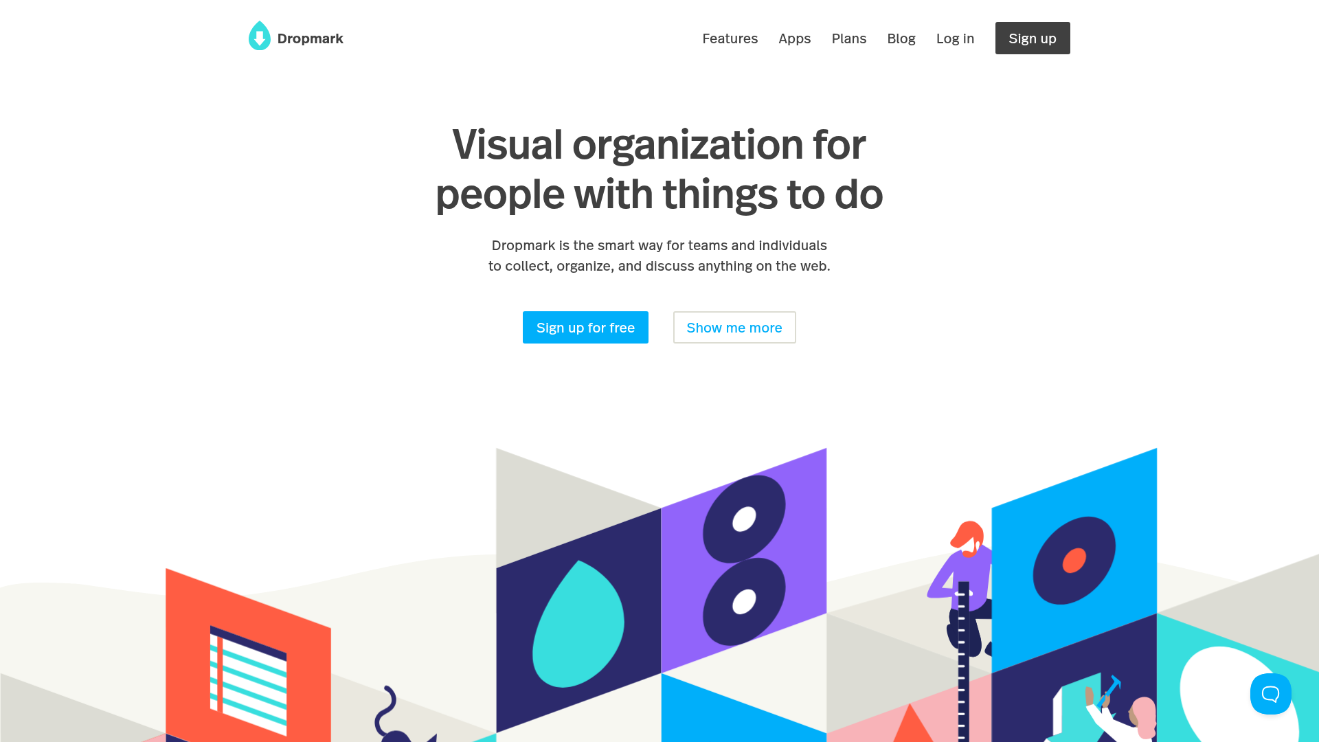
Dropmark Visual Organization Landing Page
Features a clean minimalist hero section with split-action buttons, a vibrant vector illustration footer, and an interactive horizontal flickity carousel for case studies.
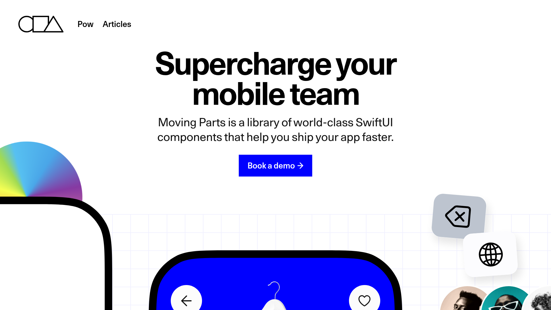
Moving Parts SwiftUI Component Library
A high-performance landing page featuring a interactive code comparison toggle, animated mobile UI previews, and a clean minimalist aesthetic for developer tools.
MetaMusic Service Landing Page
Features a horizontal scrolling card deck, animated SVG illustrations, a partner logo marquee, and a multi-step process layout with notched corner UI components.
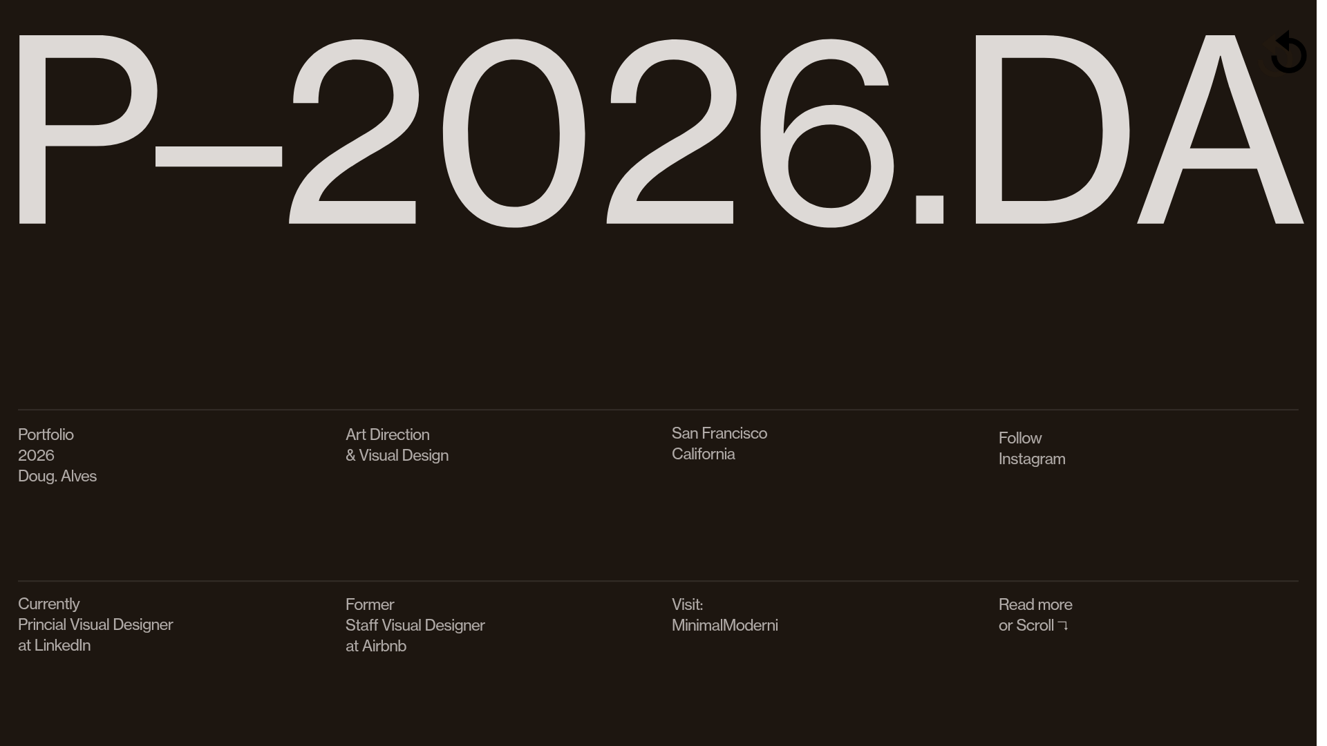
Doug Alves Visual Design Portfolio
A minimalist, high-contrast design portfolio featuring oversized typography, a sticky four-column grid footer, and a vertical scroll-triggered slide-show for project showcases.
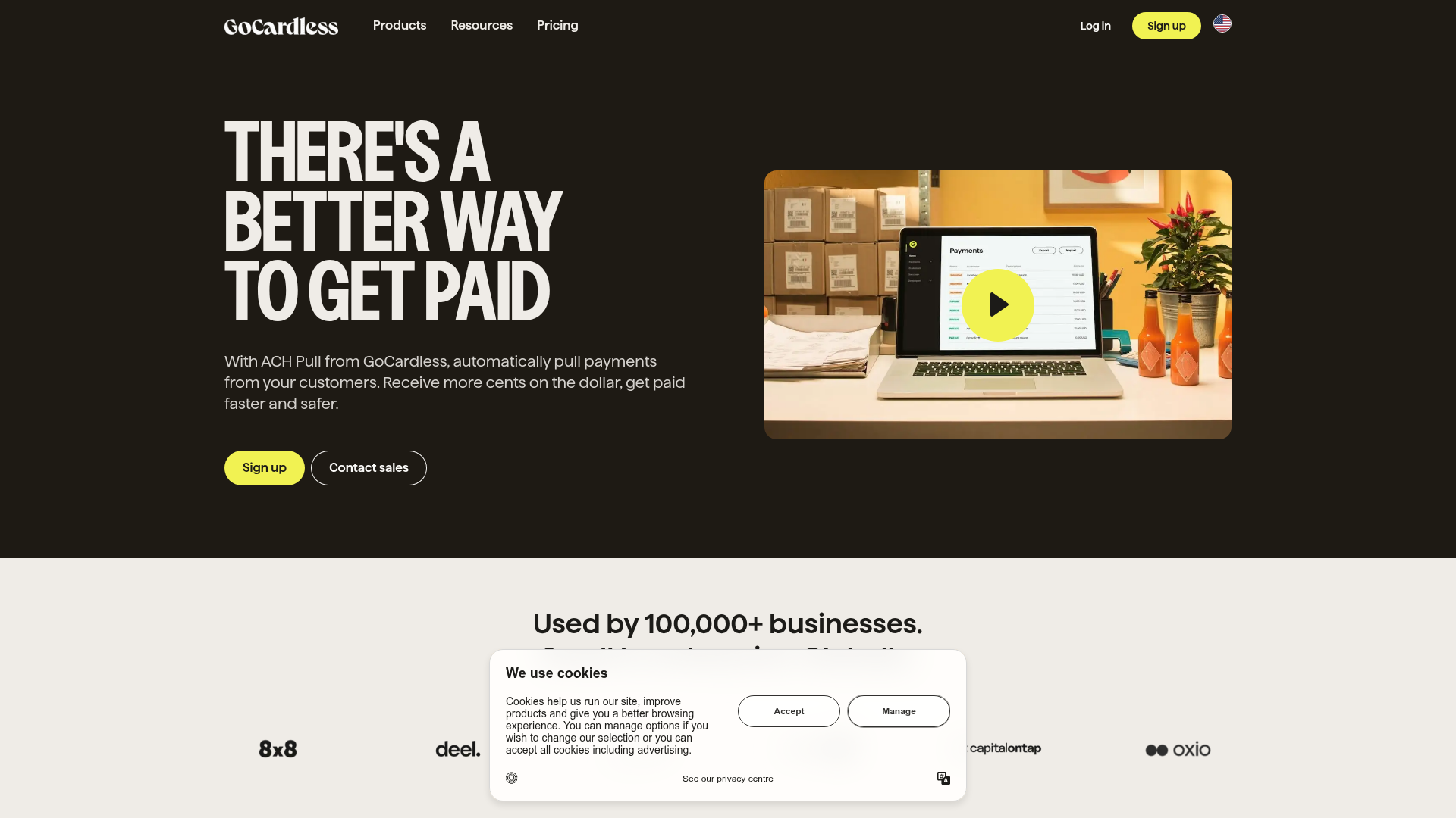
GoCardless Payments Platform Landing Page
A dark-themed fintech landing page featuring a split-screen video hero, bento-style feature cards, a horizontal logo slider, and step-by-step accordion guides.
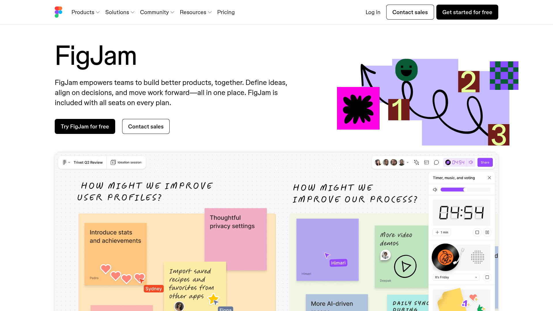
FigJam Product Landing Page
A collaborative tool showcase featuring a centered hero section, logo marquee, vertical tabbed feature switcher, and interactive carousel for templates.
