Beau Document Automation Landing Page
A modern software landing page featuring a bento-grid layout, split-screen hero assets with animated checkmarks, a step-by-step process guide, and a clean two-tier pricing table.
Overview
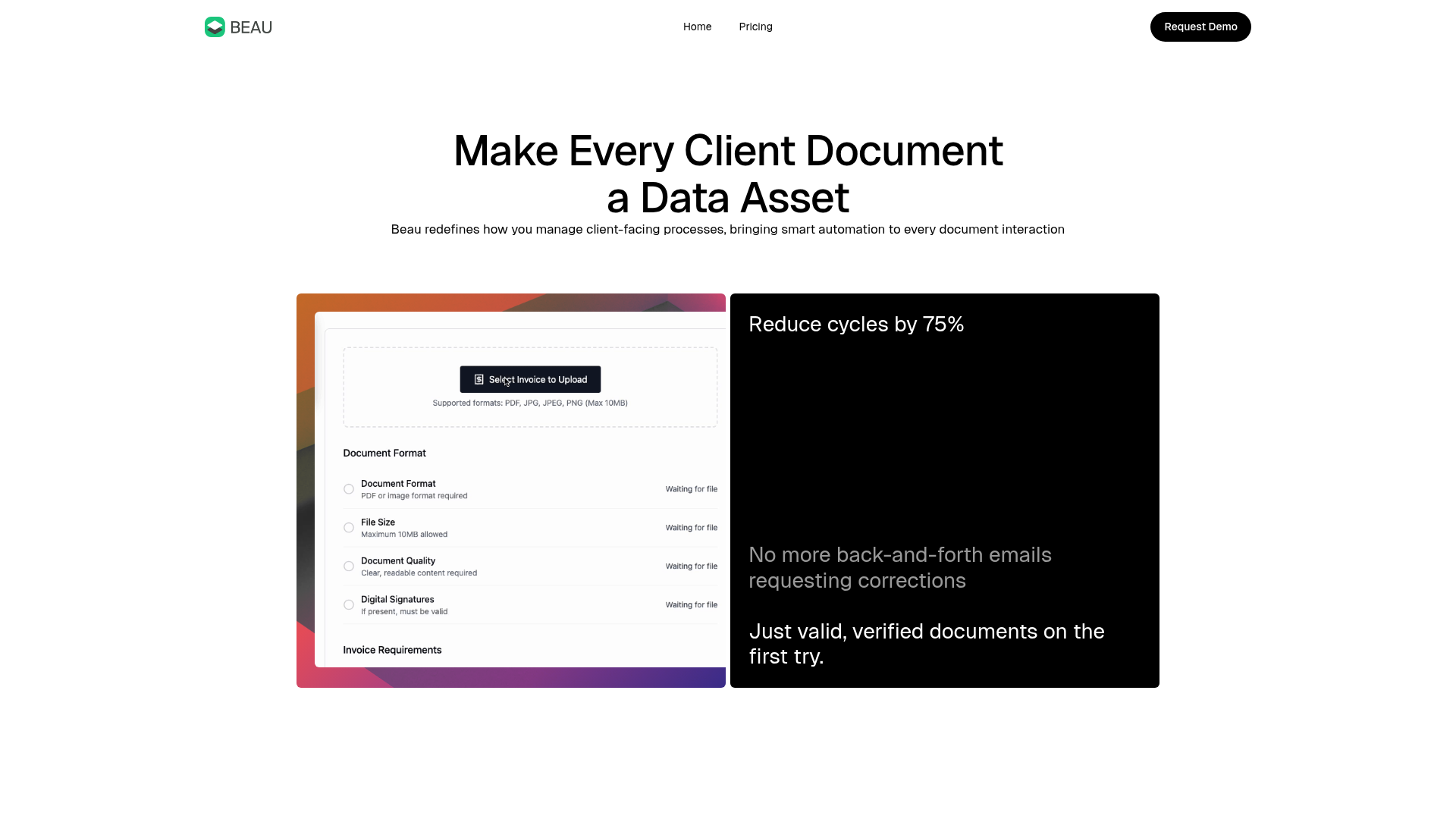
Beau is a modern, high-conversion landing page designed for document automation software. It features a clean bento-grid layout, split-screen hero sections, and subtle gradient-based visual cues, making it an excellent reference for SaaS builders who want a balance of professional trust and contemporary aesthetic.
Design System
- Color Palette & Visual Hierarchy: The design centers on a high-contrast foundation of pure white and deep black (
bg-neutralanddark-text). It uses vibrant, multi-color mesh gradients (found ingraphic-canvaselements) as both background accents for cards and primary CTAs to create focal points against the monochromatic base. - Typography System: The site uses a bold, sans-serif heading system (
heading-h1toheading-h3) with tight letter-spacing. Visual emphasis is achieved through "faded headings" (lower opacity text) to differentiate secondary information within the same typographic scale. - Page Structure: The layout follows a logical sales flow: a minimal hero with a split bento card, a headline-driven benefit section, a three-step "how it works" process guide with vertical dividers, an icon-badge cluster for feature density, and a high-contrast two-tier pricing grid.
- Reusable Components:
- Bento Cards: The
bento-halvesandfigma-cardcombine software screenshots with statistical callouts. - Process Cards: The
process-cardcomponents utilize a consistent icon-label-description structure separated by clear vertical lines. - Gradient Buttons: Primary actions use a
gradient-buttonclass with a dual-text wrapper for hover state transitions. - Icon Badges: A dense
icon-badge-clusterfor showcasing many features or integrations in a compact space.
- Bento Cards: The
- Interaction & Motion: The HTML indicates the use of
data-w-idattributes for scroll-triggered entrance animations (opacity shifts and 24px Y-axis translations). There is a horizontal marquee implementation for mobile viewports to handle the badge cluster efficiently. - Implementation Clues: The structure uses a container-based utility system (e.g.,
section,container,vertical-content). The presence ofw-nodeandw-variantclasses suggests a Webflow-based layout engine focusing on Flexbox and CSS Grid for the bento transitions.
Use Cases
- Who should clone this: B2B SaaS startups, FinTech platforms, or AI tool builders who need to explain a complex workflow in a simple, visual manner.
- Effective Remixes:
- Analytics Dashboard: Replace the document upload screenshots with data visualization mocks.
- Consulting Services: Adapt the three-step "How it Works" section into a service engagement process.
- Practical Directions: To remix, swap the colorful mesh gradients for your brand's primary colors. The information architecture can be simplified by removing the
icon-badge-clusterfor products with fewer features while maintaining the core bento-grid hero. - Suggested Scope: The full-page clone is highly effective for a standard product launch. For a quicker implementation, the "How it Works" grid and the high-contrast pricing blocks are the most valuable standalone components.
Related Inspirations
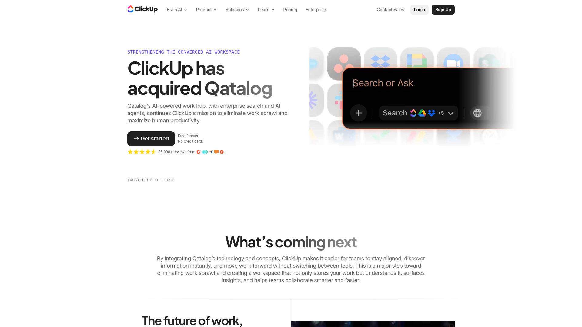
ClickUp Acquisition Hero Landing Page
Features a modern dark-themed hero section with a search UI graphic, bento-style feature grid, and a high-contrast CTA section with decorative gradients.
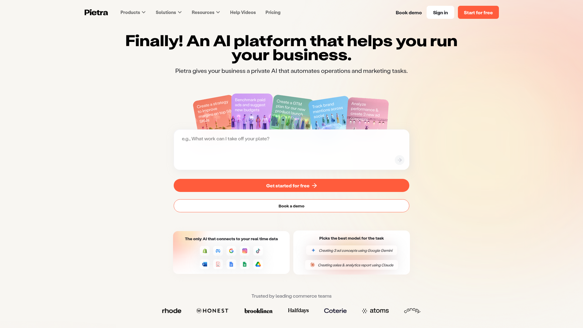
Pietra AI Platform Landing Page
A commerce-focused landing page featuring a centralized AI input hero, colorful floating value-prop cards, a bento-style integration showcase, and tabbed feature sections with side-by-side comparisons.
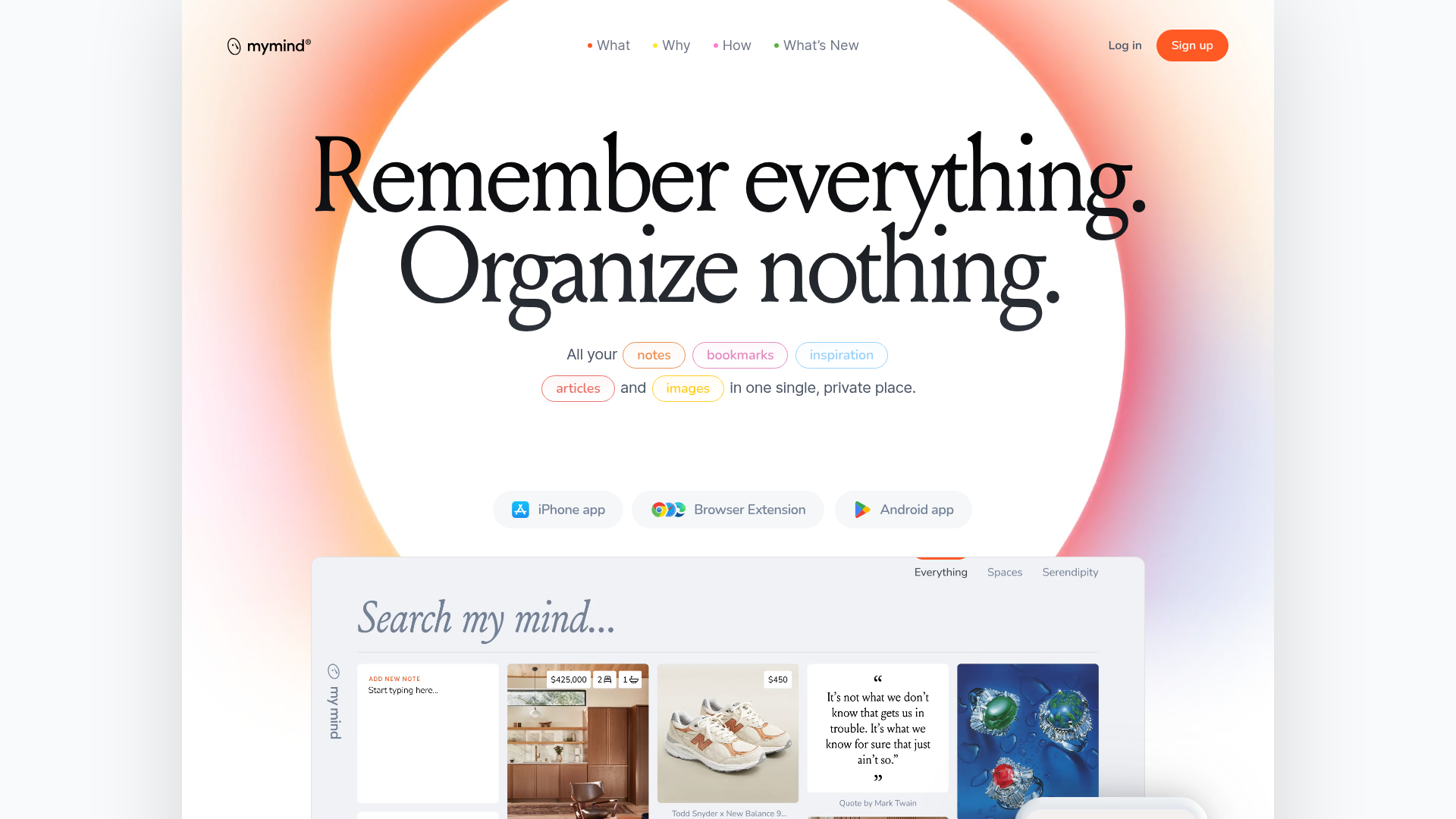
Mymind AI Tool Landing Page
A minimalist SaaS landing page featuring a soft-gradient hero section, custom pill-shaped text badges, and a dynamic bento-style search result preview grid.
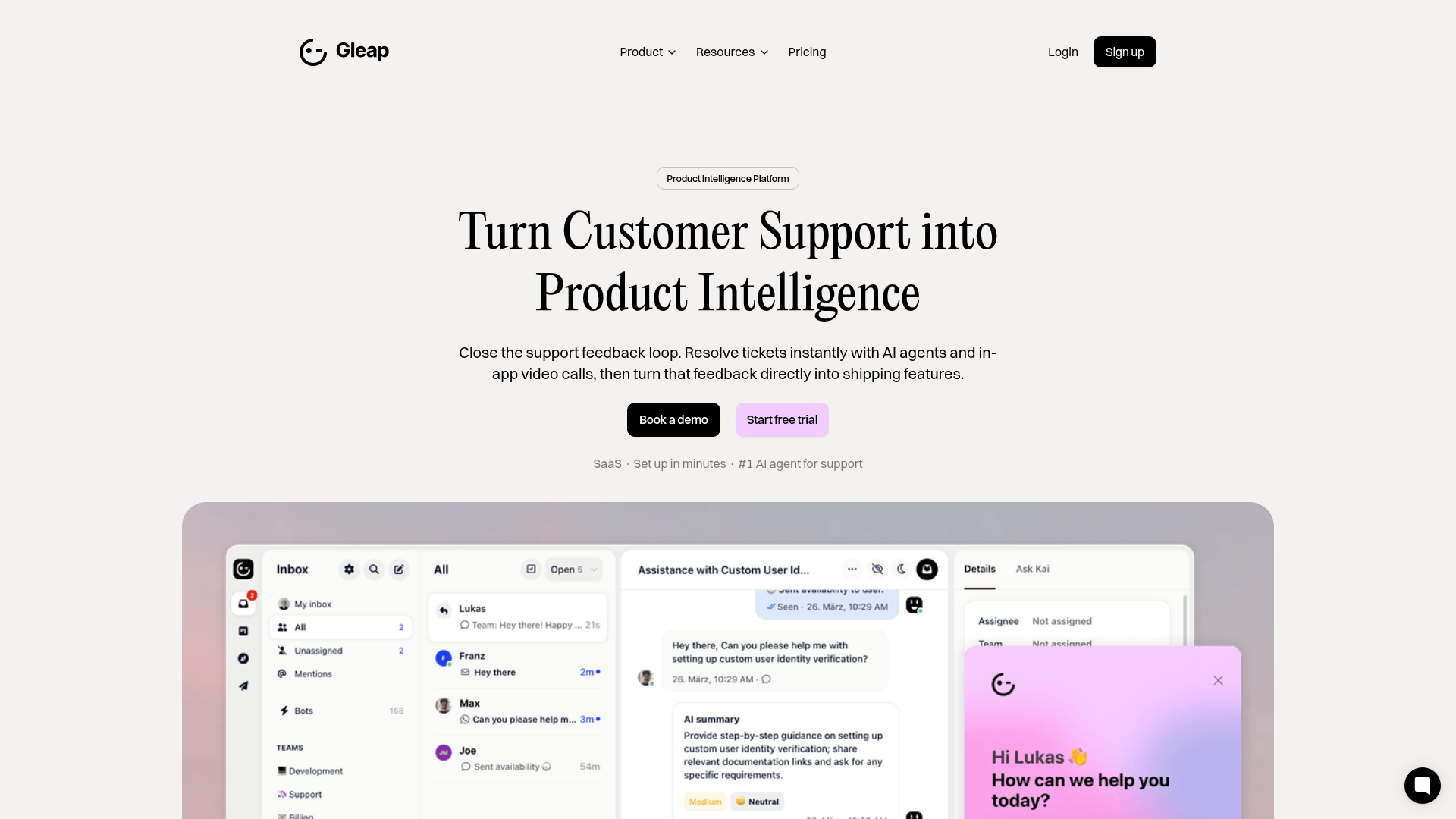
Gleap Product Intelligence Platform Landing
A SaaS template featuring a central video hero, comparison pricing tables, tabbed feature navigation, and a testimonial grid with major brand logos.
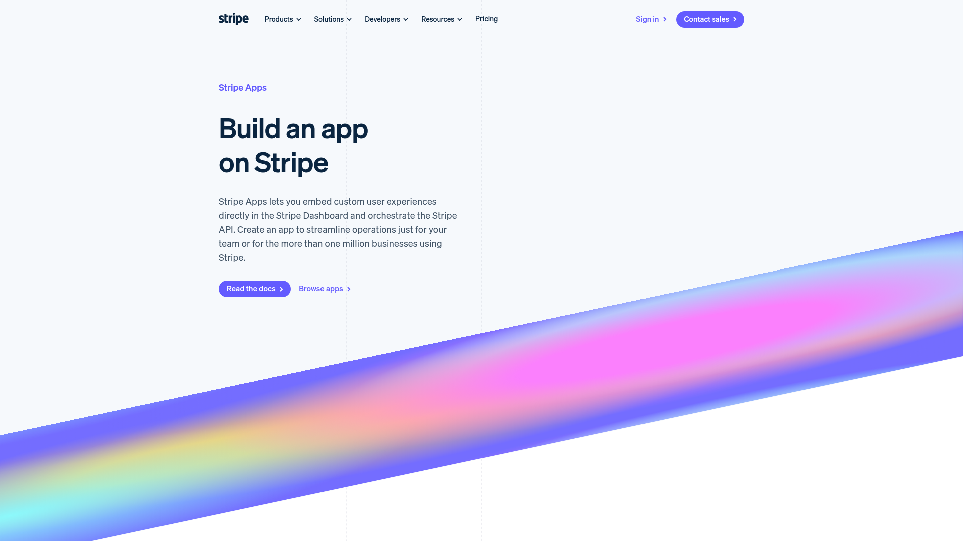
Stripe Apps Developer Portal Landing
A developer-focused landing page featuring a geometric animated gradient hero, multi-column feature sections, carousel components with code editors, and testimonial sliders.
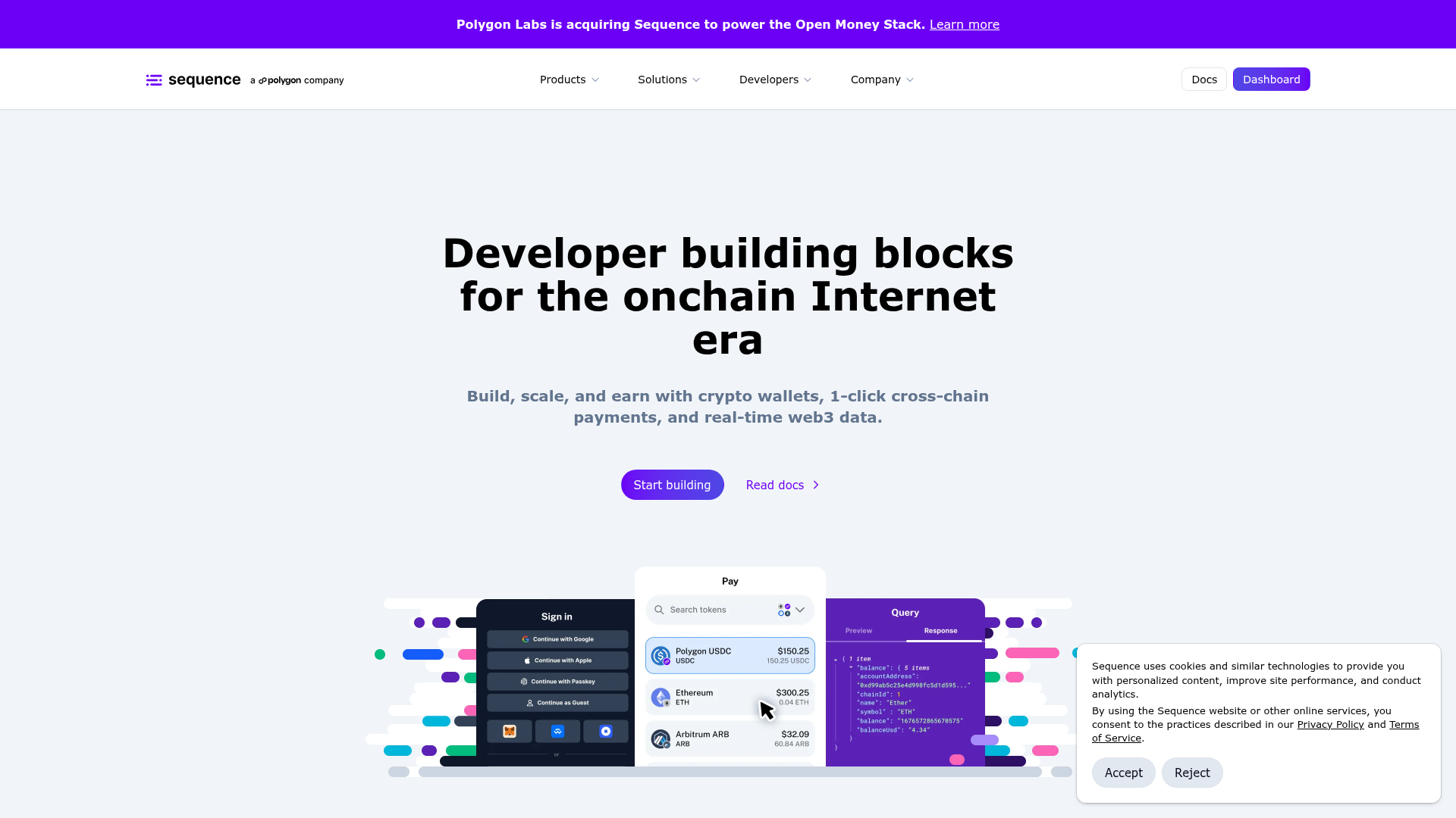
Sequence Onchain Web3 Landing Page
A developer-focused landing page featuring a purple theme, sticky navigation, alternating product feature sections, a partner logo carousel, and vertical-based solution cards.
