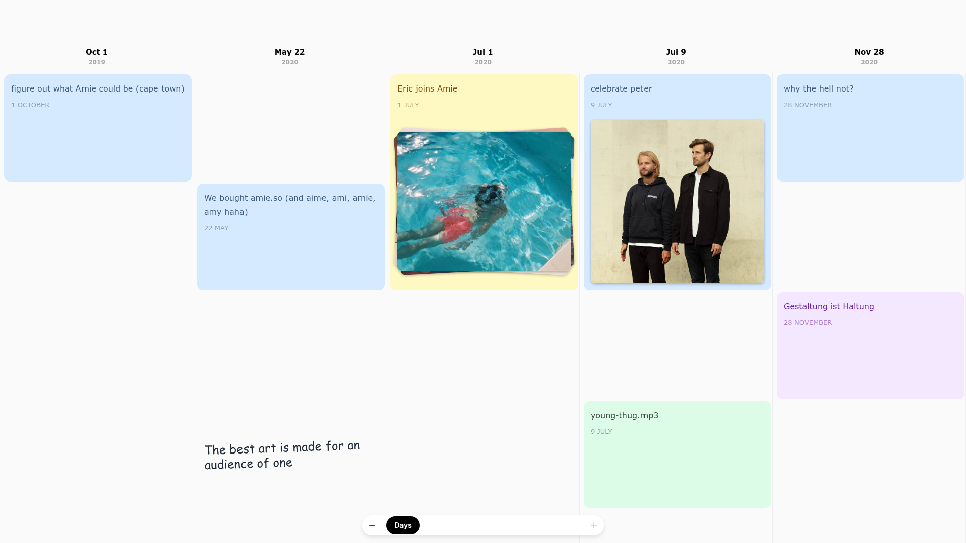
Amie Chronological Portfolio Timeline
A horizontal scrolling timeline layout featuring multi-column date headers, color-coded status cards, and embedded image assets for storytelling.
Overview
This project is a high-fidelity chronological portfolio timeline from the productivity app Amie. It reimagines traditional vertical scrolling as a horizontal calendar-grid experience, using a bento-style card layout to narrate a company's product journey. It is a premier reference for developers and designers looking to build non-linear storytelling interfaces, interactive resumes, or feature roadmaps.
Design System
- Color Palette & Visual Hierarchy: The system uses a soft, light-gray background (
#f3f4f6) to let colorful event cards pop. Cards follow a semantic or category-based color code: blue (#D5EAFF) for tasks, yellow (#fef9c3) for hires, green (#dcfce7) for media, and purple (#f3e8ff) for philosophy. Text colors are high-contrast variants of the card fills (e.g.,#854d0eon yellow) to ensure readability. - Typography: The interface utilizes a clean sans-serif stack with a focus on hierarchy. Date headers feature bold, condensed month labels with smaller year sub-headers. Card titles use variable font weights, sometimes featuring slight rotations (e.g.,
rotate:-2deg) to mimic post-it notes or hand-written aesthetics. - Page Structure: The layout is built on a
Timeline_gridutilizing CSS Grid. Each column represents a specific date, allowing for vertical stacking of multiple events occurring on the same day. This create a "scannable" horizontal flow that breaks away from standard vertical feed patterns. - Reusable Components:
- EventCard: A versatile container with properties for background color, image slots (
EventCard_photo), and stacking effects for team photos. - Sticky Header: Date markers that stay pinned to the top of the columns during horizontal scroll.
- Dynamic Navigation Bar: A custom floating control at the bottom that allows users to toggle zoom levels (Years, Months, Days) and scroll precisely.
- EventCard: A versatile container with properties for background color, image slots (
- Interaction Patterns: The design features subtle hover states and card-stacking animations (
EventCard_stack). Some cards include.gifand.mp3indicators, suggesting a rich media experience. The timeline usesoverflow-x: scrollwith atimeline-containerfor native-feeling horizontal movement. - Implementation Clues: The HTML reveals a Next.js framework (indicated by
#__next) and CSS Modules for styling (e.g.,EventCard_card__MZFio). Layout execution relies heavily ongrid-row: auto / span Xto manage card height based on importance or content density.
Use Cases
- Startup Founders: Use this to build a "Building in Public" roadmap or a company history page that feels more personal than a bulleted list.
- Creatives & Developers: Practical for an interactive CV or portfolio where projects are mapped across a career timeline.
- Music & Media Producers: Remix the
.mp3and media card patterns to create an interactive discography or release schedule. - Remix Directions: Swap the playful pastel colors for high-contrast dark tones for a technical documentation site, or adapt the horizontal scroll for a photo-heavy travel blog.
- Clone Scope: Start by cloning the
Timeline_columnandEventCardcomponents to create a modular, scrollable section for an existing landing page before committing to the full-page horizontal architecture.
Related Inspirations
Studio Otto Multi-Column Portfolio Grid
A minimalist, five-column project showcase featuring infinite-scroll vertical columns, interactive image masks, and contextual description text blocks.
Leandro Farina Portfolio Gallery
A minimalist photography portfolio featuring a full-width Slick slider hero and a responsive image grid with hover-triggered captions and category tags.

Clase Agency Branding Portfolio
A minimalist design agency portfolio featuring a typographic hero section, full-width image articles, sticky title bars, and integrated scrolling text marquees for a clean editorial layout.

Ayaka B. Ito Creative Portfolio
A minimalist design portfolio featuring an immersive full-screen hero image, clean typographic navigation, and a structured layout for showcasing branding and editorial projects.
Caserne Design Studio Portfolio
A minimalist, high-impact portfolio featuring a dynamic masonry grid of project thumbnails with overlay text and a clean, oversized typography-driven footer.

Lundqvist & Dallyn Studio Portfolio
Minimalist design studio portfolio featuring a custom video loader, world clock navigation, and a fluid masonry-style grid for high-quality photography and type design showcases.
