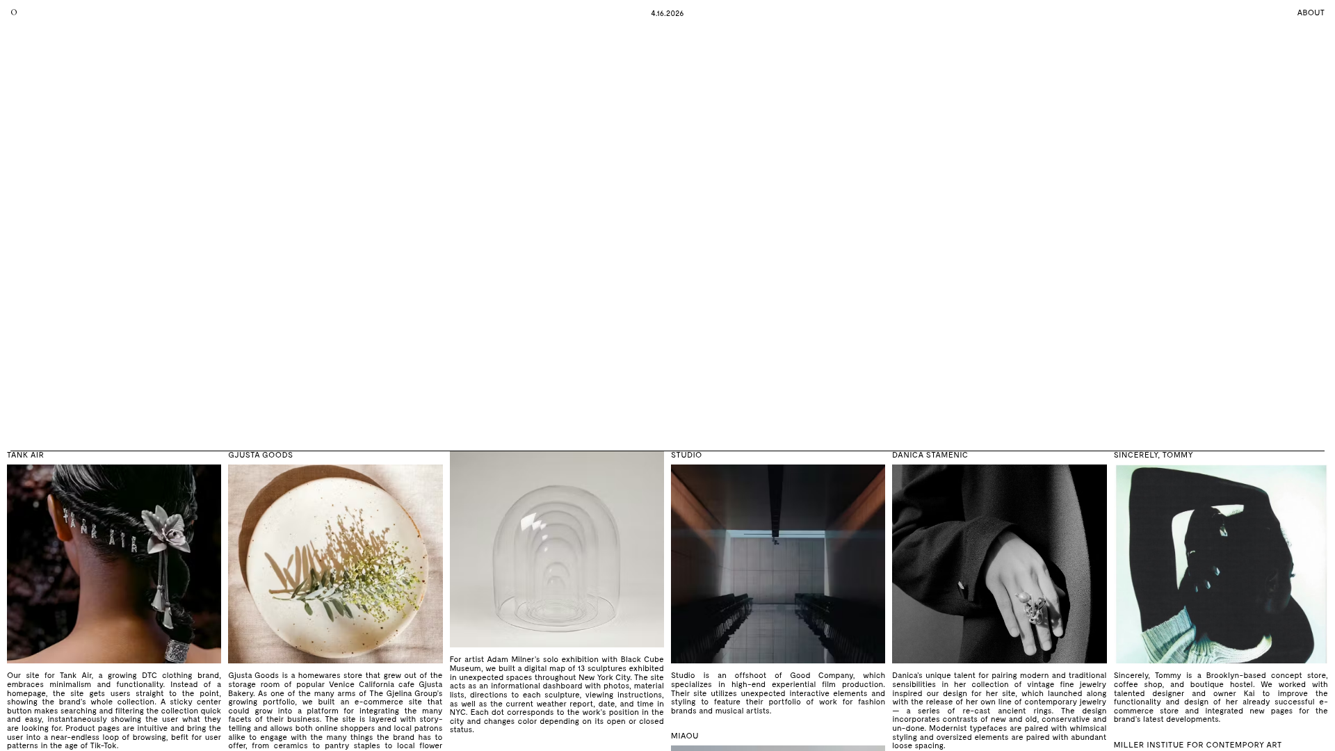
Studio Otto Multi-Column Portfolio Grid
A minimalist, five-column project showcase featuring infinite-scroll vertical columns, interactive image masks, and contextual description text blocks.
Overview
Studio Otto’s website is a highly sophisticated, five-column vertical showcase designed for creative agencies and portfolios. It utilizes a synchronized infinite-scroll mechanism where columns move semi-independently to create an immersive, gallery-like browsing experience. This is a premier reference for builders looking to implement unconventional navigational structures that prioritize visual rhythm over standard vertical scrolling.
Design System
- Color Palette & Visual Hierarchy: The site uses a high-contrast, minimalist palette with a pure white background and deep black text. Visual hierarchy is established through a strict grid; the layout is divided into five equal columns that span the full width of the viewport, with delicate horizontal and vertical lines defining borders.
- Typography: A utilitarian, monospaced sans-serif font is used throughout. Project titles are presented in all-caps labels above images, while detailed description text uses a smaller, readable scale with generous line heights. The header features metadata like the current date (
4.16.2024) and site navigation items (ABOUT,O) in a fixed perimeter layout. - Structure & Flow: The site is structured into a
projects__columns-wrapcontaining multipleprojects__column-spacerdivs. Each column contains projects with a specific scroller class (projects__column--scroller). Within these columns, content blocks alternate between project titles, interactive image masks, and narrative text descriptions. - Reusable Components:
- Column Scroller: The core container that allows for the repeated project lists (
column-repeat--0,column-repeat--1). - Interactive Image Wrap: The
scroll-image-wrapcomponent which contains high-quality project imagery. - Fixed Header: A top-level bar that stays consistent while the columns move.
- Column Scroller: The core container that allows for the repeated project lists (
- Interactions & Motion: The design features a "liquid" interaction model. HTML classes like
-liquid-fadedand-liquid-faded-2indicate sophisticated transition animations. Hovering on projects triggers cursor changes (cursor: pointer), and the DOM structure suggests each column is an independent scroller programmed to loop infinitely. - Responsive Behavior: The CSS class
box--mobileindicates a custom mobile implementation, likely collapsing the five-column grid into a single or double column format while maintaining the vertical scroller logic.
Use Cases
- Who should clone this: Designers, photographers, and architects looking for a "museum-grade" digital presentation that emphasizes high-volume visual content.
- Effective Remixes:
- E-commerce: Swap project descriptions for price tags and "Add to Cart" buttons for a hyper-visual retail feed.
- Editorial/Journalism: Use columns to categorize different news beats (e.g., Tech, Politics, Culture) allowing users to see multiple streams of content simultaneously.
- Remix Directions:
- Variable Speeds: Modify the CSS/JS to have the five columns scroll at different parallax ratios for added depth.
- Filter Logic: Implement an interactive header that filters the content across all five columns by category (e.g., only showing "Design" projects).
- Clone Scope: A full-page clone is recommended to maintain the integrity of the synchronized grid system, as the impact of the design relies on the relationship between all five columns.
Related Inspirations

Clase Agency Branding Portfolio
A minimalist design agency portfolio featuring a typographic hero section, full-width image articles, sticky title bars, and integrated scrolling text marquees for a clean editorial layout.

Caserne Design Studio Portfolio
A minimalist, high-impact portfolio featuring a dynamic masonry grid of project thumbnails with overlay text and a clean, oversized typography-driven footer.

Lundqvist & Dallyn Studio Portfolio
Minimalist design studio portfolio featuring a custom video loader, world clock navigation, and a fluid masonry-style grid for high-quality photography and type design showcases.

AcolorBright Design Agency Portfolio
Minimalist bento-style portfolio layout featuring numerical section headers, horizontally scrolling project teasers, and a clean grayscale client logo grid.
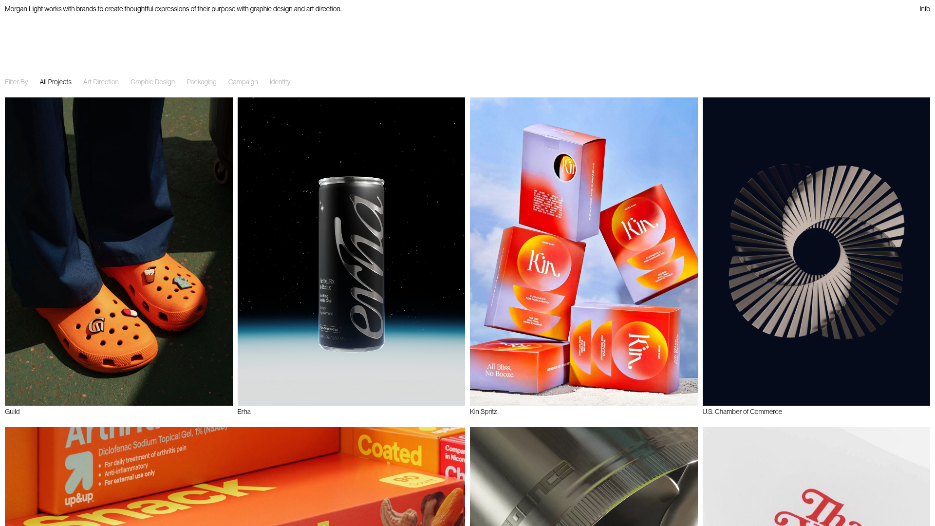
Morgan Light Design Portfolio Grid
A minimalist portfolio layout featuring a multi-column masonry-style grid with categorised project filters, image-based hover states, and smooth slide-based navigation.
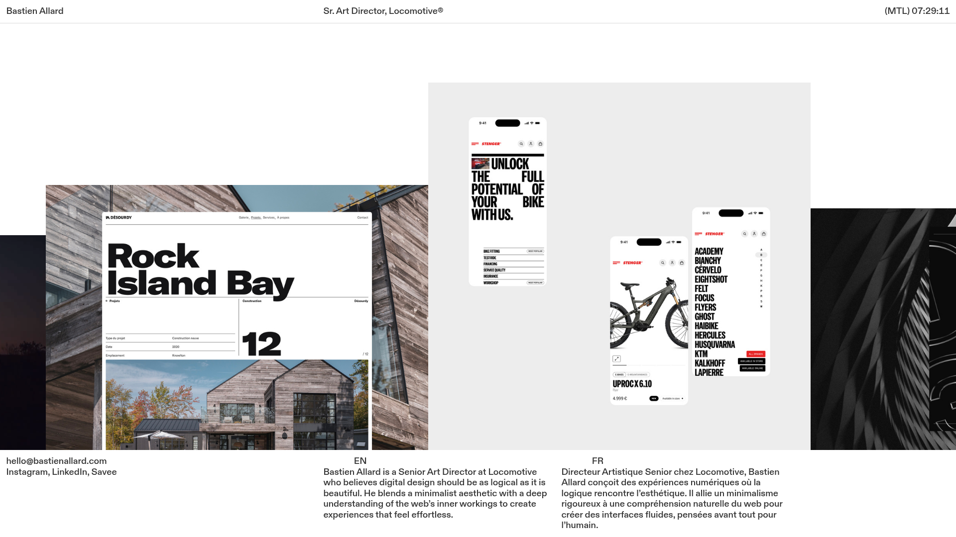
Bastien Allard Minimalist Portfolio Gallery
A clean, horizontal marquee-based portfolio featuring a sticky header/footer layout, digital clock integration, and responsive bilingual text columns for minimalist art director showcases.
