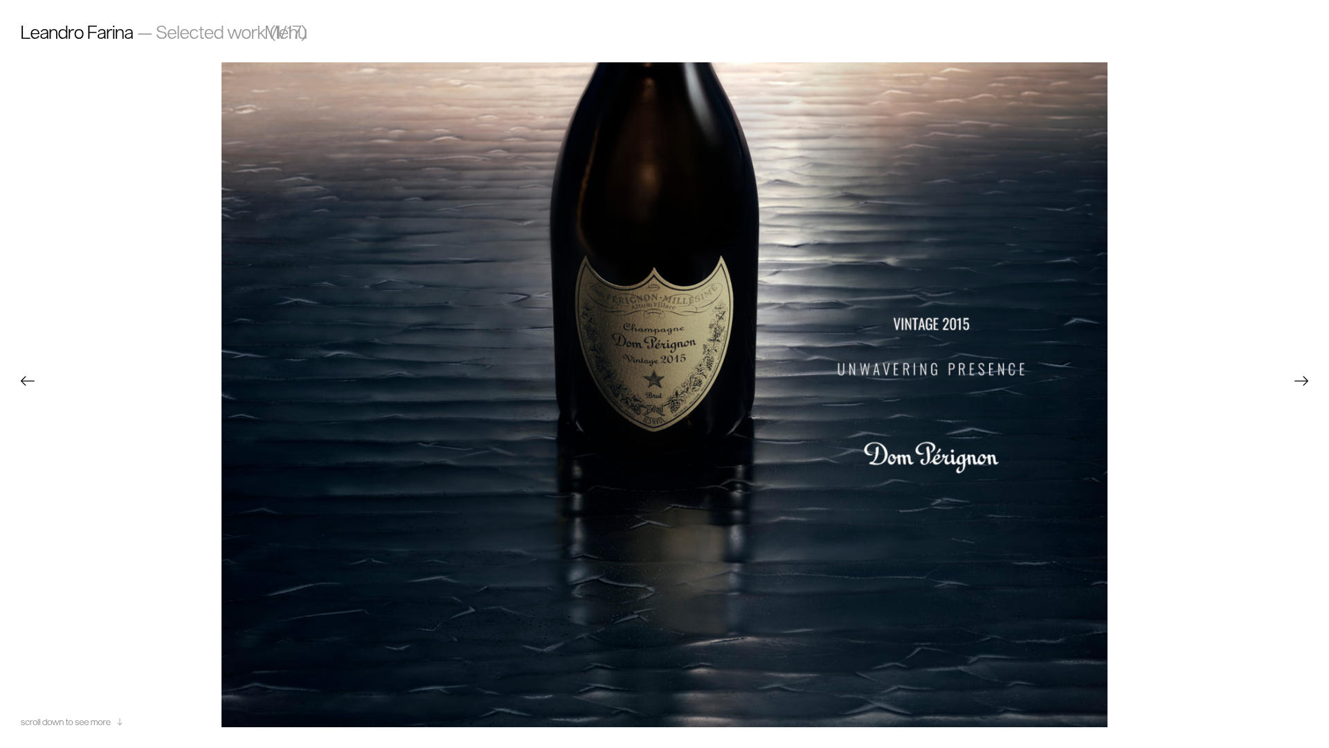
Leandro Farina Portfolio Gallery
A minimalist photography portfolio featuring a full-width Slick slider hero and a responsive image grid with hover-triggered captions and category tags.
Overview
This website is a sophisticated, minimalist photography portfolio that emphasizes high-impact visual storytelling through a full-screen hero slider and a dense image grid. It serves as an excellent reference for builders looking to implement a "dark mode" aesthetic with refined typography and seamless media-heavy layouts.
Design System
- Color Palette & Visual Hierarchy: A strict monochrome foundation using deep blacks and dark grays, allowing the high-saturation product photography (e.g., Dom Pérignon, Dior) to provide the primary color. Text is rendered in white and muted gray to maintain low-contrast elegance.
- Typography: A mix of a clean, lightweight Sans-Serif for navigation/metadata and a distinctive Serif (seen in the Dom Pérignon overlay and captions) for brand character. Titles and categories use small caps and underlined spans for subtle emphasis.
- Page Structure:
- Fixed Header: Minimalist branding ("Leandro Farina") and a functional "Menu" toggle at the top.
- Hero Slider: A
slick-sliderimplementation that spans the full viewport width, featuring centered product shots and overlay text. - Grid Gallery: A multi-column responsive grid of projects (using
<article class="post">) that appears upon scrolling.
- Reusable Components:
- Slick-Slider Hero: A high-end carousel with custom vector arrow icons (
.arrow.prev,.arrow.next). - Hover-Active Cards: Project thumbnails that reveal an underlined caption (
.caption) and a list of category tags (.post-tags) on interaction. - Video Thumbnails: Specialized grid items that support
.gifor video previews with a "1 video" indicator.
- Slick-Slider Hero: A high-end carousel with custom vector arrow icons (
- Interaction and Motion:
- Preloader: A percentage-based overlay (
#preloader) for smooth initial asset loading. - Lazy Loading: Extensive use of
lazyloadfor the image grid to maintain performance despite the high media density. - Navigation: Simple horizontal layout with right-aligned menu triggers.
- Preloader: A percentage-based overlay (
- Implementation Clues: The HTML reveals a WordPress-backed structure using the
Slickcarousel library andlazyload.js. The layout relies on a standardmaincontainer with two primary IDs:#showreelfor the hero and#galleryfor the grid.
Use Cases
- Who should clone this: Editorial photographers, luxury brand agencies, and independent motion designers who need a portfolio that feels like a premium gallery.
- Effective Remixes:
- Luxury E-commerce: Adapt the hero slider for seasonal lookbooks and the grid for product categories.
- Architectural Portfolios: Reuse the minimalist grid and high-ratio imagery to showcase spatial design.
- Remix Directions: Swap the dark background for a "gallery white" theme to significantly change the mood without altering the layout architecture. Replace the static image slider with a background video loop for more dynamic engagement.
- Clone Scope: The full-page layout is highly cohesive, but the image grid component (
#gallery) and its hover-state captions are the most valuable pieces for a quick section clone.
Related Inspirations
Cup of Couple Editorial Portfolio
A high-fashion editorial layout featuring a sticky compartmentalized header, a horizontal marquee carousel, and a mixed-width masonry grid with marquee typography effects.
Cori Corinne Minimalist Portfolio Home
A clean, typography-focused layout featuring a massive serif hero header, two-column image grid, and text-based navigation for a high-end editorial feel.
Studio Otto Multi-Column Portfolio Grid
A minimalist, five-column project showcase featuring infinite-scroll vertical columns, interactive image masks, and contextual description text blocks.
Joséphine Löchen Minimal Portfolio Gallery
A minimalist photography portfolio featuring a full-screen image slider, synchronized thumbnail navigation, and a structured multi-column about/contact section using Swiss-inspired typography.
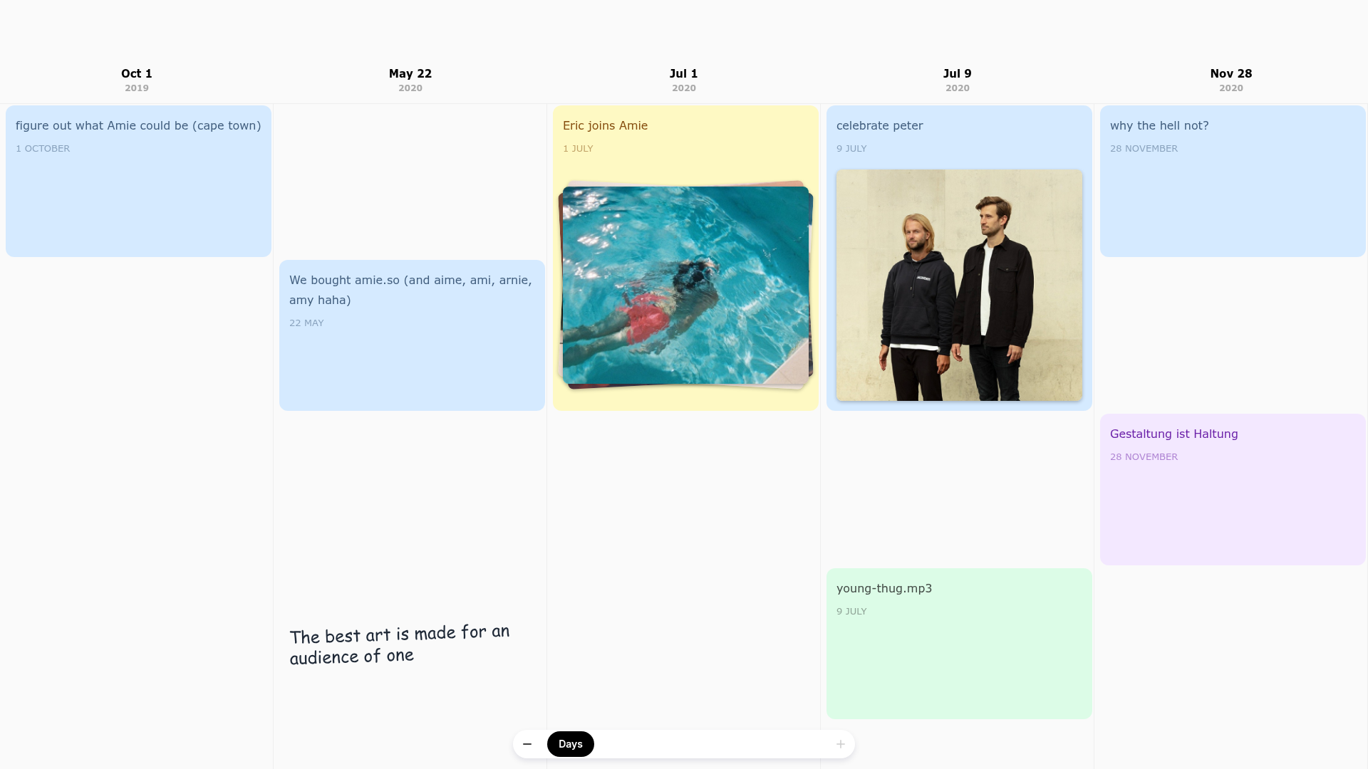
Amie Chronological Portfolio Timeline
A horizontal scrolling timeline layout featuring multi-column date headers, color-coded status cards, and embedded image assets for storytelling.

Context Gallery High-End Furniture Landing Page
A minimal editorial layout featuring a multi-column product carousel, designer biographies with image-text pairings, and a magazine-style content grid for curated design stories.
