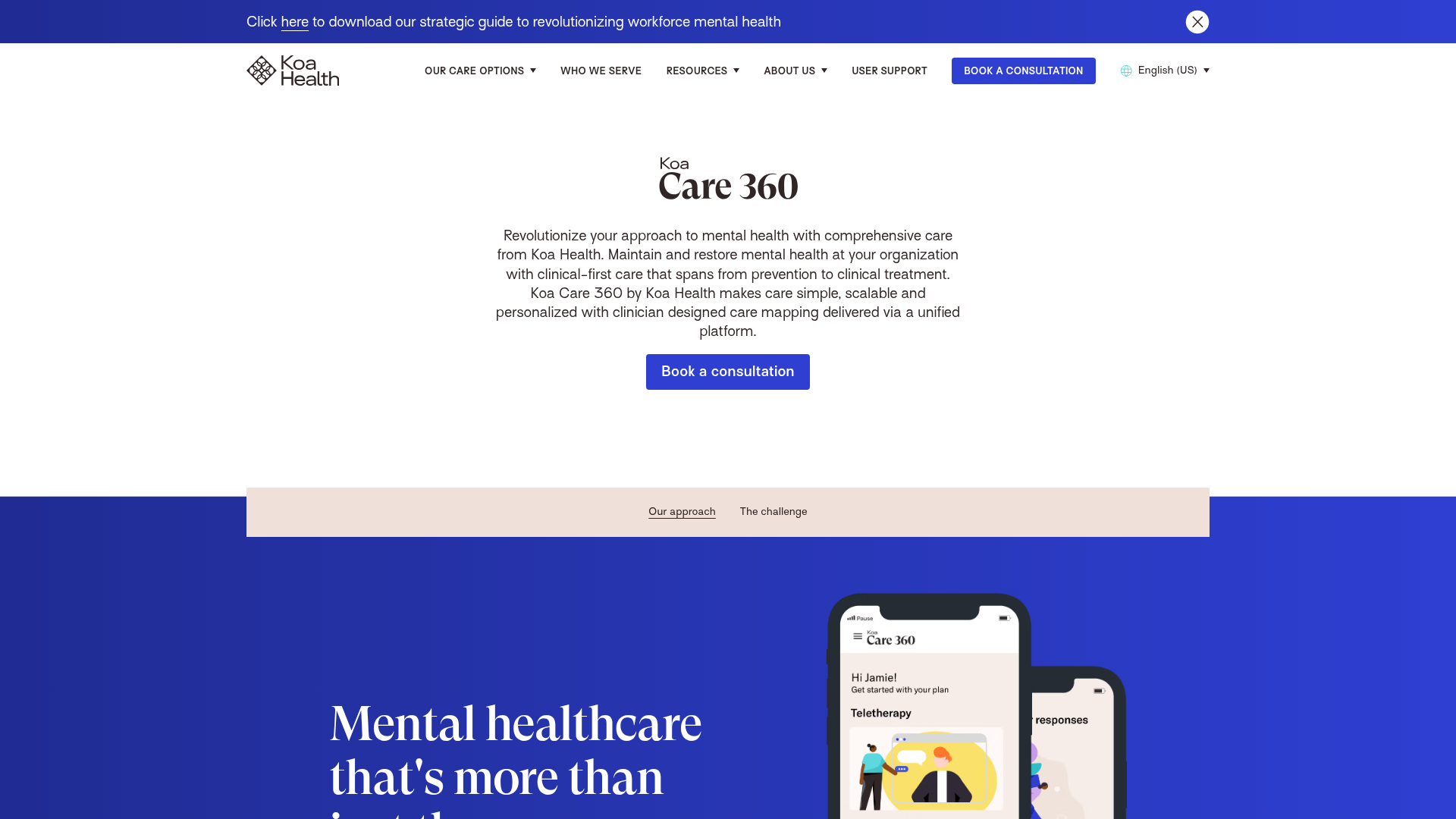
Koa Health Mental Care Landing Page
A clean healthcare landing page featuring a centered hero section, scroll-based fade-in animations, overlapping mobile mockups, and a multi-column feature grid with accent borders.
Overview
This landing page for Koa Health is a sophisticated example of modern healthcare B2B web design, focusing on clarity, trust, and accessibility. It provides an excellent reference for builders looking to implement complex layout grids, scroll-triggered animations, and a cohesive brand identity that balances authoritative serif typography with a minimalist color palette.
Design System
- Color Palette & Visual Hierarchy: The site uses a deep "Koa Blue" (
#2940D3) as its primary brand anchor, contrasted against a clean off-white/cream background (#F5EBE1). Accents of darker blues and black text create strong readability. Visual weight is managed through large typography and expansive whitespace to prevent information overload. - Typography System: A dual-font approach is utilized. A high-contrast, elegant serif is used for major headers to convey medical authority and warmth, while a clean sans-serif handles body copy and navigation. Hierarchies are clear, with large "Page Header" styles (
new-text-page-header) for heroes and smaller, bolded accents for features. - Page Structure & Flow: The flow follows a standard conversion funnel: (1) Centered Hero with a clear CTA, (2) Sub-navigation for anchor jumping, (3) A "Mental Healthcare" section featuring staggered mobile mockups in a blue container, and (4) A multi-column feature grid with thin top-border accents.
- Reusable Components:
- Mobile Mockups: Layered and overlapping PNGs that create depth and show off UI.
- Buttons: Simple, rounded rectangular buttons with generous padding and subtle
:hoverstate changes (bg-koa-blue/75). - Feature Grid: A flexible 12-column grid layout where each item is preceded by a
border-tscale-in animation. - Modal Forms: A sophisticated location-selection modal with radio group inputs and a dedicated image sidebar.
- Interactions & Motion: The HTML reveals a custom animation framework (
sa="alpha,y") that handles fade-ins and vertical translations as users scroll. Thin borders usescaleXtransitions (origin 0% 50%) to "draw" lines as they enter the viewport. - Implementation Clues: Built with Nuxt.js (Vue) and Tailwind CSS. The use of
grid-layoutandcol-span-*classes demonstrates a rigid adherence to a 12-column system, making it highly modular for layout experimentation.
Use Cases
- Who should clone this: SaaS companies, healthcare providers, or B2B platforms that need to present clinical or technical information in a way that feels approachable and human-centric.
- Effective Remixes: Fintech applications could swap the medical serif for a bold geometric sans for a more tech-forward feel. The "staggered phone" section is perfect for any mobile-first product showcase.
- Remix Directions: Consider adopting the thin accent borders above feature lists as a minimalist alternative to bulky cards. The hero section is ideal for a "Quick Clone" to validate landing page copy without complex assets.
- Suggested Scope: A full-page clone is recommended to capture the sophisticated interplay between the scroll-triggered animations and the grid-based layout flow.
Related Inspirations
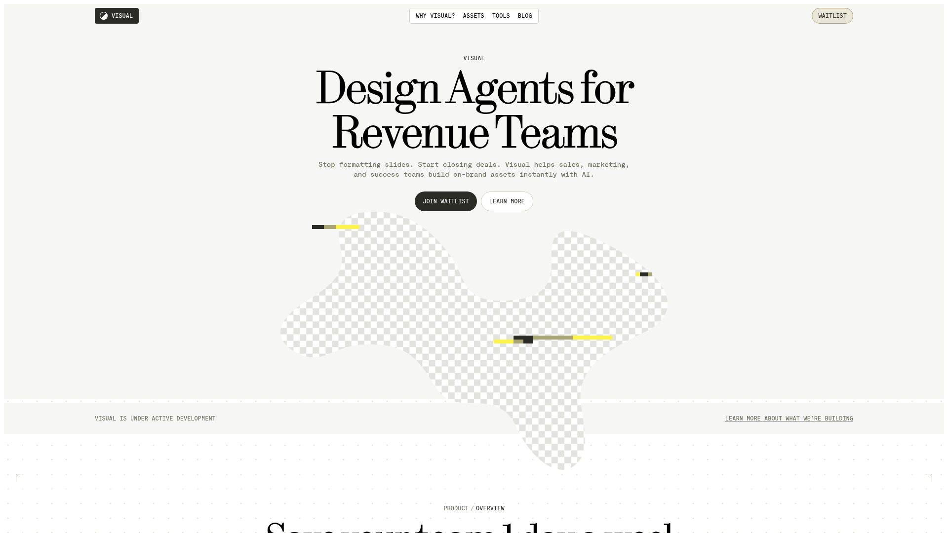
Visual AI Landing Page Templates
A high-end SaaS layout featuring a serif-heavy typography system, bento-style product showcase grids, accordion-style feature blocks, and minimalist wireframe UI components.
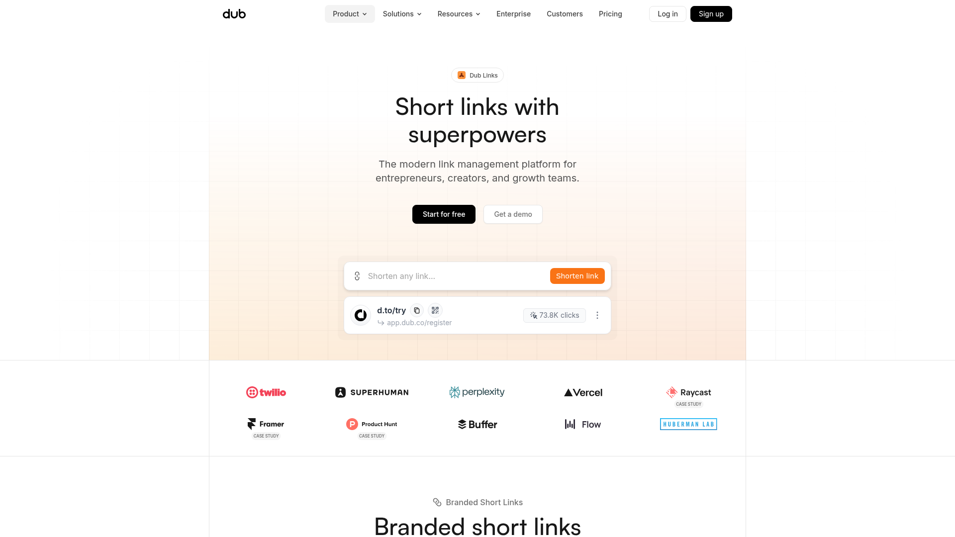
Dub.sh Link Management Landing Page
A clean SaaS landing page featuring a centralized link shortener input, bento-style product features, and a logo marquee for high-profile integrations.
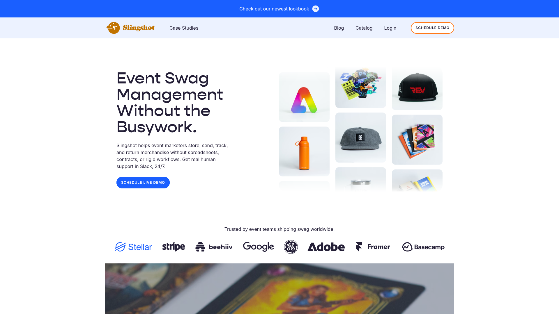
Slingshot Event Swag Hero and Logos
A clean SaaS landing page featuring a split hero layout with promotional product imagery, a call-to-action button, and a monochrome brand logo trust bar.

Slite SaaS Knowledge Base Landing Page
A clean SaaS hero section with a conversational headline, secondary call-to-action buttons, and a structured software interface preview featuring user testimonials.
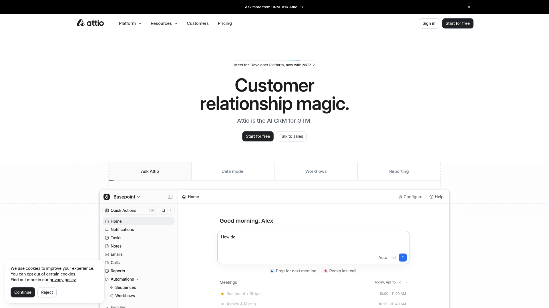
Attio AI CRM Landing Page
A clean SaaS landing page featuring a tiered navigation bar, a centered hero section with twin CTAs, and a detailed interactive dashboard preview.
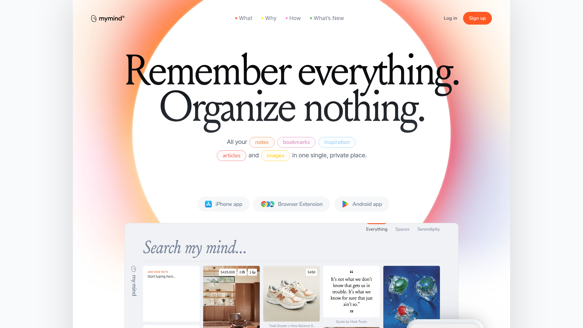
Mymind AI Tool Landing Page
A minimalist SaaS landing page featuring a soft-gradient hero section, custom pill-shaped text badges, and a dynamic bento-style search result preview grid.
