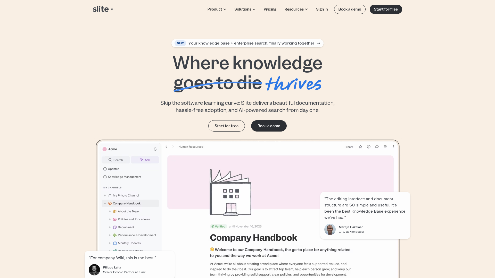
Slite SaaS Knowledge Base Landing Page
A clean SaaS hero section with a conversational headline, secondary call-to-action buttons, and a structured software interface preview featuring user testimonials.
Overview
Slite’s landing page is a masterclass in minimalist SaaS design, focusing on clarity and social proof. It utilizes a warm, off-white aesthetic to differentiate itself from the harsh white of typical productivity tools, positioning itself as a collaborative, human-centric knowledge base. This is a strong clone reference for builders who need to showcase complex internal software through a simplified, approachable hero layout.
Design System
- Color Palette & Visual Hierarchy: The background uses a soft cream hex, providing a low-contrast, parchment-like feel that reduces eye strain. High-contrast dark charcoal (#2D333A) is used for primary text and buttons, while a vibrant sky blue serves as a disruptive accent for hand-drawn annotations and highlights.
- Typography System: The system relies on a mix of clean sans-serif fonts for UI elements and a bold, high-weight serif or geometric sans-serif for the main headline. The headline features a unique "strike-through" and "handwritten" treatment on the word "thrives" to create a conversational, narrative tone.
- Page Structure: The flow begins with a pill-shaped product announcement, followed by a large headline and sub-headline, dual-button CTAs, and a high-fidelity dashboard preview. Testimonial overlays are strategically placed on the edges of the main product screenshot to provide social proof without breaking the layout.
- Reusable Components:
- Navigation: A standard sticky-capable top bar with dropdown selectors and rounded pill-shaped buttons.
- CTAs: Ghost buttons with thin borders paired with solid charcoal primary buttons, both featuring heavy border-radii for a friendly feel.
- Product UI Frame: A structured sidebar-and-content layout with nested folder hierarchies that can be easily repurposed for any dashboard mock-up.
- Pinned Testimonials: Floating cards with avatars and quotes that overlap the main image, adding depth to the 2D layout.
- Implementation Clues: The HTML structure suggests a modern component-based framework utilizing a utility-first CSS approach, evidenced by consistent spacing and the use of semantic containers for the nested navigation and product UI components.
Use Cases
- Who should clone this pattern: Early-stage SaaS startups, internal tool developers, and documentation platform creators who want an "expensive" but clean look with minimal custom assets.
- Effective Remixes: This pattern works well for project management tools, CRM dashboards, or any software where the primary value is organization and readability.
- Practical Remix Directions:
- Brand Swap: Change the cream background to a dark mode theme (deep navy/slate) while keeping the hand-drawn blue accents for a more "dev-tool" aesthetic.
- Info Architecture: Adapt the sidebar in the product preview to reflect your own application's navigation items (e.g., changing "Company Handbook" to "Client Portfolios").
- Partial Reuse: Clone the floating testimonial card pattern to overlay on existing product screenshots to increase trust signals.
- Suggested Clone Scope: A full-page clone is ideal for a homepage launch, but the hero section (headline + dual CTAs + product UI mock-up) is the most valuable portion for a high-converting landing page.
Related Inspirations
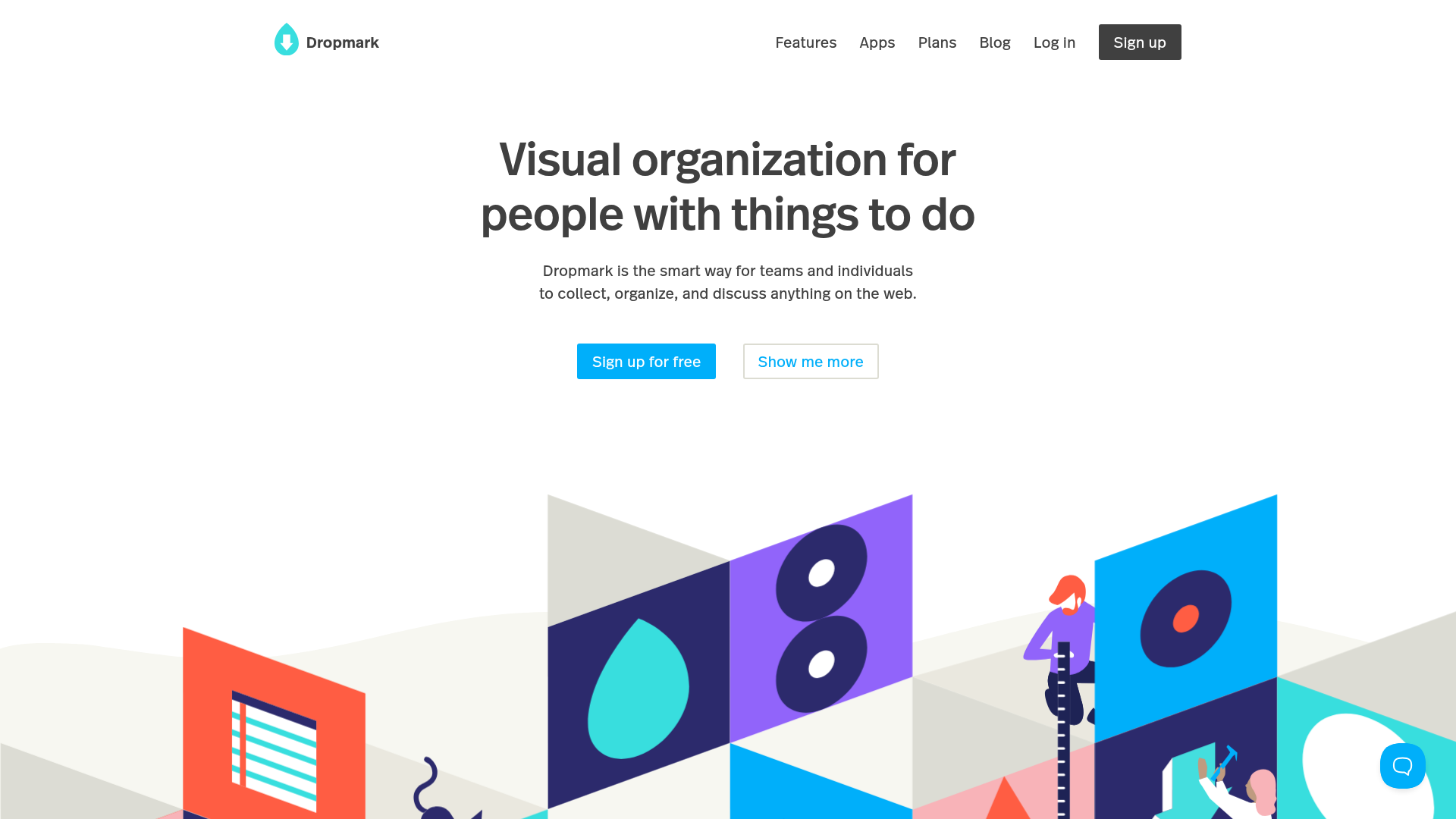
Dropmark Visual Organization Landing Page
Features a clean minimalist hero section with split-action buttons, a vibrant vector illustration footer, and an interactive horizontal flickity carousel for case studies.
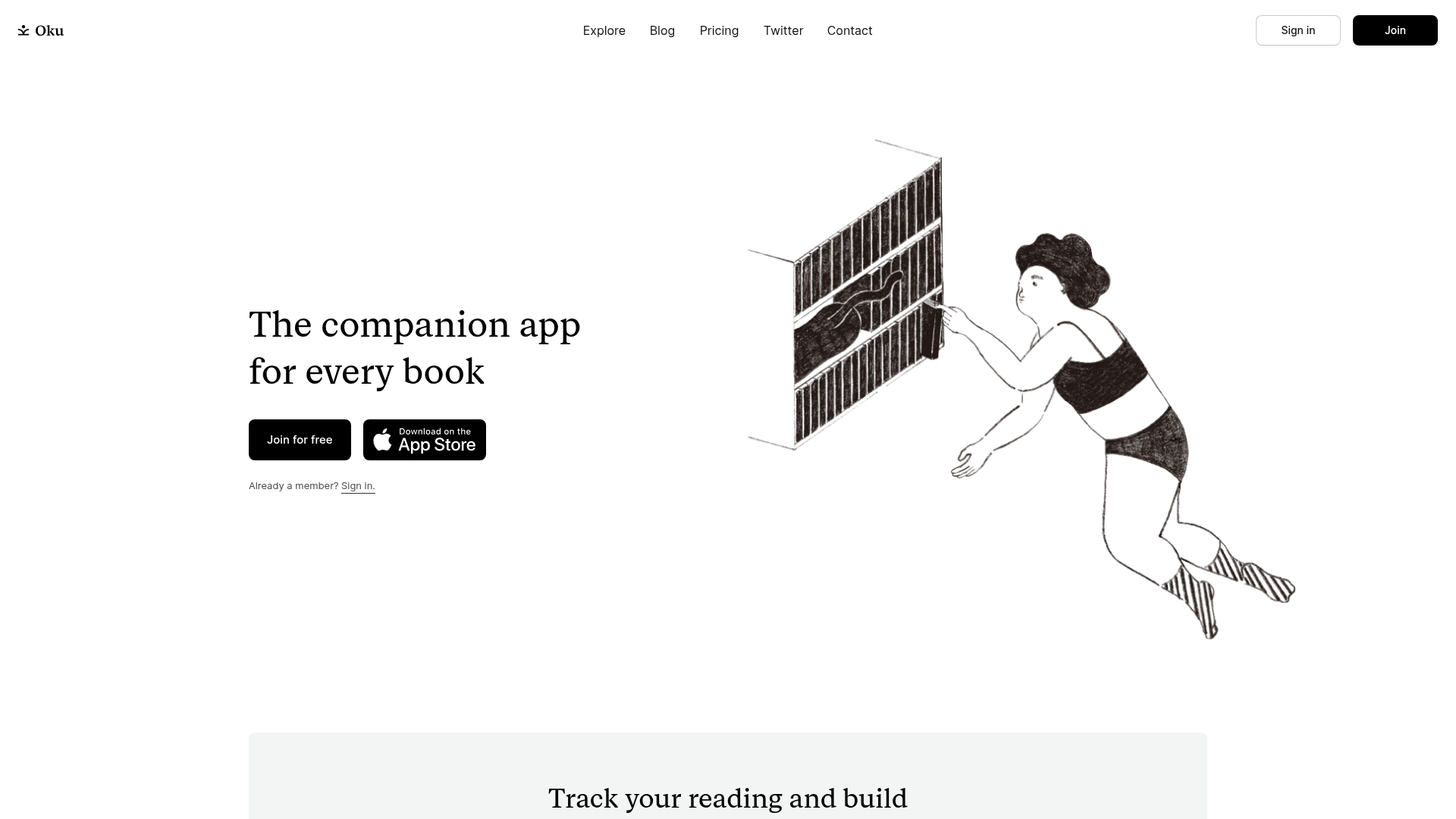
Oku Minimalist Book Tracking Landing Page
A clean, typography-focused landing page featuring a minimalist header, illustrated hero section, and clear call-to-action buttons for app downloads.
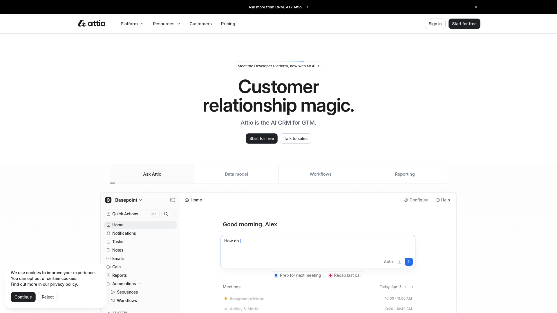
Attio AI CRM Landing Page
A clean SaaS landing page featuring a tiered navigation bar, a centered hero section with twin CTAs, and a detailed interactive dashboard preview.
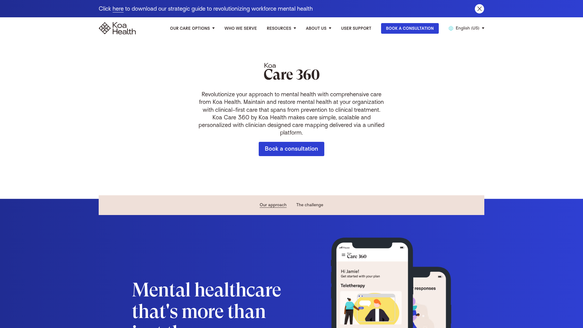
Koa Health Mental Care Landing Page
A clean healthcare landing page featuring a centered hero section, scroll-based fade-in animations, overlapping mobile mockups, and a multi-column feature grid with accent borders.
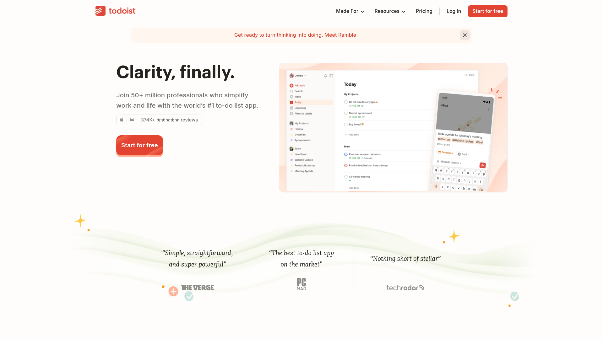
Todoist Landing Page with Sticky Features
A clean productivity app landing page featuring an animated hero section, a horizontal logo/quote marquee, a sticky side-by-side feature scroll, and a categorized project template gallery.
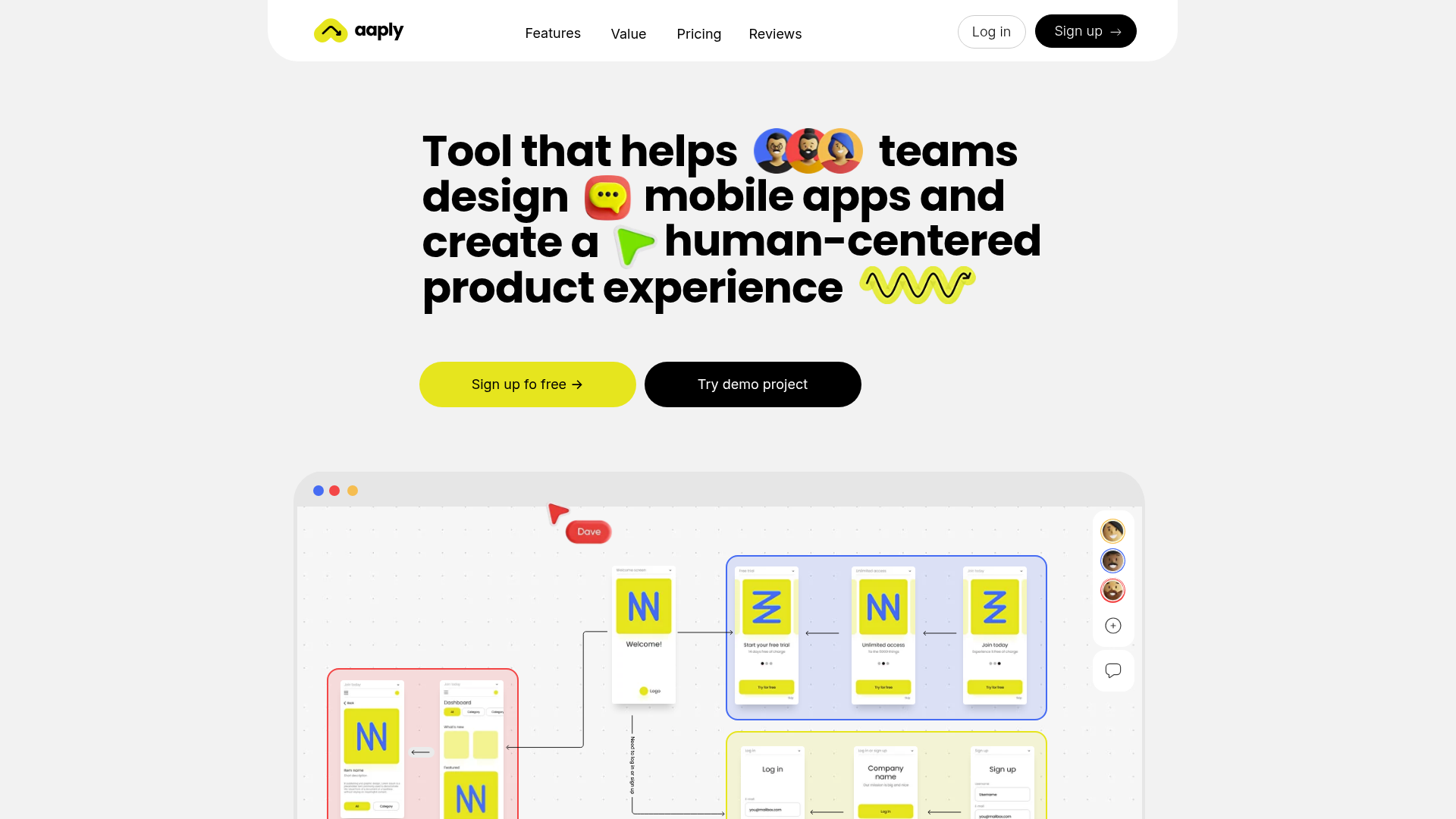
Aaply Mobile App Design Landing Page
A clean SaaS landing page featuring a bold typography-driven hero section, a sticky navigation bar, and integrated collaborative workspace UI mockups.
