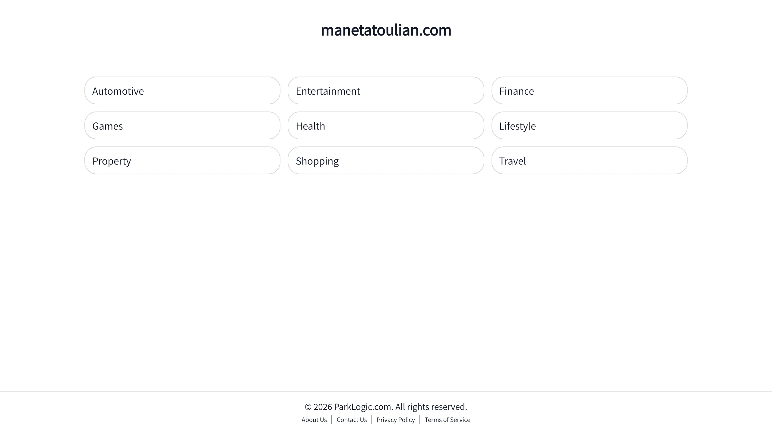
Minimalist Category Directory Landing Page
A clean, responsive link directory featuring a three-column grid of pill-shaped buttons and a simple header-footer layout ideal for landing pages.
Overview
This landing page is a minimalist category directory designed for high-speed navigation and clear information architecture. It serves as an excellent reference for builders needing a lightweight 'link-in-bio' style page or a high-level table of contents that prioritizes content discoverability through a clean, distraction-free interface.
Design System
- Color Palette & Visual Hierarchy: The site uses a monochrome aesthetic with a pure white background (
#FFFFFF) and dark gray text. Visual hierarchy is achieved through scale, with a large centered H1 heading followed by a uniform grid of light-bordered navigation elements. - Typography System: The design relies on a sans-serif typeface. The headline uses a bold weight for branding, while the grid items use a standard weight for readability. Text is consistently centered except within the navigation pills, where it is left-aligned for quick scanning.
- Page Structure & Section Flow: The layout follows a classic vertical stack: a top-aligned branding section, a centered main content area featuring a 3x3 grid (desktop), and a low-profile footer containing copyright and legal links.
- Reusable Components: The standout component is the
link-itempill. Each pill features a thin light-gray border, generousborder-radius(approx 25px-30px) creating a capsule shape, and an internal layout that accommodates a label and a hiddentriangle-rightindicator. - Interaction Patterns: The HTML structure suggests a basic hover-to-click transition for the
.link-griditems. The use of the.blinkclass on the H1 indicates a minor animation or state change meant to draw attention to the domain name. - Responsive Behavior: Based on the source code, the
.link-gridis designed to collapse into fewer columns (likely 2 or 1) on mobile devices to maintain tap target size and legibility.
Use Cases
- Who should clone this: Developers building domain parking pages, resource directories, or simplified portfolios where the primary goal is redirecting traffic to sub-pages or external links.
- Effective Remixes: This pattern works well for "LinkTree" clones, service category pages for a local business, or a simple FAQ topic selector.
- Remix Directions:
- Brand Swap: Replace the white background with a brand-specific gradient or dark mode palette.
- Iconography: Add SVG icons inside the
link-itempills to the left of the text for faster visual identification. - Interactive Feedback: Implement a
transform: scale(1.02)or a subtle background color fill on hover to provide more tactile feedback.
- Clone Scope: This is ideal for a full-page clone as the simplicity and low code overhead make it an excellent "Boilerplate" for any new directory-style project.
Related Inspirations

Koa Health Mental Care Landing Page
A clean healthcare landing page featuring a centered hero section, scroll-based fade-in animations, overlapping mobile mockups, and a multi-column feature grid with accent borders.
Visual AI Landing Page Templates
A high-end SaaS layout featuring a serif-heavy typography system, bento-style product showcase grids, accordion-style feature blocks, and minimalist wireframe UI components.
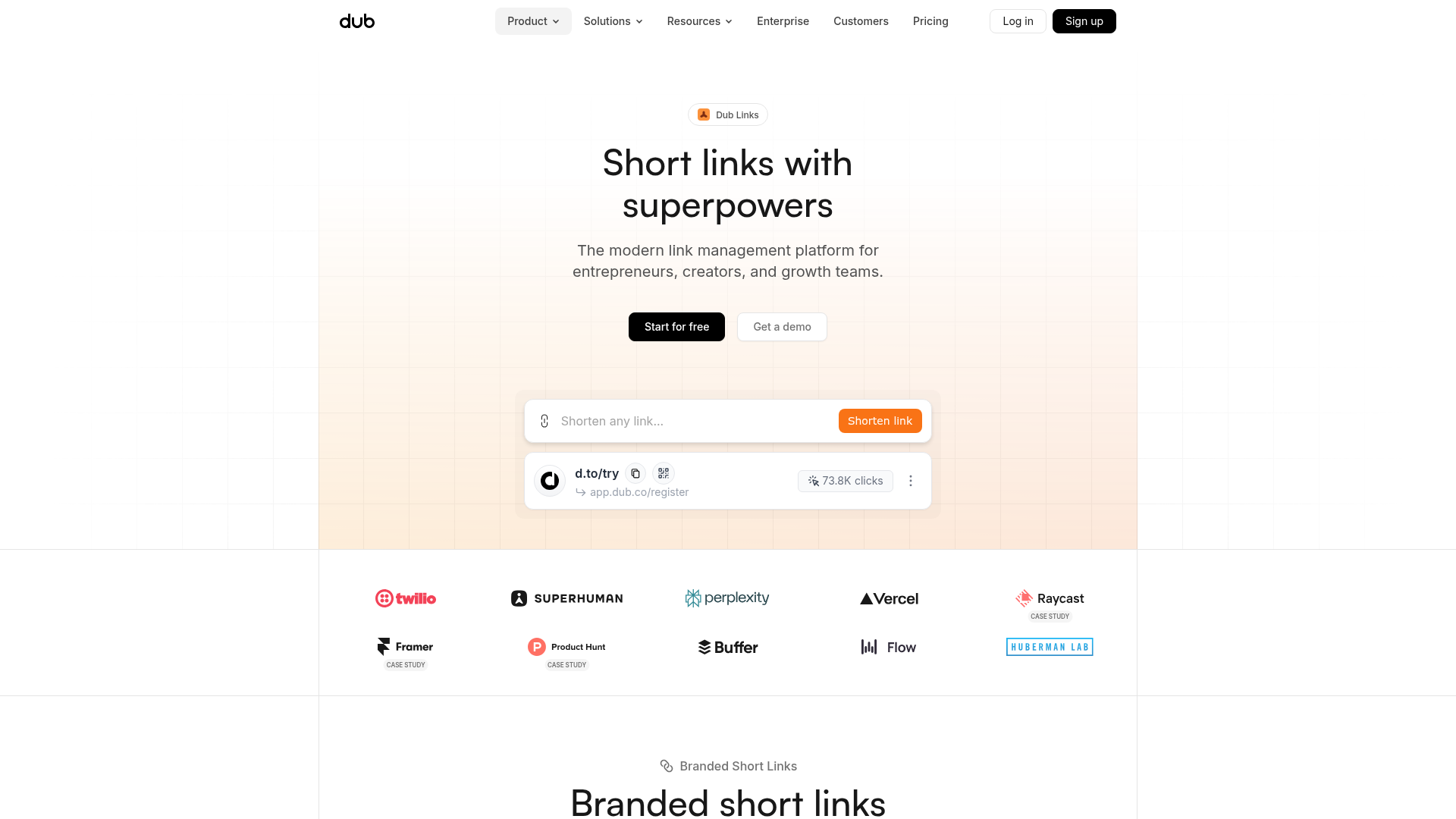
Dub.sh Link Management Landing Page
A clean SaaS landing page featuring a centralized link shortener input, bento-style product features, and a logo marquee for high-profile integrations.

Good Glyphs Font Showcase Landing Page
A single-page layout featuring an interactive type tester, donation form with custom amount logic, and a contributor gallery using swiper-based glyph previews.

Isla Beauty Skincare E-commerce Store
A clean Shopify-based storefront featuring a split-hero landing page, a step-by-step product system carousel, and a split-screen testimonial section with localized product image sidebars.
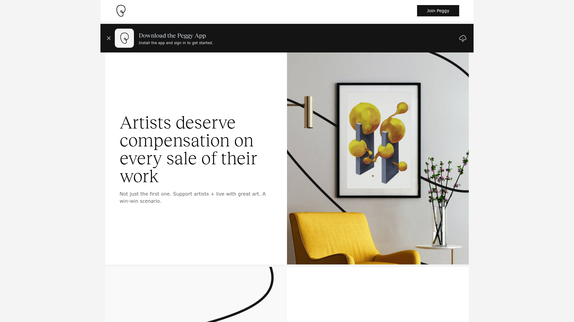
Peggy Art Royalties Pitch Page
A clean storytelling layout featuring alternating image-text sections, a three-column testimonial grid with circular avatars, and a icon-based feature grid for brand values.
