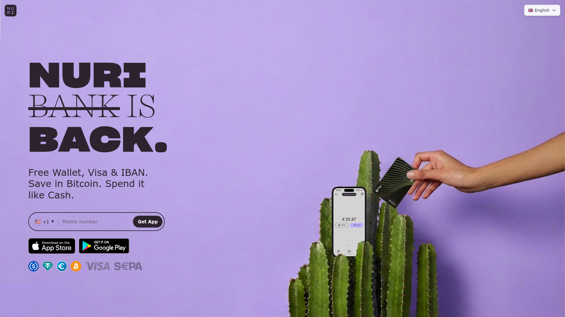
Nuri Cryto Banking Landing Page
A high-impact landing page featuring a bold typography hero, a phone-number signup component, and a sticky scroll-driven feature showcase with centered mobile mockups.
Overview
This landing page is a high-impact, crypto-banking restoration project that uses sophisticated typography and a centered-phone scroll narrative. It is an excellent reference for builders wanting to combine high-fashion editorial aesthetics with functional fintech conversion funnels, particularly for mobile-first products.
Design System
- Color Palette & Visual Hierarchy: A calming "Lavender and Deep Plum" palette features a
#BEAAFF(soft purple) hero background contrasted with#2C232E(dark plum) for text and UI elements. The hierarchy uses massive oversized type to establish brand presence, followed by high-contrast white call-to-action (CTA) elements. - Typography System: The site uses a dual-font strategy. Sharp Grotesk (Bold/Black) provides an aggressive, thick-lettered structure for key brand statements like "NURI BANK IS BACK," while Harriet (Light/Serif) adds an elegant, editorial contrast with italicized subheaders and strikethroughs.
- Page Structure & Section Flow:
- Hero: High-impact editorial shot with an integrated phone-number lead capture form.
- Sticky Scroll Showcase: A sequence of full-screen sections (
h-[100svh]) that keep a mobile mockup centered while headlines on the left and descriptions on the right alternate as the user scrolls through features. - Closing CTA: A transition back to clean white and orange sections for final conversion and trust signals (logos).
- Reusable Components:
- Lead Capture Form: A pill-shaped, border-2 input field with a country flag picker and a high-contrast "Get App" button.
- Sticky Feature Wrapper: A reusable layout pattern using CSS
sticky top-0coupled with radial gradients to create depth behind mobile mockups. - Trust Bar: A flexible set of specialized crypto and payment logos (USDC, Bitcoin, SEPA, Visa).
- Interaction & Motion: The UI relies on scroll-triggered transitions. Specifically, sections are stacked with increasing
z-index(1 through 8) using Tailwind'sstickyutility to create a layered reveal effect of app screenshots. - Mobile Behavior: The design transitions from a split-column layout on desktop to a stacked center-aligned layout on mobile, with prominent fixed App Store/Play Store buttons at the bottom of the viewport.
Use Cases
- Who should clone this: Fintech startups, Web3 wallet providers, or any brand launching a "Return" or "Legacy" product that needs a bold, editorial look.
- Effective Remixes:
- SaaS Platforms: Swap the phone app screenshots for desktop dashboard views to showcase software interfaces.
- E-commerce: Replace the phone mockup with product photography while maintaining the alternating left/right copy layout during scrolling.
- Practical Directions: Reuse the Sticky Scroll Section logic for storytelling; it's highly effective for walk-throughs where the central focus (the product) remains constant while the context changes.
- Suggested Scope: A full-page clone is ideal for products with 5-7 distinct features. A quick section clone of the Hero + Form is perfect for waitlist pages.
Related Inspirations
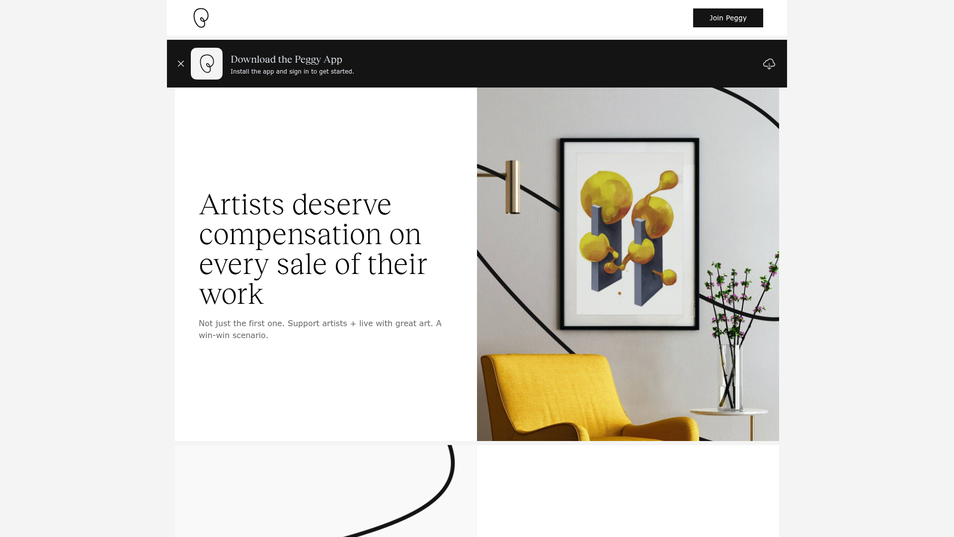
Peggy Art Royalties Pitch Page
A clean storytelling layout featuring alternating image-text sections, a three-column testimonial grid with circular avatars, and a icon-based feature grid for brand values.
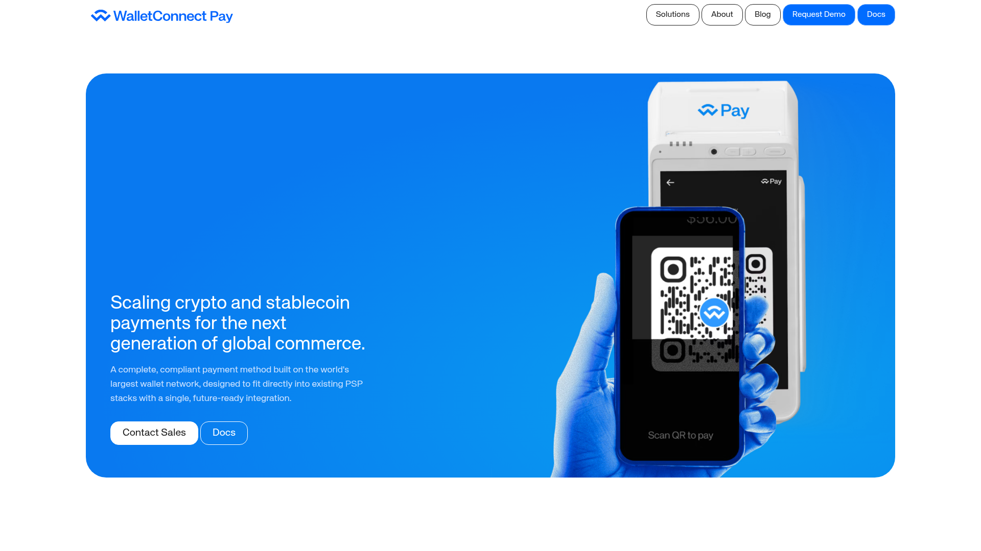
WalletConnect Pay Crypto Hero Page
A high-impact landing page featuring a full-width blue hero section with side-by-side text and hardware mockup, bento-style feature grids, and a clean blog post masonry layout.

Finn Pet Supplements Landing Page
An e-commerce landing page featuring high-contrast typography, a sticky brand logo banner, parallax scroll effects on product headers, and a clean product grid.
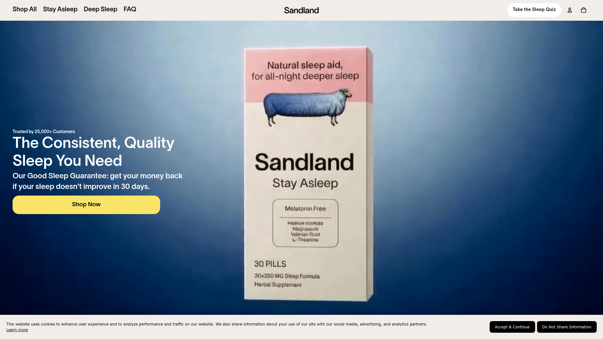
Sandland Sleep Product Landing Page
A high-conversion Shopify layout featuring split-video hero sections, logo-based social proof ribbons, and a testimonial slider integrated with biometric sleep tracker results.
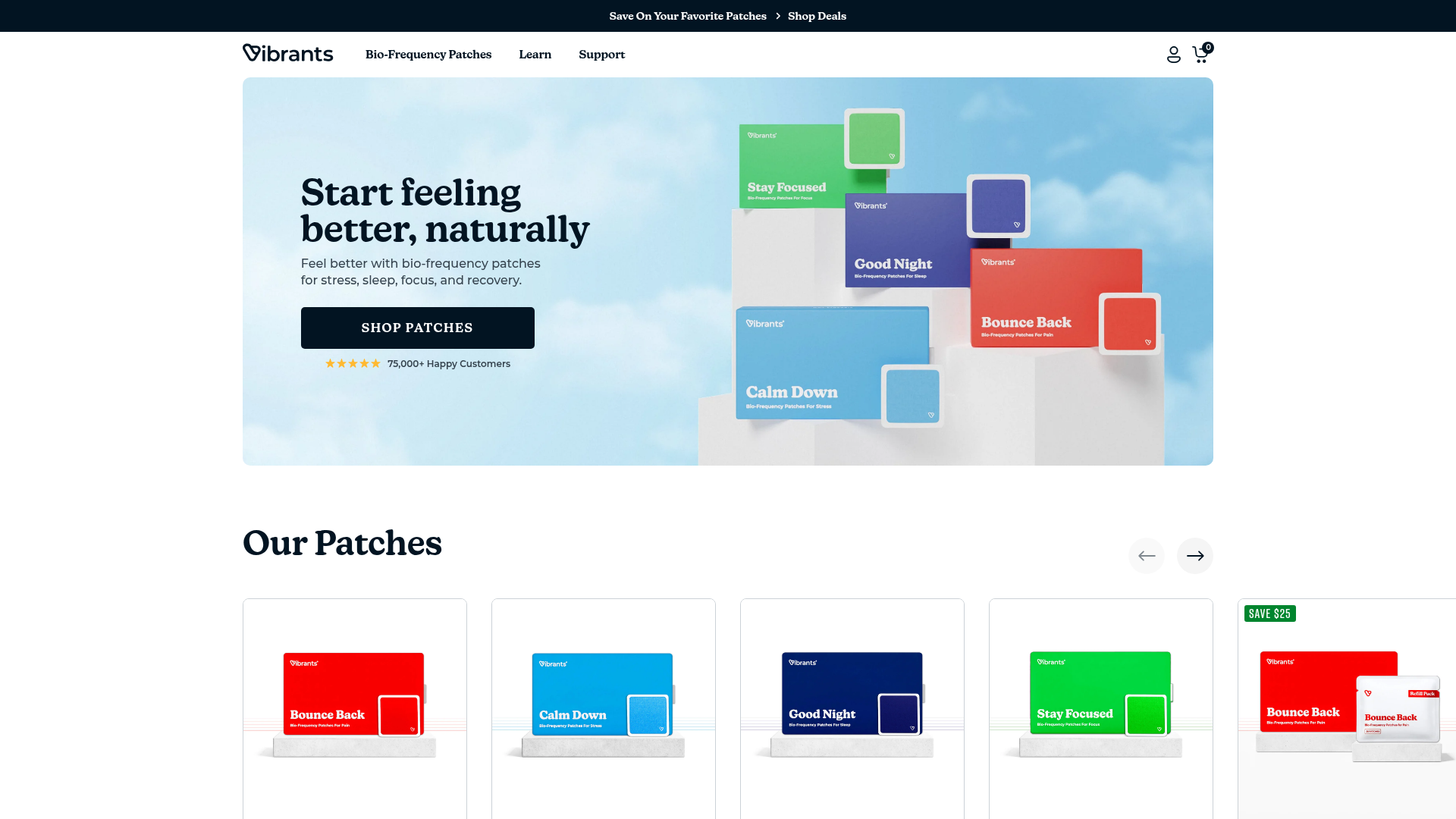
Vibrants Wellbeing E-commerce Landing Page
A clean Shopify-style landing page featuring a full-width hero with overlaid product cards, a horizontal product slider, and interactive cart drawer with utility progress bars.
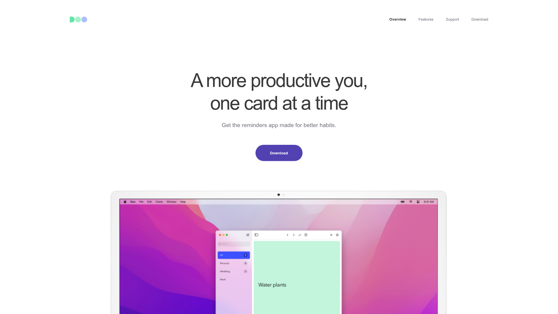
Doo App Minimalist Product Landing Page
A clean, centered product showcase featuring a parallax hero image, icon-based feature checklists, horizontal gesture illustrations, and stacked section layouts with ample whitespace.
