Duties Studio Brutalist Design Portfolio
A minimalist Framer-built portfolio featuring bold custom typography, a floating pill-shaped navigation dock, and a multi-column site footer with live status indicators.
Overview
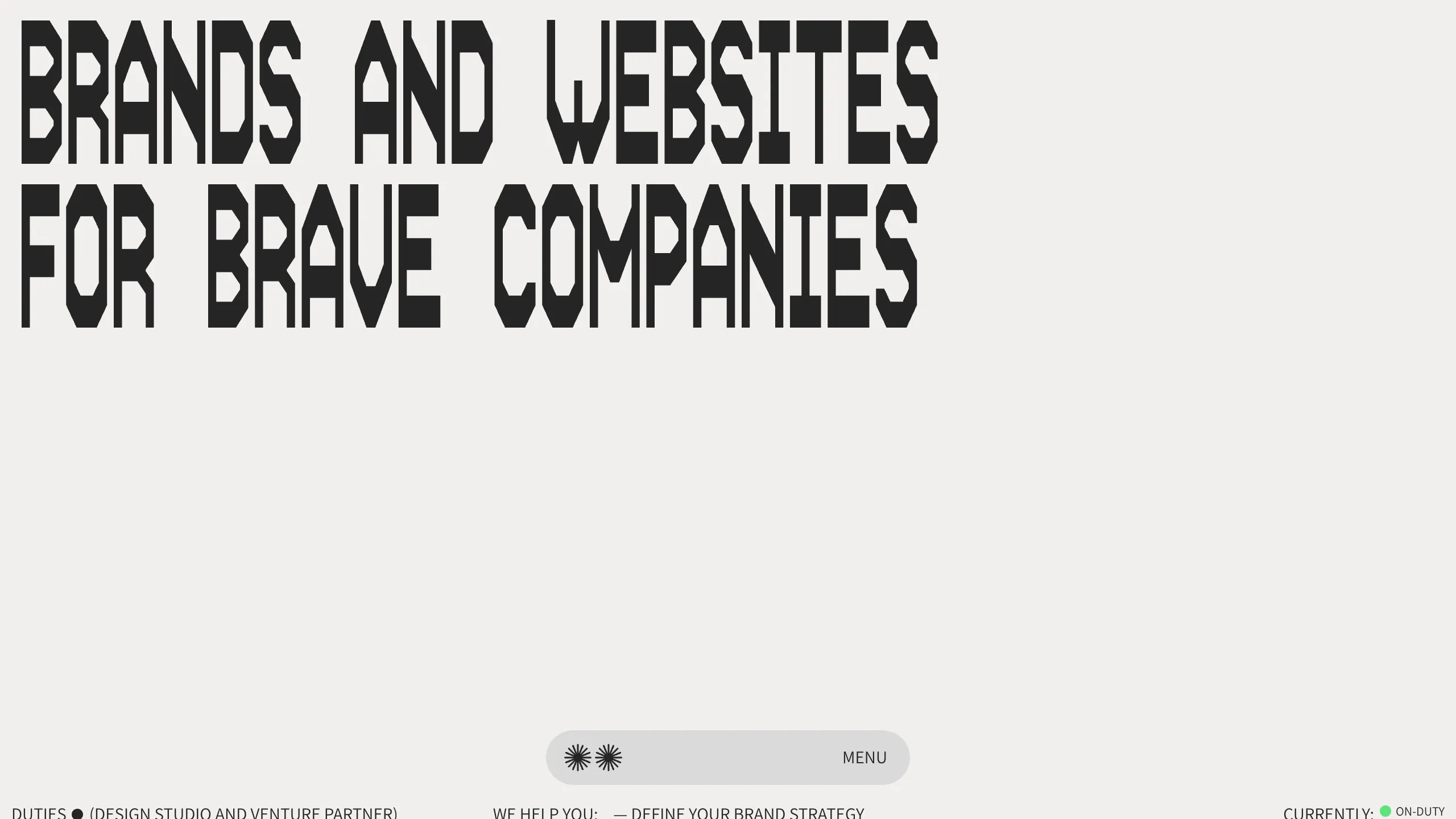
This portfolio for Duties Studio is a masterclass in modern brutalist design, leveraging high-contrast typography and extensive white space to create a high-impact visual identity. It serves as an excellent clone reference for creatives and agencies looking to build a "type-first" brand presence that prioritizes clarity and a bold aesthetic over traditional imagery.
Design System
- Color Palette & Visual Hierarchy: The site uses a monochrome aesthetic, featuring classic black text (#000000) against a neutral light gray or off-white background. The hierarchy is established through massive font scales rather than color variance.
- Typography System: The central feature is a custom, heavy-weight geometric sans-serif font utilized in all-caps for the hero section ("BRANDS AND WEBSITES FOR BRAVE COMPANIES"). Secondary information, such as the footer and navigation, uses a clean, monospaced or highly legible sans-serif for a technical, utilitarian feel.
- Page Structure: The layout follows a minimalist flow: a massive hero header dominates the upper half, leading down to a clean footer area. The footer is organized into distinct functional zones: branding/studio description on the left, service categories in the center, and a live status indicator (using a green dot component) on the right.
- Reusable Components:
- Floating Navigation Dock: A pill-shaped translucent bar centered at the bottom, containing star icons and a "MENU" trigger.
- Live Status Indicator: A small, rounded green dot paired with text ("CURRENTLY: ON-DUTY") located in the bottom right corner.
- Multi-column Informational Footer: A highly organized horizontal list of services and partner information.
- Implementation Clues: The HTML structure indicates a Framer-built site, characterized by absolute positioning for the navigation bar and a flexbox-based footer layout to maintain alignment across different screen sizes.
Use Cases
- Who should clone this pattern: Creative directors, design studios, and freelance developers who want a portfolio that feels architectural and authoritative without relying on a project gallery as the primary hook.
- Effective Remixes: This pattern is ideal for boutique law firms, high-end architecture practices, or early-stage venture capital landing pages where "bold minimalist" branding is required.
- Remix Directions:
- Brand Swap: Replace the heavy geometric font with a high-contrast serif for a more luxury/fashion feel.
- Interactive Accents: Keep the floating dock but add hover triggers that change the background color of the entire page.
- Quick Section Clone: The footer layout and the floating navigation pill are the most versatile components to lift for use in existing projects.
- Suggested Clone Scope: A full-page clone is recommended to capture the specific spatial relationship between the oversized header and the compact, edge-to-edge footer elements.
Related Inspirations
Magda Reyman Designer Portfolio
A minimalist portfolio layout featuring a fixed hero intro, absolute-positioned mobile UI mockups, and a distinctive high-contrast footer with rounded interaction buttons.
Jun Works Portfolio Landing Page
Minimalist graphic design portfolio featuring a text-heavy layout with image-on-hover tooltips, a pill-shaped marquee contact card, and a categorized hashtag tag cloud for project navigation.
Ekipa Agency Artist Roster Site
A minimalist agency portfolio featuring a dynamic block-based logo, colorful background transitions, and a hover-activated image preview grid for an artist roster.
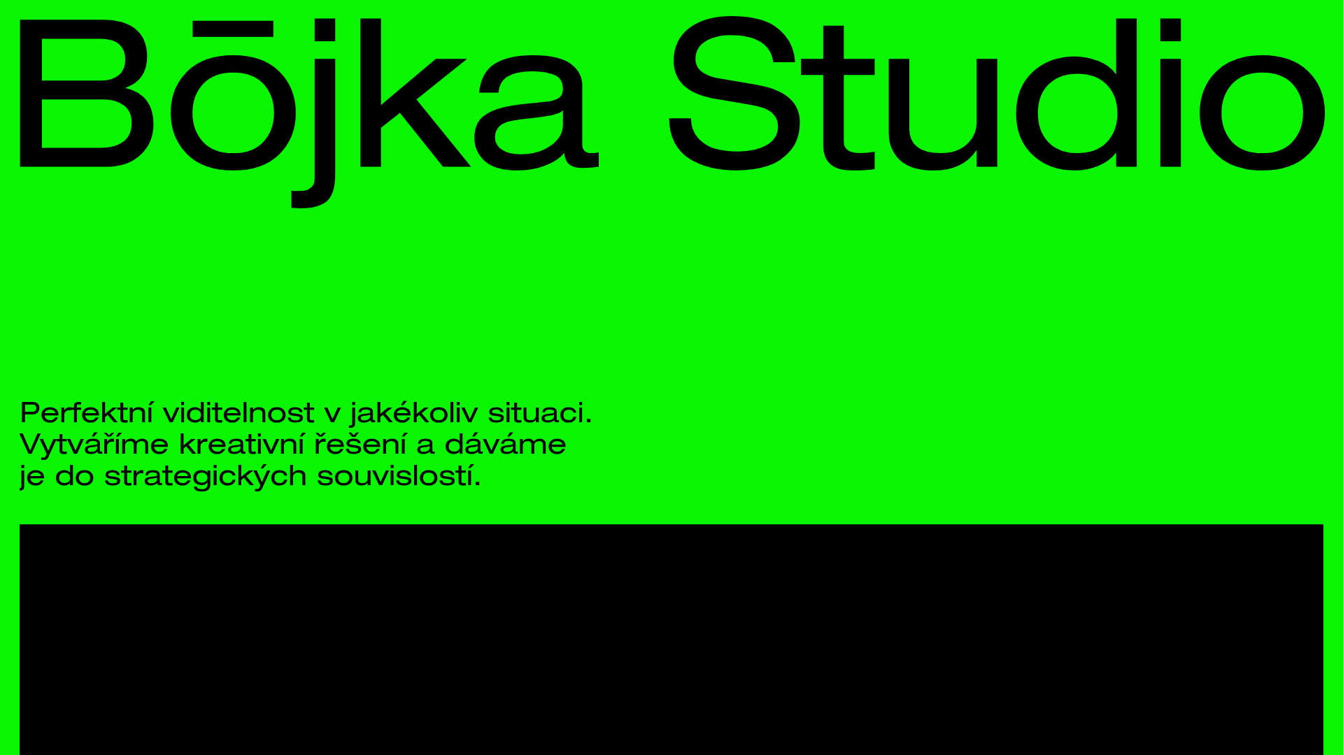
Bōjka Studio Minimalist Portfolio Landing
A bold, high-contrast design featuring a vibrant green hero section, large-scale typography, a crossfade image slideshow, and a fixed navigation footer.
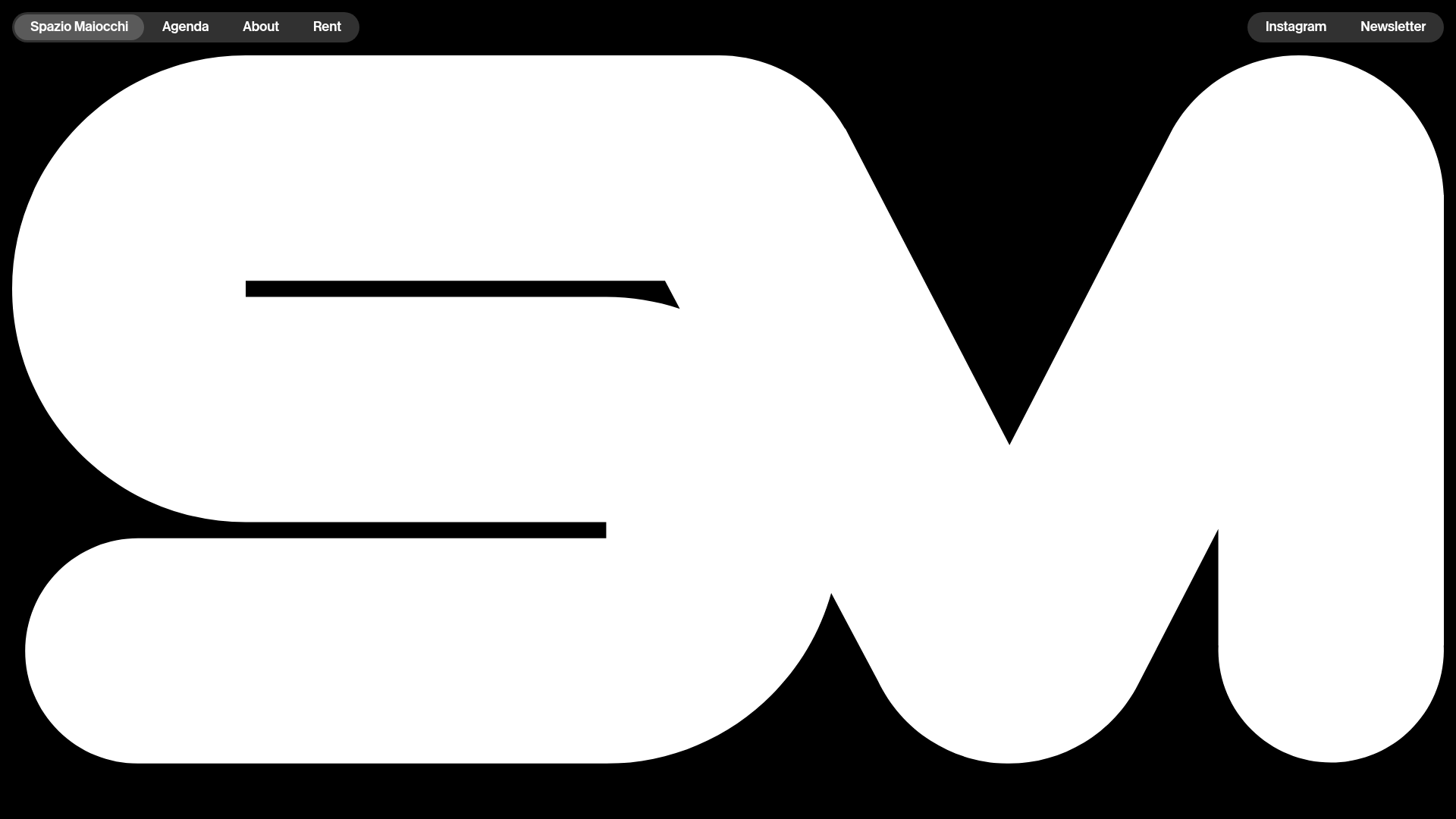
Spazio Maiocchi Bold Typography Landing
A minimalist art space portal featuring a high-contrast hero logo mask, top-bar navigation capsules, and a scroll-triggered image gallery with large-scale typography.
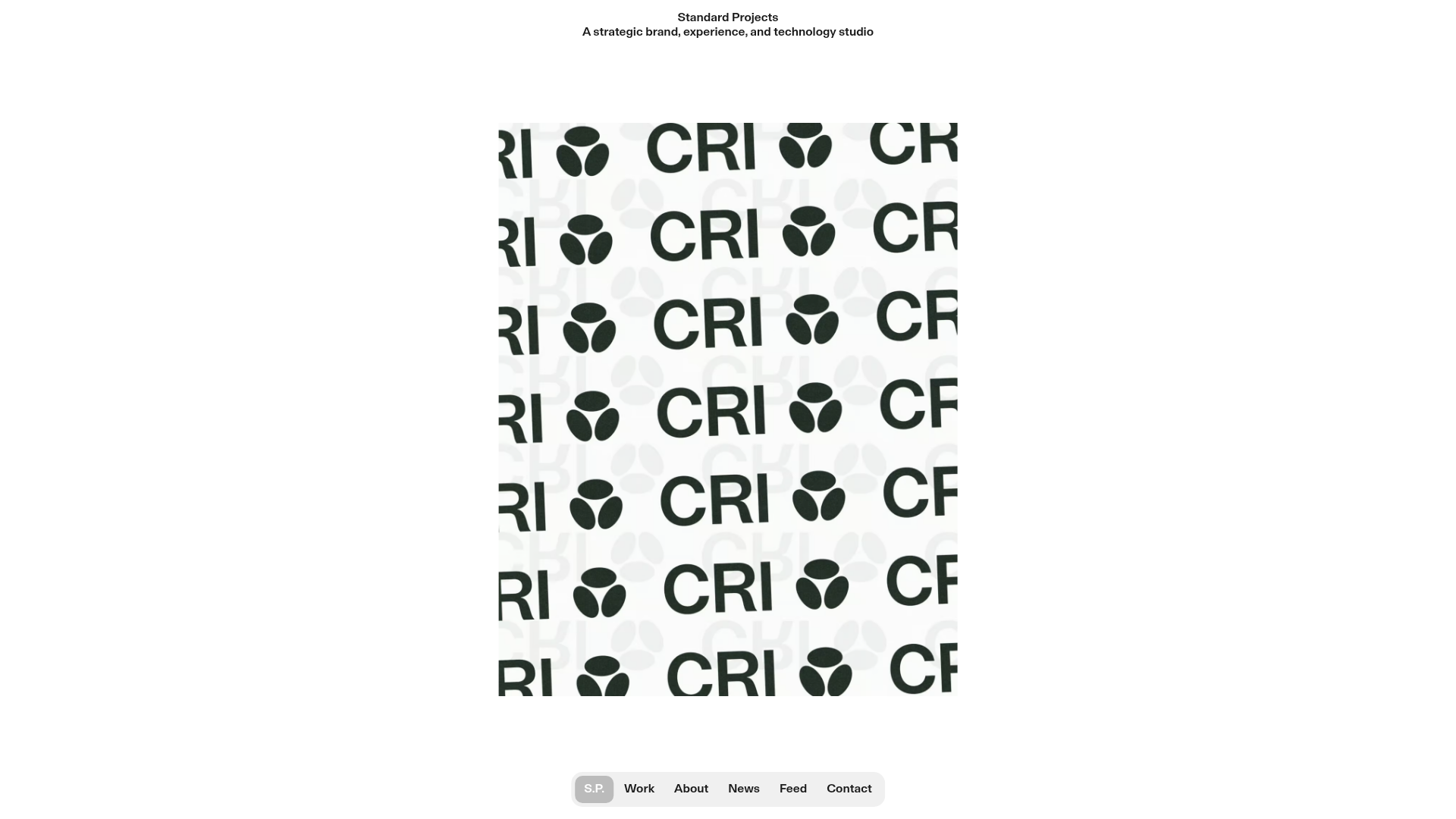
Standard Projects Portfolio with Sticky Hero
A minimalist studio layout featuring a full-height animated carousel, sticky header typography, and a dynamic masonry element grid for case studies.
