Magda Reyman Designer Portfolio
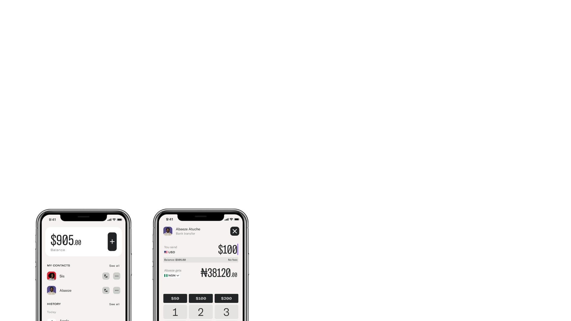
A minimalist portfolio layout featuring a fixed hero intro, absolute-positioned mobile UI mockups, and a distinctive high-contrast footer with rounded interaction buttons.
Overview
This portfolio site demonstrates a sophisticated minimalist aesthetic that balances white space with bold, high-fidelity UI mockups. It is an excellent reference for designers or agencies wanting to showcase mobile products through a layered, vertically-scrolling storytelling layout that blends fixed branding with dynamic content.
Design System
- Color Palette & Visual Hierarchy: The system uses a neutral foundation of greys (
#C0C0C0) and off-whites, punctuated by a high-visibility lime green (rgb(206, 255, 0)) in the footer. Hierarchy is established through size and position, using large, thin-weight typography for headers and absolute-positioned mobile mockups to pull visual focus. - Typography: A clean, modern sans-serif system (referenced as
custom_351in HTML) is used with a focus on generous line heights (30px) and a mix of font sizes (21px and 24px) to distinguish introductory text from navigation. - Structure & Components:
- Fixed Hero: A persistent intro section with an absolute-positioned "(intro)" tag and bio text.
- Floating Mockups: Overlapping mobile UI cards (z-indexed between 330-335) that create a three-dimensional scroll effect.
- Pill Buttons: Rounded action buttons (
border-radius: 162px) used for social links and navigation. - High-Contrast Footer: A full-width colored block containing social triggers and a "To the top" anchor.
- Motion Patterns: The HTML structure uses
animation-containerandcontent-scroll-wrapperclasses, suggesting elements that fade or slide into place based on scroll position. The use ofstickypolyfills indicates a layout where headers or background elements remain pinned while product mockups float past.
Use Cases
- Who should clone this: Product designers, UI/UX agencies, and mobile app developers looking for a high-end way to display screen designs without standard grid containers.
- Remixing Product Types: This pattern is highly effective for fintech, healthcare, or productivity app landing pages where the "app experience" needs to be the primary visual hook.
- Practical Remix Directions:
- Swap Brand Style: Replace the lime green footer with a brand-specific primary color.
- Adapt Info Architecture: Use the absolute-positioned mockup layout to showcase a step-by-step user journey by adding text descriptions alongside each floating phone screen.
- Clone Scope: The Footer Section is a great quick clone for its unique button layout. The Mobile Mockup Gallery is recommended for a full-page clone to capture the complex overlapping z-index logic and scrolling depth.
Related Inspirations
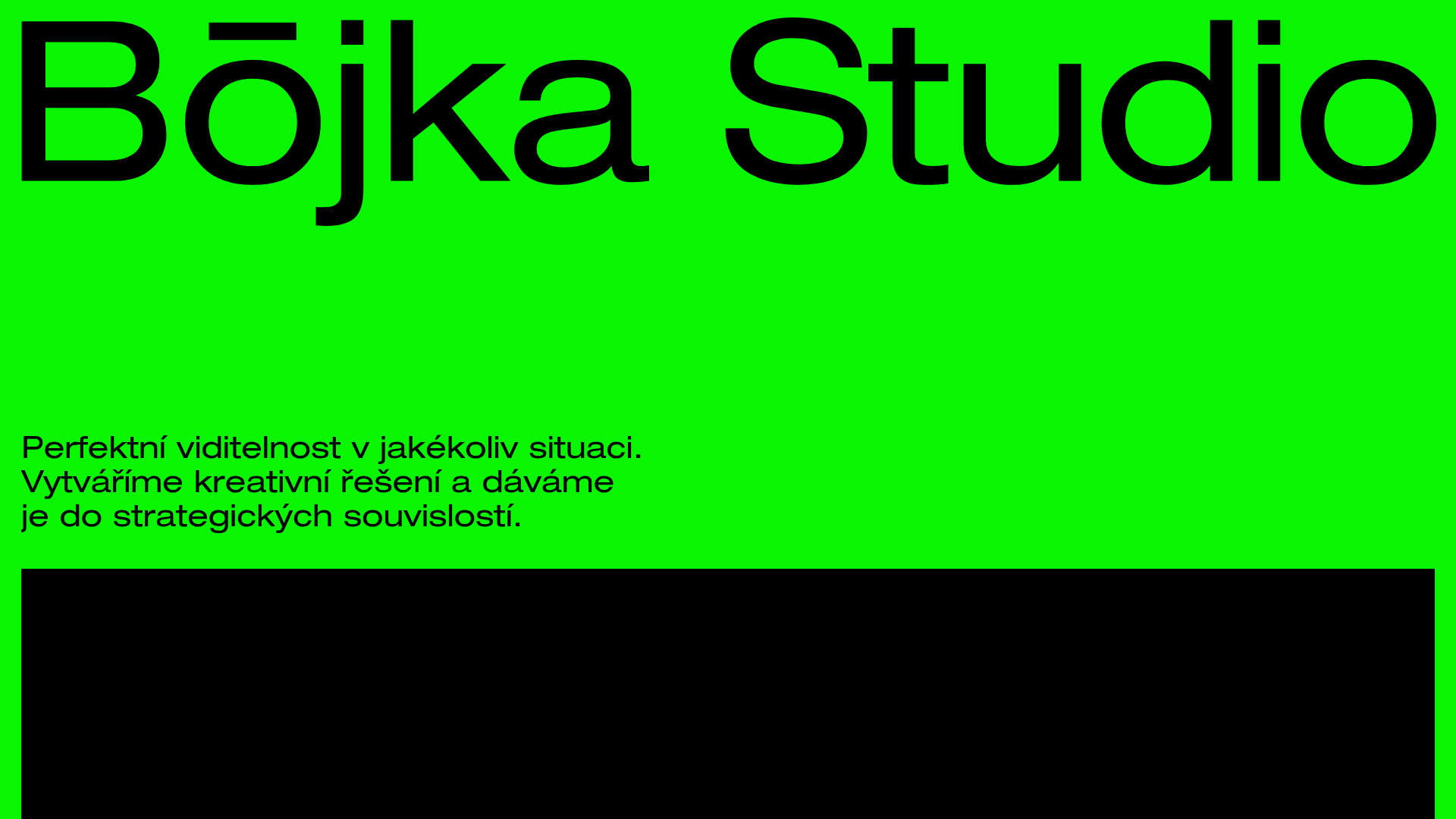
Bōjka Studio Minimalist Portfolio Landing
A bold, high-contrast design featuring a vibrant green hero section, large-scale typography, a crossfade image slideshow, and a fixed navigation footer.
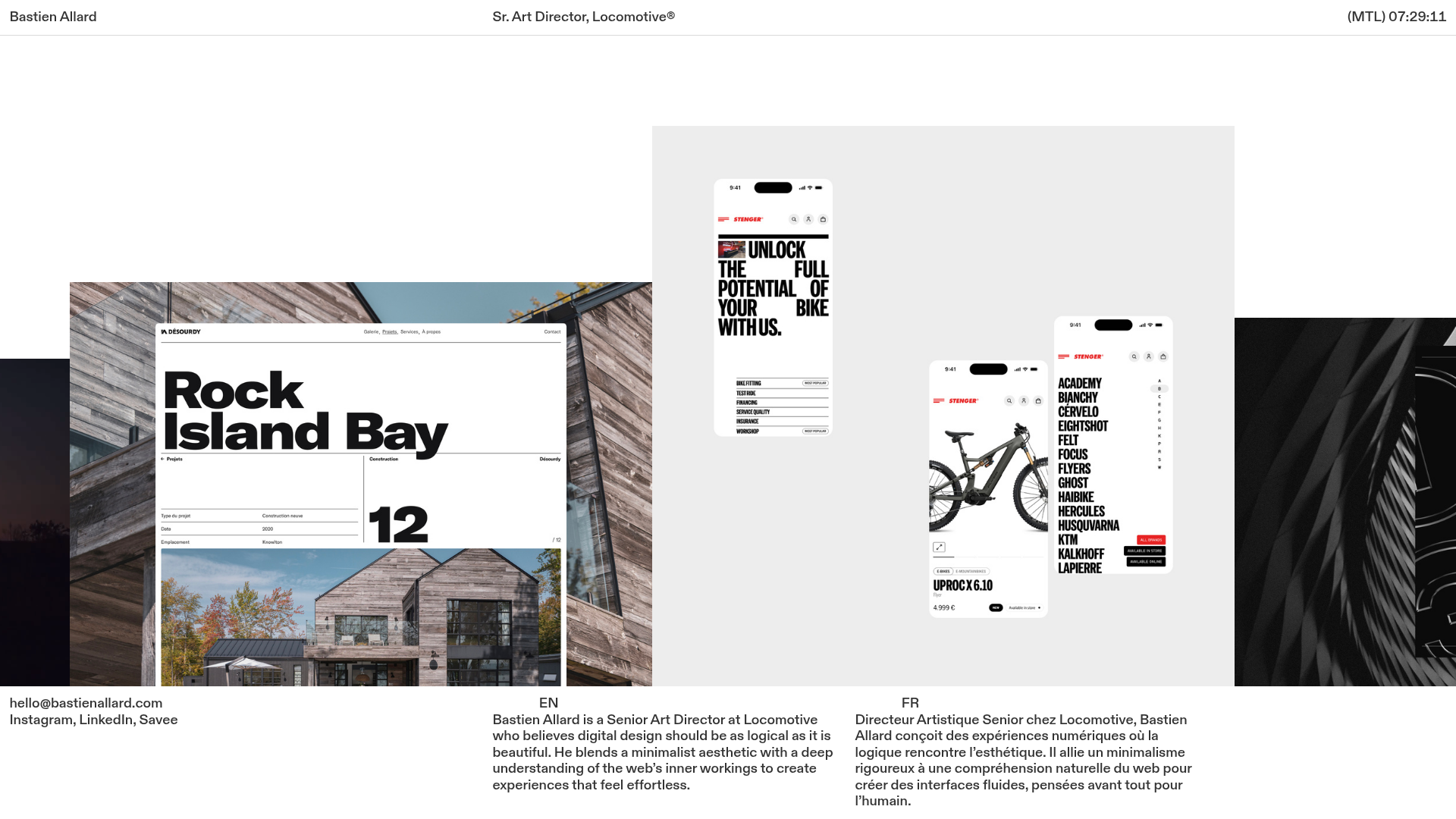
Bastien Allard Minimalist Portfolio Gallery
A clean, horizontal marquee-based portfolio featuring a sticky header/footer layout, digital clock integration, and responsive bilingual text columns for minimalist art director showcases.
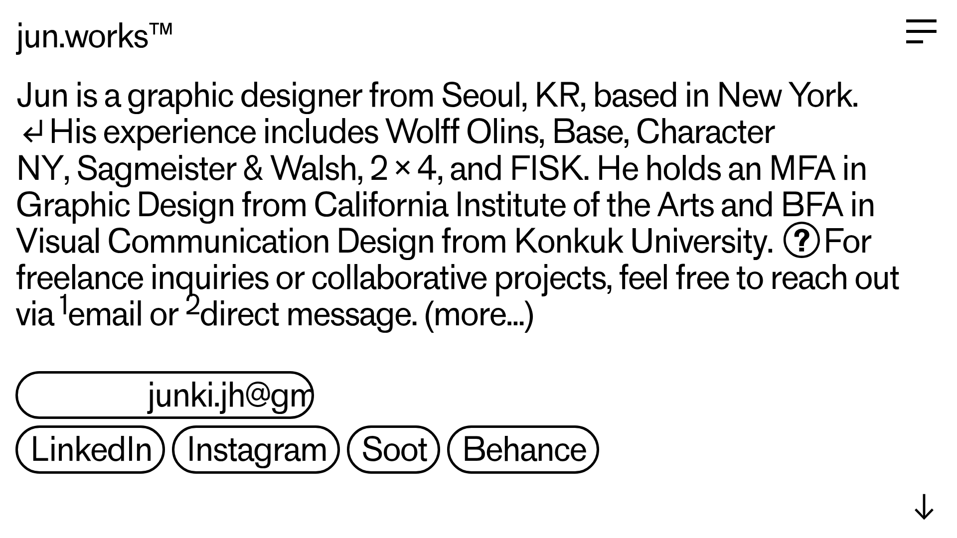
Jun Works Portfolio Landing Page
Minimalist graphic design portfolio featuring a text-heavy layout with image-on-hover tooltips, a pill-shaped marquee contact card, and a categorized hashtag tag cloud for project navigation.
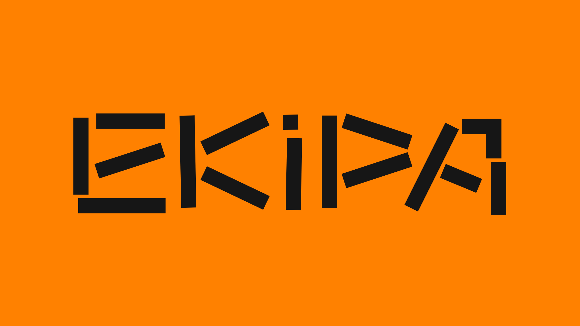
Ekipa Agency Artist Roster Site
A minimalist agency portfolio featuring a dynamic block-based logo, colorful background transitions, and a hover-activated image preview grid for an artist roster.
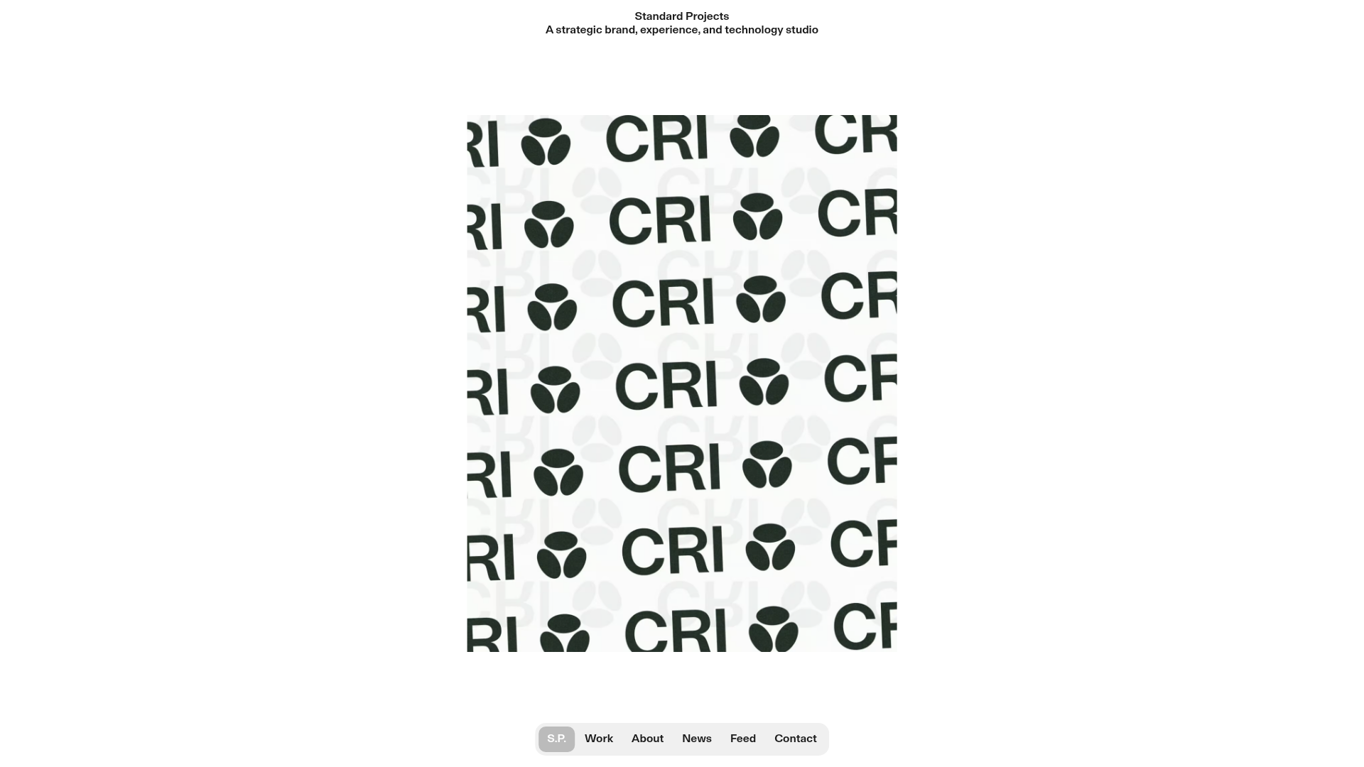
Standard Projects Portfolio with Sticky Hero
A minimalist studio layout featuring a full-height animated carousel, sticky header typography, and a dynamic masonry element grid for case studies.
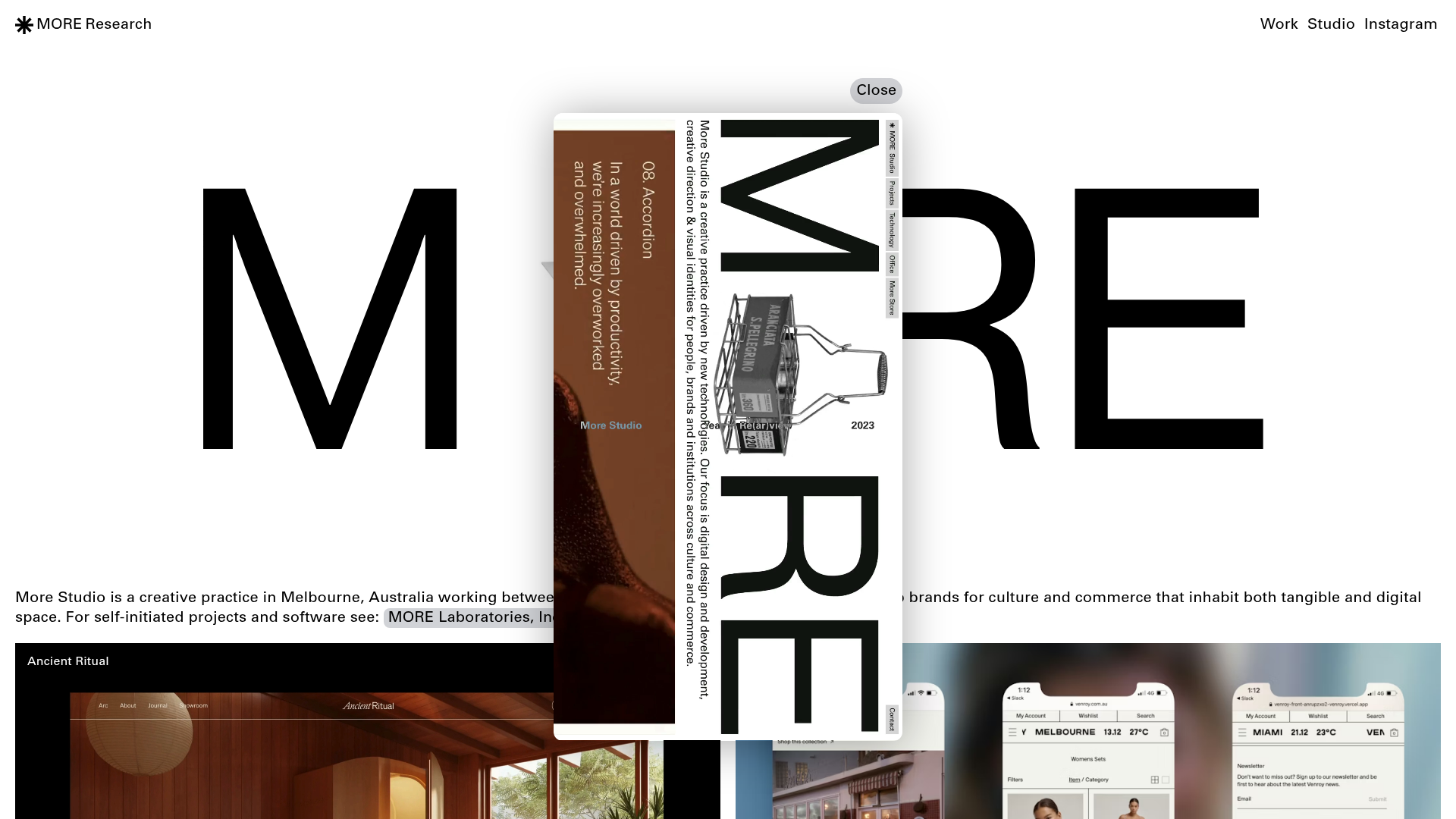
More Studio Creative Agency Portfolio
A high-end creative portfolio featuring oversized experimental typography, immersive video modals, accordion-based project lists, and unique cursor-following hover effects.
