Bōjka Studio Minimalist Portfolio Landing
A bold, high-contrast design featuring a vibrant green hero section, large-scale typography, a crossfade image slideshow, and a fixed navigation footer.
Overview
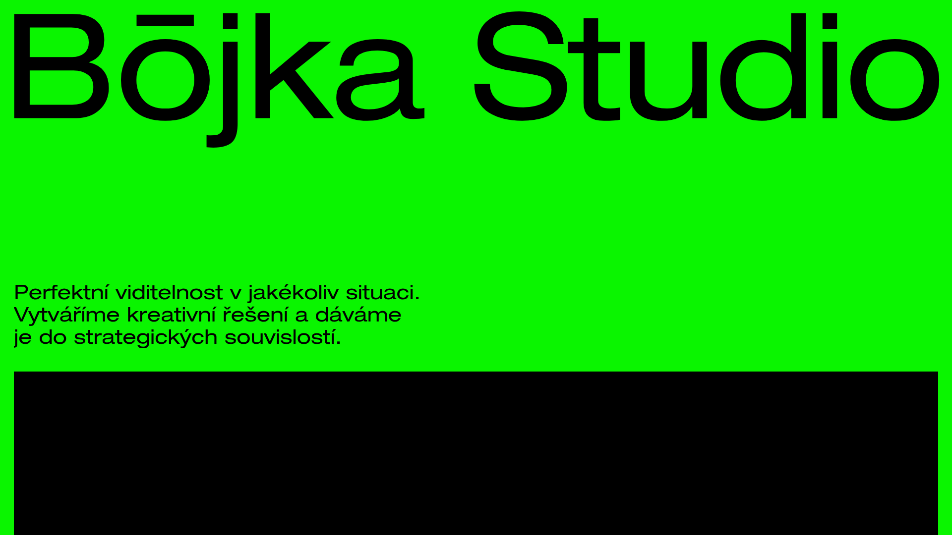
Bōjka Studio’s landing page is a masterclass in high-contrast minimalism, utilizing a striking fluorescent green and deep black palette to command immediate attention. It serves as an excellent reference for builders looking to implement a "brutalist-lite" aesthetic that prioritizes immense typography and seamless image transitions over complex layouts.
Design System
- Color Palette & Visual Hierarchy: The site uses a high-impact base of Fluorescent Green (
rgb(10, 245, 0)) for the hero section, contrasted against pure Black and White. The primary hierarchy is established by extreme scale—massive black headlines against a vibrant background, followed by image-heavy sections. - Typography: The typography uses a modern, wide sans-serif font family. The hero title is set at an oversized 157px with tight letter-spacing (-1.2px), while body text remains clean and readable with generous line heights.
- Page Structure: The layout follows a vertical linear flow: a full-height vibrant hero, a centered crossfade slideshow for portfolio highlights, secondary descriptive text blocks split into columns, and a minimal footer containing contact CTA buttons and social links.
- Reusable Components:
- Fixed Navigation Footer: A white semantic bar at the bottom containing category links (Proces, Projekty, Studio, Kontakt).
- Crossfade Slideshow: A responsive container (
widget-slideshow) that cycles through full-bleed portfolio imagery. - Pill Buttons: Large, rounded call-to-action buttons (
border-radius: 68px) used for email and social links.
- Interaction & Motion: The implementation features a
crossfadeanimation for the image gallery and a sticky/fixed positioning for navigation elements that remain visible as the user scrolls through the 2500px+ long page. - Responsive Behavior: The HTML includes
phone_portraitdata attributes, suggesting a fluid layout where font sizes scale down significantly while maintaining the centered text alignment and vertical stack of the image gallery and buttons.
Use Cases
- Who should clone this: Creative agencies, independent designers, and architects who want a portfolio that feels bold and unconventional while remaining highly functional.
- Effective Remixes: High-end retailers or fashion lookbooks can remix this by swapping the neon green for a neutral beige or muted pastel while retaining the large-scale typography for a luxury feel.
- Remix Directions:
- Info Architecture: Adapt the fixed bottom navigation into a top-fixed bar if a more traditional UX is preferred.
- Brand Swap: Replace the hero background-color with a high-resolution video loop for a more dynamic first impression.
- Clone Scope: A full-page clone is recommended to capture the specific relationship between the fixed footer and the scrolling content bounds. However, the hero section alone is a valuable reference for a high-conversion newsletter sign-up or landing page header.
Related Inspirations
Magda Reyman Designer Portfolio
A minimalist portfolio layout featuring a fixed hero intro, absolute-positioned mobile UI mockups, and a distinctive high-contrast footer with rounded interaction buttons.
Bastien Allard Minimalist Portfolio Gallery
A clean, horizontal marquee-based portfolio featuring a sticky header/footer layout, digital clock integration, and responsive bilingual text columns for minimalist art director showcases.
Jun Works Portfolio Landing Page
Minimalist graphic design portfolio featuring a text-heavy layout with image-on-hover tooltips, a pill-shaped marquee contact card, and a categorized hashtag tag cloud for project navigation.
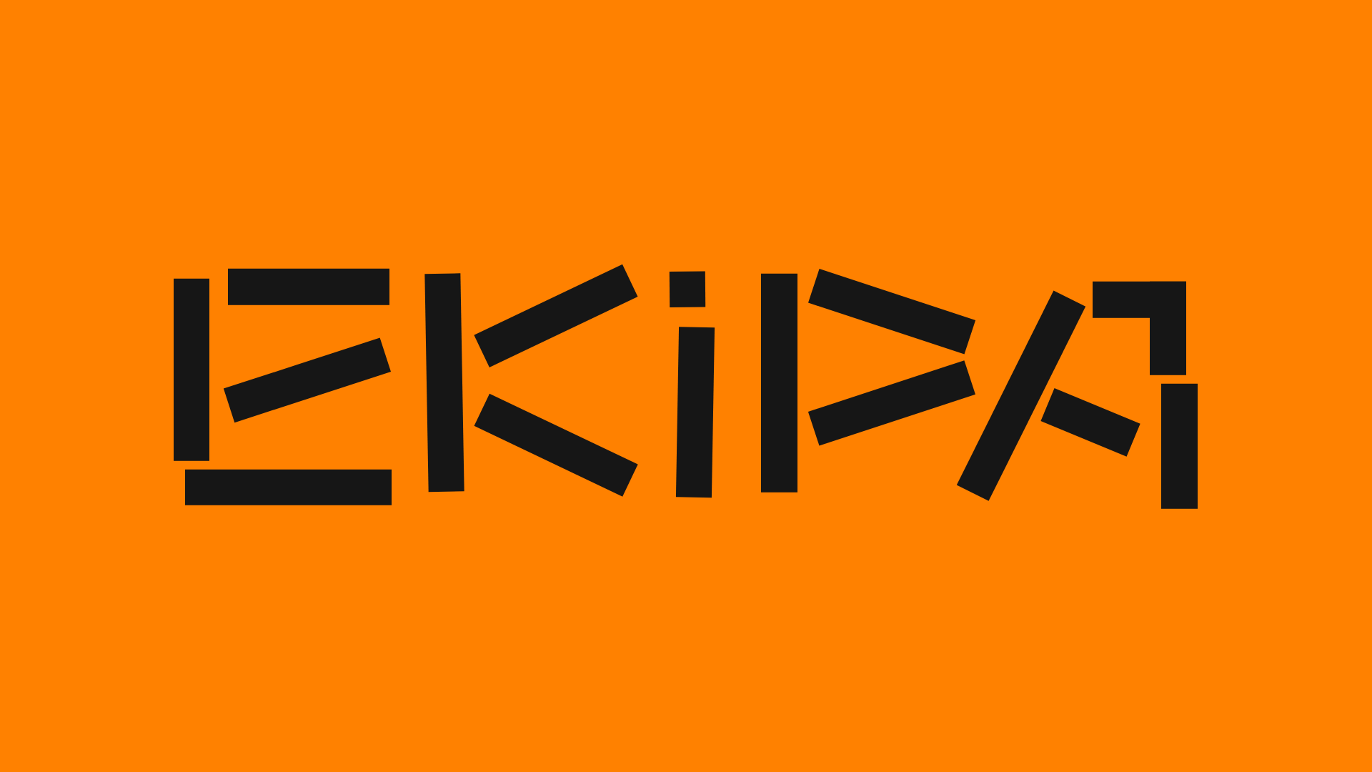
Ekipa Agency Artist Roster Site
A minimalist agency portfolio featuring a dynamic block-based logo, colorful background transitions, and a hover-activated image preview grid for an artist roster.
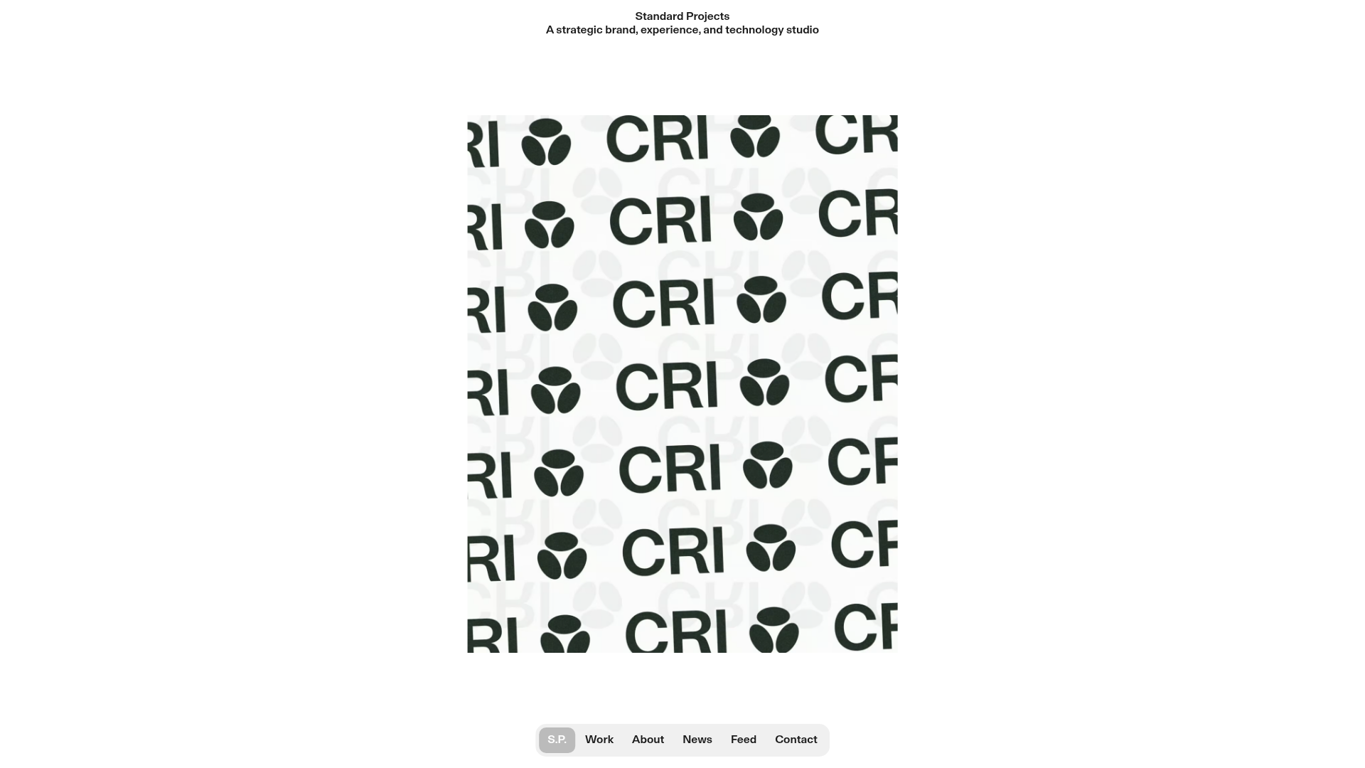
Standard Projects Portfolio with Sticky Hero
A minimalist studio layout featuring a full-height animated carousel, sticky header typography, and a dynamic masonry element grid for case studies.
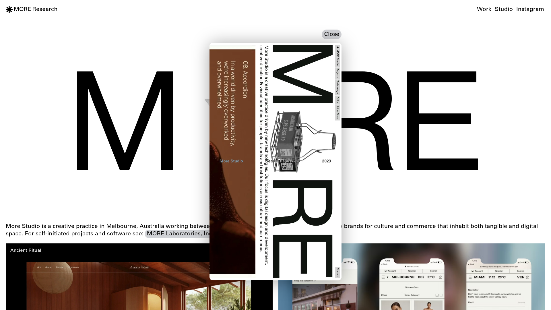
More Studio Creative Agency Portfolio
A high-end creative portfolio featuring oversized experimental typography, immersive video modals, accordion-based project lists, and unique cursor-following hover effects.
