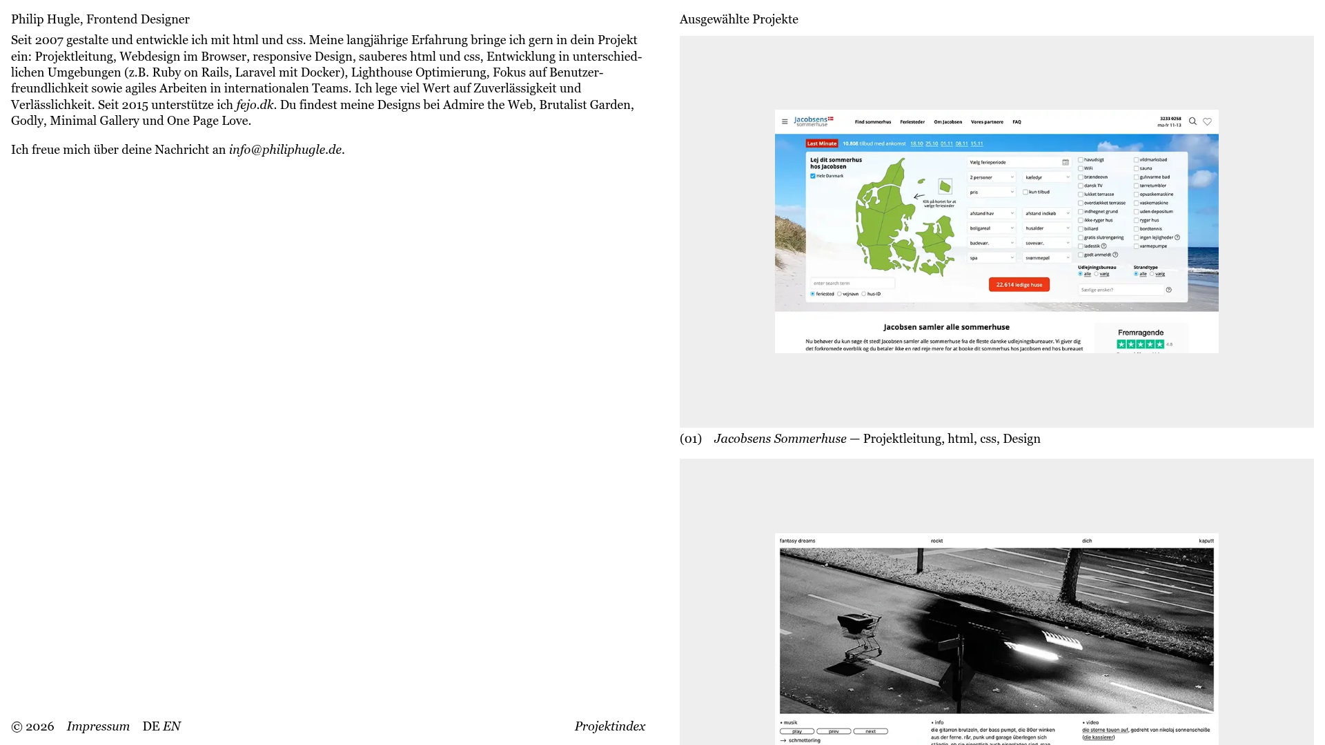
Philip Hugle Frontend Designer Portfolio
A minimalist, high-contrast designer portfolio featuring a responsive asymmetrical dual-column layout and a text-based project list with large thumbnail hover previews.
Overview
This is a minimalist, text-first portfolio for a frontend designer that achieves a high-end editorial feel through stark typography and generous whitespace. It is an excellent reference for builders wanting to showcase a high-volume portfolio using a clean, asynchronous layout that prioritizes content over decorative elements.
Design System
- Color Palette & Visual Hierarchy: The site uses a monochrome aesthetic with a pure white background and high-contrast black text. Visual hierarchy is established through a two-column grid where the left is dedicated to identity/intro and the right to project showcases.
- Typography System: Features a refined serif typeface for body text and project descriptions, combined with a clean sans-serif for UI elements like footers and navigation. Emphasis is driven by font-weight variations and consistent numbering (e.g.,
(01)) for lists. - Page Structure: A binary split-screen layout. The left column remains static or text-heavy with contact info and a long-form bio, while the right column acts as a scrolling feed of project entries (
Project_list). - Reusable Components:
- Project Item: A combination of a large
figureimage and a descriptive text block below it. - Minimal Footer: A simple horizontal flex-row containing copyright, site map links, and language toggles.
- Custom Cursor: The HTML includes a
#custom-cursordiv, suggesting a bespoke interaction layer for mouse movement.
- Project Item: A combination of a large
- Interaction Patterns: The HTML structure shows hidden or nested
Project_imagefigures within project links, indicating a hover-to-reveal or constant-scroll image gallery pattern. The list format suggests a smooth vertical scroll experience. - Responsive Behavior: The layout is built for responsiveness, likely collapsing the dual-column desktop view into a single vertical stack on mobile devices where the intro text precedes the project list.
- Implementation Clues: Use of semantic HTML5 tags (
article,main,figure) with BEM-style naming conventions (Project_link,Project_info) simplifies styling and component-based development.
Use Cases
- Who should clone this: Independent designers, developers, or copywriters who want a "no-fluff" professional presence that feels like a modern art gallery.
- Effective Remixes: Perfect for agency landing pages, architecture portfolios, or digital journals.
- Practical Directions:
- Typography Swap: Change the serif to a brutalist sans-serif for a more "tech-heavy" feel.
- Asymmetric Grid: Maintain the side-aligned bio but allow the right column to use a masonry grid for varied image sizes.
- Information Architecture: Replace the long bio with a "Services" checklist or a "Now" page to adapt to different business models.
- Suggested Clone Scope: A full-page clone is recommended to capture the specific balance between the wide-gutter layout and the image-to-text ratio.
Related Inspirations
Giulia Saporito Minimal Portfolio Landing
A minimalist graphic design portfolio featuring high-contrast serif typography, asymmetric grid layouts, and an image hover reveal interaction pattern for showcasing creative projects.
Simon Rogers Rotating Text Portfolio
A minimalist single-page layout featuring a CSS-transformed rotating text column with a repeating biography and career timeline sections.
Studio Tumulte Minimalist Portfolio
A design studio portfolio featuring a split-hero landing page, custom cursor interactions, and a non-linear masonry collage layout for creative case studies.
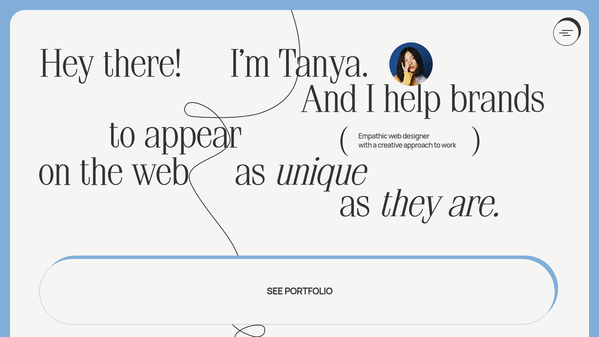
Tanya Creative Portfolio Landing Page
A minimalist hero section featuring asymmetric typography, a hand-drawn vector line animation, a custom circular cursor, and an oversized rounded call-to-action button.
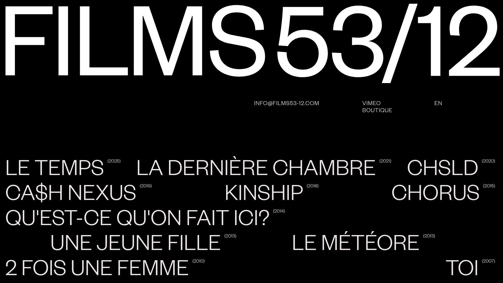
Films 53/12 Cinematographic Portfolio Layout
A minimalist dark-mode production site featuring a scattered typography grid, interactive hover-to-reveal image states, and a clean list-based film catalogue.
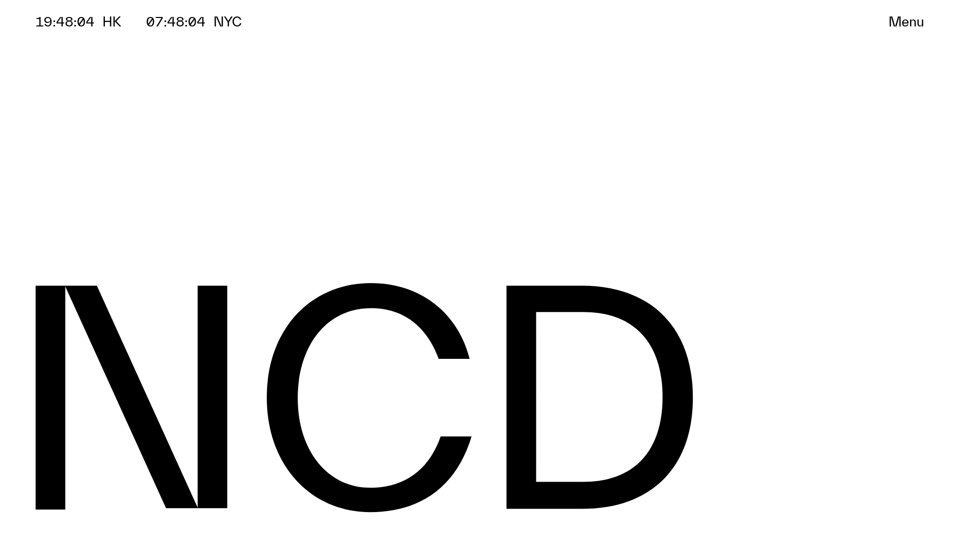
NCDA Architecture Studio Portfolio Template
A minimalist design featuring a bold typography splash screen, real-time dual-city clocks, and a discipline-based vertical scroll layout with hover-triggered overlays.
