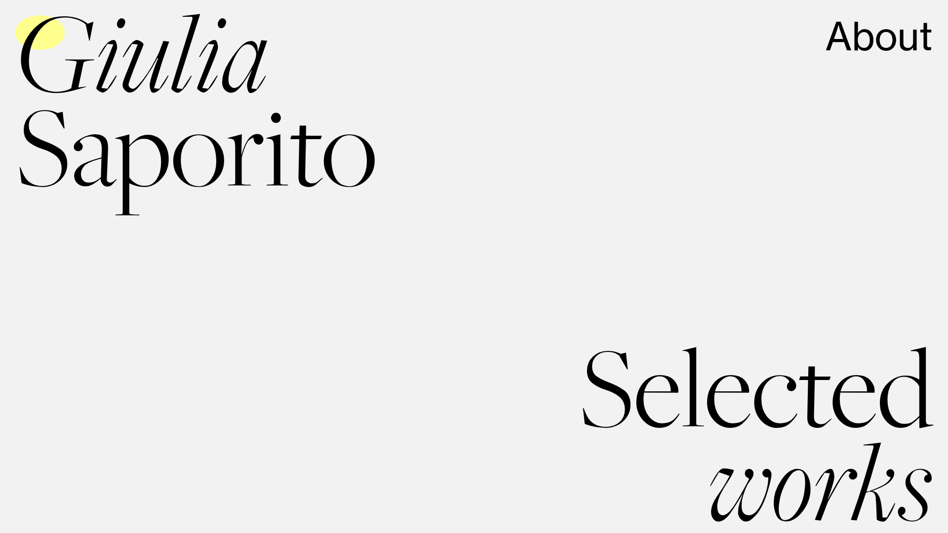
Giulia Saporito Minimal Portfolio Landing
A minimalist graphic design portfolio featuring high-contrast serif typography, asymmetric grid layouts, and an image hover reveal interaction pattern for showcasing creative projects.
Overview
This minimalist landing page serves as a high-end graphic design portfolio, utilizing dramatic serif typography and intentional whitespace to create a sophisticated editorial aesthetic. It is an excellent clone reference for creatives who want to balance a clean, text-heavy layout with dynamic, interactive project reveals.
Design System
- Color Palette & Visual Hierarchy: The design uses a muted off-white/light gray background (#f0f0f0 equivalent) with high-contrast black text. A soft yellow circular highlight appears as a decorative element behind the 'G' in Giulia. Project titles occasionally use a soft lavender/pink class (
rosa), creating a secondary hierarchy for metadata. - Typography System: The site features a luxury serif typeface (similar to Didot or Bodoni) with high stroke contrast. It uses a mix of upright and italic styles to denote different hierarchy levels: large project titles in bold serif, and biological or category metadata in smaller capitals or italics. The 'Selected works' and 'Giulia Saporito' headers use extreme scale to anchor the layout.
- Page Structure: The layout follows an unconventional, asymmetric grid. It starts with a hero section containing the name and an 'About' link, followed by a shifted 'Selected works' header. Projects are then listed in a scattered, staggered vertical flow using a multi-column grid (
grid-col="8",grid-col="x11", etc.) that avoids standard linear rows. - Reusable Components:
- Asymmetric Grid Blocks: Divs with varied
grid-colwidths that create the signature staggered look. - Hover-Reveal Links: The most critical component is the
.linkprogetto/.hover-titlecontainer which acts as a trigger for the project navigation.
- Asymmetric Grid Blocks: Divs with varied
- Interaction & Motion Patterns:
- Image Hover Reveal: As evidenced by the
.hover-imageclass and associated metadata, project imagery is hidden by default and appears/follows the cursor when the user hovers over a text link. - Custom Cursor: The HTML includes a
mouse-circlediv, suggesting a trailing cursor effect that interacts with the site's minimalist elements.
- Image Hover Reveal: As evidenced by the
- Responsive Behavior: The HTML uses
grid-responsiveandexclude_mobileclasses, indicating that the complex asymmetric grid collapses into a single-column stack on smaller screens to maintain legibility.
Use Cases
- Who should clone this: Independent designers, typographers, and architects who have high-quality project imagery but want their name and typography to lead the user experience.
- Effective Remixes: This pattern works exceptionally well for luxury brand lookbooks, experimental digital journals, or high-concept agency landing pages.
- Practical Directions:
- Agency Portfolio: Swap the serif for a bold grotesque sans-serif for a more modern, tech-focused agency feel while keeping the staggered grid.
- Editorial Project: Reuse the cursor-following image reveal to create an interactive table of contents for a digital magazine.
- Suggested Clone Scope: Start with the full-page layout to master the asymmetric grid logic. For a quicker win, clone the hover-reveal project list section (
.linkprogetto+.hover-image) to integrate into an existing minimalist site.
Related Inspirations
Studio Tumulte Minimalist Portfolio
A design studio portfolio featuring a split-hero landing page, custom cursor interactions, and a non-linear masonry collage layout for creative case studies.
Tanya Creative Portfolio Landing Page
A minimalist hero section featuring asymmetric typography, a hand-drawn vector line animation, a custom circular cursor, and an oversized rounded call-to-action button.

Bruno Arizio Designer Portfolio Website
A minimalist creative director portfolio featuring a clean typographic layout, side-aligned image previews, and high-contrast spacing patterns suitable for luxury or design showcases.
Sing-Sing Creative Portfolio Landing Page
A minimalist studio portfolio featuring high-contrast typography, a horizontal line-grid hero section, and responsive image components with custom cursor interactions.

Vita Architecture Portfolio Landing Page
A minimalist, high-end architecture portfolio featuring a custom canvas-based image gallery, split-text animations, and a project slider with dynamic image masks.
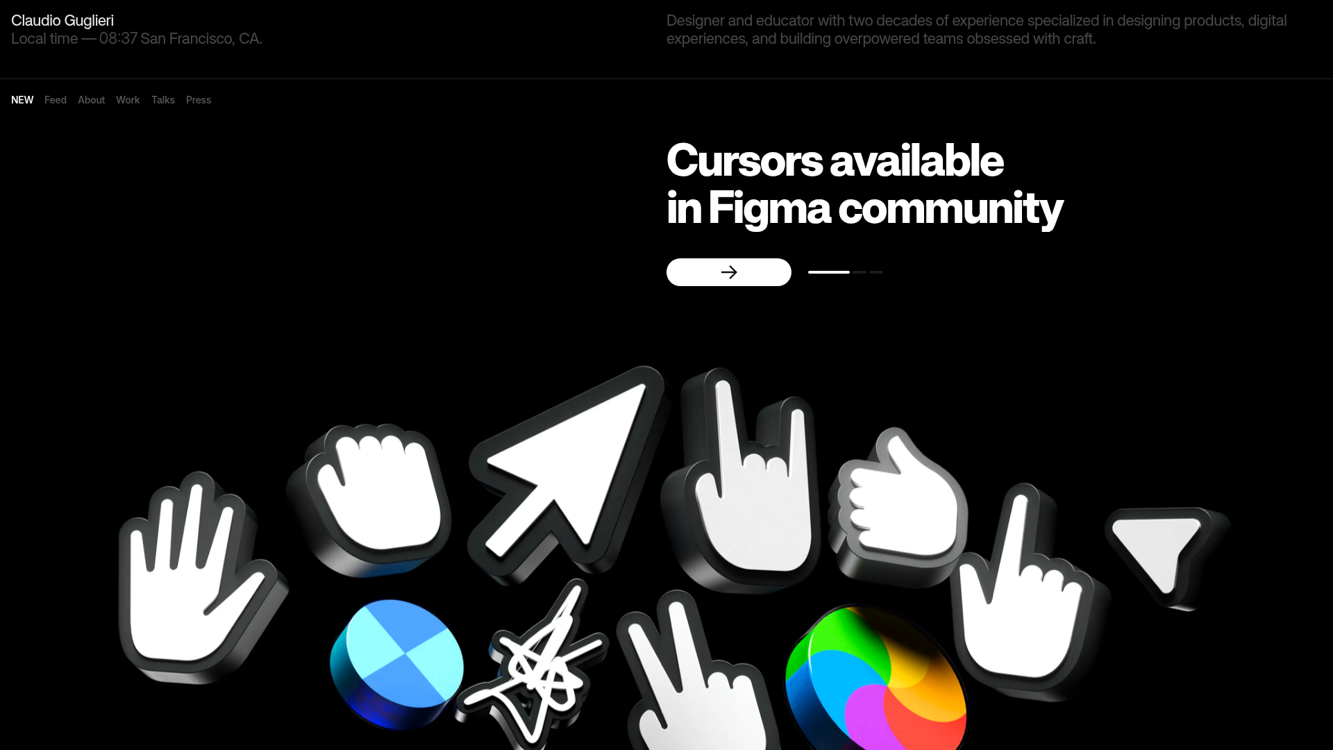
Claudio Guglieri Portfolio Portfolio Hero
A dark-themed designer portfolio featuring a 3D asset hero section, minimal top navigation bar, and integrated visitor message submission form.
