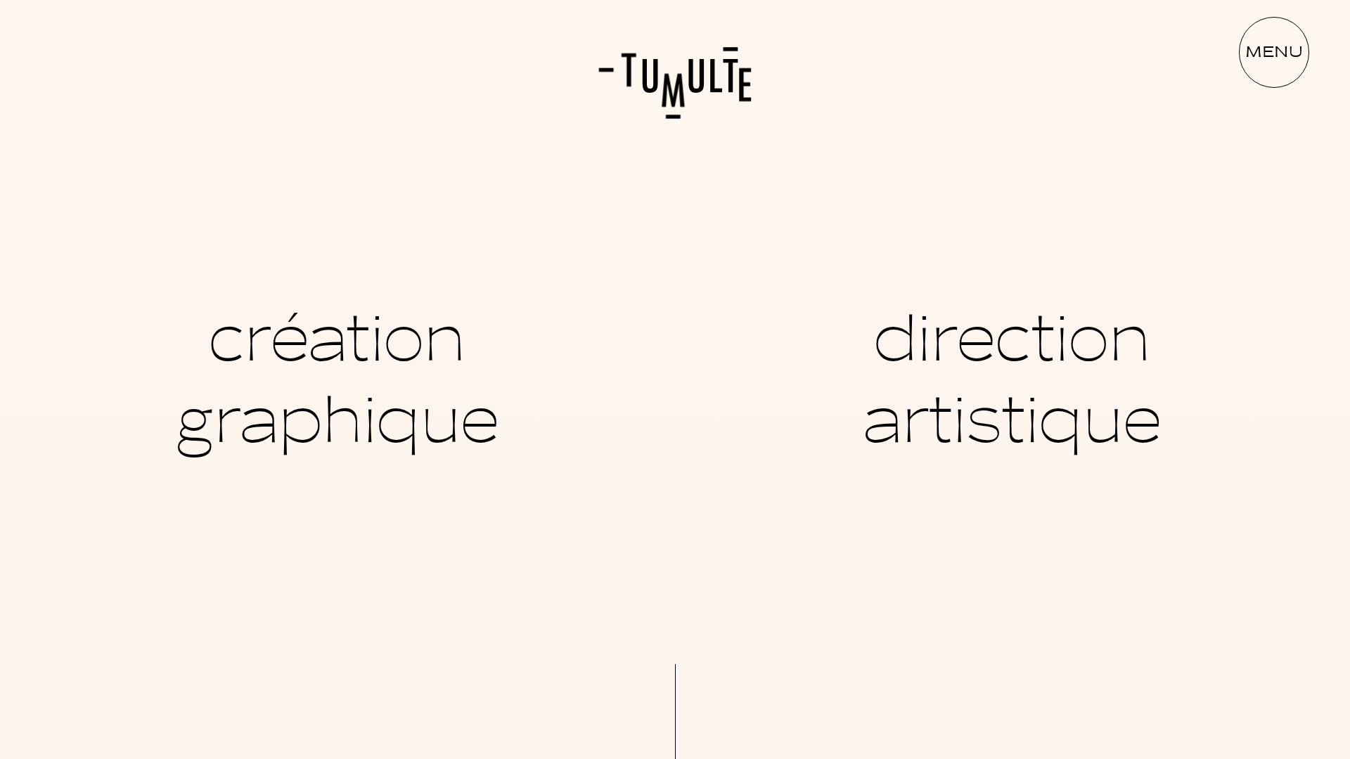
Studio Tumulte Minimalist Portfolio
A design studio portfolio featuring a split-hero landing page, custom cursor interactions, and a non-linear masonry collage layout for creative case studies.
Overview
Studio Tumulte is a high-end graphic design and art direction portfolio that masterfully uses whitespace and editorial typography to create a premium, minimalist feel. It serves as an excellent reference for builders wanting to implement non-traditional layouts, such as split-hero sections and asymmetrical masonry grids that break the standard container constraints.
Design System
- Color Palette & Visual Hierarchy: The primary background is a warm off-white/cream hex-code (
#f9f3ed), significantly softer than pure white. High-contrast black typography serves as the primary visual anchor, creating a sophisticated print-media aesthetic. - Typography: The system utilizes high-contrast sans-serif fonts. The hero section features ultra-thin, wide-set lowercase headers for "création graphique" and "direction artistique," while the logo uses a custom vertical-stack motif. Hierarchy is maintained through letter spacing and negative space rather than heavy font weights.
- Page Structure & Flow: The site begins with a split-hero landing page divided by a thin vertical line. Below the fold, it transitions into a complex "non-linear masonry" collage where project cards are positioned with intentional overlaps using varying widths and negative top margins (e.g.,
-29%,-13%as seen in the HTML classes). - Reusable Components:
- Split-Hero: A 50/50 vertical split for dual navigations/niches.
- Custom Cursor: A multi-state follower that changes based on intent (drag, hover, or link-click).
- Dynamic Grid Cards: Reusable image containers that support square, portrait, and landscape ratios seamlessly.
- Interaction & Motion: The HTML indicates a heavy reliance on GSAP or similar motion libraries for 'skewed-title' animations and 3D transforms (
translate3d). Hovering over projects triggers a custom cursor state, and images appear to have a subtle blur-load transition effect (data-blur). - Implementation Clues: The structure uses a main routing container with
position: fixedandcontain: content, suggesting a single-page application (SPA) feel with smooth, AJAX-based page transitions and custom scroll hijacking.
Use Cases
- Target Personas: Independent designers, architects, photographers, and high-end boutique agencies seeking an "editorial" digital presence.
- Effective Remixes: This layout is perfect for luxury brand lookbooks or fashion editorials where high-resolution imagery takes precedence over descriptive text.
- Remix Directions: Replace the French copy with bold serif type for a more classical look, or use the asymmetrical masonry layout for a landing page to showcase a product gallery instead of portfolio projects.
- Suggested Scope: For a quick win, clone the Split-Hero section to differentiate service offerings. For a deeper project, clone the Home List Grid to master the CSS positioning required for the offset collage effect.
Related Inspirations
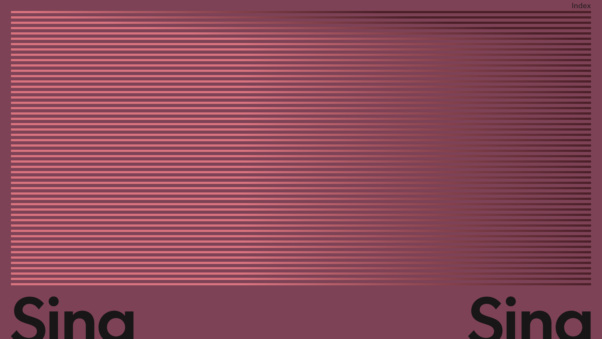
Sing-Sing Creative Portfolio Landing Page
A minimalist studio portfolio featuring high-contrast typography, a horizontal line-grid hero section, and responsive image components with custom cursor interactions.
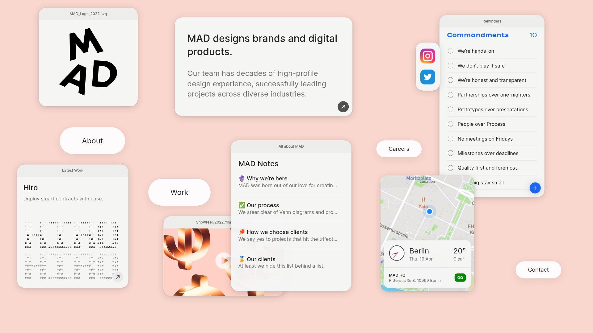
MAD Agency Interactive Dashboard Portfolio
A creative workspace-style layout featuring draggable OS-like applets, including interactive notes, a map widget with live weather, and a custom task checklist.
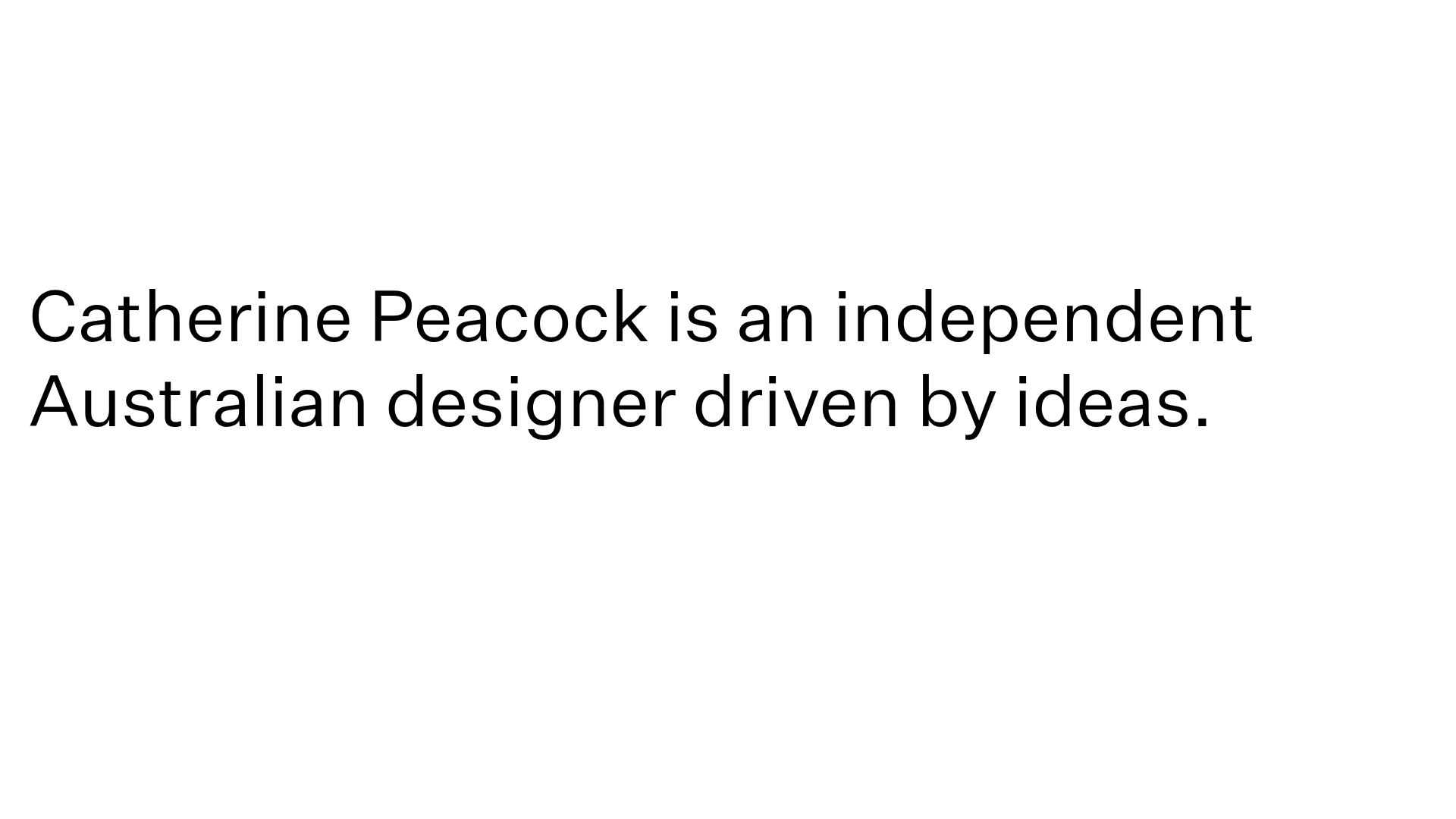
Catherine Peacock Designer Portfolio Home
A minimalist portfolio layout featuring a vertically stacked masonry project grid, sticky navigation with animated icons, and offset typography.
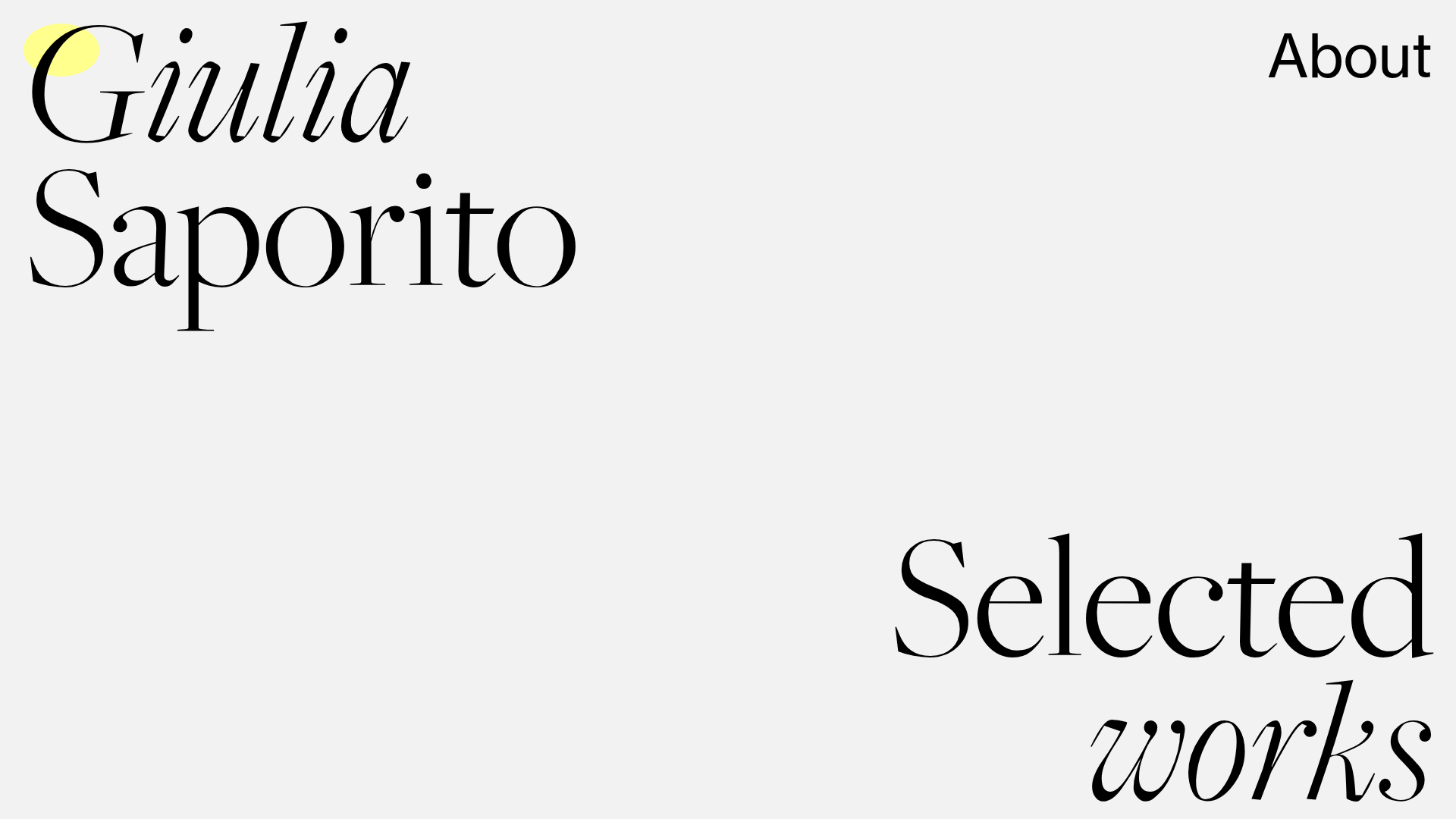
Giulia Saporito Minimal Portfolio Landing
A minimalist graphic design portfolio featuring high-contrast serif typography, asymmetric grid layouts, and an image hover reveal interaction pattern for showcasing creative projects.
OPX Studio Agency Portfolio
A minimalist dark-themed portfolio featuring a staggered masonry project grid, cinematic video embeds, and a responsive oversized typography hero section.
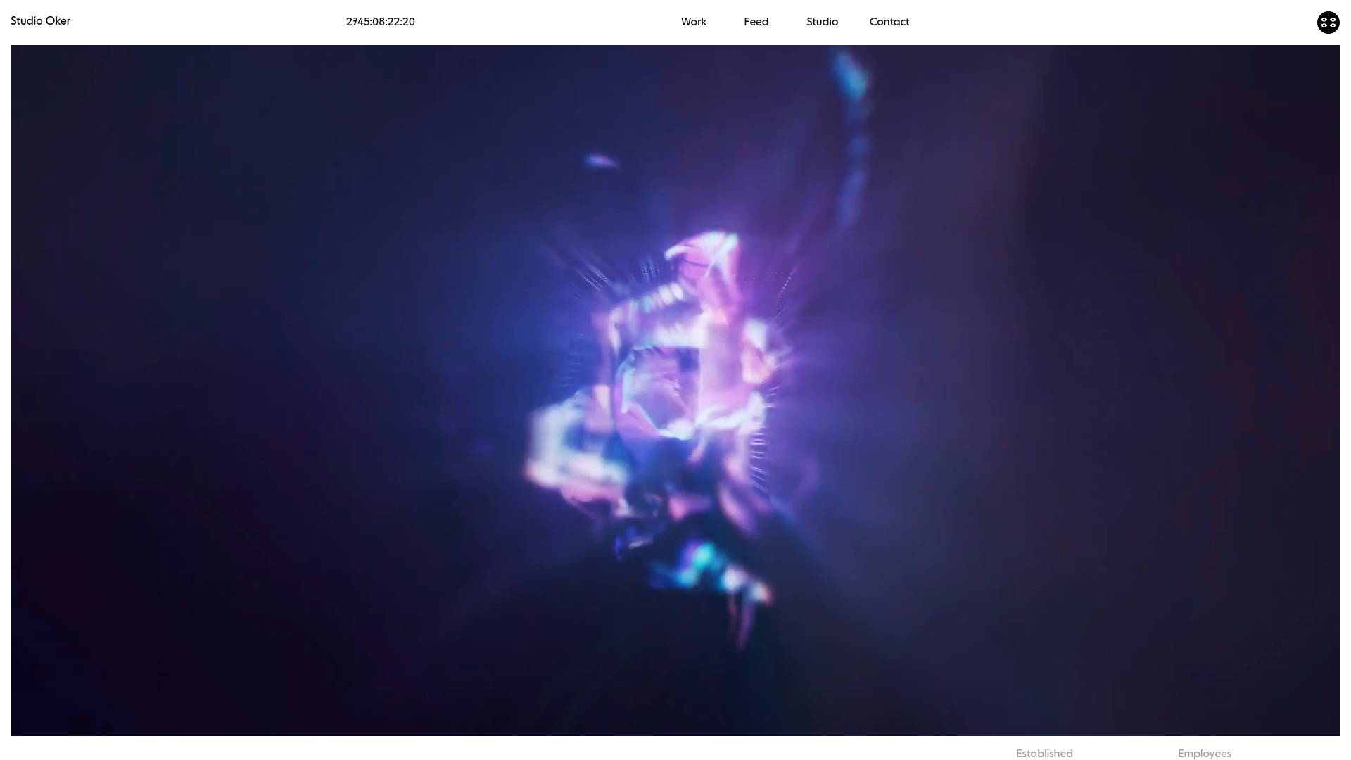
Studio Oker Creative Portfolio Landing
A minimalist studio landing page featuring an immersive full-screen video hero, horizontal glide carousel for project feeds, and a dynamic masonry project grid.
