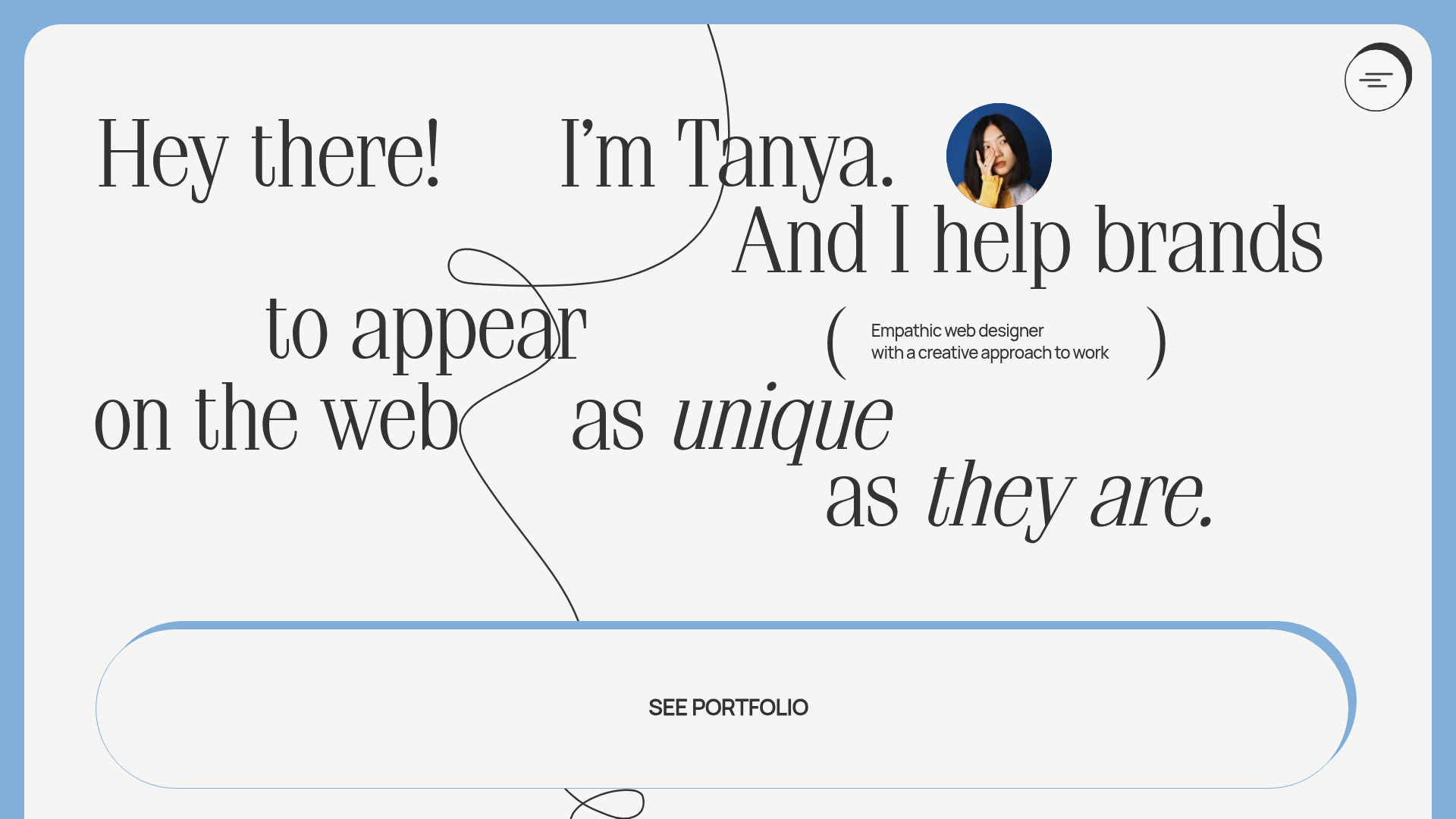
Tanya Creative Portfolio Landing Page
A minimalist hero section featuring asymmetric typography, a hand-drawn vector line animation, a custom circular cursor, and an oversized rounded call-to-action button.
Overview
This landing page is a minimalist, high-impact hero section for a creative professional portfolio. It serves as an excellent reference for cloning due to its sophisticated use of asymmetric typography, organic line art, and a custom circular cursor interaction that enhances the user experience through subtle motion.
Design System
- Color Palette & Visual Hierarchy: The design uses a soft, off-white background with a muted sky-blue border frame. The typography is primary in high-contrast charcoal black, creating a clear visual hierarchy that directs the eye from the greeting to the primary call-to-action.
- Typography System: The site features a mix of a high-contrast serif font for the main headline and a clean sans-serif for secondary details. It utilizes various font styles—upright, italics, and different weights—to create a rhythmic flow in the text layout. Large-scale headings dominate the screen to act as both content and graphic element.
- Page Structure: The layout is a centralized hero section. It features a top-right hamburger menu for navigation, a circular headshot profile for personal branding, and an oversized, pill-shaped "SEE PORTFOLIO" button at the bottom center to capture user intent.
- Reusable Components:
- The CTA Button: An expansive, thin-bordered pill button that spans a significant width of the viewport.
- Custom Cursor: The implementation (referenced in HTML classes like
cursor-changedandcursor-border) provides a dynamic, state-aware pointer that reacts to interactive elements. - Decorative SVG Line: A thin, hand-drawn vector line that weaves through the text, providing visual continuity and a bespoke, artistic feel.
- Interaction & Motion: The site relies on fixed positioning for cursor elements and CSS transitions (noted at
0.25sin the HTML) for smooth state changes. The layout usesmix-blend-modefor the cursor to ensure visibility over varying background elements.
Use Cases
- Who should clone this: Independent designers, artists, or creative directors looking for a high-concept "digital business card" style site.
- Effective Remixes: Perfect for boutique creative agencies or architectural firms that want to emphasize a unique aesthetic over high-density information.
- Remix Directions:
- Style Swap: Replace the serif font with a bold grotesque sans-serif for a more brutalist, tech-forward look.
- Interactive Line: Remix the SVG path to match different branding shapes (e.g., geometric instead of organic).
- Suggested Scope: This is ideal for a quick section clone of the hero area to be used as a high-conversion entry point for a larger multi-page site.
Related Inspirations
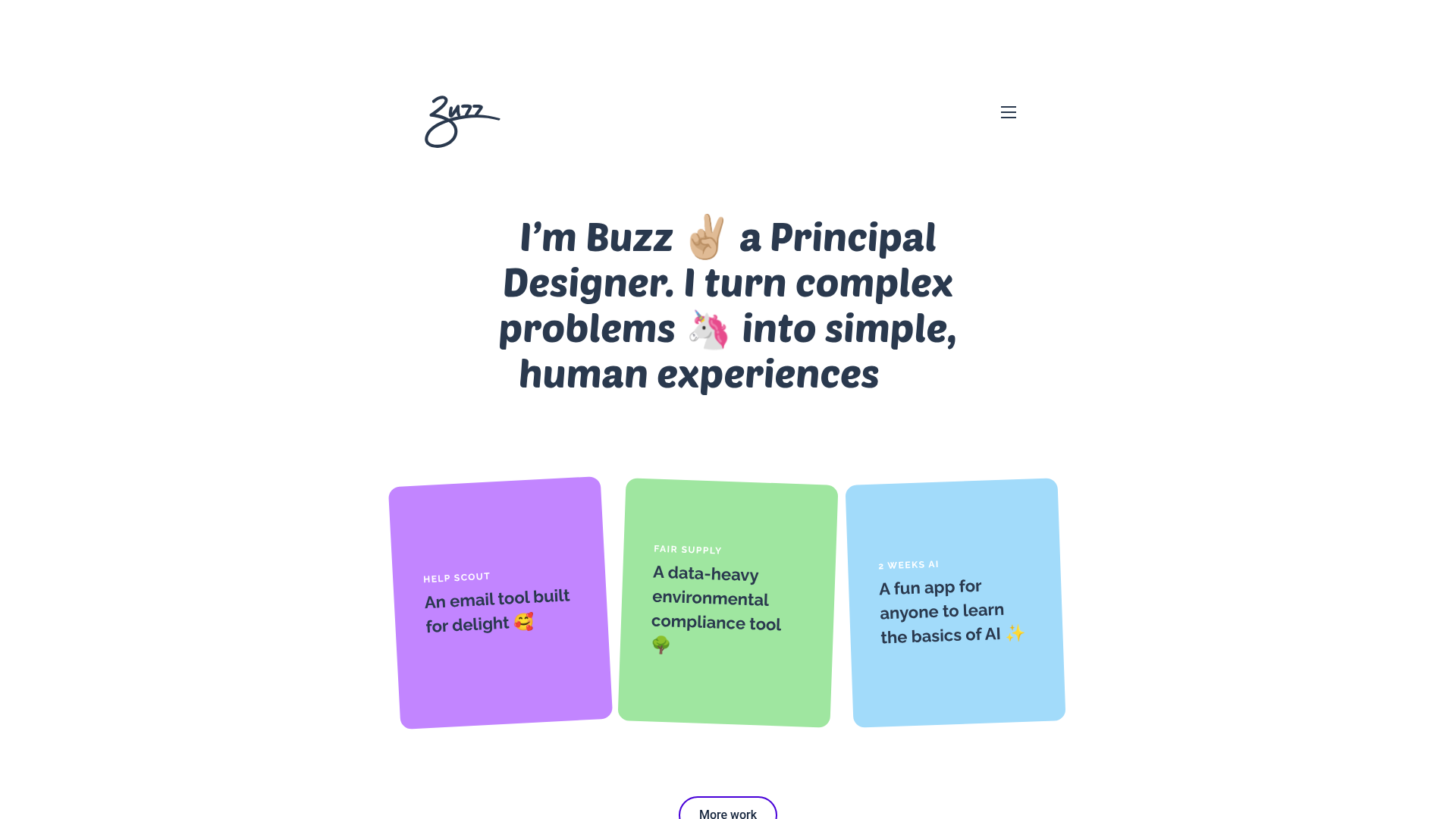
Buzz Usborne Designer Portfolio Landing
A minimalist portfolio layout featuring a large typography-driven hero section with animated emojis and a responsive grid of colorful, card-based project previews.
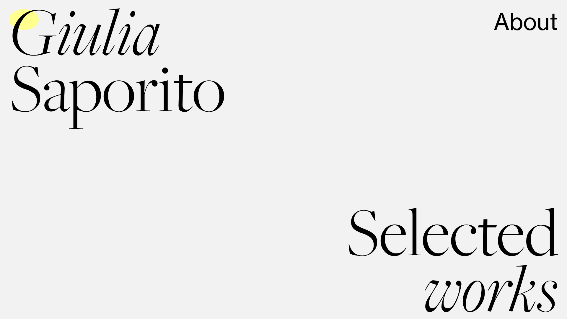
Giulia Saporito Minimal Portfolio Landing
A minimalist graphic design portfolio featuring high-contrast serif typography, asymmetric grid layouts, and an image hover reveal interaction pattern for showcasing creative projects.
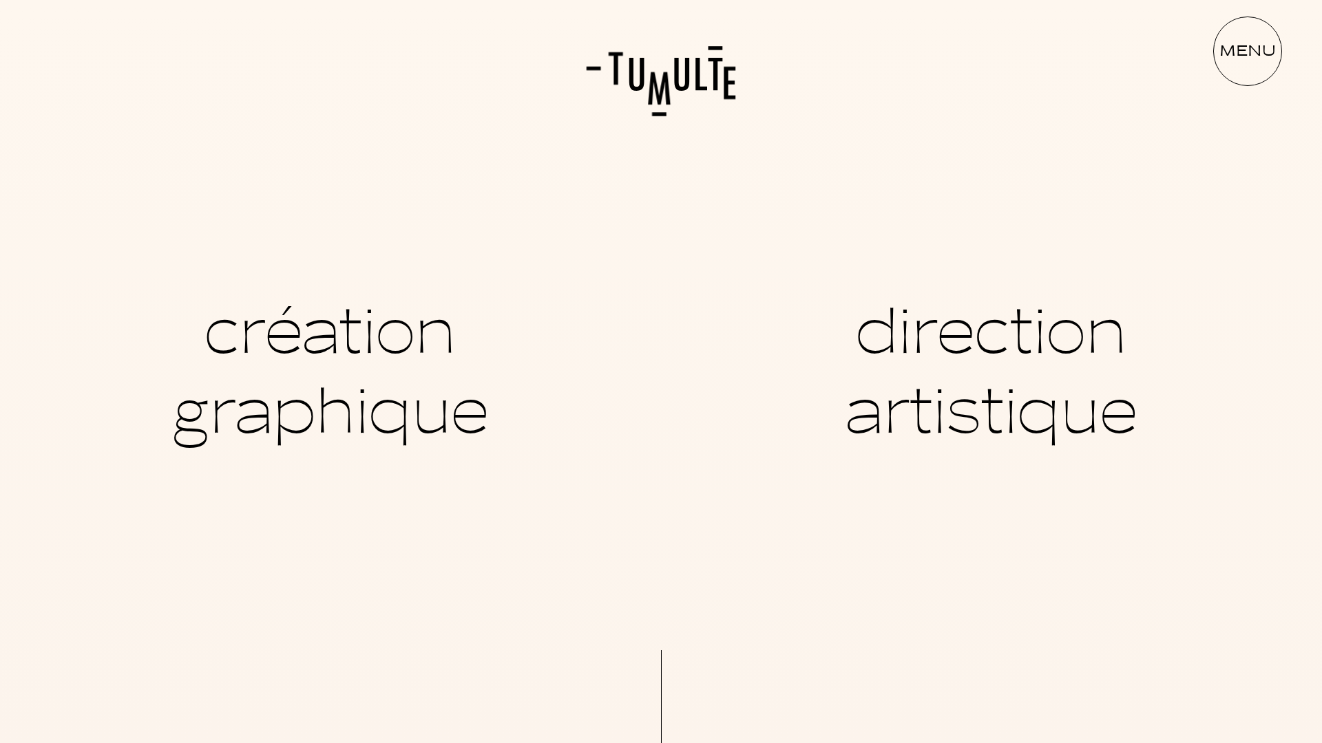
Studio Tumulte Minimalist Portfolio
A design studio portfolio featuring a split-hero landing page, custom cursor interactions, and a non-linear masonry collage layout for creative case studies.
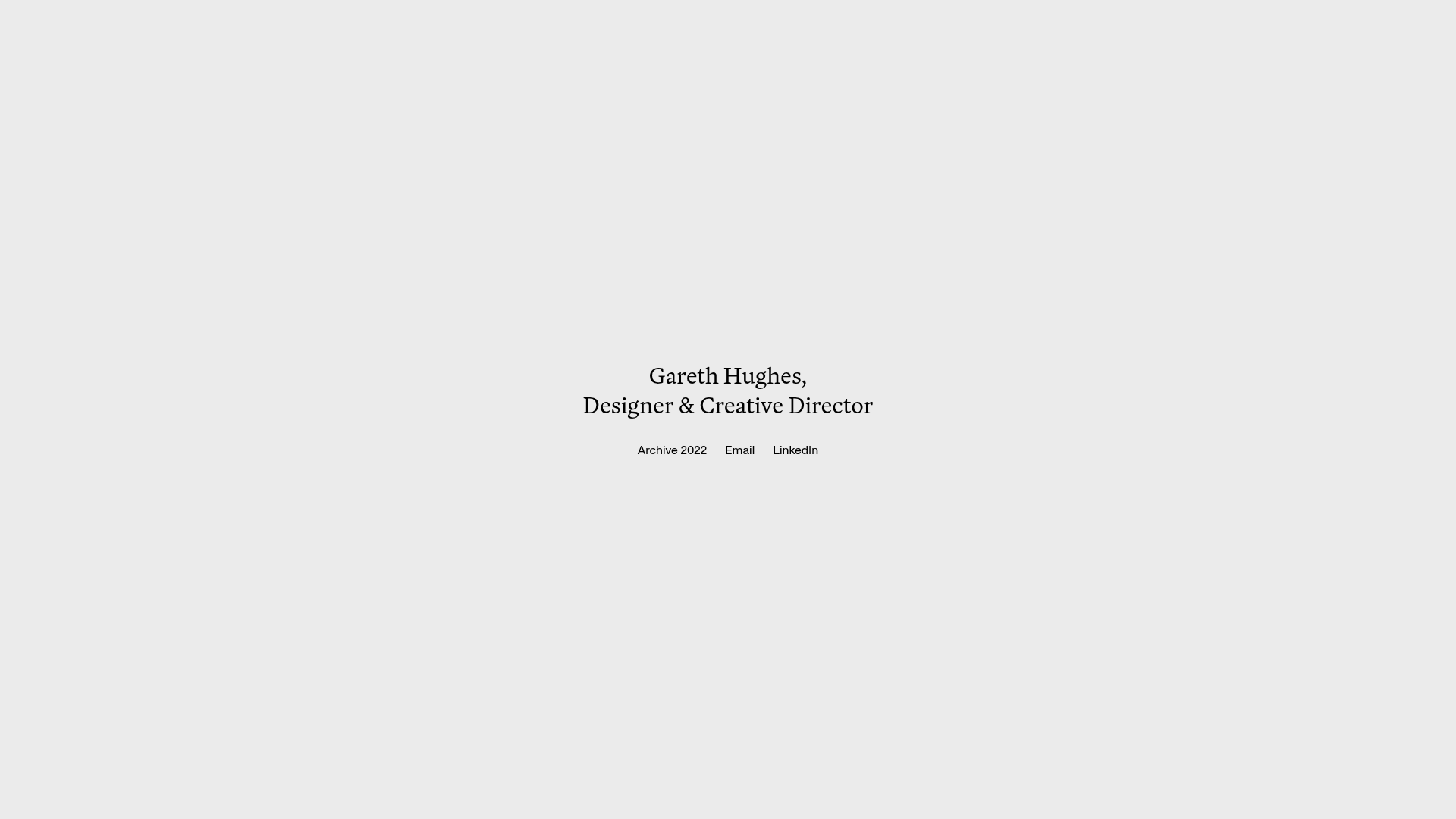
Gareth Hughes Minimalist Landing Page
A clean, centered portfolio placeholder featuring a custom cursor interaction, high-contrast typography, and a simplified navigation layout for professional networking.

Bruno Arizio Designer Portfolio Website
A minimalist creative director portfolio featuring a clean typographic layout, side-aligned image previews, and high-contrast spacing patterns suitable for luxury or design showcases.
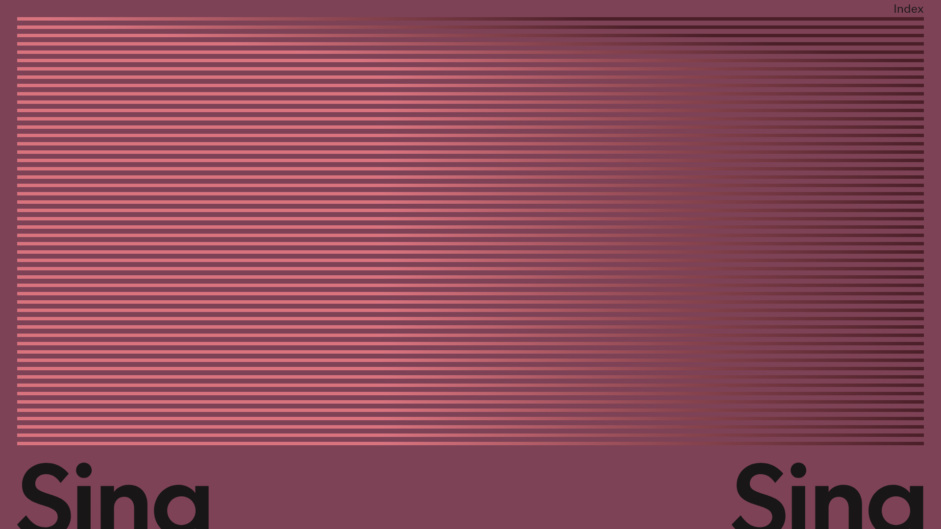
Sing-Sing Creative Portfolio Landing Page
A minimalist studio portfolio featuring high-contrast typography, a horizontal line-grid hero section, and responsive image components with custom cursor interactions.
