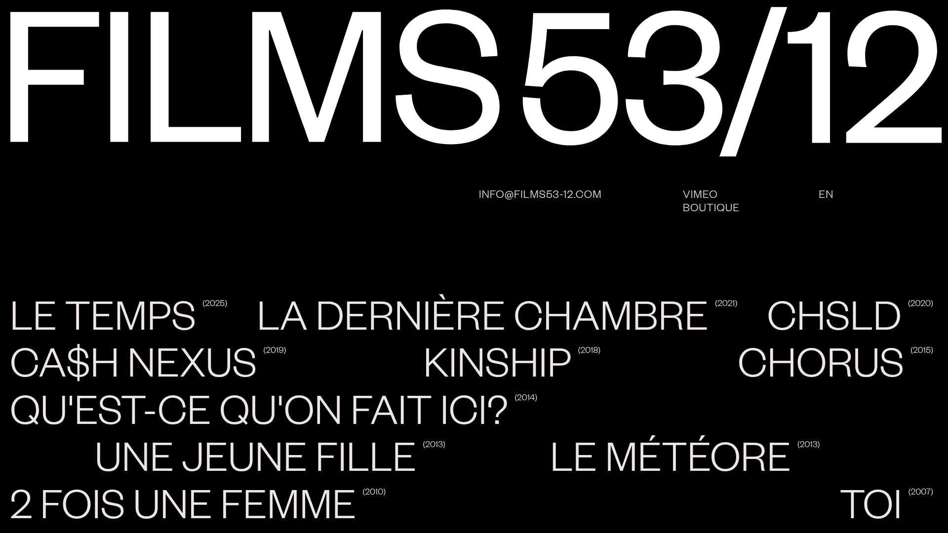
Films 53/12 Cinematographic Portfolio Layout
A minimalist dark-mode production site featuring a scattered typography grid, interactive hover-to-reveal image states, and a clean list-based film catalogue.
Overview
This cinematographic portfolio for Films 53/12 is a masterclass in high-impact, minimalist typography. It primarily serves as a visual index for a film production house, using a non-linear scattered grid to create an editorial, avant-garde feel. This is a strong clone reference for creatives who want to move beyond standard list layouts and experiment with spatial typography and interactive hover states.
Design System
- Color Palette & Visual Hierarchy: A stark high-contrast dark mode using solid black (
#000000) and pure white text. This creates a focused, cinematic environment where the only occasional colors come from the underlying film thumbnails revealed on hover. - Typography System: The site uses a heavy-weight, wide sans-serif for the hero logo and film titles. A clear hierarchy is established by pairing these large, uppercase titles with smaller, bracketed year markers (e.g.,
(2025)) and even smaller utility links in the footer. - Page Structure & Section Flow: The layout is built using a fragmented grid where titles (like "LE TEMPS", "CHSLD", and "KINSHIP") are positioned seemingly at random across the viewport. Below this typographic cloud, a clean horizontal navigation bar contains contact info, social links (Vimeo), and a shop link.
- Reusable Components: The most valuable component is the
home_film_wrapper—a specific link block that pairs a title with a year. The footer layout, documented in the HTML aslistefilms, is a robust 4-column utility bar that anchors the energetic typography above it. - Interaction & Motion: The HTML reveals a sophisticated hover system (
home_imagethumbnail) where film-specific images (e.g.,La-dernie%CC%80re-chambre-1-floue.jpg) are mapped to specific text links. Moving the cursor over a title triggers a state change, potentially revealing a background image or opacity shift. - Responsive Behavior: The HTML includes classes like
titrefilm_mobileanddate_mobile, suggesting a transition from the scattered "desktop" grid to a more structured, readable list format for vertical screens. - Implementation Clues: The site is built with Webflow, evidenced by classes like
w-dyn-list(CMS collections) anddata-w-idattributes used for complex Lottie animations (lottie-animation-3) and interactions.
Use Cases
- Who should clone this: Independent film directors, production houses, and high-end architects who want a portfolio that feels like a physical gallery space rather than a digital list.
- Effective Remixes: This pattern works exceptionally well for archives or discographies. A record label could swap film titles for album tracks, using the hover state to show cover art.
- Practical Remix Directions:
- Information Architecture: Adapt the scattered grid for a landing page where every "title" is a service offering.
- Style Swap: Change the background to a deep forest green and the font to a classic serif to shift from "Modern Cinema" to "Luxury Editorial."
- Selective Reuse: Clone only the utility footer and the typographic cloud logic while keeping the rest of the site traditional.
- Suggested Clone Scope: A full-page clone is recommended to maintain the specific spatial relationships between the floating titles, though the
home_film_wrapperlogic can be exported for standalone sections.
Related Inspirations
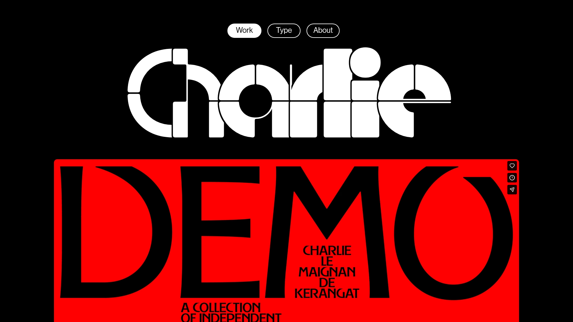
Charlie Le Maignan Portfolio Archive
A minimalist dark-mode portfolio featuring high-contrast typography, a geometric logo header, and an integrated full-width video gallery showcasing independent creative work.

Dries Bos Creative Developer Portfolio
A high-interaction dark-mode portfolio featuring a grain-textured bento grid, marquee headers, theme switching, and a dynamic project list with hover-triggered image previews.
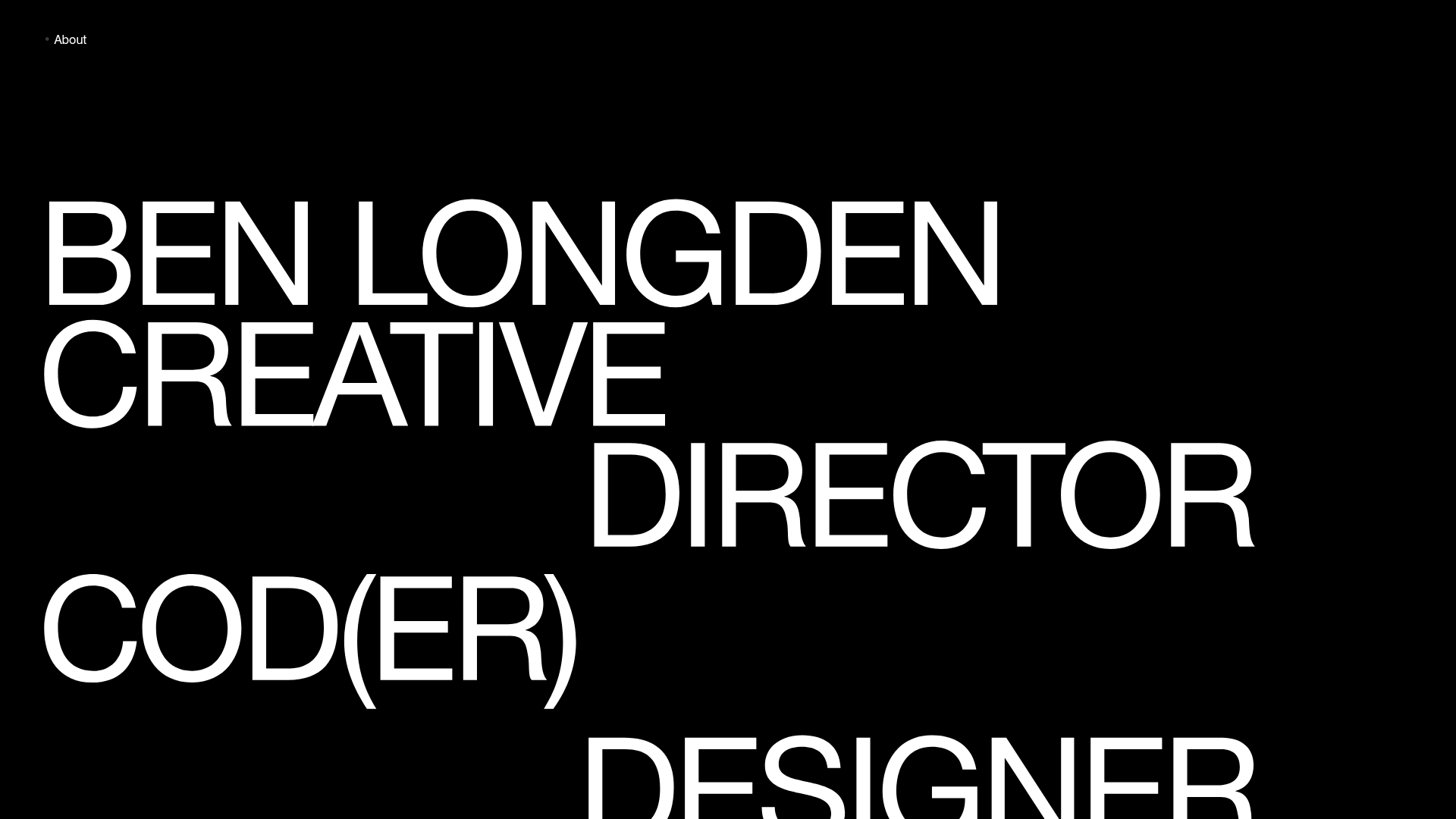
Ben Longden Minimalist Creative Portfolio
A bold typography-focused site featuring a large-scale overlapping hero section, horizontal image carousels for projects, and a scrolling text marquee footer.
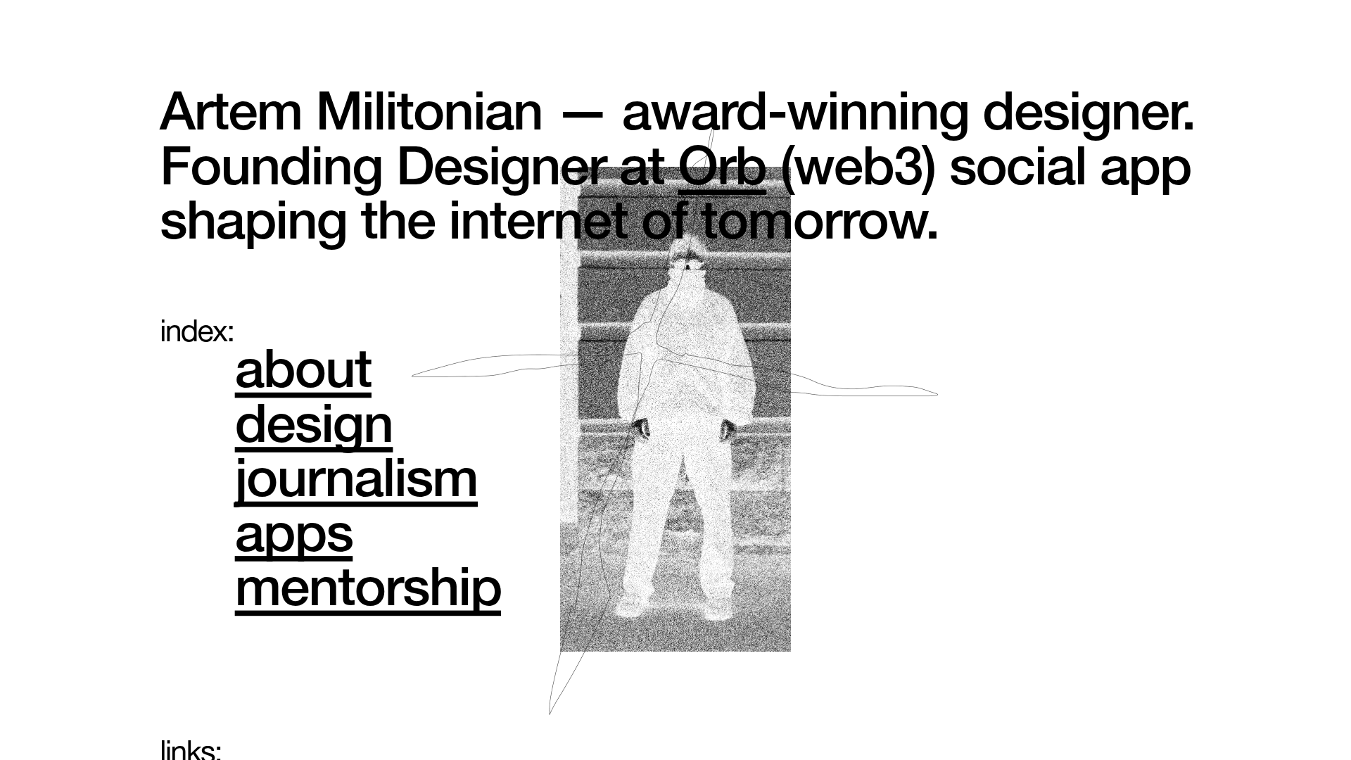
Artem Militonian Portfolio Landing Page
A minimalist, typography-focused designer portfolio featuring a layered grayscale hero image, staggered vertical navigation links, and a fixed header with utility data.
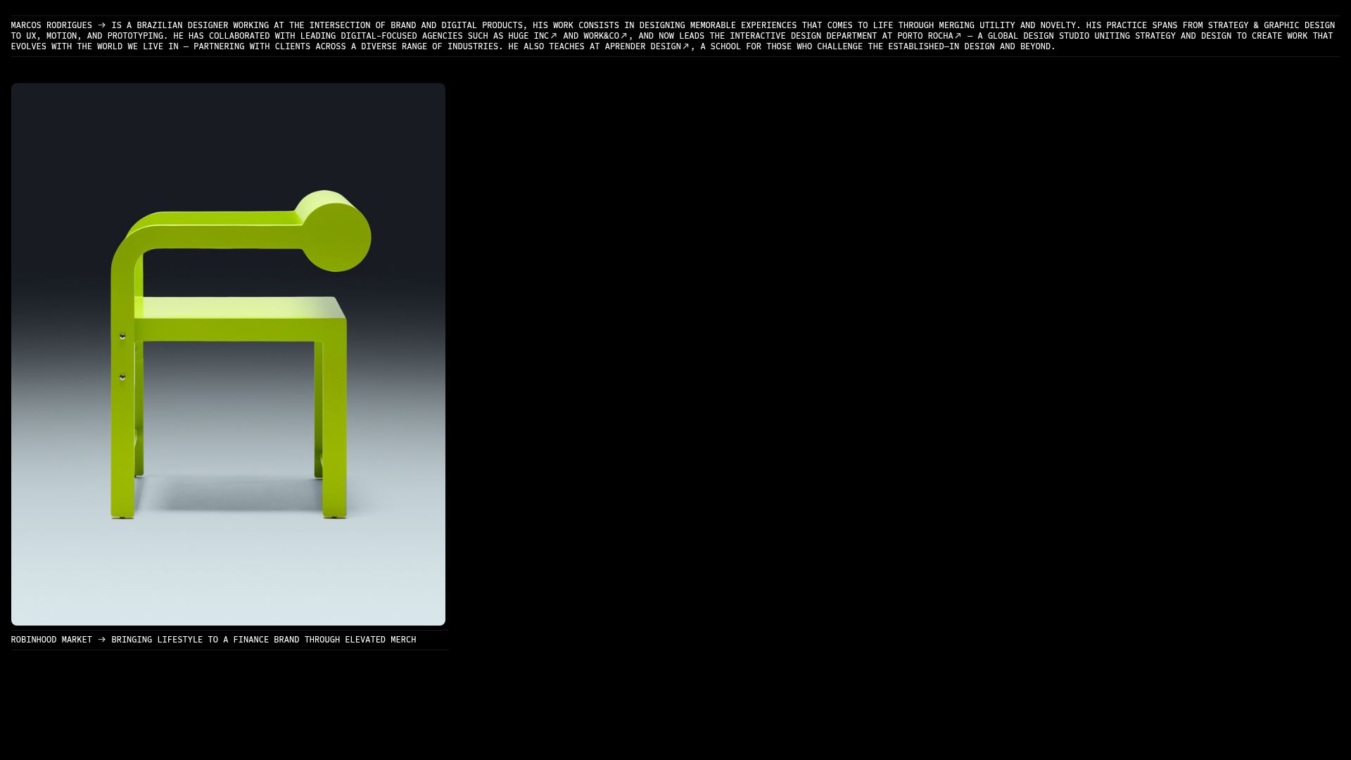
Marcos Rodriguez Minimalist Design Portfolio
A dark-themed personal site featuring a high-contrast monospaced header, a full-height centered image/video slideshow, and minimal thin-rule horizontal dividers.
OPX Studio Agency Portfolio
A minimalist dark-themed portfolio featuring a staggered masonry project grid, cinematic video embeds, and a responsive oversized typography hero section.
