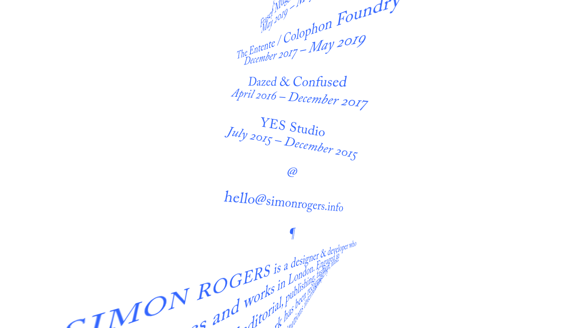
Simon Rogers Rotating Text Portfolio
A minimalist single-page layout featuring a CSS-transformed rotating text column with a repeating biography and career timeline sections.
Overview
This single-page portfolio is an exercise in typographic minimalism and radical geometry. It features a continuous, repeating column of text rotated at a sharp diagonal angle, creating a unique scrolling experience that prioritizes motion and letterforms over traditional navigation layouts. It is an excellent reference for builders wanting to experiment with CSS transforms and non-conventional information architecture for personal branding or creative studios.
Design System
- Color Palette & Visual Hierarchy: The site uses a high-contrast, two-tone palette: vibrant royal blue text on a stark white background. Hierarchy is established purely through typographic styling and symbols (such as the @, †, and ¶ glyphs) rather than through contrasting scales or container blocks.
- Typography System: The design relies on a classic serif typeface with varied weights and styles. It employs regular weights for body text, italics for dates and timeframes, and consistent letter-spacing (
letter-spacingclass in HTML) for proper nouns like "SIMON ROGERS" and "YES Studio." - Page Structure: The structure is an infinite-feeling list (
<ul>) where three distinct content blocks—biography, career timeline, and contact info—are repeated multiple times. This repetition ensures that regardless of scroll depth, the core information is always visible within the viewport. - Reusable Components: The primary reusable component is the
contentlist item (<li>) wrapper. Builders should first clone the repeated list structure and the specific CSS transform responsible for the 45-degree (approximate) rotation and translation of the container. - Interaction & Motion: The core movement is a diagonal scroll. The text is transformed using CSS
transform: rotate(-30deg)or similar, which shifts the scroll direction from vertical to diagonal. Hyperlinks are active within this transformed space, maintaining standard hover states (typically underlines or color shifts). - Implementation Clues: The HTML confirms the use of the Nuxt.js framework (indicated by
# __nuxtand# __layout). The repeating structure suggests a loop-based component where a single array of bio/experience data is mapped multiple times to fill the screen space.
Use Cases
- Who should clone this pattern: Creative developers, graphic designers, and experimental artists looking for a "lo-fi" digital business card that stands out through sheer typographic personality.
- Effective Remix Directions:
- Brand Identity: Swap the blue for a neon palette or dark mode to radically change the mood.
- Layout: Adjust the rotation degree to 90 degrees for a vertical sidebar effect or use a subtle 5-degree tilt for a more readable, yet edgy, aesthetic.
- Content: Replace the repeating biography with a ticker of project titles or a curated list of values/manifesto points.
- Suggested Clone Scope: A quick section clone is ideal for a "hero" section of a larger site. A full-page clone is best suited for minimal landing pages where the primary goal is to provide a single point of contact and basic credentials.
Related Inspirations
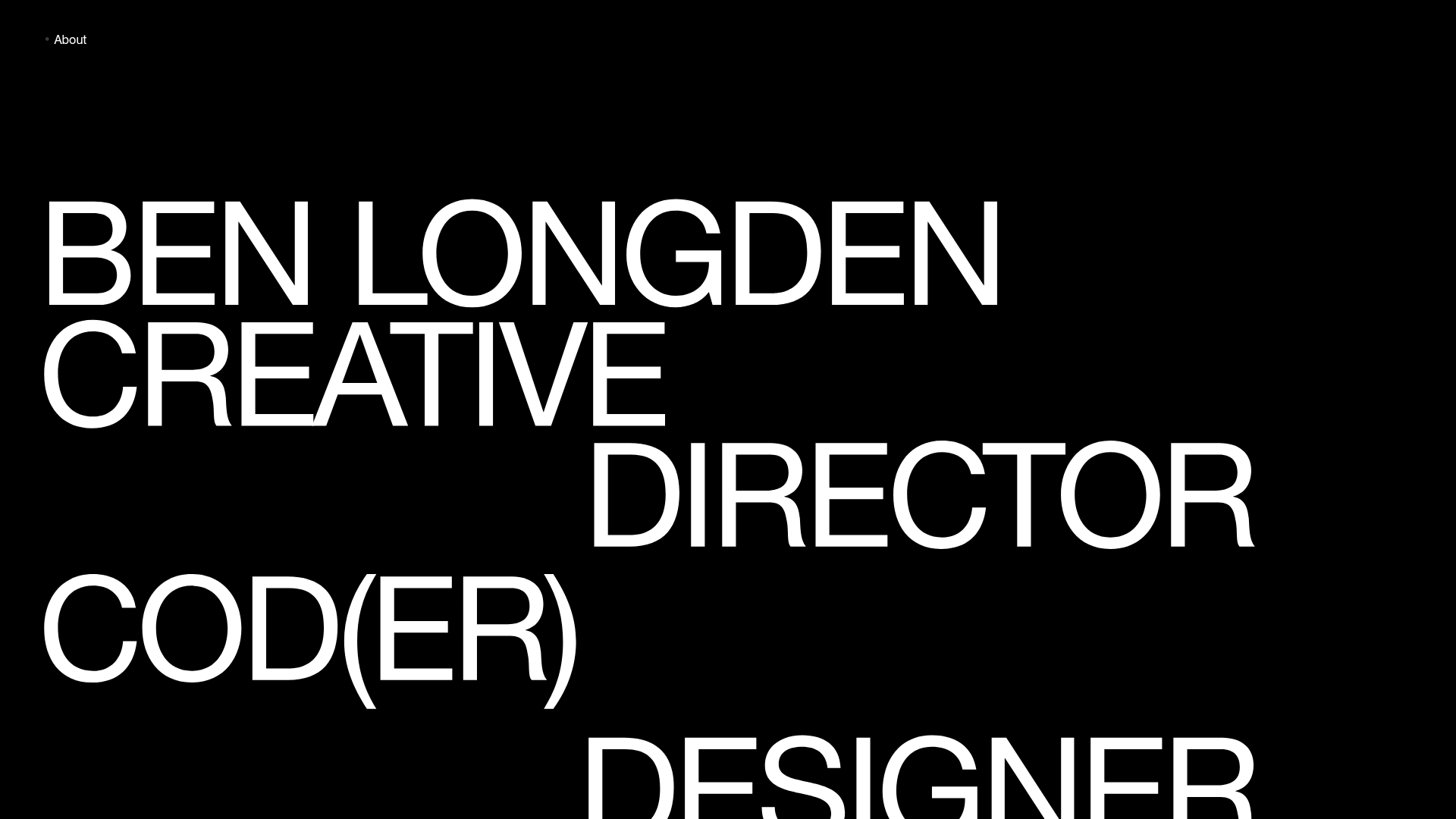
Ben Longden Minimalist Creative Portfolio
A bold typography-focused site featuring a large-scale overlapping hero section, horizontal image carousels for projects, and a scrolling text marquee footer.
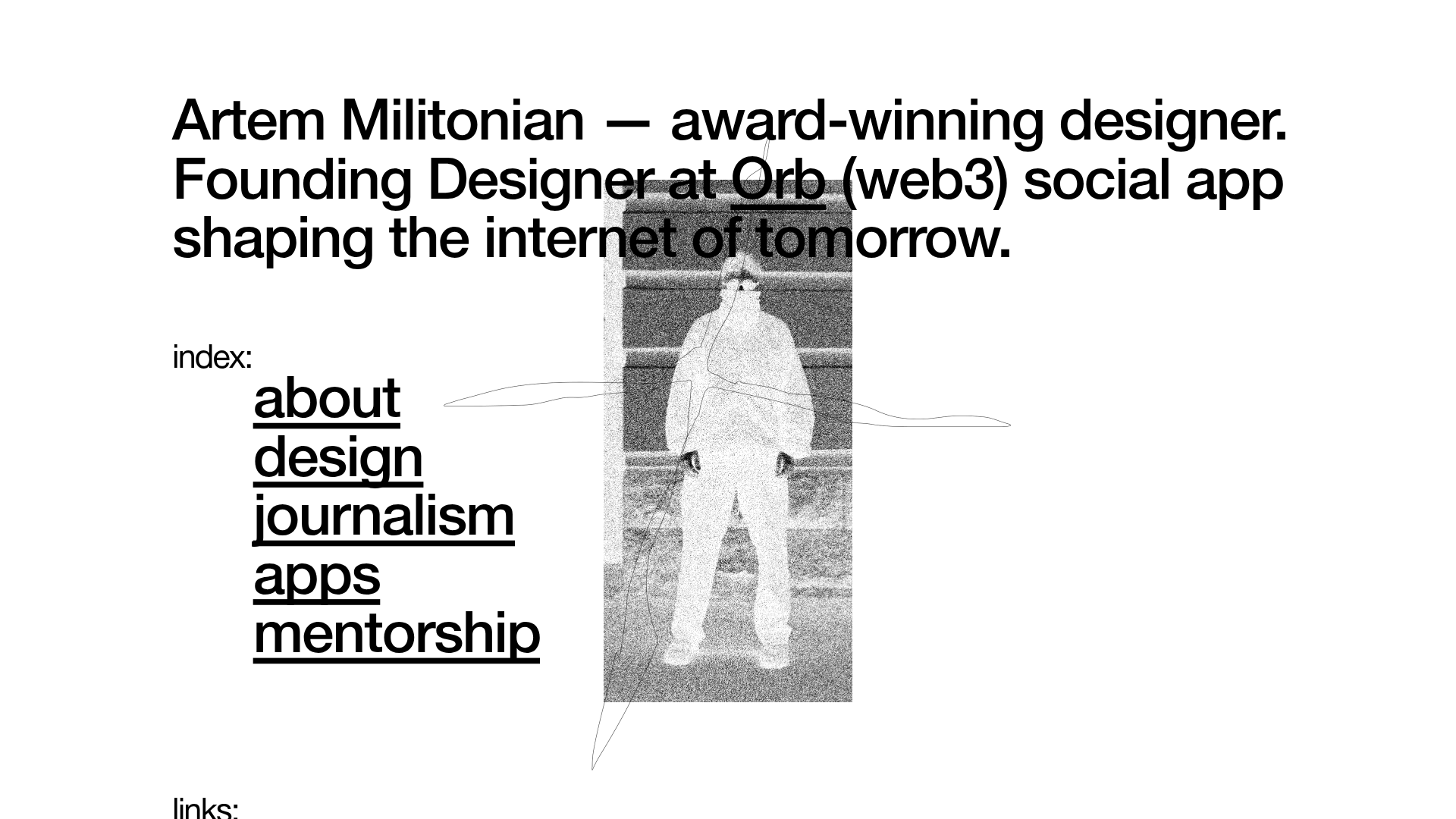
Artem Militonian Portfolio Landing Page
A minimalist, typography-focused designer portfolio featuring a layered grayscale hero image, staggered vertical navigation links, and a fixed header with utility data.
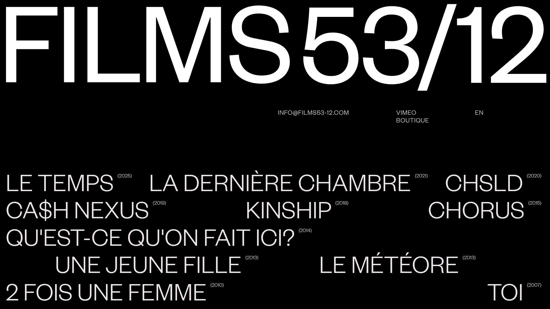
Films 53/12 Cinematographic Portfolio Layout
A minimalist dark-mode production site featuring a scattered typography grid, interactive hover-to-reveal image states, and a clean list-based film catalogue.
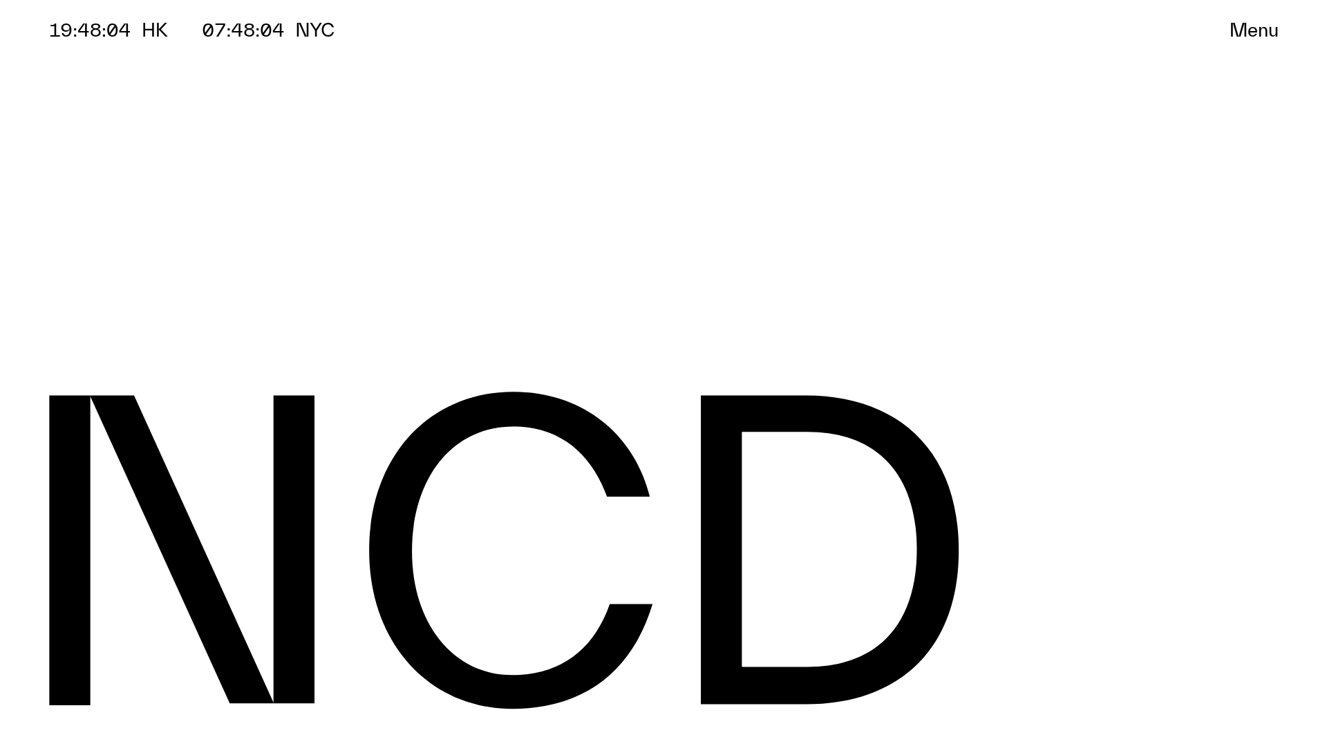
NCDA Architecture Studio Portfolio Template
A minimalist design featuring a bold typography splash screen, real-time dual-city clocks, and a discipline-based vertical scroll layout with hover-triggered overlays.
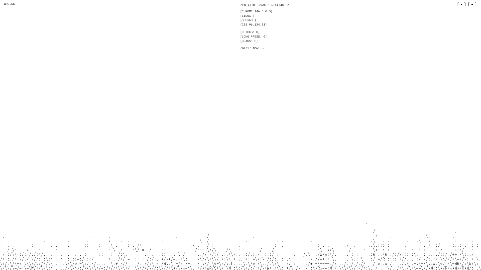
WRDLSS ASCII Aesthetic Portfolio Site
A minimalist portfolio layout featuring a full-width ASCII art hero section, scroll-based text fade-ins, and a multi-column services grid built with Nuxt.
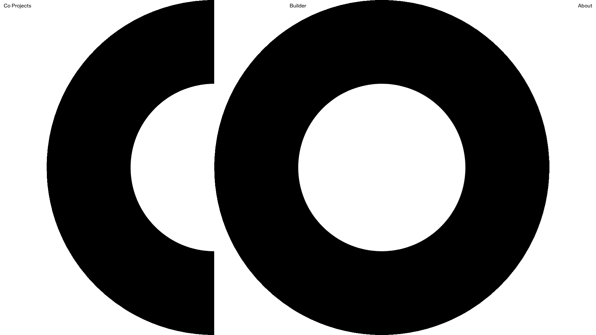
Co Projects Design Portfolio
Minimalist case study layout featuring a bold kinetic typography landing state, responsive staggered grid, sticky section headers, and a scroll-triggered image revealing interaction pattern.
